


art direction . branding . graphic design . motion graphics
RTP (Rádio e Televisão de Portugal) is the Portuguese public service broadcasting organization. It runs four national television channels and three national radio stations. As well as several satellites and cable offerings. They challenged Itsanashow Studio to develop a new visual identity for every newscast program.
THE CHALLENGE
This new identity should mirror the company's new strategy — forward-looking, dynamic, and youthful.
This new identity should mirror the company's new strategy — forward-looking, dynamic, and youthful.
It had to make the operators' daily routine easier and in line with the channel's visual identity.
INFOGRAPHICS
SPORT

ECONOMY NEWS

GENERAL INFOGRAPHICS
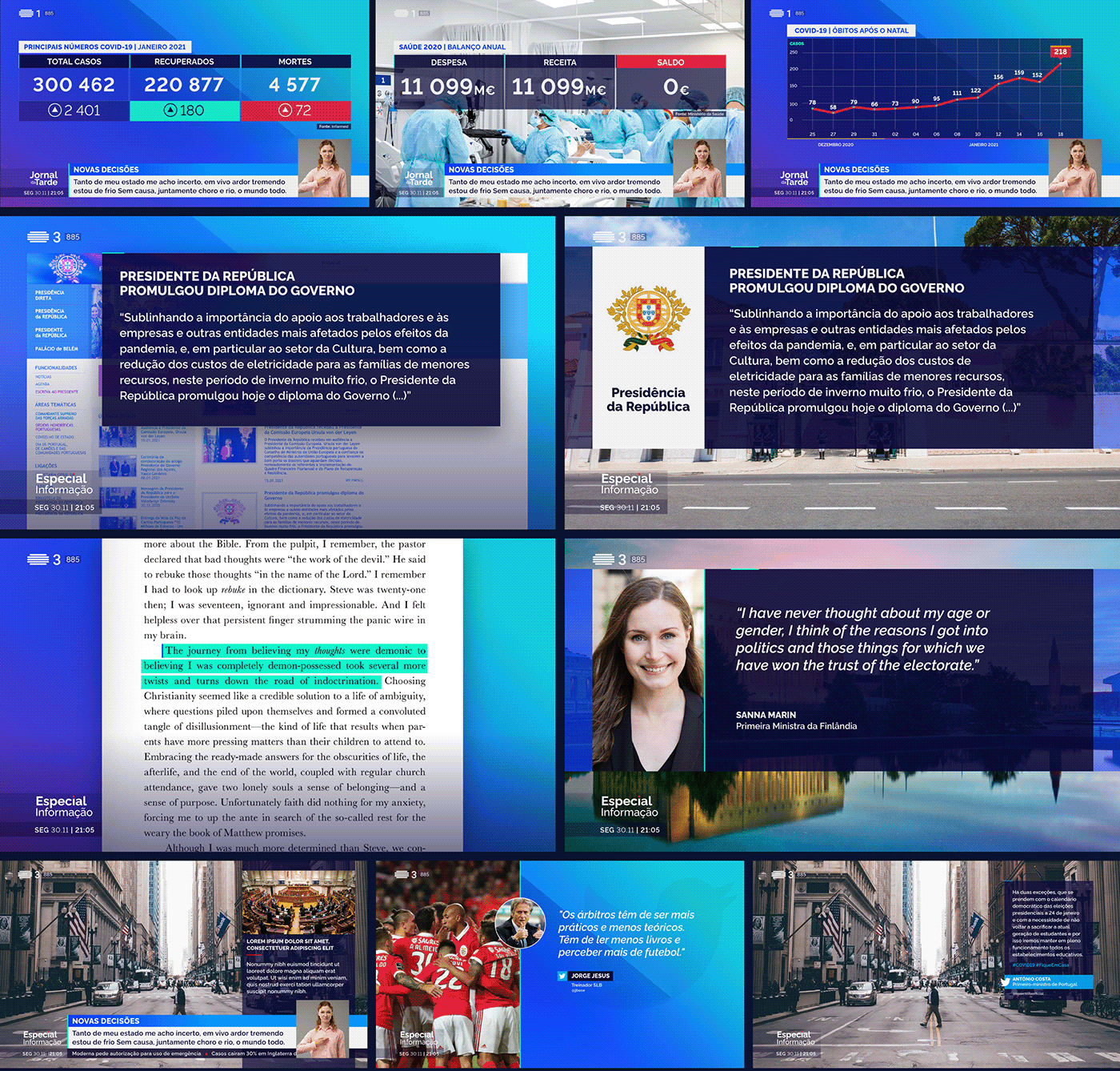
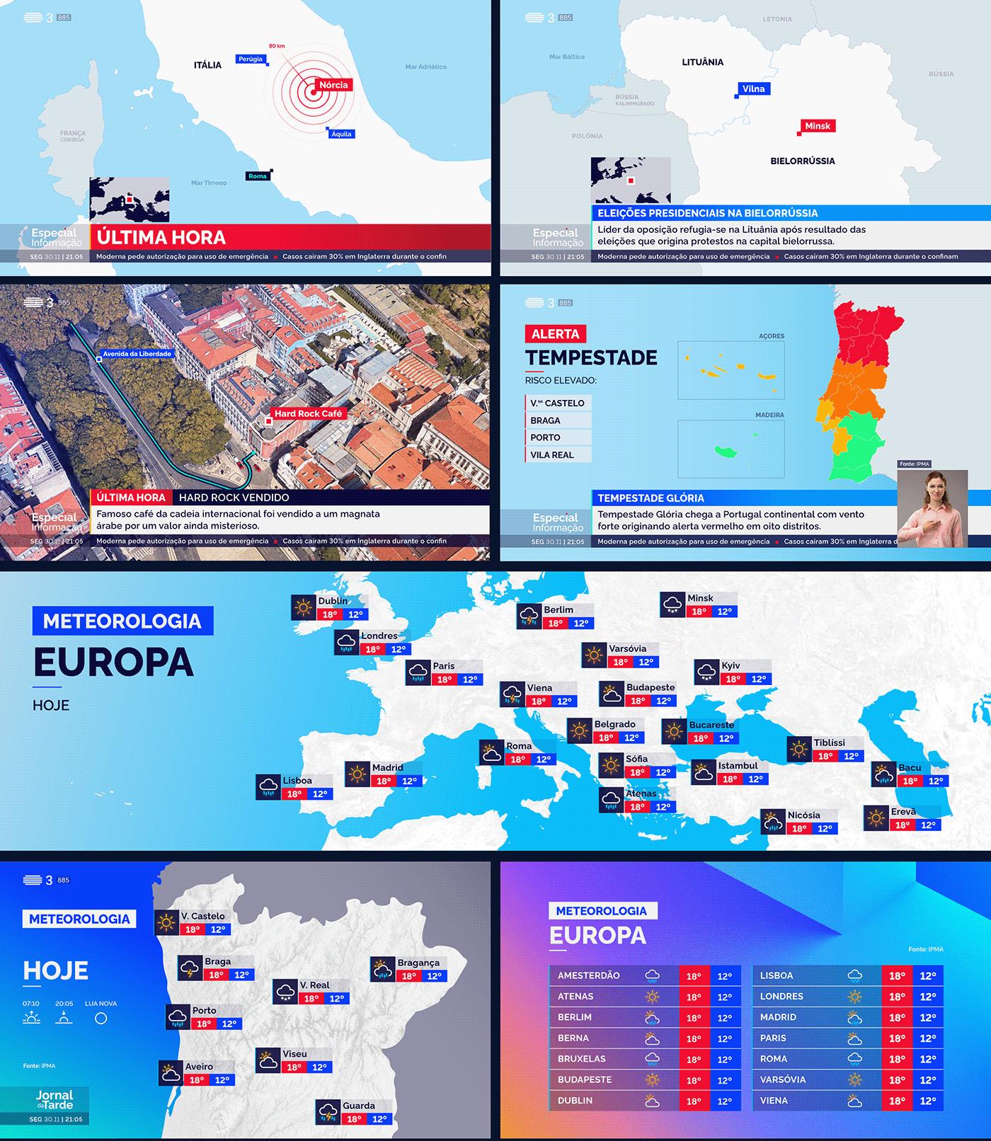
MAPS & METEO

THE SOLUTION
Color became the defining feature of RTP's rebranding. For each news outlet, we chose a predominant color.
For all graphic maps, we chose minimalist iconography, all balanced with neutral colors. For the weather report, we also create a minimalist imagery, combining simple and immediately readable shapes and strokes.
For all graphic maps, we chose minimalist iconography, all balanced with neutral colors. For the weather report, we also create a minimalist imagery, combining simple and immediately readable shapes and strokes.
In all these blocks, the animation assumes the main role. Through rhythmic and organic transitions we visualize information in a chained way. Thus reinforcing the notion of reading and quick assimilation of all journalistic content.
ALL TOGETHER
—
Directed by: Itsanashow Studio
RTP's Art Direction: Nicolau Tudela
Creative Direction: Ana F. Borges
Graphic Design: Gonçalo Quinaz, Ana F. Borges
Animation: Rudá Virgínio, Ruben de Sousa
Project Manager: André Torres
Project Manager: André Torres
—
THANKS FOR WATCHING!
If you liked it, please don't forget
to give us some love :)
FOLLOW US ON


