Cercle Brugge.
From underdog to ballsy brand.
From underdog to ballsy brand.
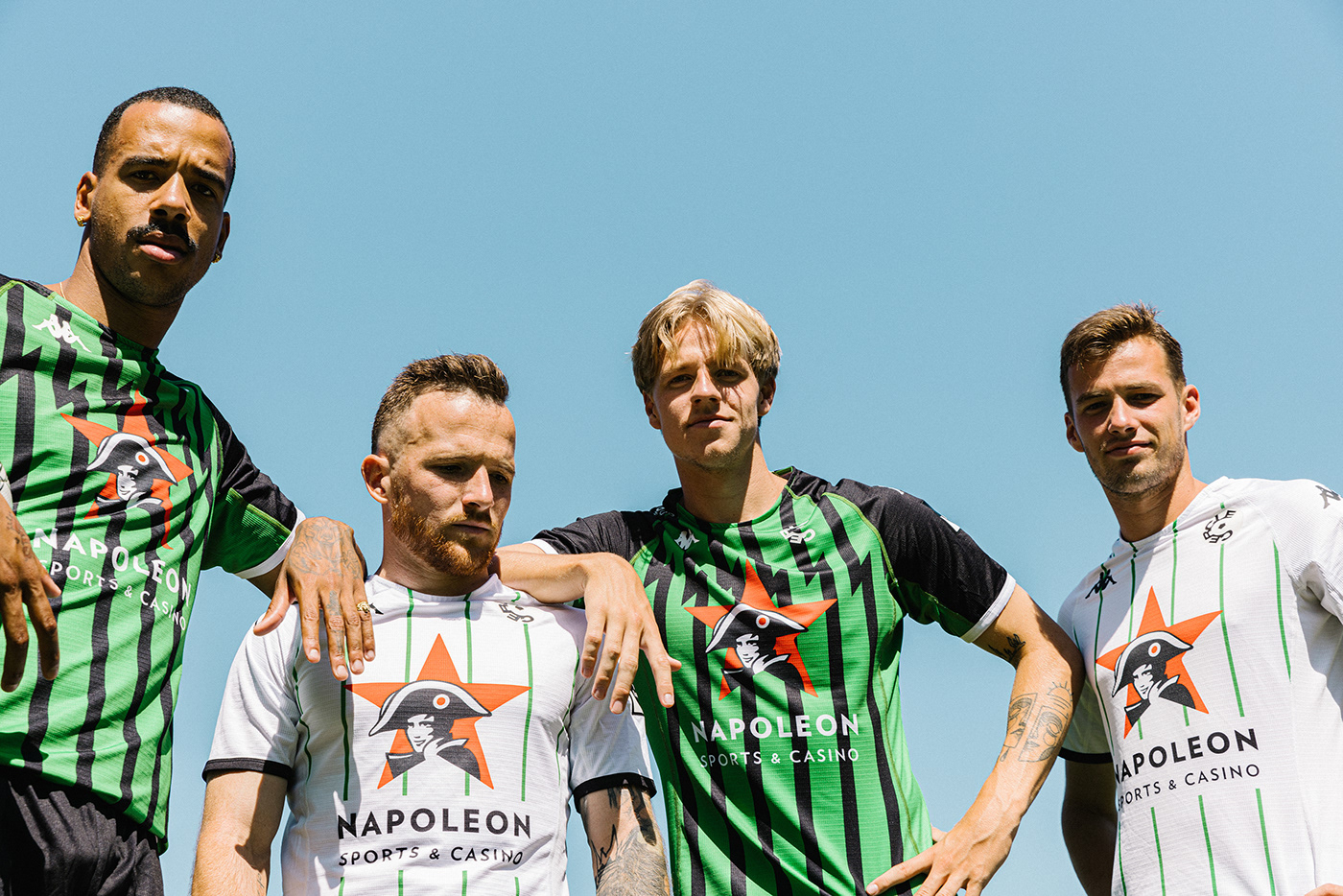
With a legacy of 123 years, Cercle Brugge is a Belgian soccer veteran. And yet, in 2022, the team has never felt younger. The board is keeping its eye on the ball, the team kicks ass and combined, their belief in the next generation is palpable. In other words: there’s a real drive. But one that wasn’t necessarily reflected in the club’s branding. So we created a brand that matches the way Cercle is today. Hungry. Energetic. And ballsy. But still respecting its past. Ready for a future generation of fans.

One-two punch
between past and future
between past and future


The new brand identity feels
young, dynamic and energetic.
young, dynamic and energetic.


The new logo too honours its predecessor. With recognisable elements like the letter C, the circle and the pentagon. They are still there, but with a more energetic look and feel. Sleek, powerful and assertive.


Cercle’s identity is ‘digital first’. Even prominently so. Its graphical assets, tools and templates are reminiscent of social media, but allow for enough leeway to demonstrate Cercle Brugge’s more personal and familiar side.

The revamped Cercle is a game changer. A total score. Ballsy. Just like the teams on both sides of the pitch. Ready for a new generation of fans.


skinn.be


