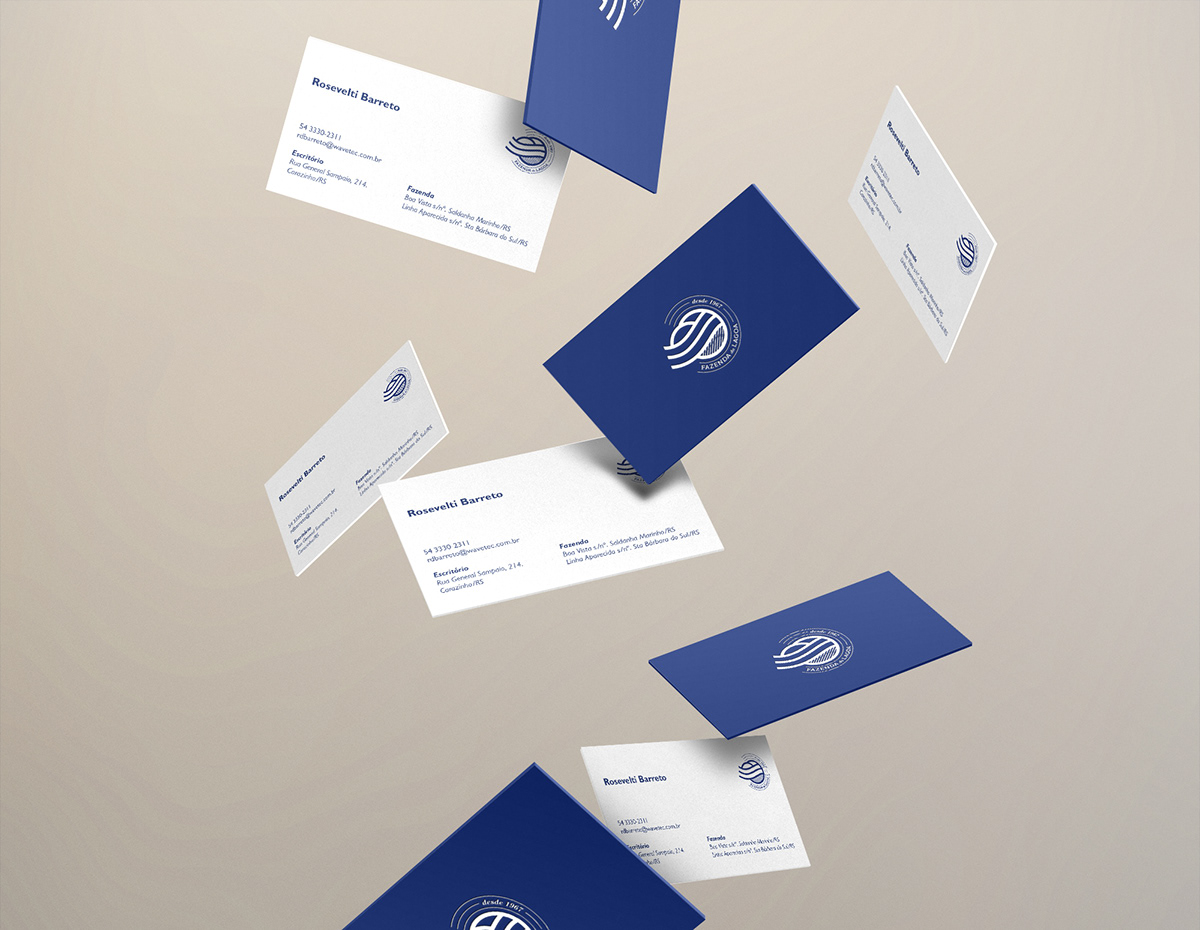

Fazenda da Lagoa ("Lagoon Farm") is a medium-sized seeds and grain producer, with a strong and well built client roster.
In an ever-growing market, they needed to communicate a distinct personality, built on responsibility and respect for their history and tradition. Their brand identity intends to stand as message of credibility, of a company in which business partners can trust.
We chose an elegant blue as main color, to diffentiate the brand from other agriculture-related companies. The logotype has its forms based on Gill Sans, for a classic and hard-working approach, while the icon symbolizes a plantation, the rising sun and a lagoon, picturing the farm's landscape.


-----------------------------------------------------------------------------------------------------------------------------------------------------
facebook.com/MultiversoID

