


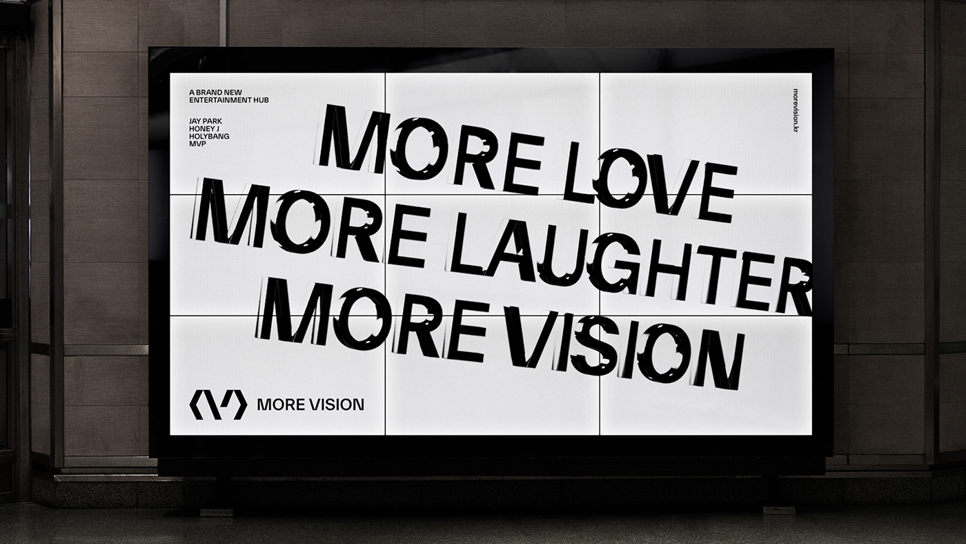
MORE VISION
A BRAND NEW ENTERTAINMENT HUB
MORE VISION has developed sensual brands based on hip-hop and R&B genre culture. A new entertainment hub founded by Jay Park. More Vision in the entertainment industry. By presenting a new business model and based on this, K-Pop. It was established to become a complete global genre.
VISIONARY LEADER
MoreVision nurtures K-Pop artists, where their individuality is respected. of entertainment that communicates with the public and delivers pleasure through various contents Visionary Leader. MoreVision delivers a diverse spectrum of inspiration and experiences. To make the lives of the public and artists more valuable and allow them to dream bigger.


MORE LOVE, MORE LAUGHTER, MORE VISION
The values pursued by more vision are embodied in more vision's slogan, 'More Love, More Laughter, More Vision'. More vision is a company that presents a vision to pursue the joy that the entertainment industry gives to the public and love, the ultimate value that people pursue in life, and to create it together.

BRAND MARK
The symbol mark, which is the core of the Morevision brand mark, is a monogram-type symbol that forms the shape of M and V, the initials of Morevision, by combining parentheses < > in the shape of an arrow with the meaning of expansion and direction and two diagonal lines representing growth and leap. mark. The symbol mark created by connecting diagonal lines is symmetrical, and the image of the hub and platform and rhythmic bends deliver an entertainment image.


COLORS
More Vision's color starts with the light that symbolizes VISION. The main colors are Black & White that make up the light, and the 3 primary colors of light, RED, GREEN, and BLUE, are used in combination as secondary colors. Each color that symbolizes VISION shows the inclusiveness that encompasses the diverse music, content, and artist personality pursued by Morevision.


TYPEFACE
TWK Everett is a typeface that best represents Morevision's brandingness, and it is a typeface that reflects the visual characteristics of the logo along with the modern image of sans serif. Through the use of typefaces, you can consistently build MoreVision's own image. ABC Favorit Hangul is a solid and sharply crafted typeface, which can be used not only for clear readability of the text itself, but also for visual harmony by balancing images and texts when used together.


MORE VISION
March, 2022
Brand Design
form & function
Creative Director | Chung Jinsuh, Park Juyoung
Brand Design | Hwangbo Sanghyun, Lee Dahee
3D & Motion Graphic | Hwangbo Sanghyun
Client
MORE VISION
Please, Visit Our Website
Thank you.


