This is a "The More I See It The More Things I Find" kind of project. The statement mirrors the craft behind the Speakeasy Magick show at The McKittrick Hotel in New York which is about a group of the best magicians in a bar atmosphere where libations and indulgence runs in the blood of an unprecedented experience.

Many years ago, I started a series of legged in-animate objects called "Poemas a Mi Madre." It was a personal project that followed my curiosity with Pin-up illustration— which for a period of time I was enamored with — and allowed me to create a Surrealistic-Pin Up world. Earlier this year, this same style came back to me; when Speakeasy Magick commissioned me to do their re-branding poster and had attached my legged illustrations as a reference. At first this took me by surprise, but it made me extremely happy that someone would even look at those pieces when I considered them buried.


Additionally, I did three different options during the early stages of the project (1) both options inspired by old Magic posters and handbills, as well as a postcard set called "MAGIC" by Taschen. Those options were dismissed. The idea of the limbs and a magical creature was always everyone's favorite idea, and it wasn't until the second round when I finally gave it try. I started rough; to me what's important is to visualize and then craft (2); and also have some artistic reference, someone to look up to. In this case that was Gil Elvgreen and Luis Ricardo Falero.
Lastly, the main copy had to be legible, yet seamlessly integrated; and I didn't want to fight the presence of the creature. Since the body seemed blank, I used it as a canvas, turning the text into tattoos, adding depth, playfulness and a bold personality that also seemed more accurate to represent the personality of the show (3). It also gives the overall aesthetic a contemporary touch in the middle of such an intricate and vintage design. (4) The 2D final image for final approval.
More about this process can be found here.


Across the poster, I intentionally planted different eyes, some more literal than others. This graphic language functions as the red thread to communicate that Magic is all about perception and detail. The main character comes out of an oval, the ornamented frame equally includes two mirrored eyes, and the stabbed ace-pupil eye main element grounds the poster with its own narrative about vision and magic.


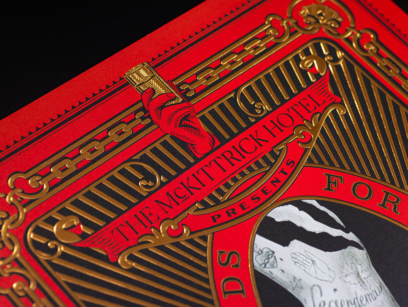
The Chain frame, a nod to one of the most recognizable names in the Magic business; Houdini—adds up literal strength to the composition and also gives the poster a good use of the metallic foil adding realism.