


Once upon a Time
In 2008, Malaysia’s Time staged one of the greatest turnarounds in the country’s history – transforming from a struggling start-up to Malaysia’s challenger Internet Service Provider of choice.
They did this by stripping back to the essentials, delivering fast speeds, rock-solid stability, responsive service, and clear value-for-money – a feat achieved, in part, by massive investment in building their own infrastructure.
They did this by stripping back to the essentials, delivering fast speeds, rock-solid stability, responsive service, and clear value-for-money – a feat achieved, in part, by massive investment in building their own infrastructure.
Recently, though, Malaysian regulations have changed in a way that will require companies like Time to share their infrastructure with other ISPs. In order to reinforce their position as Malaysia’s most hardworking and beloved ISP, and remind people that they’re more than their great infrastructure, Time needed to evolve their brand to better express how they uniquely understand what Malaysians need from their internet service – and how Time enables that, better than anyone else.

Time for a new approach
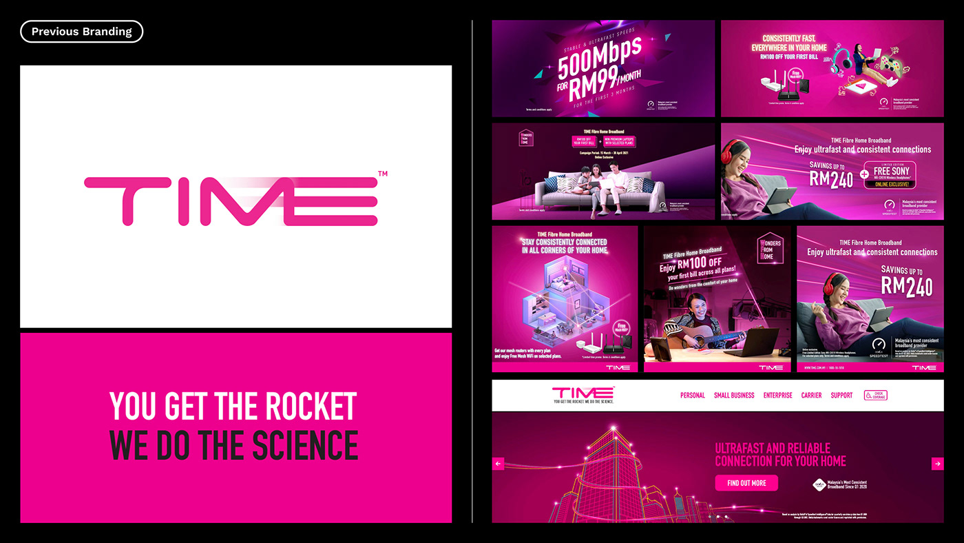
The Time brand had strong market recognition through colour and a distinct, quirky personality expressed through razor–sharp and irreverent communications and campaigns.
But to build strategic growth and establish a more sustainable brand platform, they needed a radically-redefined brand with the consistency to cut through in a market saturated with a “more-is-more” visual design, stock photography, and a layering of multiple offers and discounts. To do this, we brought an external perspective to the Malaysian market – but did this in close collaboration with the Time team and partner creatives on the ground in Kuala Lumpur, ensuring we weren’t losing any of the specificity and charm that makes Malaysian culture so rich.

How we actually spend time on the internet
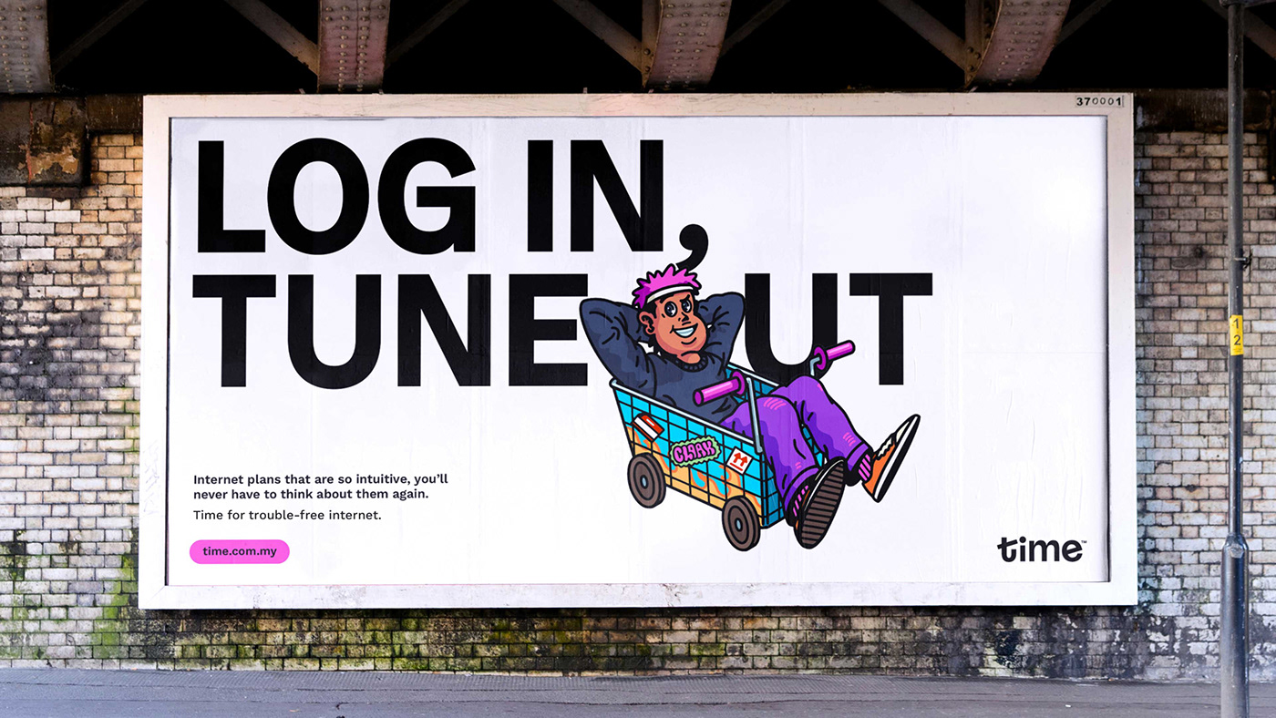
We all depend on the internet to simply be ourselves. Whether it’s to buy limited-release clothes, learn a skill, game competitively, engage in communities, share our lives, work from home, manage investments, keep up with the latest trends, or manage our homes. The story of the internet is the story of life.
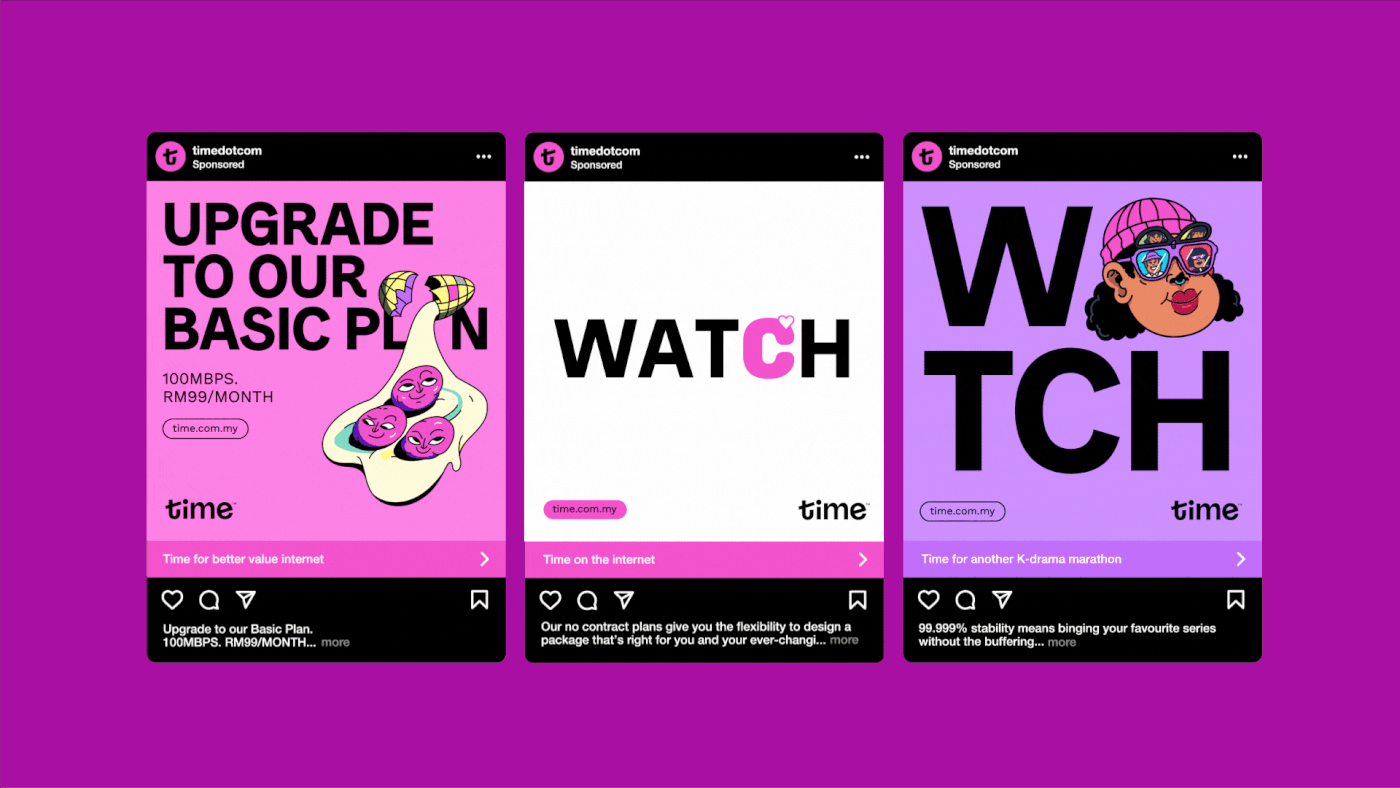
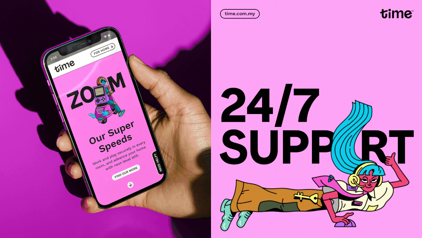
This eclectic and humanist reality forms the basis of how Time now talks to its customers. By demonstrating this insight (and getting away from stock photography of people inexplicably jumping with joy whilst carrying around laptops), the new system communicates that Time has a grounded, real-world relationship with providing internet access… and that their products and services are built from that relationship.


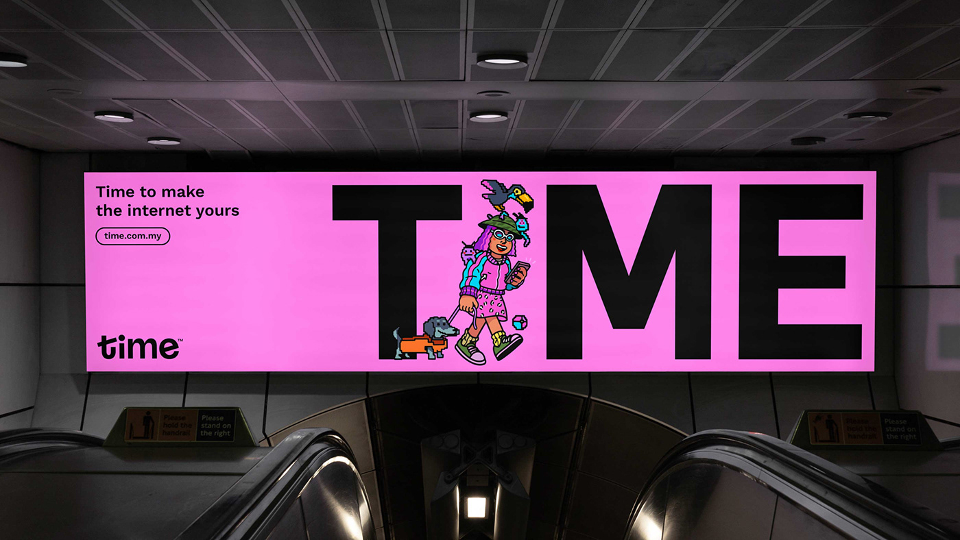
Clock the newness
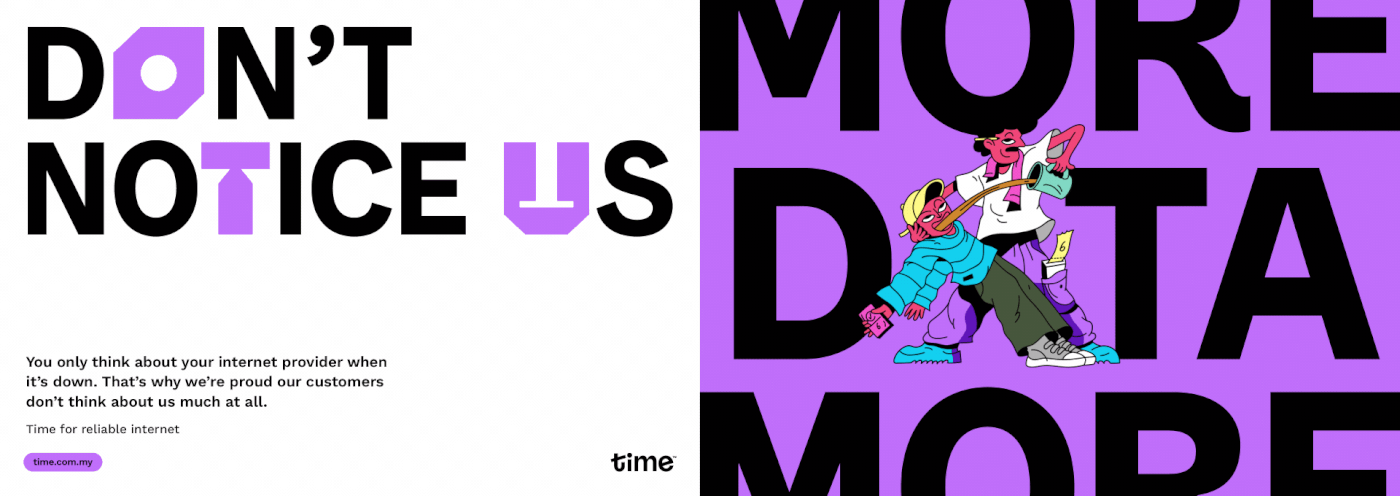
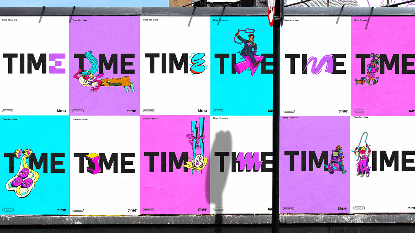
Built into the new wordmark is a subtle reference to a clock (with the crossbar of the T and the stem of the I forming the hands, with the dot of the I at the center) – a winking acknowledgement of how valuable time is to customers, and how Time knows never to waste .
Even the things that remained the same got an evolution. Time’s trademark pink is still dominant – albeit now in a different tone, and supported by secondary pinks, purple and blue.
Even the things that remained the same got an evolution. Time’s trademark pink is still dominant – albeit now in a different tone, and supported by secondary pinks, purple and blue.


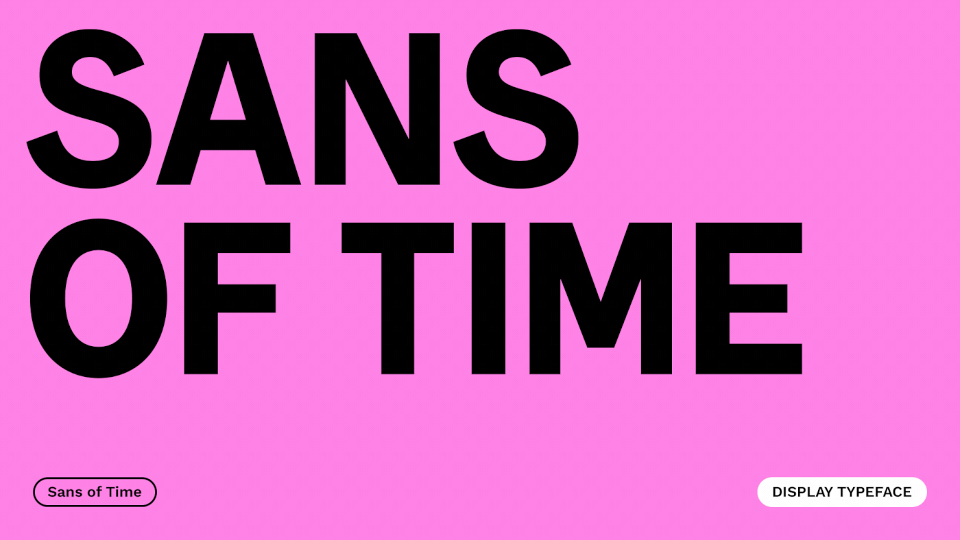
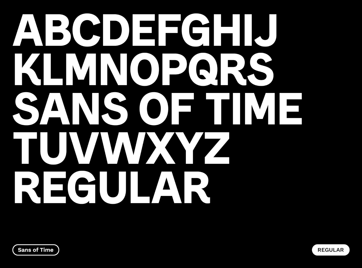
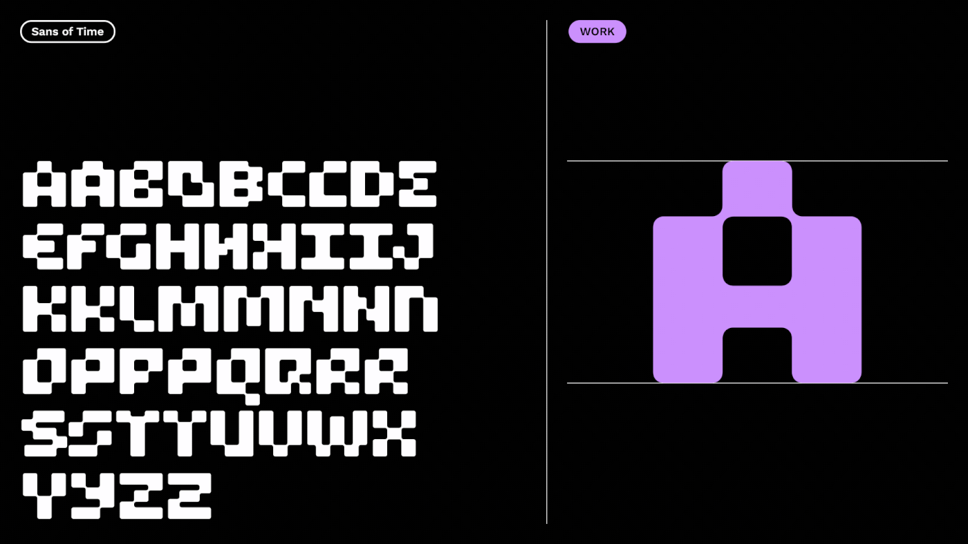
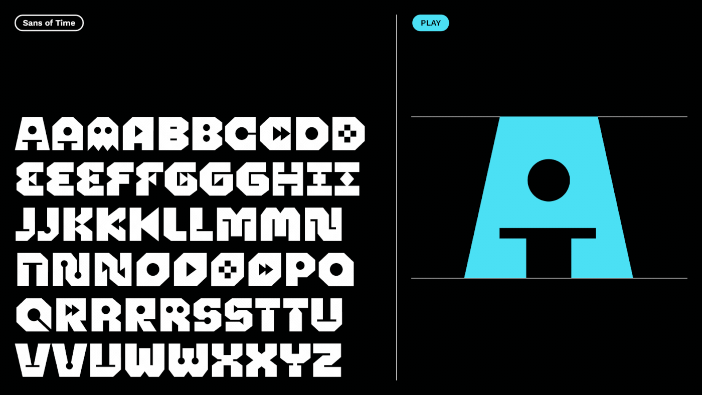
Sans of Time: A typeface for all
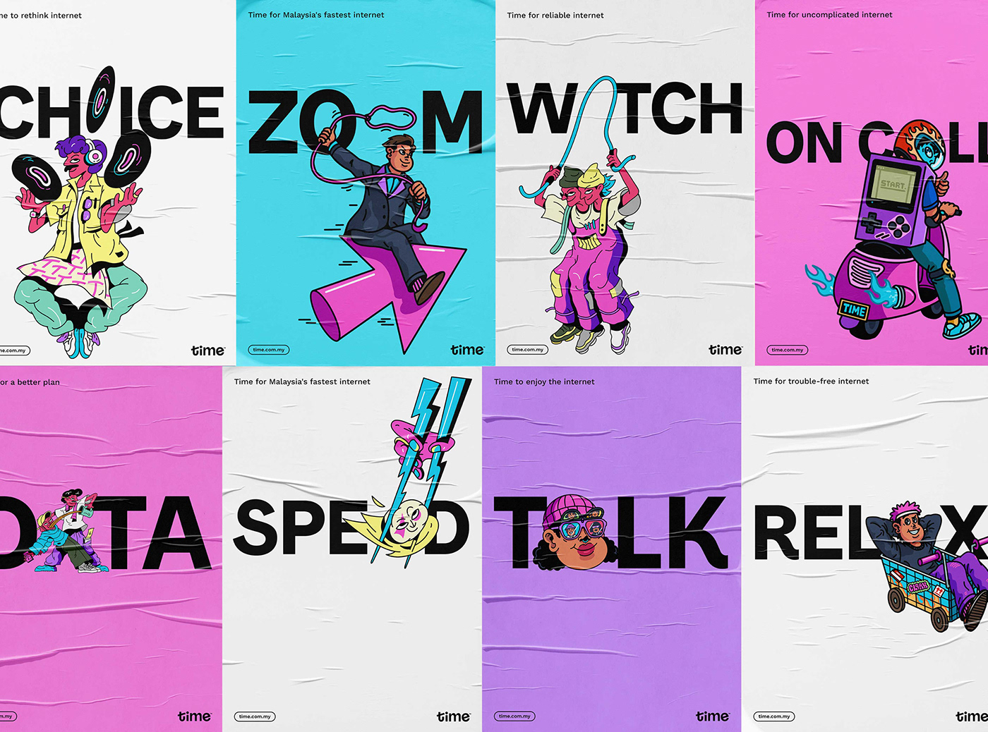
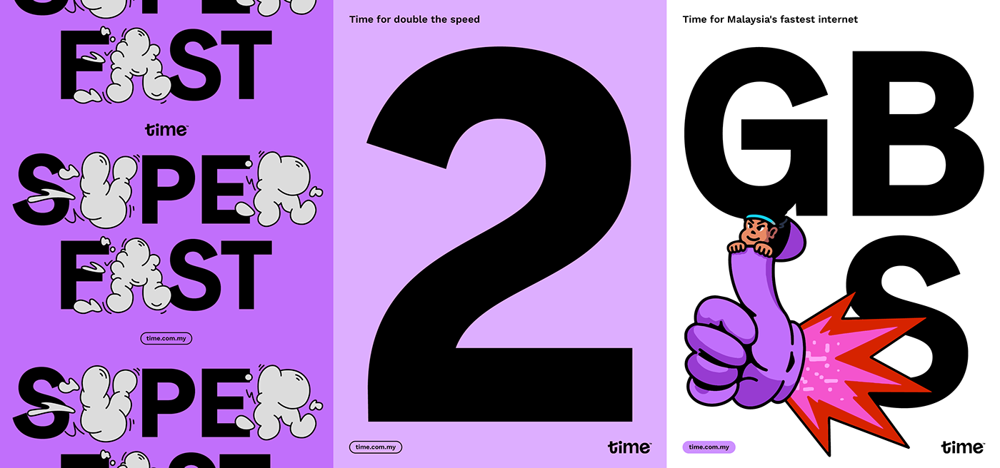
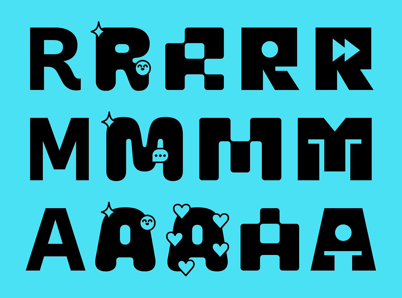
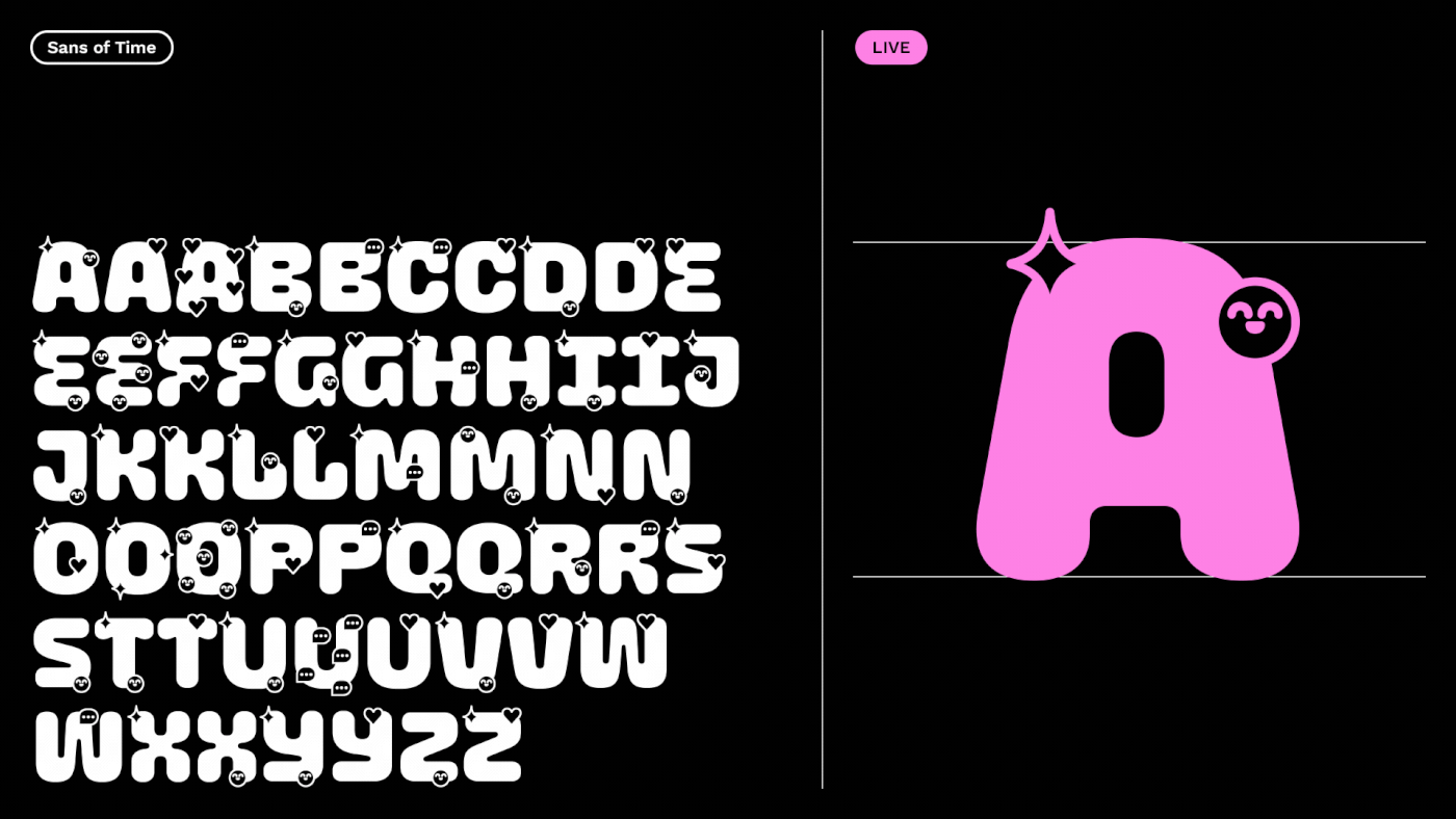
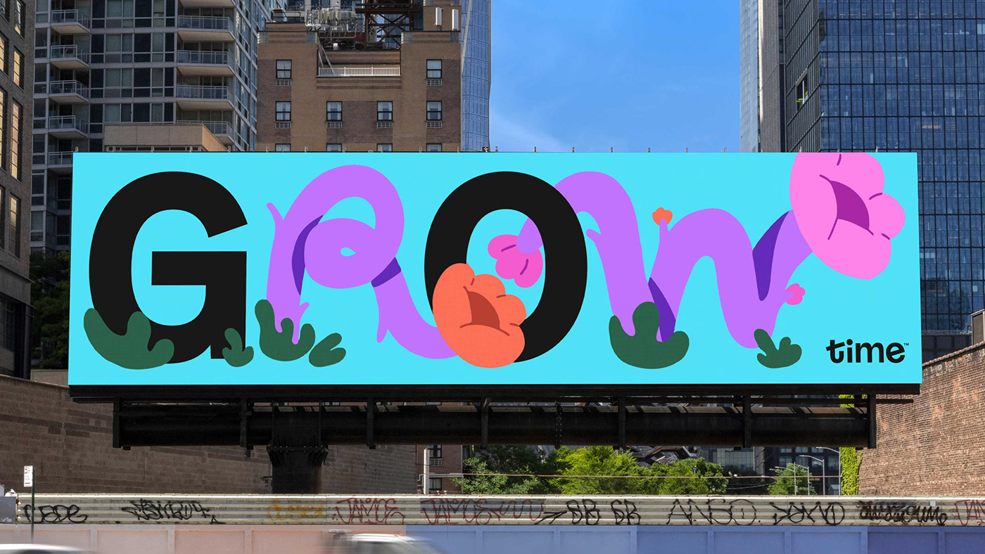
We worked with typographer Mathieu Régeur to create Sans of Time – a custom-designed display typeface that integrates three expressive alternate character weights: LIVE, WORK and PLAY.
These alternates communicate different aspects of how we use the internet (such as work, social media and streaming), and consequently are used to enhance a desired tone or message.
The typeface has been designed to integrate illustrated letters or complete illustrations that can be injected directly into the headline words, replacing one or more letters. This approach links in to meme culture where messaging and imagery are inextricably linked.


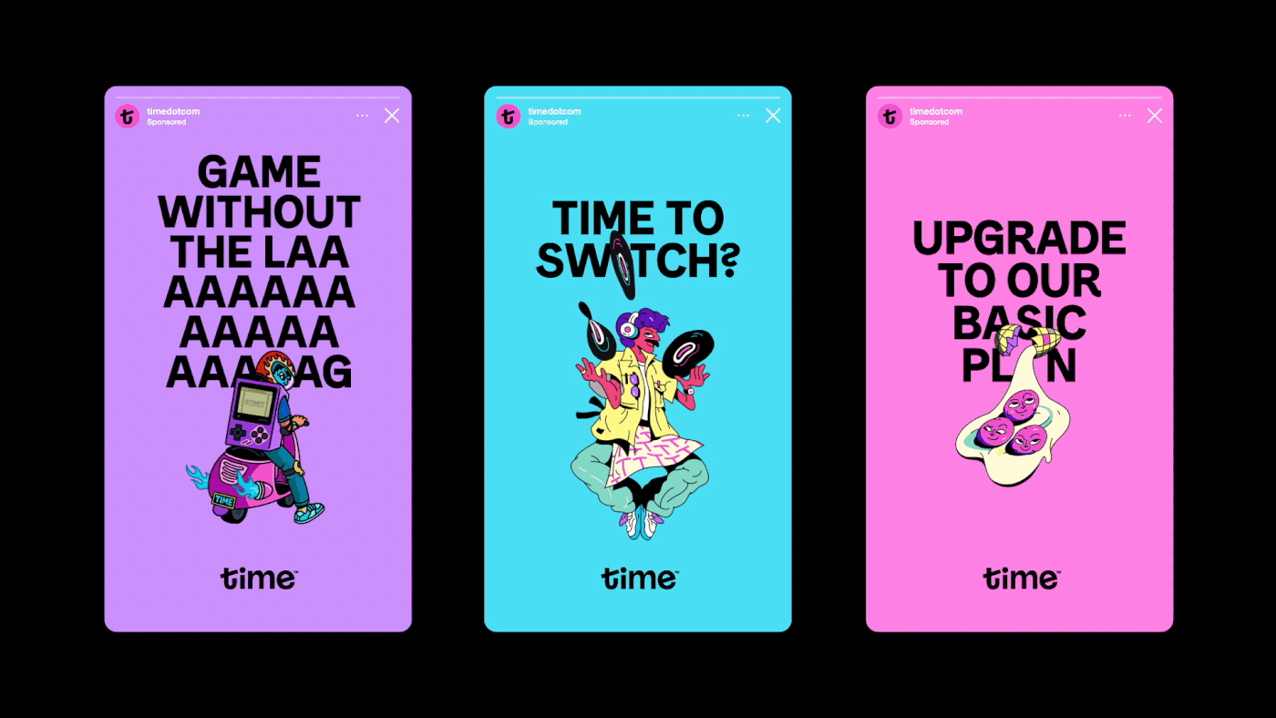
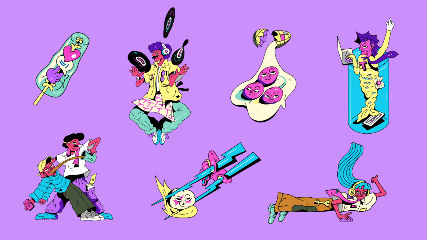
Local characters
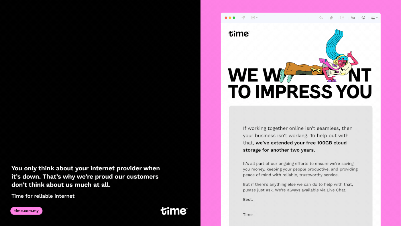
Supporting local artists and creative talent is a key principle of the Time ethos and identity. Malaysian contemporary artists Cloakwork and Shu Yee were engaged to develop illustrations for the brand launch and initial campaigns, bringing their signature styles and cultural expression to the Time brand. The ambition is for the continued support and engagement of established and up-and-coming artists on an ongoing basis, ensuring the brand is always visually fresh and keeping at pace with the internet and culture.

Voice of the people
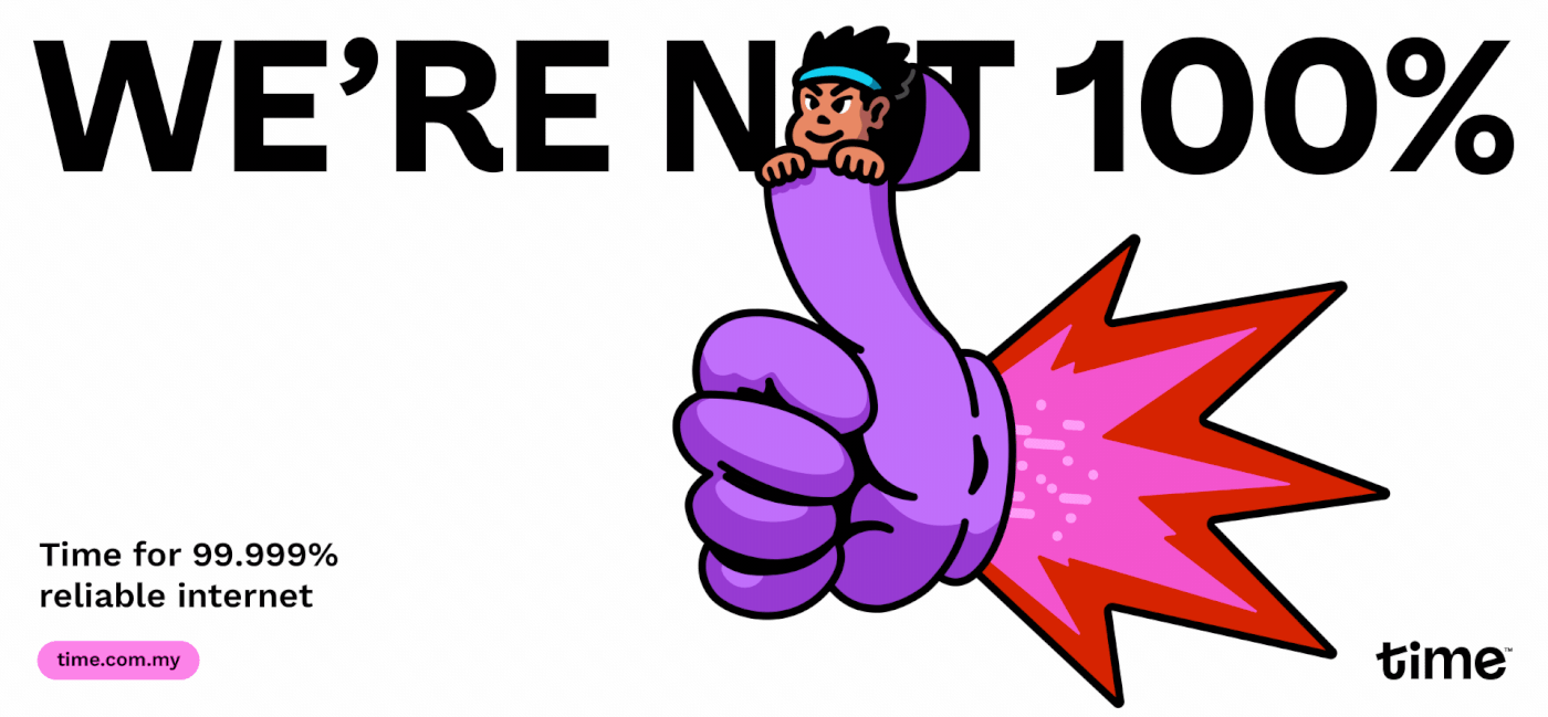
While some of the brand language is intended to demonstrate Time’s understanding of internet usage, much of it has another purpose – to counteract the sector’s previously-mentioned penchant for obfuscation.
This starts with making things as simple and as clear as possible. From there, Time introduces what we call “radical honesty” – demonstrating our openness and integrity by admitting to the stuff that nobody else would. Is the network only operating 99.9% of the time? Then Time will acknowledge that they’re not (quite) 100% perfect, and that they’re working to fix it. Does a particular service package include a free modem? Where others would call it a “free gift” or “bonus”, Time calls a spade a spade – it’s a bribe.
Continuing this maverick spirit is the inclusion (and closer integration) of Time’s trademark, irreverent style of humour. Though the use of English is common in Malaysian communication, Bahasa Malay is also often used, too – so the Brand Voice needed to be flexible enough to accommodate this. To make sure this worked properly in the cultural context, we integrated Malaysians directly into our team – and created guidelines that focused more on style and intent, leaving subject matter up to the locals who know best.

Time for business
Time doesn’t just serve general consumers. They also have a range of data and connectivity services, and serve both SME and Enterprise-level organisations. Accordingly, the brand is designed to modulate its tone based on audience.
It’s never entirely without forthrightness and charm – after all, business people are people first-and-foremost, and don’t appreciate needless jargon or empty platitudes any more than anybody else. Even when dealing with the biggest businesses, Time is still Time – but with an appropriate (and earned) aura of professionalism and wisdom.
It’s never entirely without forthrightness and charm – after all, business people are people first-and-foremost, and don’t appreciate needless jargon or empty platitudes any more than anybody else. Even when dealing with the biggest businesses, Time is still Time – but with an appropriate (and earned) aura of professionalism and wisdom.

Tick, tick, tick
With the new brand just launched, For The People have worked with the Time team (including extensive workshops and training) to ensure a smooth roll-out – and the internal enthusiasm has been overwhelming. Now finally equipped with an appropriate vehicle for their enthusiasm and irreverence, Time is now ready to properly express their ethos and personality – to show the world just how they got this far, and where they’ll be taking Malaysia next.
Credits:
Executive Creative Director: Jason Little
Creative Director: Alexis Waller
Design Director: Mac Archibald
Senior Designer: Joseph Dennis
Typographer: Mathieu Réguer, Joseph Dennis
Account Director: Mabel Tu, Farah Smurthwaite
Head of Strategy: Damian Borchok
Senior Strategist: Matt Pearce
Head of Storytelling: Mat Groom
Senior Storyteller: Daniel St. Vincent
Designer: Atsaya Gabiryalpillai, Dash O’Brien Georgeson, Emma Turney
Motion Design: Mac Archibald, Atsaya Gabiryalpillai, Emma Turney
Motion Design: Mac Archibald, Atsaya Gabiryalpillai, Emma Turney
Illustrators: Chern Loo & Shu Yee
Brand Video:
Animation, Illustration — Never Sit Still
Brand Illustrations — Cloakwork, Shu Yee
Sound Design — Smith & Western
Brand Illustrations — Cloakwork, Shu Yee
Sound Design — Smith & Western
Client team:
Afzal Abdul Rahim - Commander-in-Chief
Head of Marketing: Andrew Yeoh
Head of Brand Comms: Ian Choe
Head of Strategic Segments, Activations & Partnerships: Irene Foo
Head of Design & Content: Weng Wye Low
See Mun Loo: Head of Communications


