Brand visual language
The logo is based on a geometric grotesque, with tiny references to the historical version of the logo. The key detail of the identity is the frame — a vivid symbolism of the area of interest of the observer, the analyst. Kontur helps you focus on the details, make the invisible visible and find insights.
The logo is based on a geometric grotesque, with tiny references to the historical version of the logo. The key detail of the identity is the frame — a vivid symbolism of the area of interest of the observer, the analyst. Kontur helps you focus on the details, make the invisible visible and find insights.
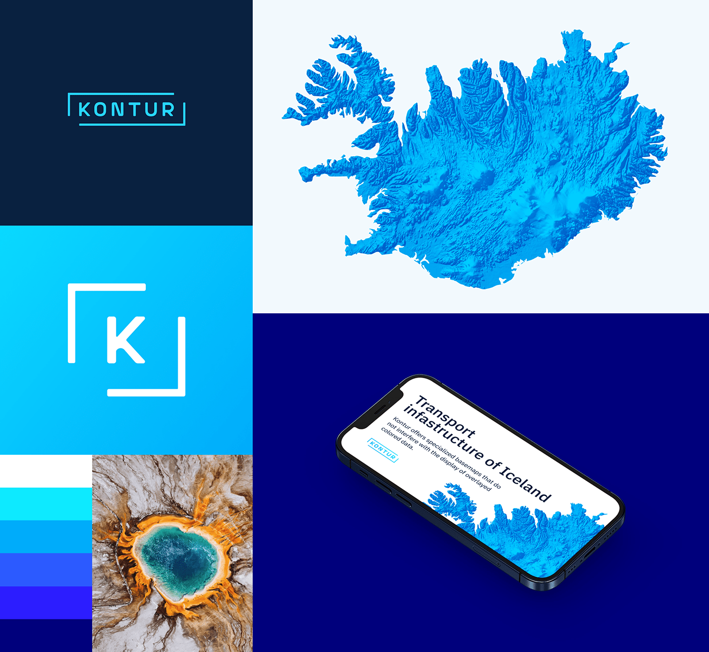
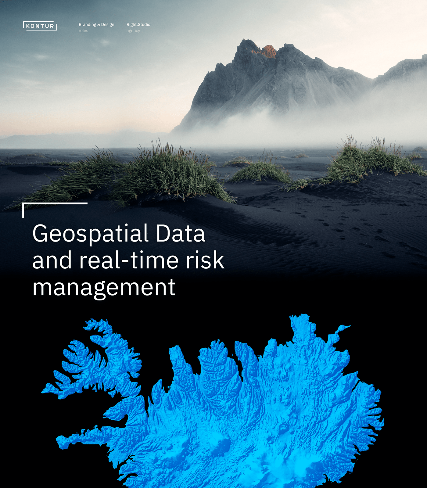
Striking details — striking photo identity
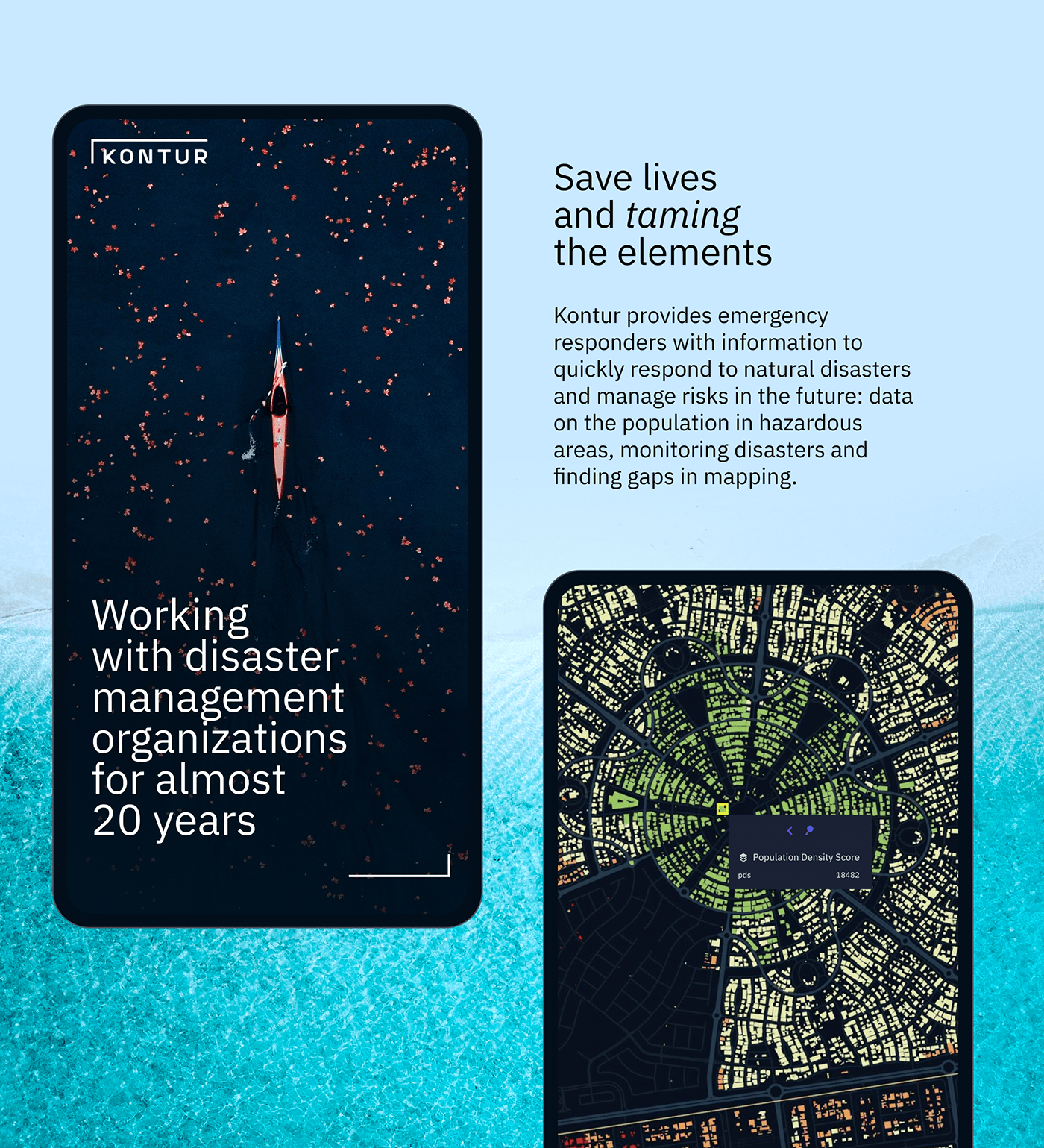
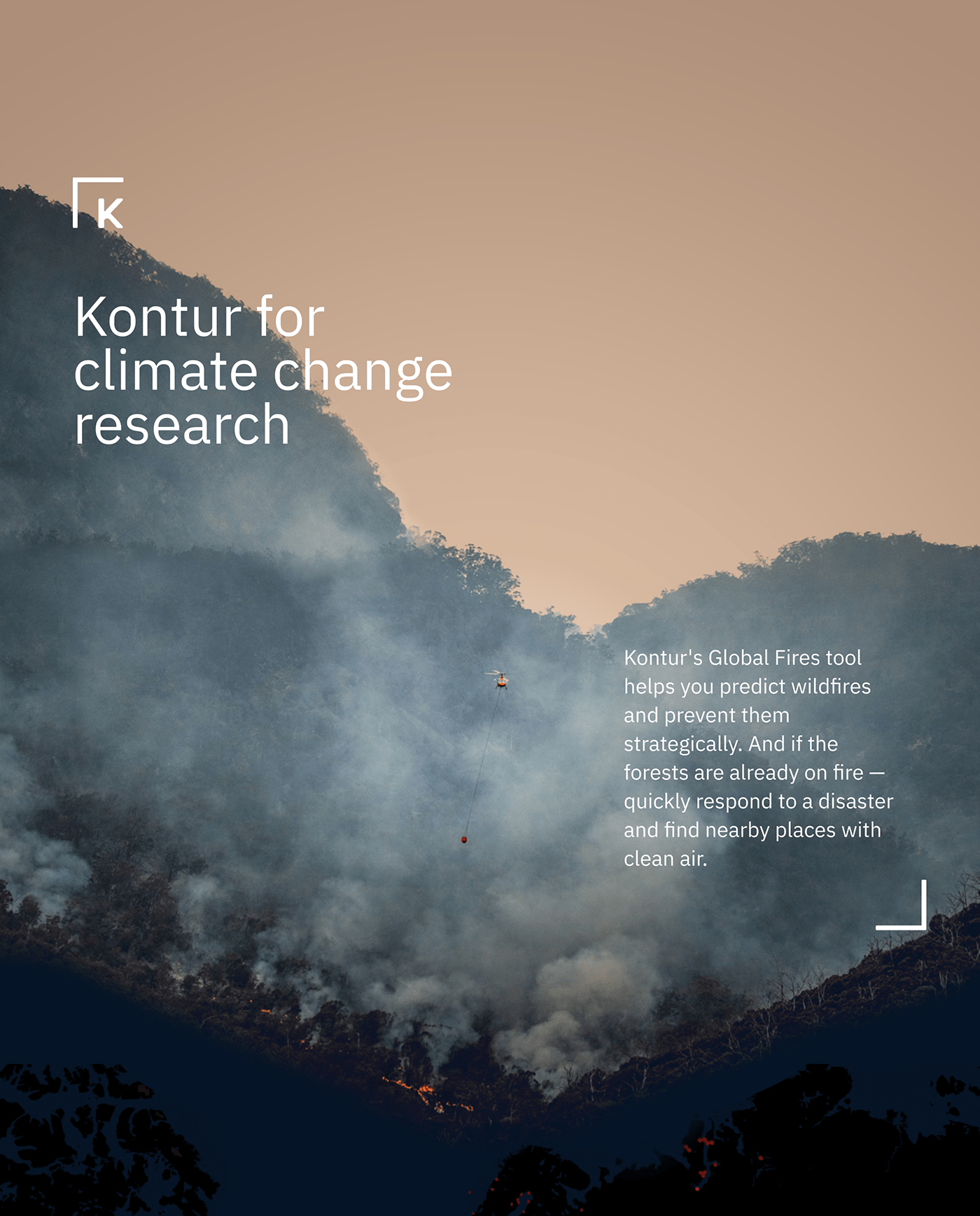
We put the cartographer's view of interesting deviations in the usual course of things into the Kontur photo style. Unexpected objects in the photographs are a metaphor for insight that prompts and inspires analysts to bold new hypotheses and solutions.
We put the cartographer's view of interesting deviations in the usual course of things into the Kontur photo style. Unexpected objects in the photographs are a metaphor for insight that prompts and inspires analysts to bold new hypotheses and solutions.

Adaptive grid as a symbol
of the multi-applicability
Frame is a graphic code of the Kontur. The Structure’s dynamics allows to build memorable communication and symbolizes that with the help of the Kontur you can analyze data and identify trends in areas of any size: from a small house to a huge mainland.
Frame is a graphic code of the Kontur. The Structure’s dynamics allows to build memorable communication and symbolizes that with the help of the Kontur you can analyze data and identify trends in areas of any size: from a small house to a huge mainland.

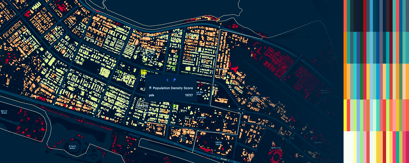
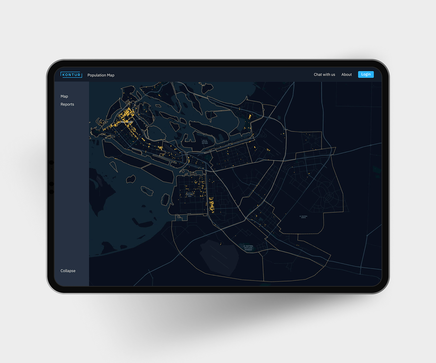
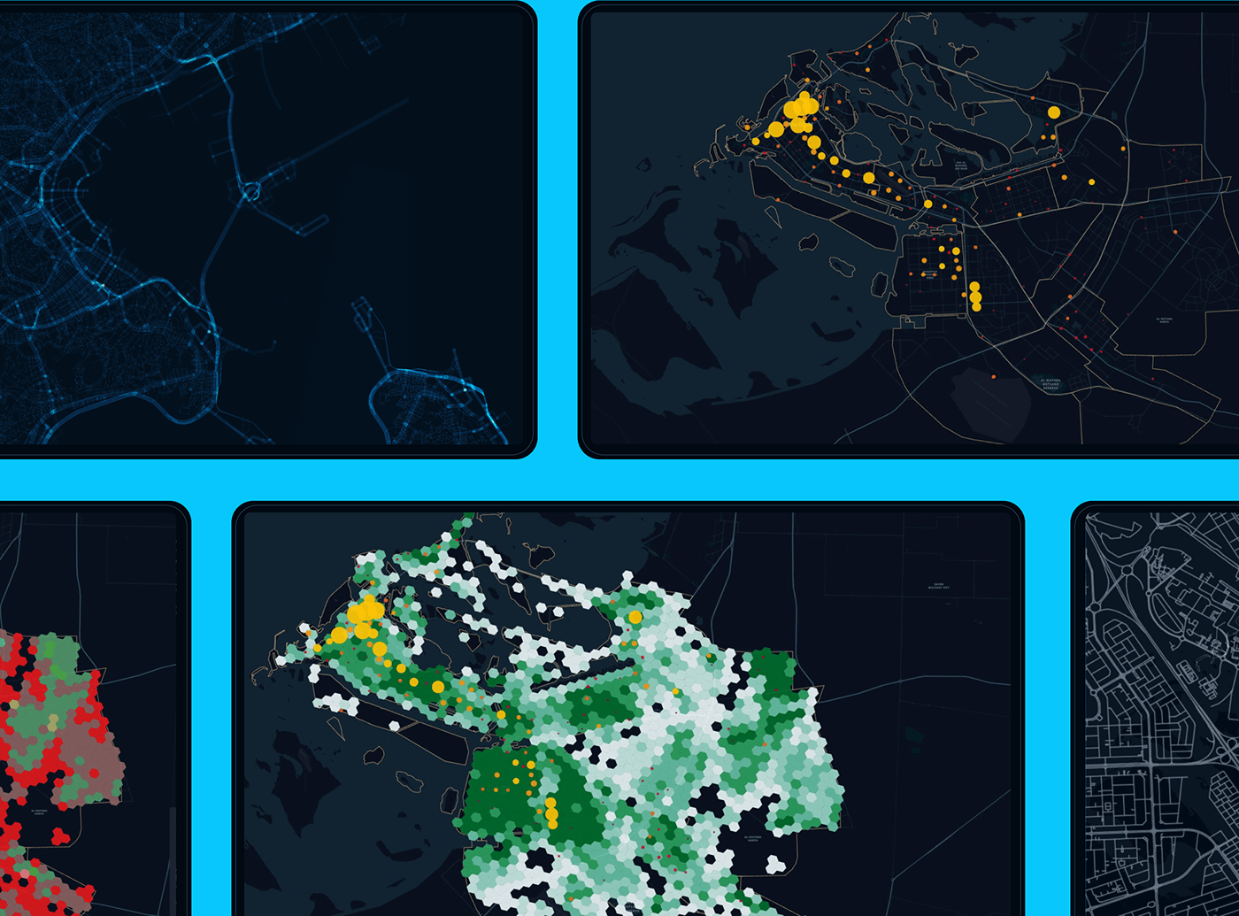
Map und dataviz palette
The unique mega-palette differentiates the tool and makes it recognizable, while maintaining data readability and high contrast forms for easy analytics.
The unique mega-palette differentiates the tool and makes it recognizable, while maintaining data readability and high contrast forms for easy analytics.
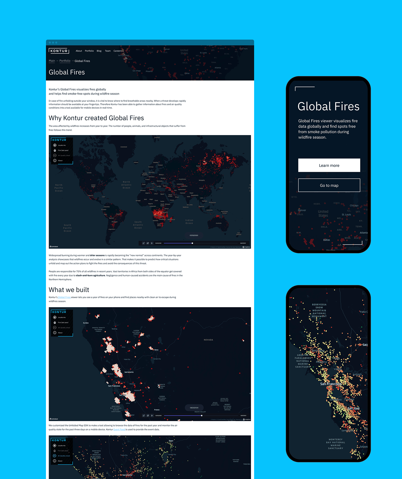

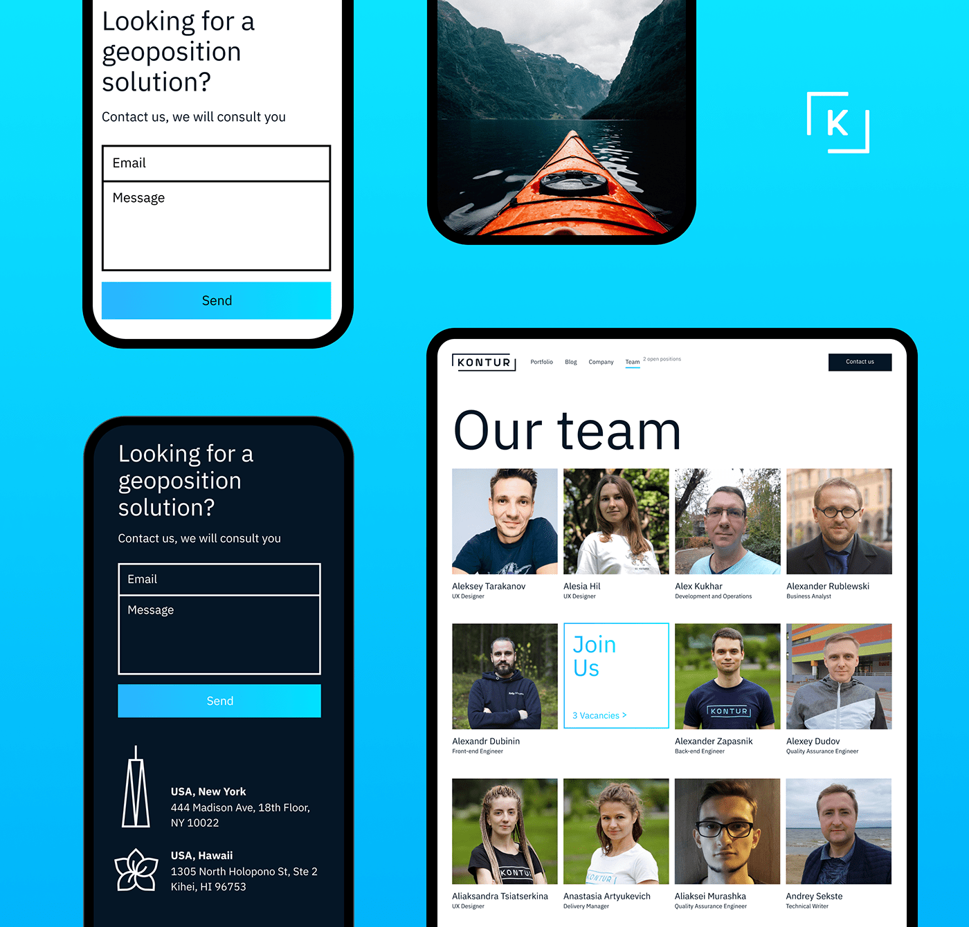
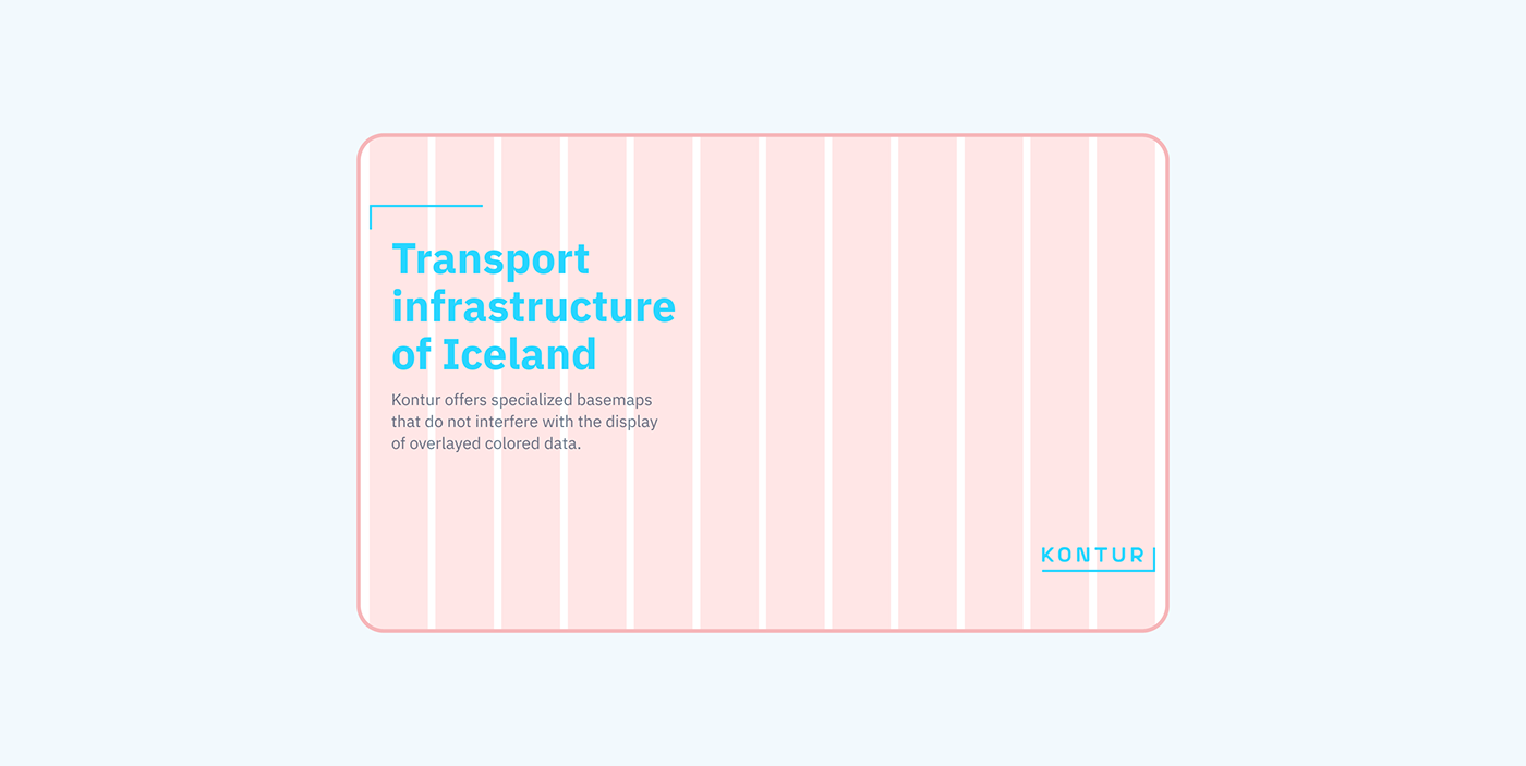
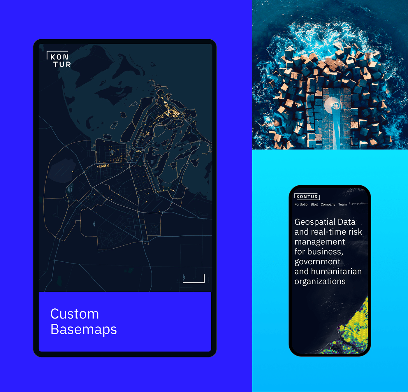
Web meets identity
Identity elements brand Kontur services and make them recognizable even without a logo.
Identity elements brand Kontur services and make them recognizable even without a logo.
Now Kontur can launch and integrate new services, communicate its value to potential customers and help even more companies save lives, open new businesses and grow.