
The Brief
For this project I will be designing packaging for biscuits. My design needs to be sustainable, easy to produce, easy to store, easy to transport and easy to use. The packaging must also protect the product, keep the products fresh for as long as possible and interest the consumer. At the end of the day the packaging acts as its own form of marketing and needs to assist in selling of the product.
Dutch Stroopwafels
A stroopwafel is a thin, round waffle cookie made from two layers of sweet baked dough held together by caramel filling. First made in the city of Gouda, South Holland, Netherlands, stroopwafels are a well-known Dutch treat popular throughout the Netherlands.
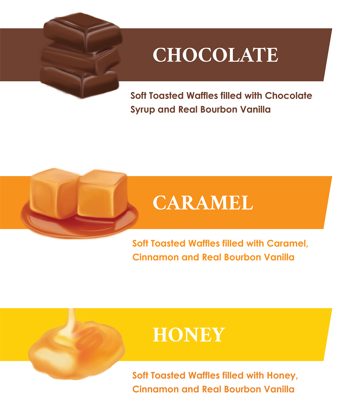
Flavours and variety: caramel, toffee, chocolate, gluten free, organic, honey, mini’s.
Flavours and variety: caramel, toffee, chocolate, gluten free, organic, honey, mini’s.

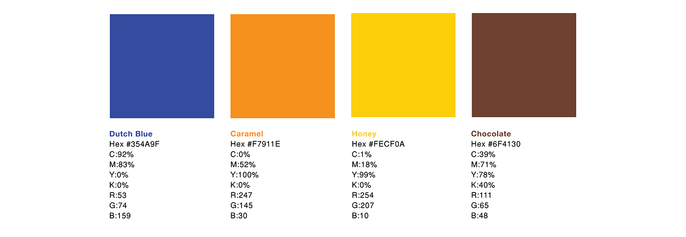
Colour Palette
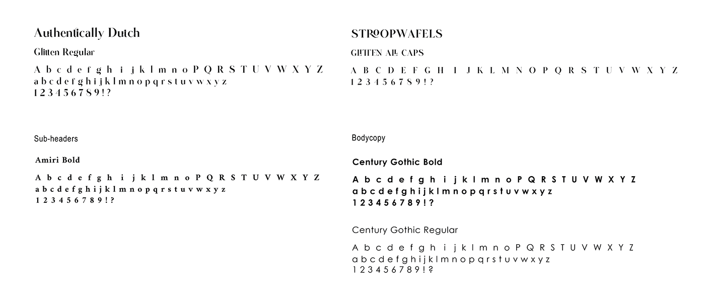
Typography

Brand: Authentically Dutch (Logo)

Sub-Brand: Stroopwafels (Logo)
Die-Cut

Packaging Design


Sustainability
Packaging acts as not only the protector and carrier of its product, but also a form of marketing. However, the disposal and waste of said packaging has an extreme impact on the environment.
To combat the environmental impact of packaging, this Stroopwafel Box is designed with Nautilus Super White stock. It is a 100% post-consumer recycled, uncoated paper. It scores 81 points on the WWF environmental score card. It is certified as "green range".
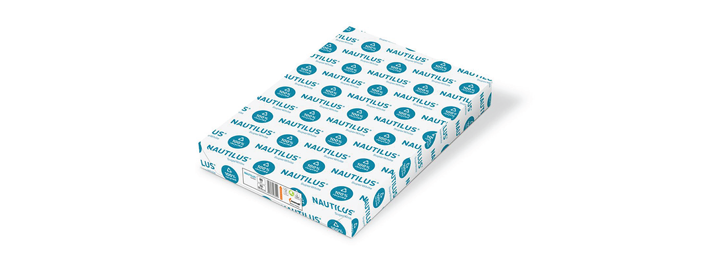
Supported by leading certifications, such as Blue Angel, FSC™ & EU Ecolabel, NAUTILUS® sends a clear environmental commitment with every application.
Illustrations

Stroopwafel Flavours
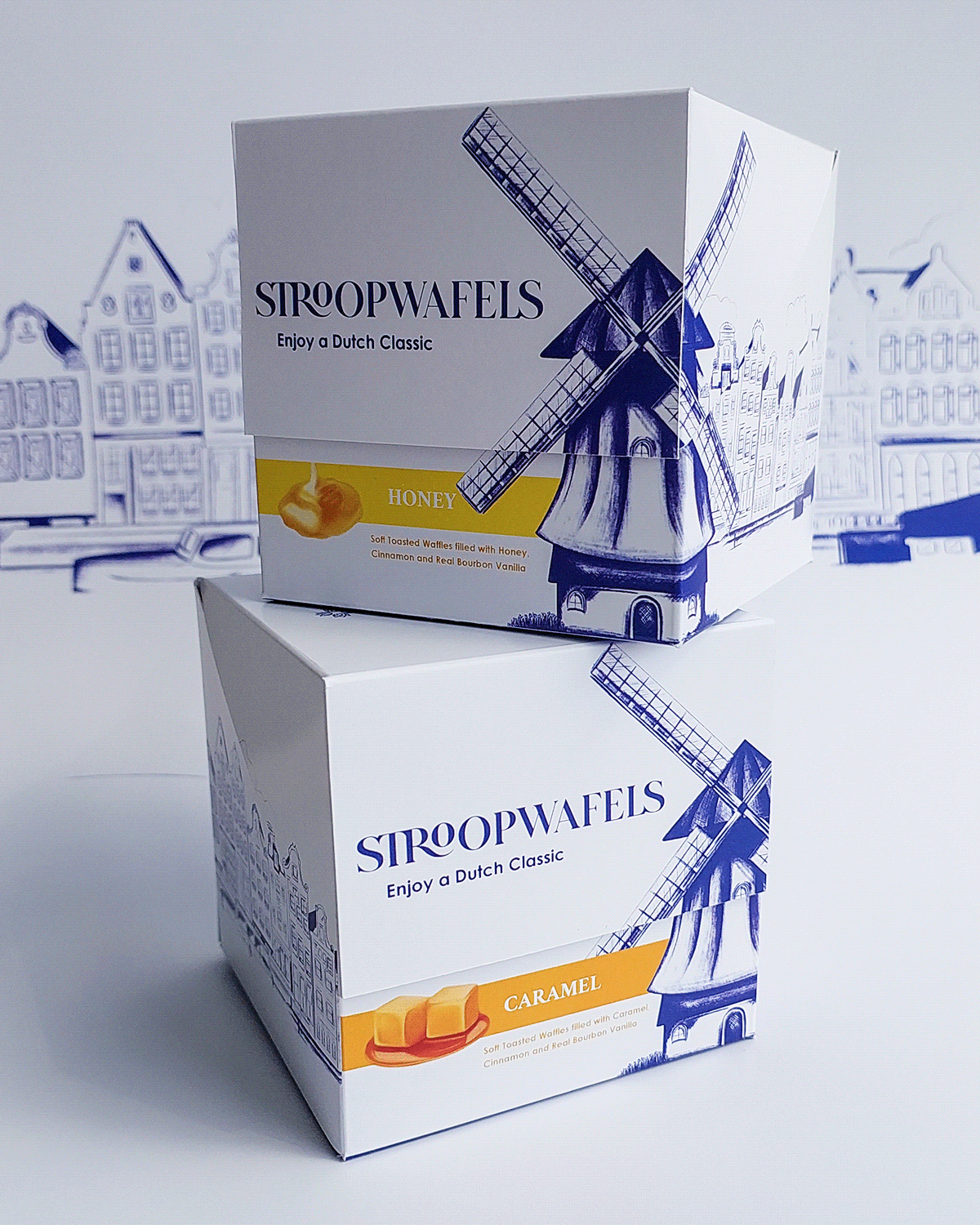
Final Packaging


This design is printed on a white 350gsm stock, and would be produced using Nautilus Super White stock.


Rationale
I designed a new packaging solution for the classic Dutch Stroopwafels. These delicious biscuits are usually packaged in a plastic bag or a box, and are stacked on top of one another. I found that the packaging does not do this unique biscuit justice. The biscuits are difficult to get out of the packaging and can be a sticky mess. The designs on the packs are not easy to see, especially in plastic wrapped bags.
I designed a box that makes the expense of these biscuits worthwhile. My design consists of 2 separate boxes, one of which sits inside the main box. The biscuits are in the inserted box inside of the main box. They are stacked upright so that they are easy to remove and even easier to enjoy! My design compliments the uniqueness of the product and has a traditional Dutch style. I illustrated Amsterdam inspired buildings and a Dutch windmill to use as the main graphics, alongside small three-dimensional illustrations of the biscuit flavours (caramel, honey & chocolate).
I aimed to keep my design clean, elegant and traditional, so that the brand was as authentic to Dutch culture as possible. The brand embodies a tulip, the National Dutch flower, and is named “Authentically Dutch” to tell the consumer that this is the traditional, authentic syrup waffle that is loved by people all over the world.


