品牌簡介
ABLE 是一個以數位思考為核心的品牌,透過成熟的管理與系統工具,為中小型客戶組合精簡專業的服務,以幫助企業邁向國際化為目標。品牌以「航行者」自詡在數位世界不斷探索、航行的角色;隨時掌握新資訊與技術,才能跟上這個快速的時代。ABLE 如同太空中為完成進階任務而對接的飛行器,與客戶溝通連結、相互理解,進而共創更好的成果。
Background
ABLE is a digital branding company dedicated to web and UI/UX design. Through professional management and system tools, the brand assist local enterprises create a commercially valuable, international image. ABLE explores and navigates in the digital world as a voyager, and keeps abreast of the latest information and technologies in order to keep up with this fast-paced era. Like the navigating aircraft in space, the brand communicates and connects with customers, aiming to complete all extraordinary mission ahead.
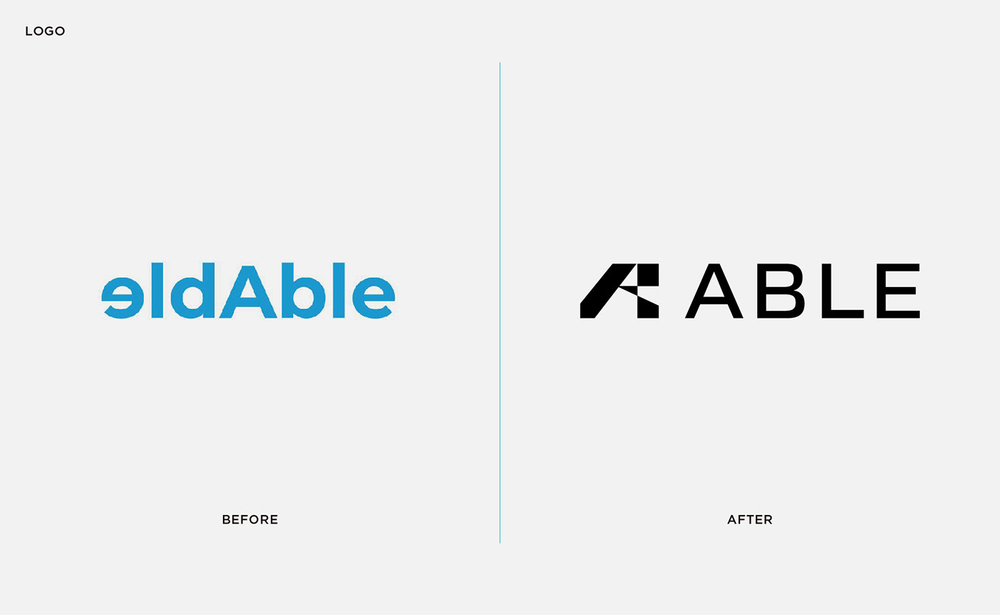
設計方案
從獨到眼光與精準判斷力出發,標誌設計以象徵引領方向的箭頭為重點,展現光芒的意象。圖標取品牌代表字母 A 結合箭頭造形,角度參考人眼在專注時的25° 視野,暗示精準直接的態度;外擴的線條如同放射的光芒,象徵在數位世代探索過程中,提供客戶專業的指引與方向。英文標準字採黑體為基本結構,重心更拉近中心點、加強穩定感。主色 A.I. Aqua 參考 Coloro 2021年度趨勢色票:此款藍色具有數位時代的前瞻特性、時尚的潮流導向,同時連結科技領域的氛圍想像。
Design
Symbolizing unique vision and precise judgment, logo design focuses on the arrow leading the direction, showing the image of light. The symbol takes letter A combined with the arrow shape, with the 25° angle refers to the human eye view, implying a precise and positive attitude. The center of gravity of English standard characters is closer to the center point and strengthens the sense of stability. Able chooses A.I. Aqua, the tech-inspired hero color for the year (Coloro 2021), as the brand color. This blue has the forward-looking characteristics, and the atmosphere of the technology field.