
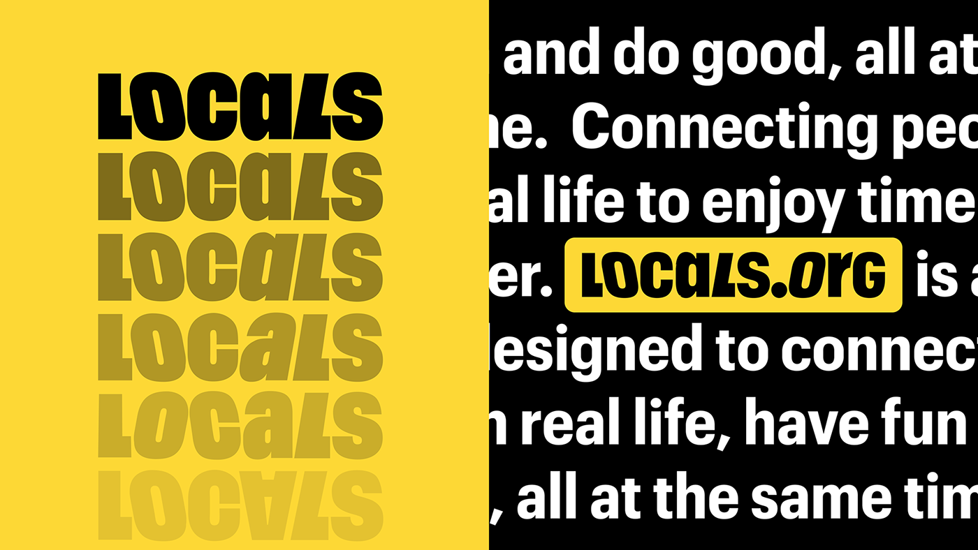
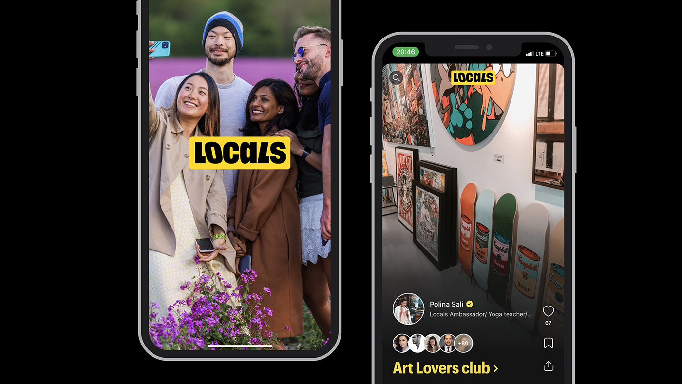
Locals.org is a social platform encouraging people to meet in real life. People use it to share their passions and support good causes by inviting strangers to have fun and build meaningful connections offline.
The Locals.org team asked us to build a short version of their logo. To help them stand out, we proposed a new logo with a friendlier tone, improved lettering, and several variations to fit any medium.

We examined the logo and discovered several issues:
The short and long versions were inconsistent. The logo should easily adapt to any medium, from a billboard to a cell phone screen.
The logo should be compatible with the Graphik typeface, which is used as the main font in the interface and communication layouts of the Locals.org app.
An app that invites users to connect in person prompts a more humanistic design.
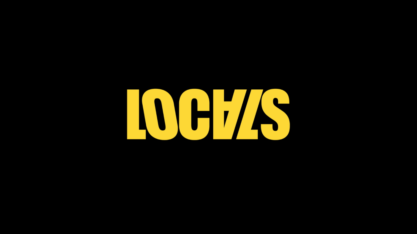
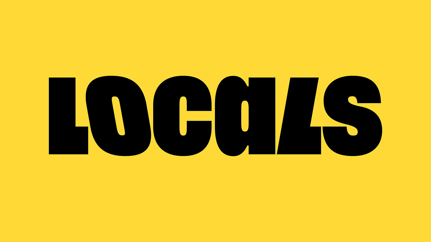
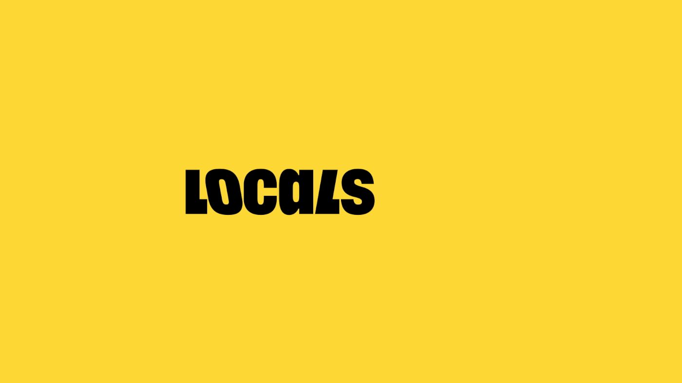
We switched the upside-down uppercase "A" to lowercase. This gives the lettering a lighter, more relaxed tone. Using the "a" with a round grapheme supports the rhythm of the neighboring letters’ vertical elements and reads better on a small scale.
We kept the rhythm of the italics, but made the characters bolder and wider to match the Graphik font.
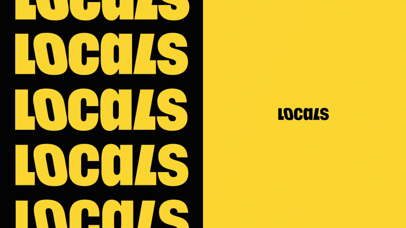
We designed 3 versions of the logo for use at various scales, from 10 pixel interface icons to a street banner.
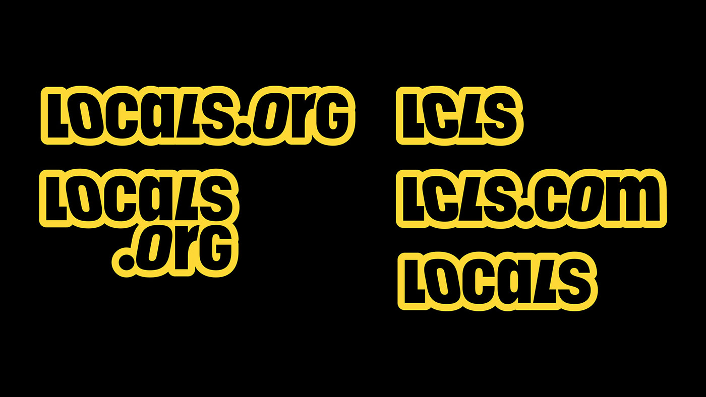
For the app's icon, interface, and merchandise, we proposed 3 variations of the logo: short, standard, and with the ".org" domain.


This project, which we proposed, served as the foundation for the new logo that the Locals.org team created in-house. It is currently live here.
Art-director: Phillip Tretyakov
Designer: Ekaterina Daugel-Dauge
Project-manager: Ivan Matskevich
Typeface: Graphik
Client: Locals.org
Year: 2022


