Tzol’Skin: all-natural daily routine
Brand Identity for Tzol'Skin
Feeling good about our skin is important at any age. Tzol'Skin is a natural skincare brand created by a beauty industry veteran specifically for women looking for affordable, simple, and effective products. Humana was invited to define and express this vision for Tzol'Skin and help the brand establish itself in the market.


We began working with the founder of Tzol'Skin to define the brand's visual identity and vision for the future. The founder's website Mayan Roots became our foundation for creative and design experimentation.
We decided to return to the Mayan heritage, adapting the glyphs of the Mayan calendar to represent the brand's values and combining them with an elegant style. The main goal was to create a simple but playful and bold brand.


Mayan's secrets for today’s beauty.


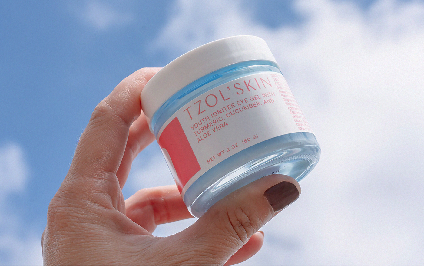
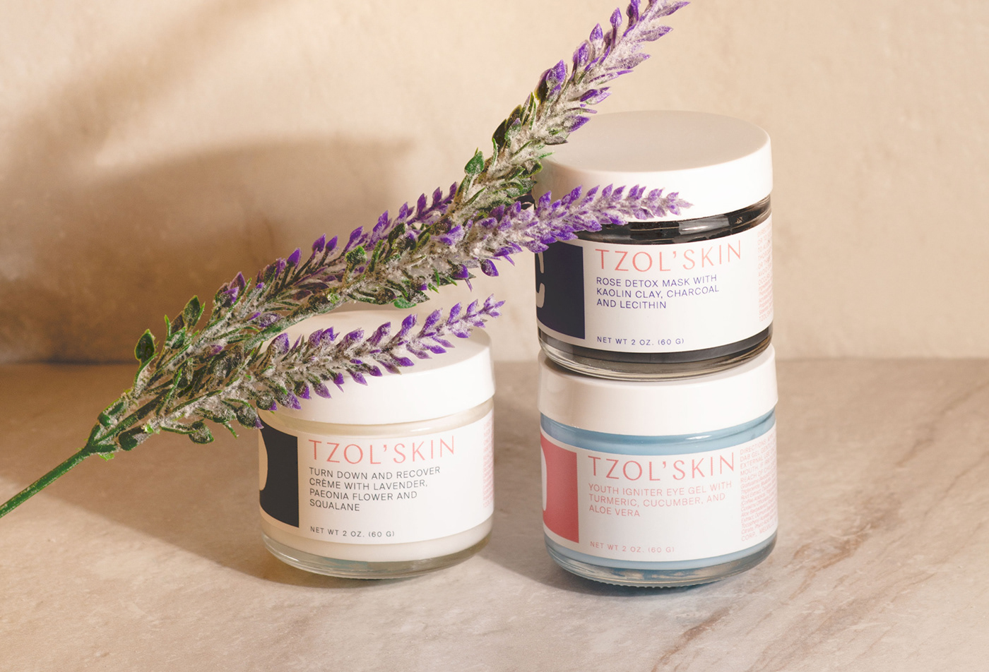
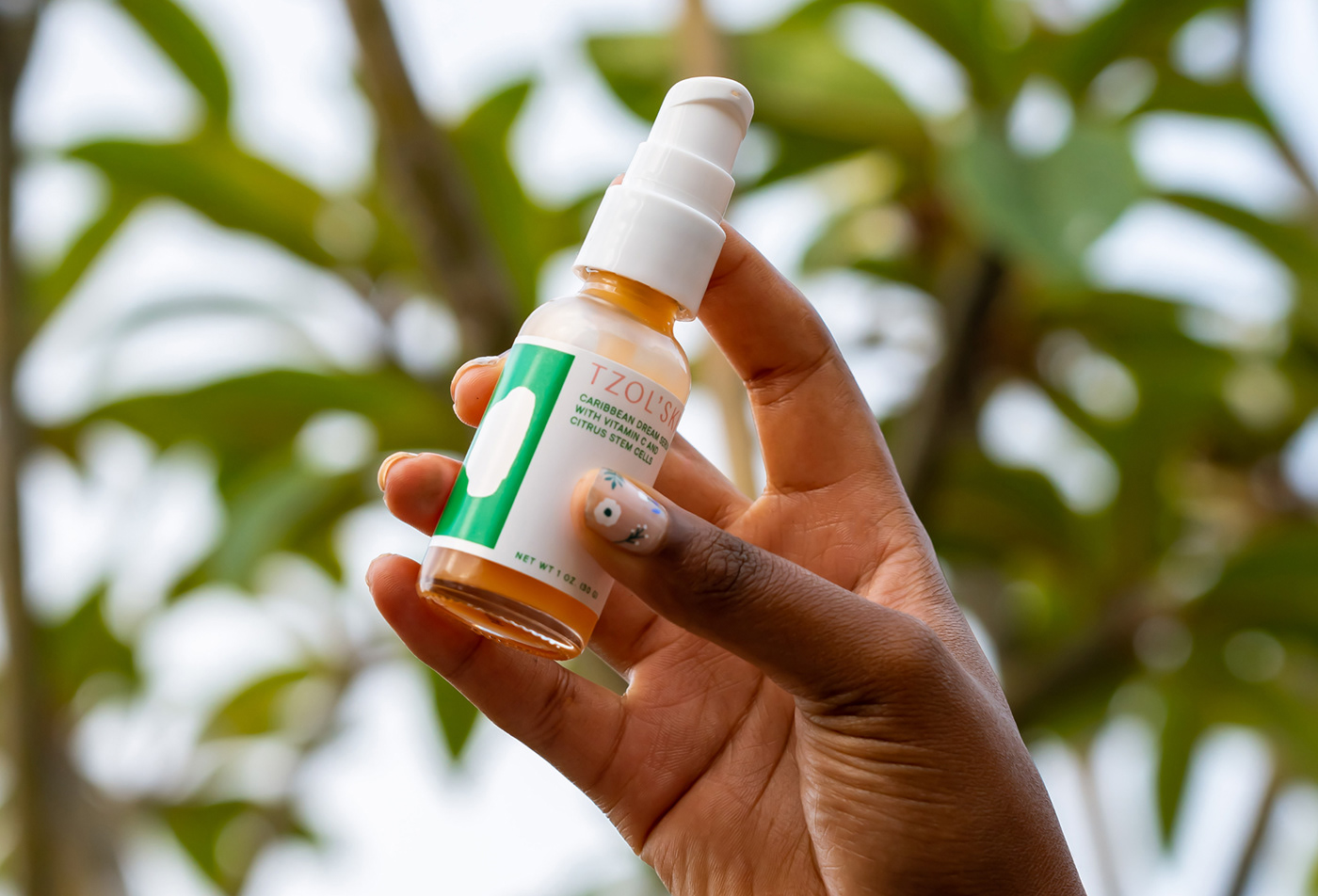
Typography is a crucial aspect of the Tzol'Skin brand. It gives shape and voice to the brand in almost all visual materials. When used consistently, it can build tremendous value for the brand over time. “Chap” is the typography used, a mix of smooth and sharp, with a new idea of contrast, and was applied to the logo and titles. The colors chosen to represent the different elements of the earth: sun, sky, water, clouds, and green; and the human part: person and woman. The use of these colors together with the white color gives brightness and freshness to the brand.
The resulting visual system reflects hints of femininity and elegance. We also explored new concepts in packaging and visual language to introduce the brand to the skincare industry with high-quality and contemporary beauty ideas. As a result, Tzol'Skin has been featured in publications such as Condé Nast, Vanity Fair, Vogue UK, and many others. See more tzolskin.com


