The launch of a new skincare brand
Brand Identity for Rocket Science
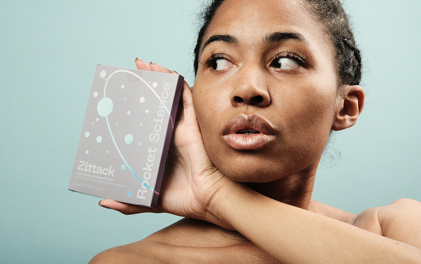
Rocket Science is a clinical skincare brand powered by proven ingredients to give the best care to our skin. We were invited to help increase brand awareness and grow a brand that could keep up with its ambitions. The challenge was - how can we communicate the effectiveness of each product?


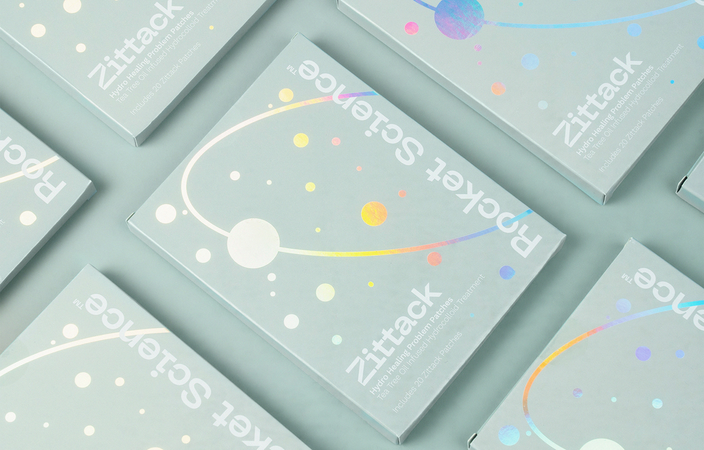
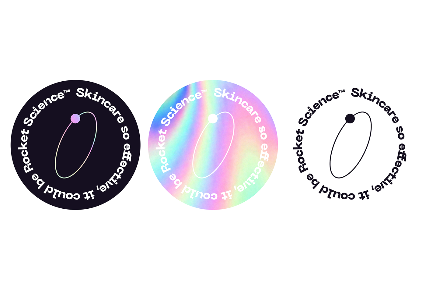
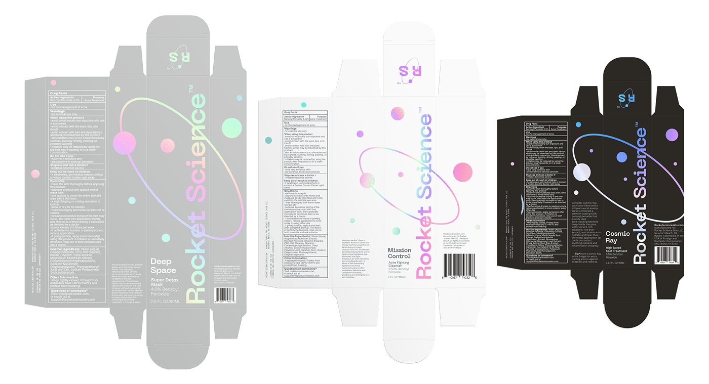
We wanted to make sure that the visual strategy conveyed such impactful products. That people would think they came from another planet. This idea of elevation is expressed in a fun way by adding colorful details combined with a clean and minimal layout to convey the scientific research behind each product.
Skincare so effective it could be rocket science.


Typography and color also play a critical role in the brand design of Rocket Science. They've helped us shape the brand's voice in almost all visual materials. When used consistently, it can build tremendous value for the brand over time.
The typeface is a geometric sans serif that combines purity with warmth, balancing functionality, conceptual rigor, craftsmanship, and appropriate idiosyncrasy. It's a friendly text typeface that's both distinctive and near-universal appealing.
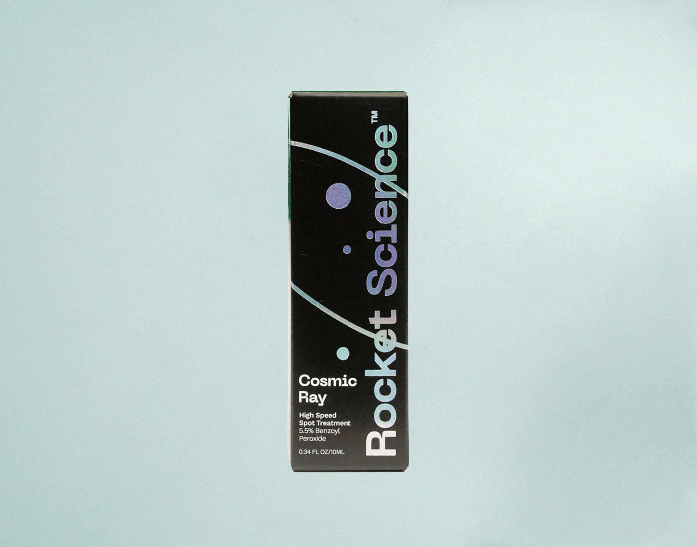

The result? We defined an expression that embraced the transcendent scenery of space to communicate the effectiveness of each product based on clinically tested ingredients to give the best to our skin.