_
Arlequim
Promotional material for a play
_
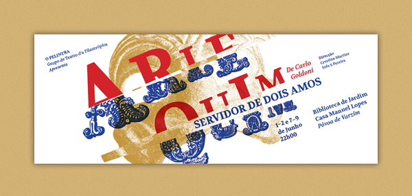
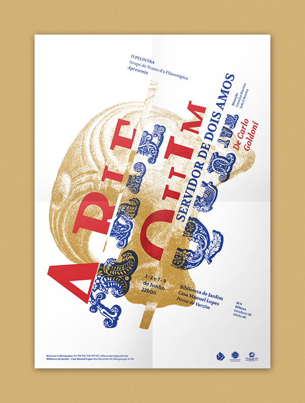
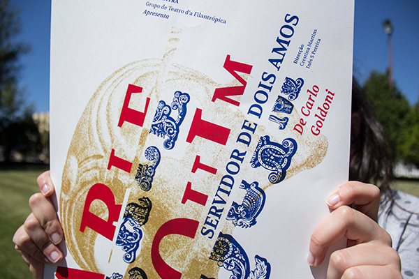
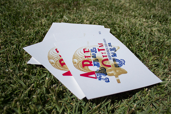
This project was developed in record time, one week before the first run of the play, at the request of two friends of mine, and consisted in design the promotional material for the play "Arlequim, Servidor de dois amos" (in english "Harlequin, Servant of two masters").
_
After watching a rehearsal of the play, seeing the setting and the costumes and doing a brief research about the period of the play, I decided to give emphasis to the fact that the main character is always divided between two masters and always mistaking and messing around. This was achieved through the typesetting, dividing in half the name of the main character “Arlequim” (Harlequin) and using two quite different fonts for each half. The choice of the colors is related to the colors of the costumes and also because Commedia dell'arte without vivid colors is not the same. The image of Harlequin's mask is used as a graphic element with the aim of complementing the typesetting.
Poster

Flyer

Facebook event cover