Hello.
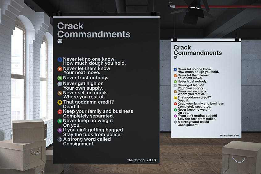
As a fan of both modernism in design and hip-hop as a musical genre, this project is something I had thought of for the past few years, only realising it now.
There's rules to this shit, I wrote me a manual
A step-by-step booklet for you to get
Your game on track, not your wig pushed back
A step-by-step booklet for you to get
Your game on track, not your wig pushed back
Starting with the lyrics of 10 Crack Commandments and studying the style guide for Unimark's NYCTA graphic redesign, I created a visual list of the Commandments talked about in the song.

Unimark's specified typeface for the NYCTA was a sans serif called Standard Medium.
Of the various weights of sans serif available, Standard Medium has been found to offer the easiest legibility from any angle, whether the passenger is standing, walking or riding.
now official typeface of the NYCTA is Helvetica.

Helvetica
The grid will indicate the proportions to be observed in setting lines of text. Uppercase X height has been used as a point of reference.

Unimark designated a 8-color code to distinguish between the different subway lines. The modern NYCTA is comprised of 10 lines, the colors of which are shown below.

Color coding

I know you've heard this before..
The final list has been created taking into account all of Unimark International's suggestions for the NYCTA.

Thank you for viewing.
Leave an appreciation/comment if you can!
Leave an appreciation/comment if you can!

