
Who are the Tigers?
Social Tigers was founded in 2015. It is a digital marketing agency dealing with advertising and content on social media platforms. Their activities also include video and photography.
They also run workshops and training for companies. Building their own awareness, goals and work culture led the Tigers to completely new, undiscovered areas of the jungle.
Thanks to this journey, the agency recorded a very dynamic development, both in terms of the team, clients and competences. What distinguishes the Tigers is that they do not follow trends and believe in their own abilities - they are driven by an excellent instinct!

Great Change
Exactly at midnight of the New Year 2021, the great transformation of Social Tigers took place, which transformed from a social media agency into a digital agency. This change also resulted in the name being changed to TIGERS!
An interesting coincidence is the fact that, according to the Chinese calendar, 2021 is the year of the Buffalo.
An interesting coincidence is the fact that, according to the Chinese calendar, 2021 is the year of the Buffalo.
This sign symbolizes self-control and hard work. At present, Tigers is growing steadily and, as I sincerely wish them not only in the year of the Buffalo - it will be constantly reaching for more and more!
The Tigers began their transformation with a thorough rebranding, and one of its stages was to design a completely new website, reflecting the spirit and goals of the company.
The Tigers began their transformation with a thorough rebranding, and one of its stages was to design a completely new website, reflecting the spirit and goals of the company.
It was during this process that I supported the Tigers in changing them! ROOOAR!
Cooperation in the project
When I started participating in the rebranding project, I knew it would be a fantastic adventure. As a creator - website designer, I would also like to mention those who also took part in this amazing change in the image of the Tigers.
Coperative identity
The Kommunikat team is responsible for the implementation of branding - a group of extremely creative people who were able to develop a type of logo that contains all the important information related to what they strive for and how Tigers define themselves.
In addition, they developed an extensive brand book, which was the basis for me to create a website design.
The expansion of the company to the East, inspired by Asia, the reference to the name, dedication to the character of the company - congratulations for such a great translation of all the features!
Web development
Wisepeople is a company that has worked on web development. Their specialists and the team open
to my ideas allowed them to develop a unique website for Tigers.
to my ideas allowed them to develop a unique website for Tigers.
Custom animations, page generator, form customization with 5 different configurations and an online store created on WooCommerce are all the work of this invaluable team. Commitment, accuracy and problem solving are the qualities that contributed to the finalization of this inspiring project.
The Tiger's hunger for changes
Need
The advent of the Tigers era and the change of the company's image required a lot of courage and just as much work. The desire to expand into the Asian market resulted in a strong trend of this culture that was translated into the entire branding. It also translated into my work and the expectations that I should meet when creating a website.
Expectations
The Tigers knew what they wanted to achieve:
- reflect the spirit of the brand,
- indicate the strategic direction of the company through the new image,
- create a completely new, closely matched to the target market visual identity and website,
Scope of work
-UX desktop & mobile,
-UI desktop & mobile
-UI desktop & mobile
Colors
The previously developed brand book provided me with the basis for creating a website in a developed convention. I knew which way to go and what the effect of my work should be. The colors that I chose are dominant black, accents of a beautiful orange shade and white - in contrast to black.
Typography
As with colors, the typography and font selection comes from the brand book.
Nevertheless, let me add a few words about this font: Object Sans is a great choice because it is a font with geometric features.
This type of font is perfect for all kinds of projects, such as: logo designs, posters, packaging or websites - it is multifunctional. Such a font is perfect if we want to use it in texts of small sizes.

How I built the website structure
Overall, the entire website design is rich in animation. At the same time, I made sure that the website was useful, functional and legible. An important issue in the whole project is the page structure that I proposed and the mesh aesthetics that I introduced into the project.
Let me explain: the entire grid has a value of 1920 px, from which the main content is 1360 px wide - divided into 12 columns.
Let me explain: the entire grid has a value of 1920 px, from which the main content is 1360 px wide - divided into 12 columns.

Additionally, the decorative elements in the form of orange vertical lines follow a simple relationship:
From the last graphic element, I set the value of 120px with a spacing of 60px, while the height was set according to the adjustment to the entire section - so that the vertical orange lines would make the section more attractive.
From the last graphic element, I set the value of 120px with a spacing of 60px, while the height was set according to the adjustment to the entire section - so that the vertical orange lines would make the section more attractive.
My participation in the great transformation
I started my work by collecting all the completed materials, getting to know the new strategy chosen
by the company and starting the project. The issue that I had to think through, propose and design was
a new website design and its mobile version.
by the company and starting the project. The issue that I had to think through, propose and design was
a new website design and its mobile version.
I was looking for inspiration in Asian countries, where Tigers reign to expand their activities and narrow their business contacts. I took a lot of inspiration and the basis for the project from the first phase of rebranding - the brand book, where the foundations for the new image of the Tigers were laid.
I knew that the design had to be unique, but also authentic and reliable.
I knew that the design had to be unique, but also authentic and reliable.
I tried to be equal to the task entrusted to me and… you can judge the results for yourself!
ROOOAR!
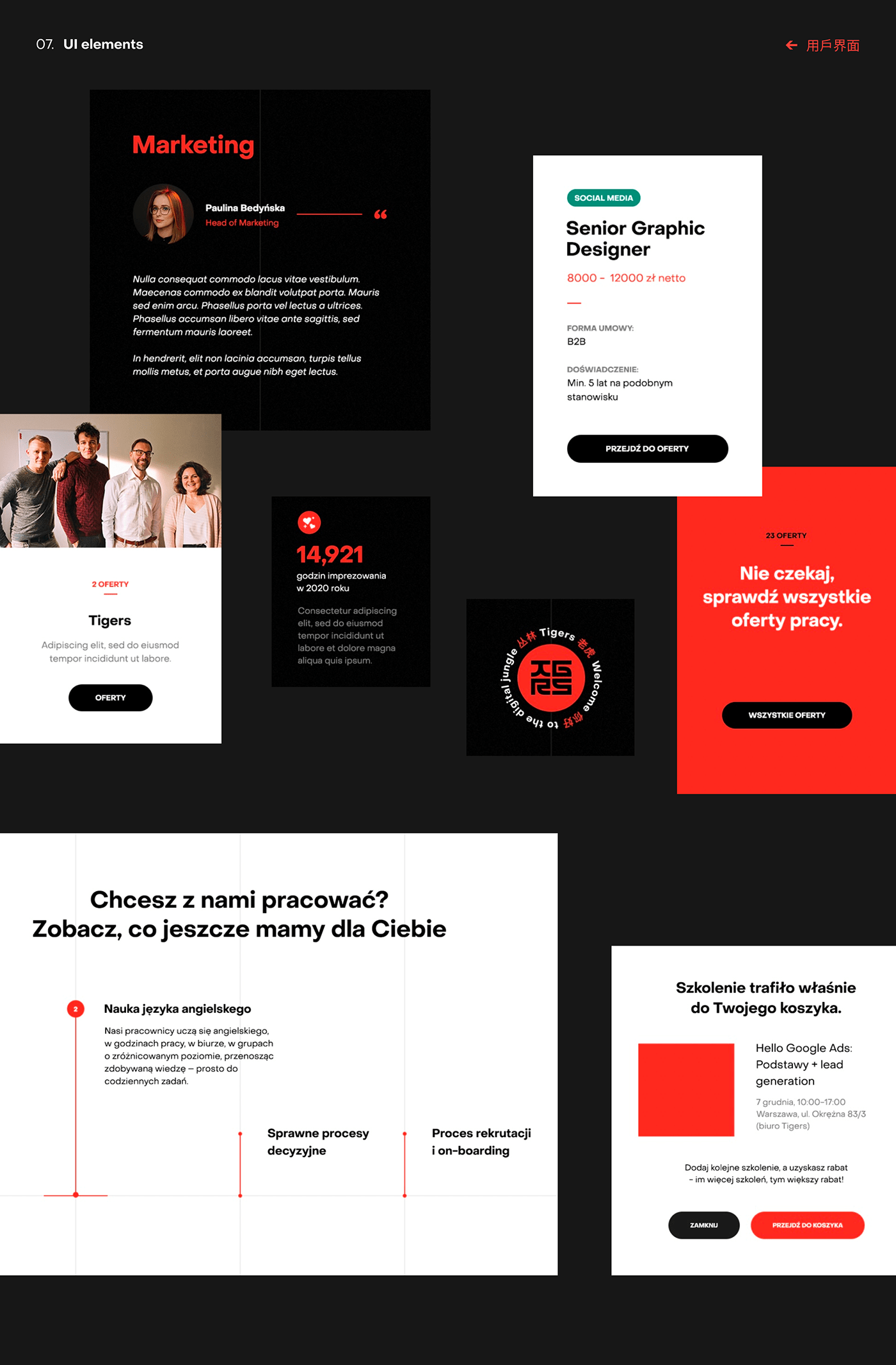
UI Elements
Minor UI elements affect the overall perception of the project.
Therefore, accuracy, refinement and treating every element in the project with the same care is crucial. As you can see, while the entire website design is a dark-colored design, individual UI elements were created in various colors available in the design's color palette: white boxes, orange accents.
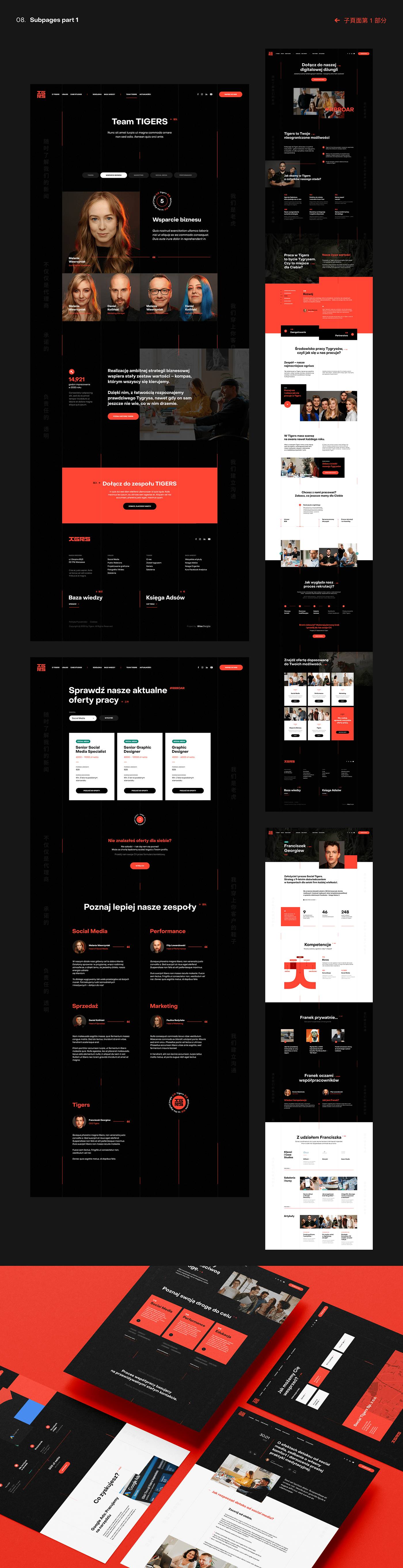
Team Tigers
Tigers are one herd, so one of the most important subpages for me was the "Team" subpage. I have tried to have pictures
of all the Tigers properly presented, with enough space for content. Photographs taken in one style are very helpful
and a great design element.
The team was divided into 4 groups: social media, performance, business development, and in the "Tigers" category you will find all team members.
Looking for tigers
The process of recruiting Tigers is transparent, which I also wanted to present on the subpage on acquiring new Tigers. Helpful information and clear recruitment rules have been placed on the subpage so that everyone who is interested
knows exactly what to do and how the recruitment process works. For this purpose, I have placed a section
that sets out the rules and stages of recruitment step by step.
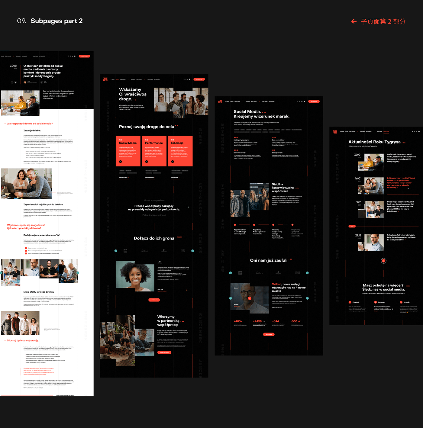
Services
Due to the sales character of the new website, the "Services" subpage is one of the key elements of the whole. We spent a lot of time analyzing the structure, content and UX of this part of the project.
Finally, I was able to propose a condensed, but rich in key information subpage, which includes services in the field of social media, performance and training. In addition, there is also a section with partners who have undertaken to put their business in the predatory hands of the Tigers.
Services - Details
By entering into the details of the services, you get transparent information and clear rules.
On this subpage you will find everything related to the selected service - from the explanation to the step by step scheme, and the people who are responsible for this branch of services in the Tigers team.
News
A very important part of the website is the knowledge base built by the community of the Tigers team and passed on to its recipients. Tigers like to be active, so the news site will surely be full of information. That is why it was so important to prepare the News section well, in which numerous dynamic news related to the activities of the Tigers are presented.
News - Details
Details of the selected news were a big challenge for me due to the extensive content of the publication. Considering all constants and variables, I have developed a flexible template that works well for both short and lengthy publications.
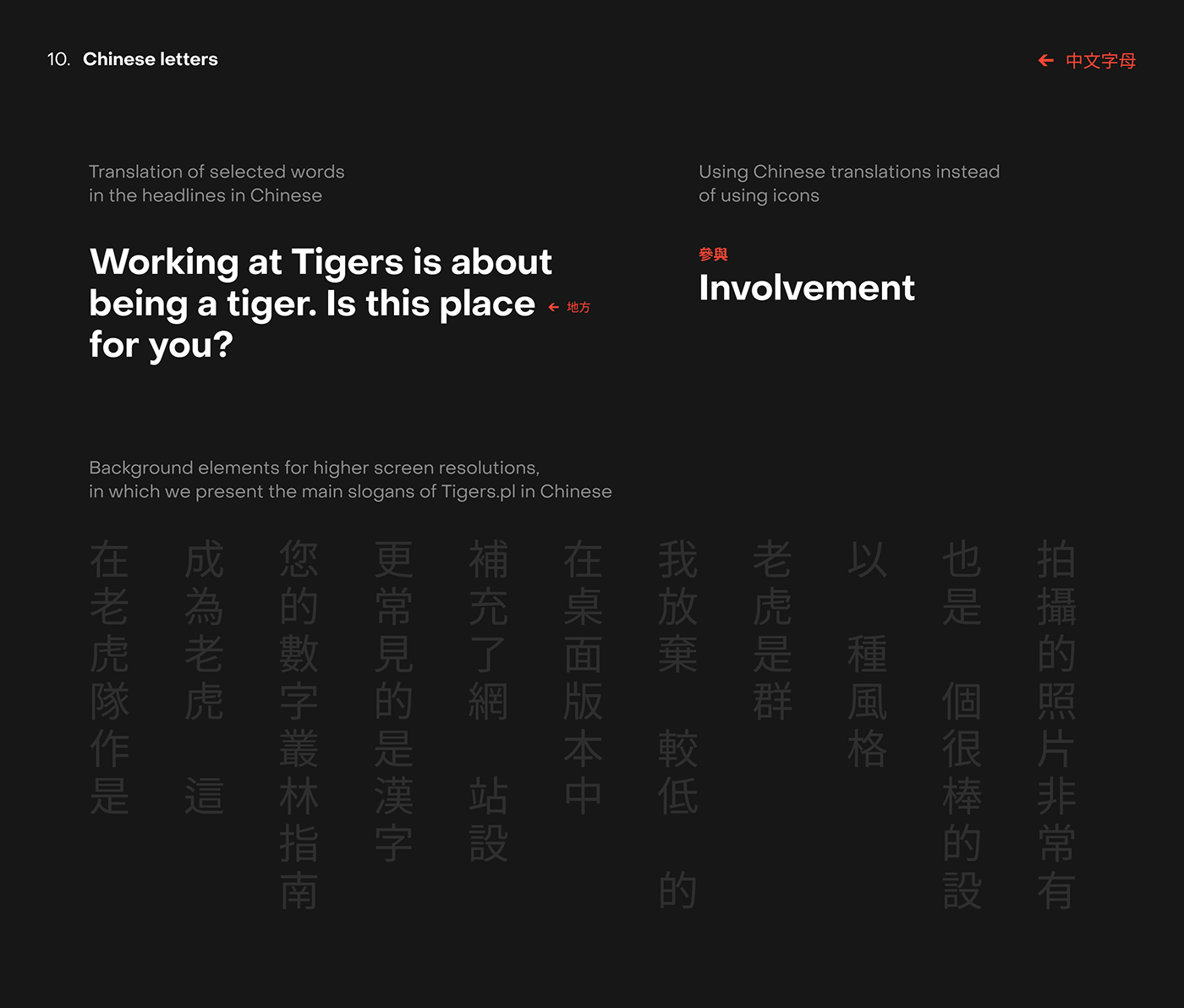
Chinese letters
More commonly known as Hanzi, complement the Asian character of the website design. You can see them both in the section headers and in the outer background columns.
Placement in external parts is provided only in the desktop version - at lower resolutions I gave up on them due to limited space.

Neon
I would like to show you the neon design process on the website as one of the leading elements of the entire project. The result of my work was the development of assets, which in a simple and quick way made it possible to transform any elements into neon lights, in the form of objects consisting of three layers.
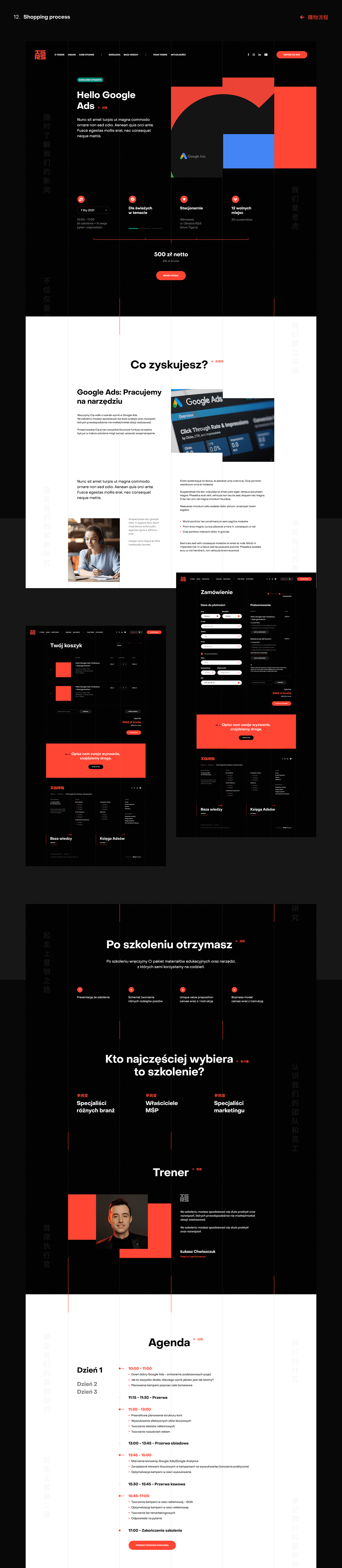
The shopping process at the Tiger's house
Tigersi also offers all kinds of digital courses, workshops and webinars.
In addition to the shopping part, which had to be properly designed, it was necessary to allocate the right amount of space for content and added value - photos, illustrations. All of this has been correlated with the purchasing process, which leads the user step by step to the finalization in the shopping cart.
The entire shopping part has been well designed and planned in terms of UX. Designing this part was also demanding for me, but on the other hand I wanted the user to have the sense of ingenuity I wanted to get in this project.
As Tigers have a wide range of courses, the project required me to propose a structure that would not overwhelm the user, but would encourage them to take advantage of their offer.
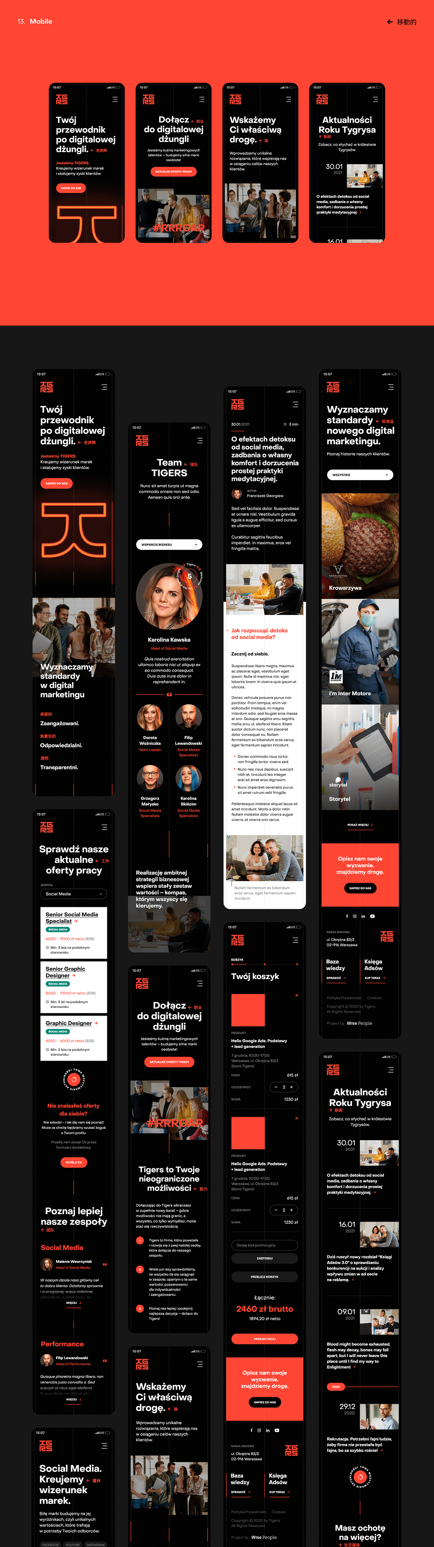
Mobile version
With the current standards and trends, the mobile versions are as important as the desktop.
That is why, personally, as a designer and UX fan, I attach so much importance to the fact that RWD is not just an addition - a smaller version of the desktop, but an equal element of the entire product, which is the website.
That is why, personally, as a designer and UX fan, I attach so much importance to the fact that RWD is not just an addition - a smaller version of the desktop, but an equal element of the entire product, which is the website.
The value of the Tigers
Tigersi is more than a digital marketing company. Thanks to the community they build around themselves and a specific identity, they are gradually expanding their reach among people who are looking for their guide in the digital jungle.
The strength of the Tigers comes from real, defined goals. The culture of knowledge combined with a team of specialists gives spectacular effects that are followed by everyone related to the topic of digital marketing.
The strength of the Tigers comes from real, defined goals. The culture of knowledge combined with a team of specialists gives spectacular effects that are followed by everyone related to the topic of digital marketing.
Summary
The adventure with the Tigers was a very creative journey for me, in which I found myself.
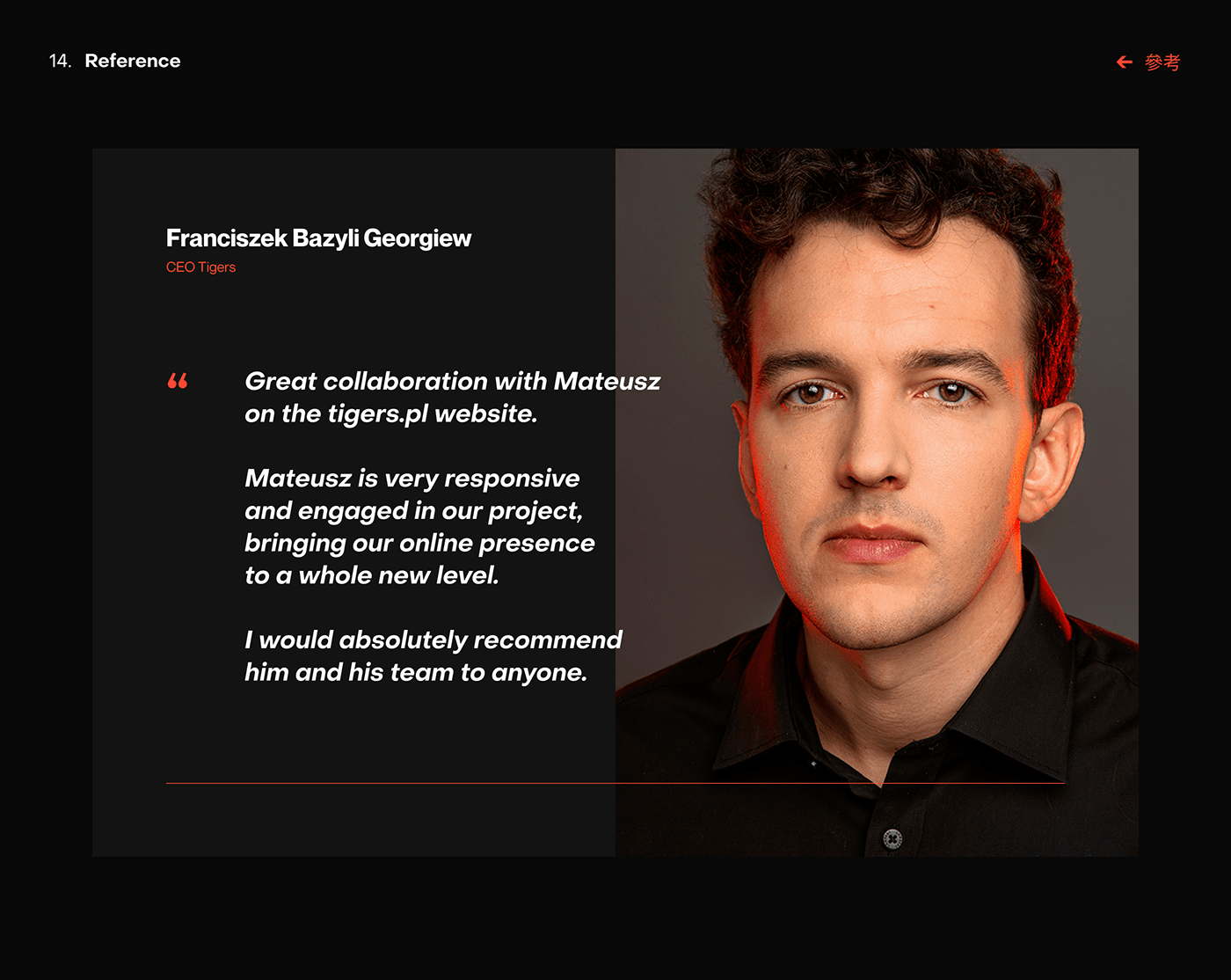
Confirmation can be a personal reference I received from Tigers CEO, Franciszek Bazyli Georgiev!
Confirmation can be a personal reference I received from Tigers CEO, Franciszek Bazyli Georgiev!
Thank you for watching!
Check it out online
Would you like to implement a new website, mobile application or visual identification, but you don't know where to start?
Write at biuro@visiontrust.pl
and trust our vision. 💌
We invite you to follow our social media profiles!
Cheers!

