HyperActive
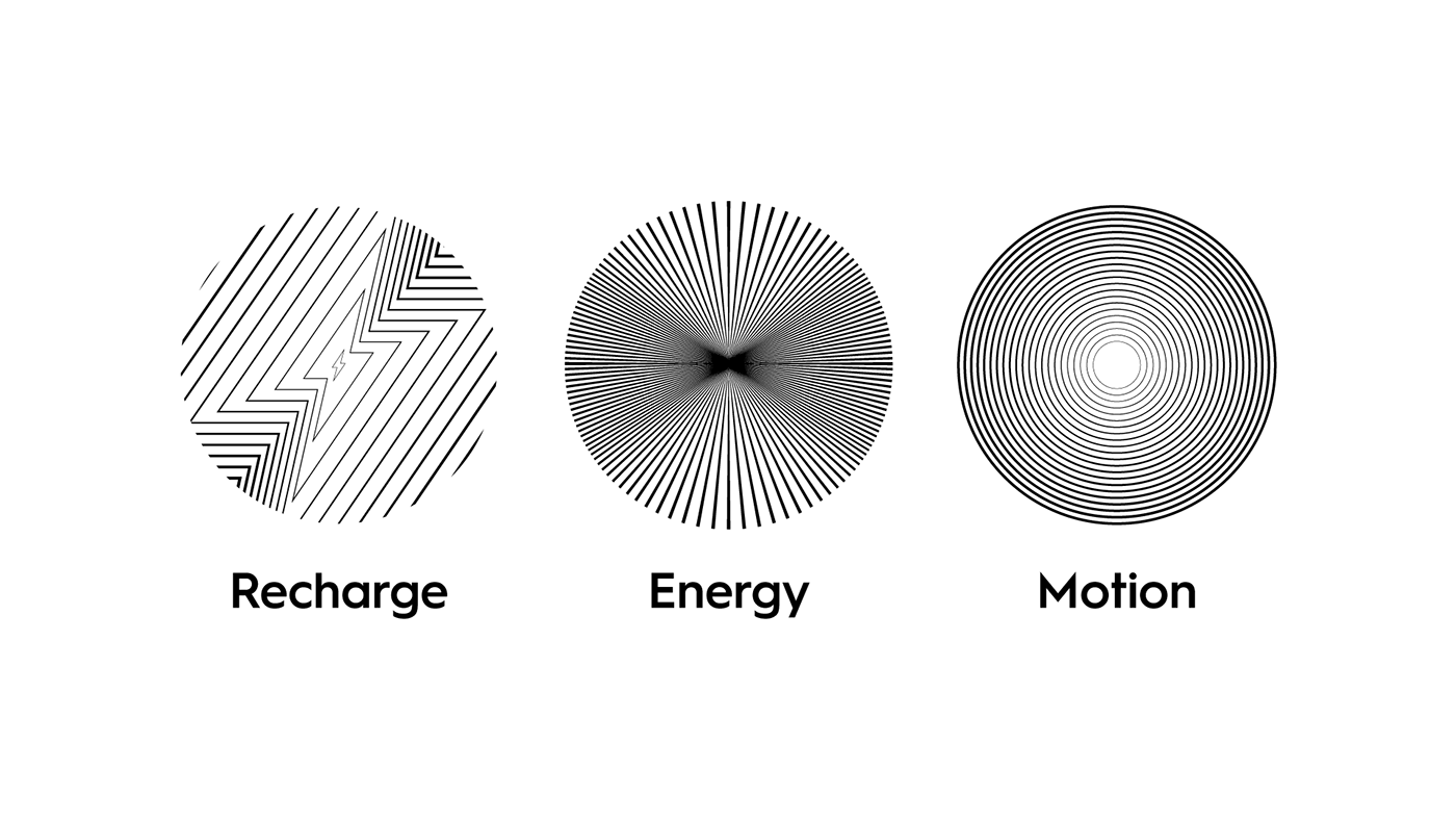
A place like HyperActive is a place to recharge your energy by using it right. Energy, Motion & Recharge are three keywords that define HyperAcitve brand.
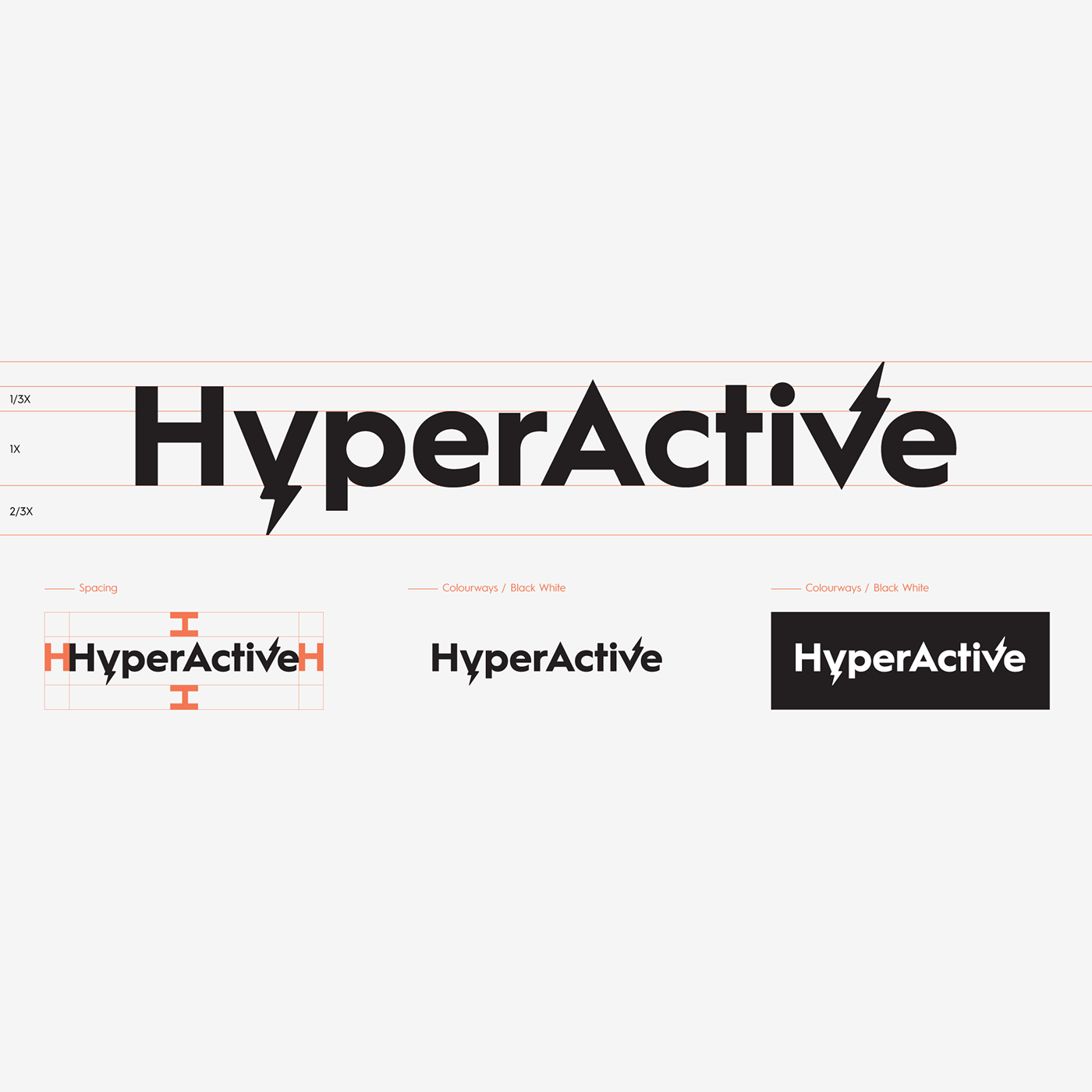
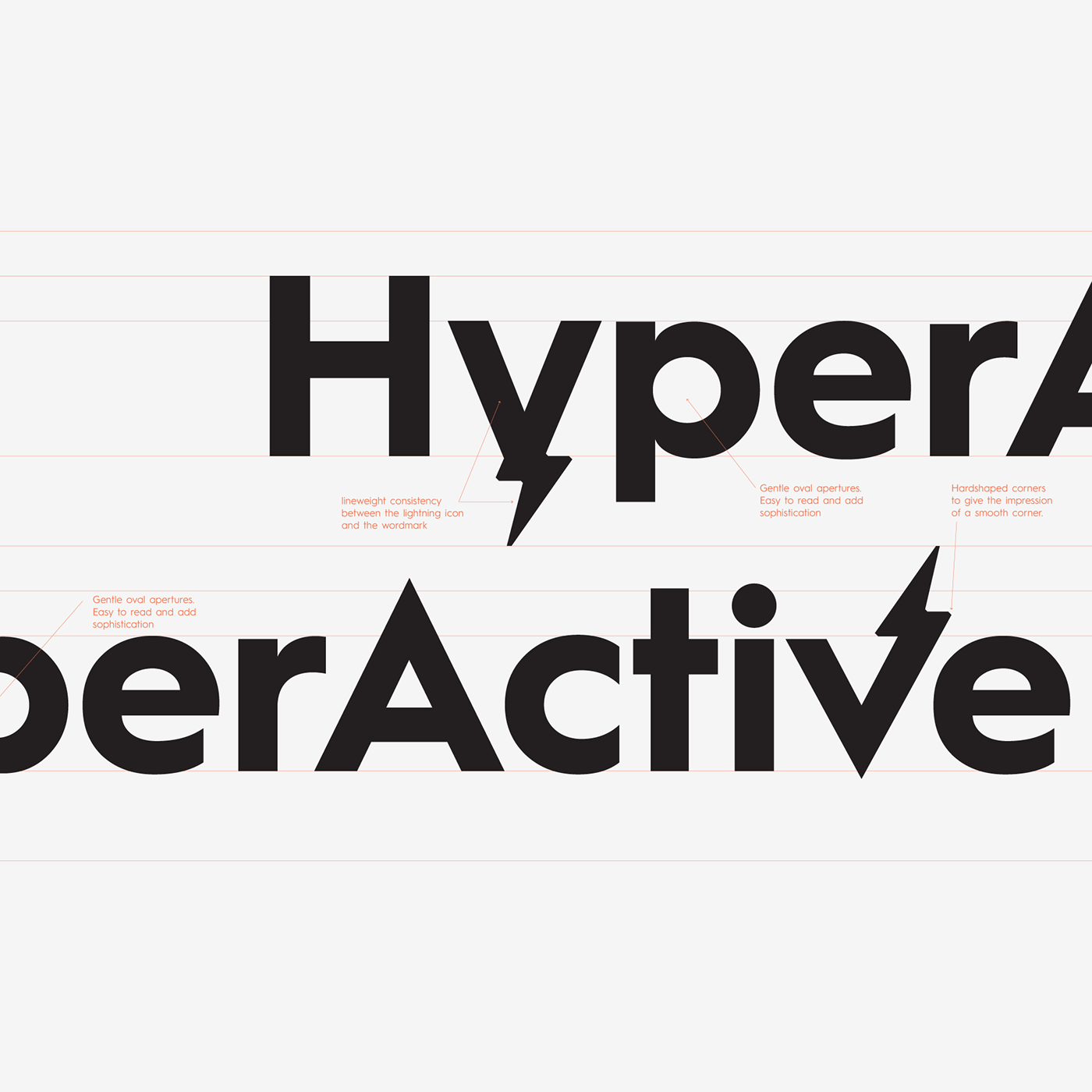
Building off the DNA of the HyperActive masterbrand, we worked for over three months with HyperActive to develop a robust style guide and flexible visual identity designed to help HyperActive change the game in entertainment arena.
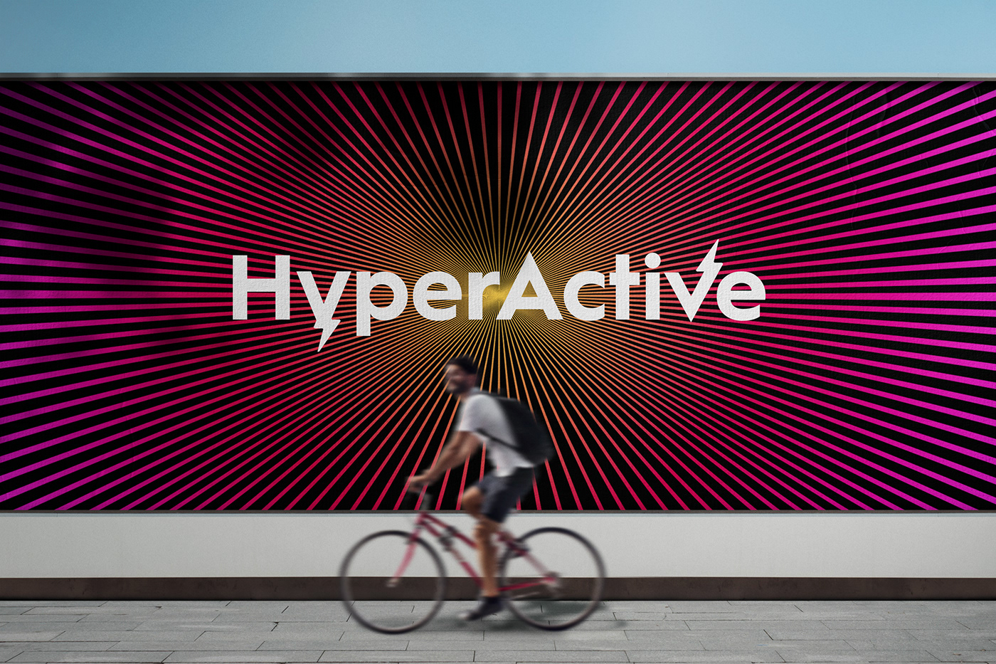
This wasn’t just about a new color palette, logo standards, or typography guidelines — it was about establishing a new creative ecosystem custom-built for a new era of digital fandom. From a suite of screen-friendly gradients to an in-depth library of iterative digital display ads, we gave HyperActive all the tools it needs to stand out.


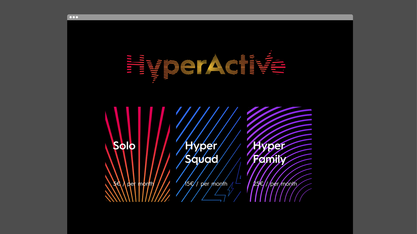
The fresh HyperActive color palette uses gradients instead of single colors, allowing it to express the mood and tone of content rather than identify a single, rigid genre. The resulting system, compiled in a comprehensive style guide, allows the brand to further flex across mood and tone while always remaining clean, dynamic, and surprising.
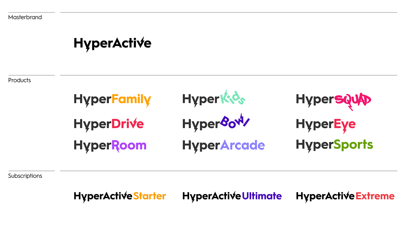
As a system, typography works as an ally to generate hierarchy and order. As if it could turn up or down the volume or presence of the masterbrand brand in each level of the branding system: corporate, products and services, B2B brands, etc.