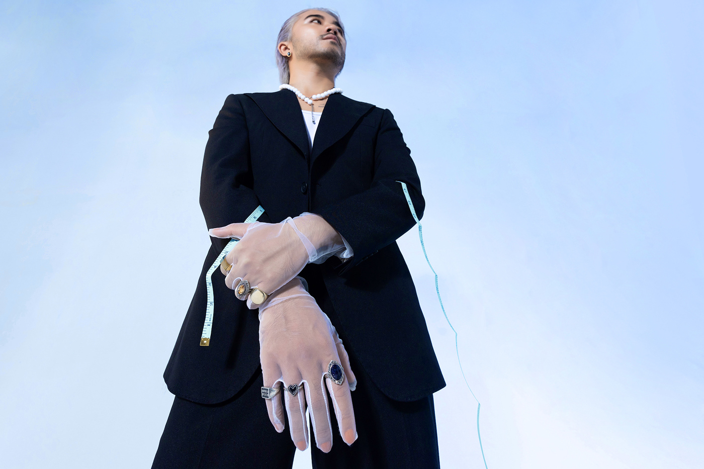
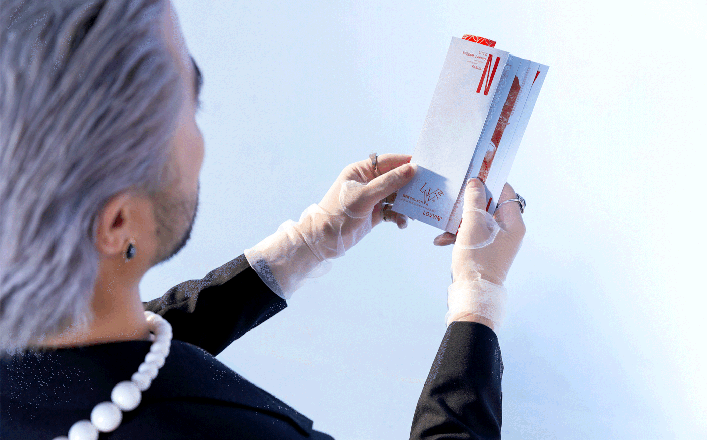
*Lovvin' - Dare to love, dare to express
The world is harsh; its long-lasting stereotypes put high pressure and expectation on every person, destroy their emotions and desires, and force them to follow the frequent social institutions. In the belief that gender-fluid fashion can liberate people from social pressure, Lovvin’ is the frontline to counter social stereotypes and toxic masculinity, help gentlemen realize and accept their softness/feminity and break out of the Man-box.
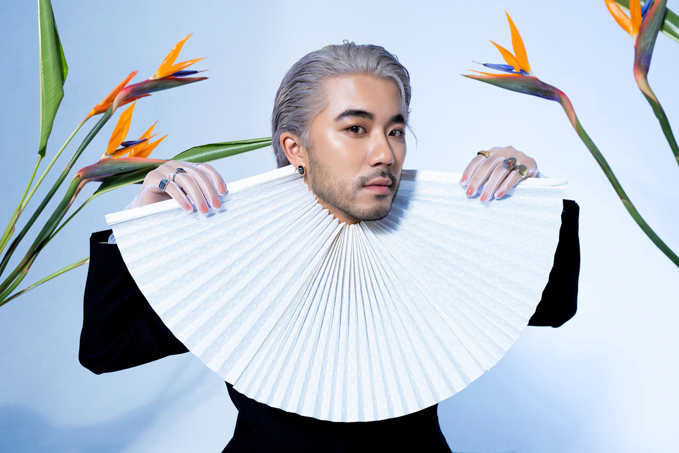
The name Lovvin’ inspires the messages: “Loving yourself, your loves” and “Love wins” that encourage customers to enjoy their fashion interests and freely express themselves daily with no gender limits or boundaries.


*Concept
Androgynous fashion is evolving to dispel gender stereotypes and expand the general perception that clothing no longer belongs to one specific gender. To illustrate this revolutionary fashion movement, Lovvin’s brand identity requires uniqueness and a dare to make new changes and break regular design rules. Finally, the result of our research and ideation for Lovvin’s branding originates from Futurism and Dadaism, the movements breaking away from traditional aesthetics as well as the rationality of any kind.
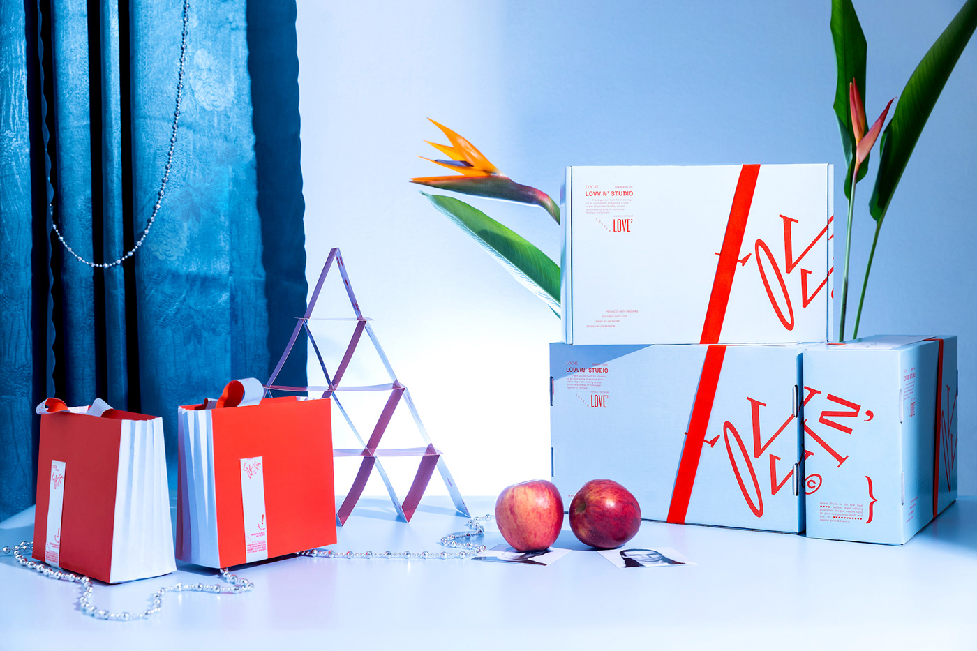
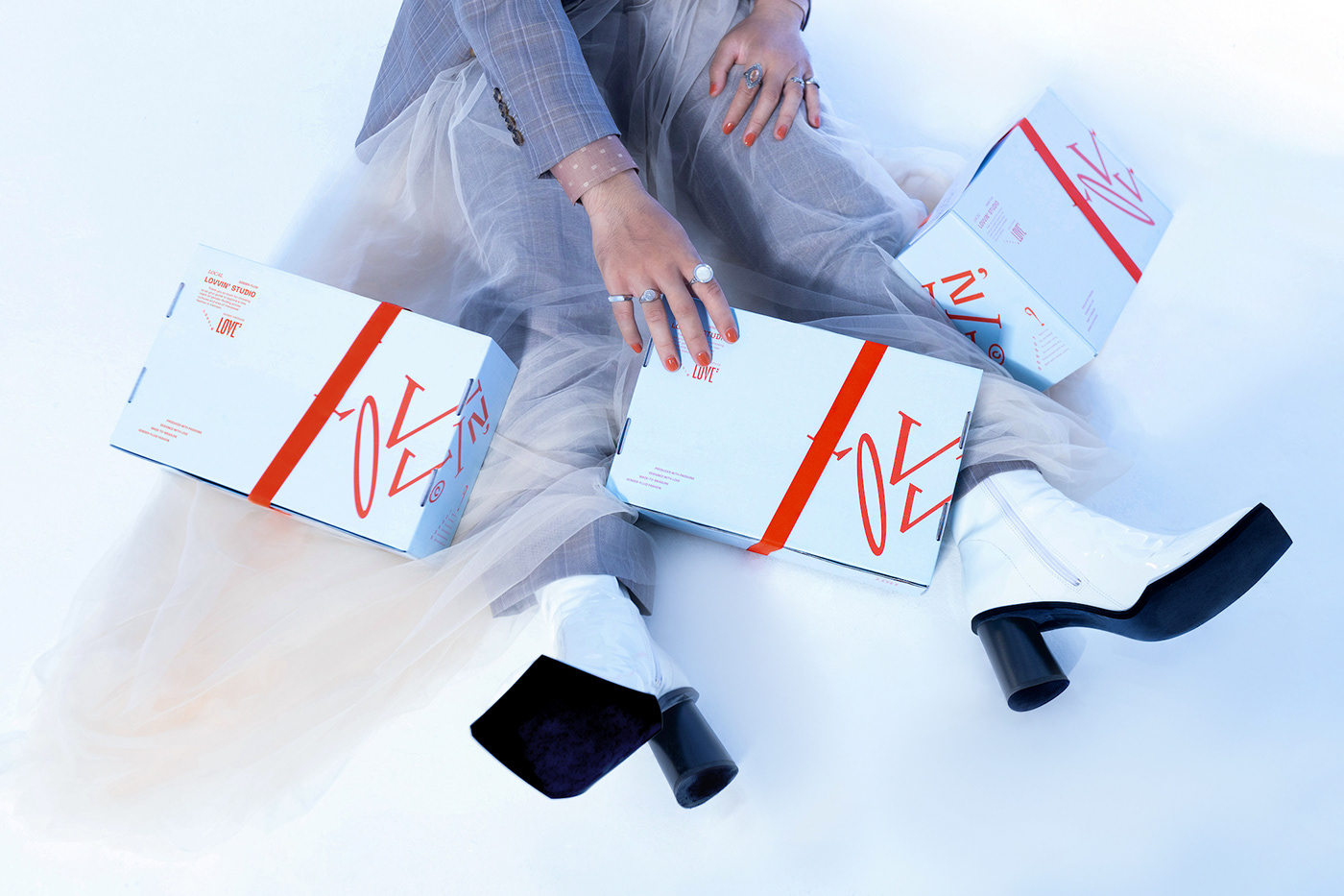
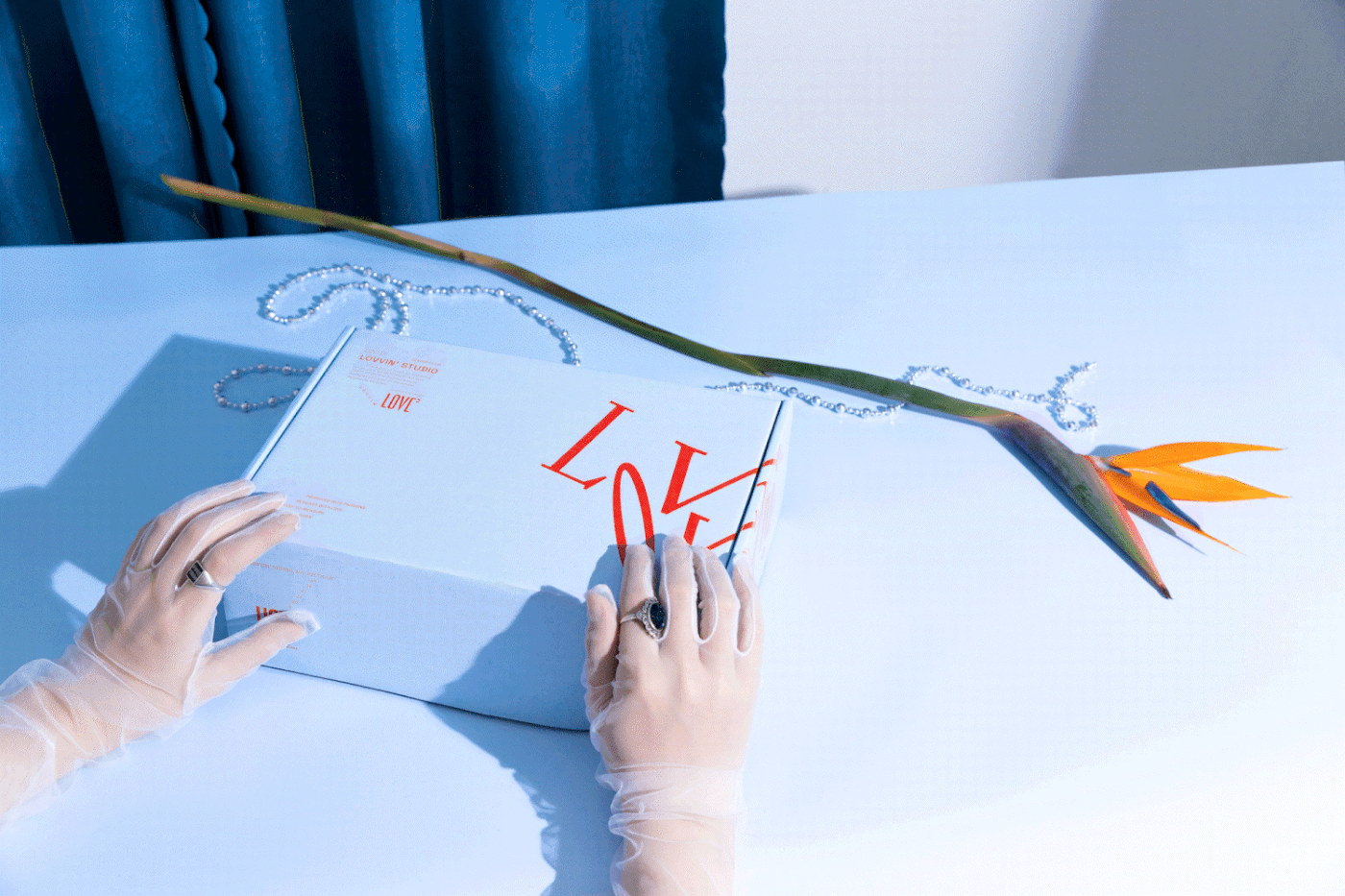
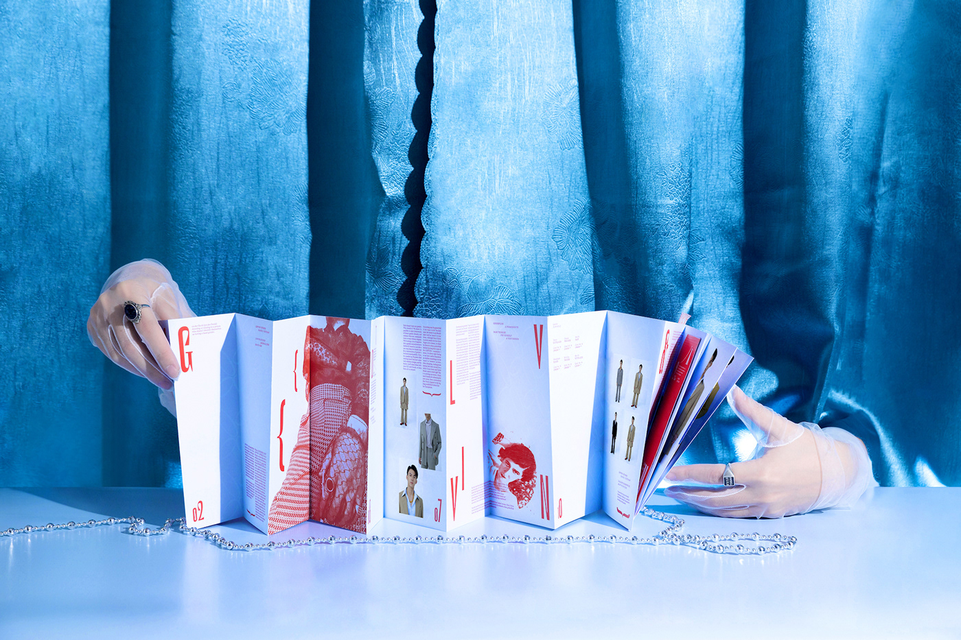
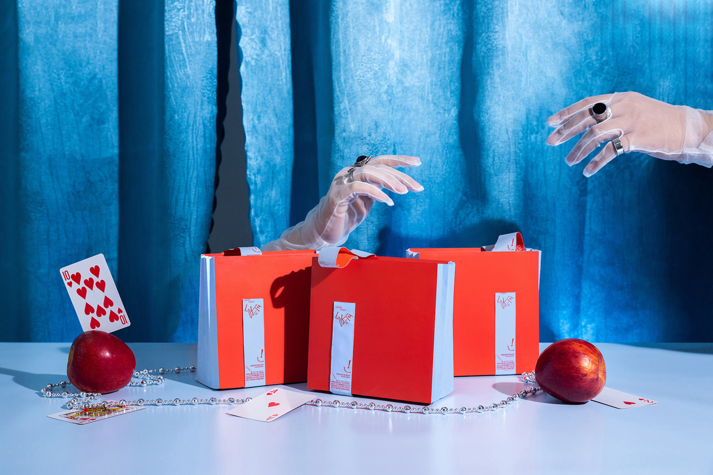
On the other hand, fashion cannot be described only by paper, but by cloth. By attaching woven labels to the brand identity, a conventional paper design has migrated to unexpected outcomes to create a new sensational manner. This approach also helps us discover a new sensual design and break down preconceived ideas of what branding design may look like.


*Visualization
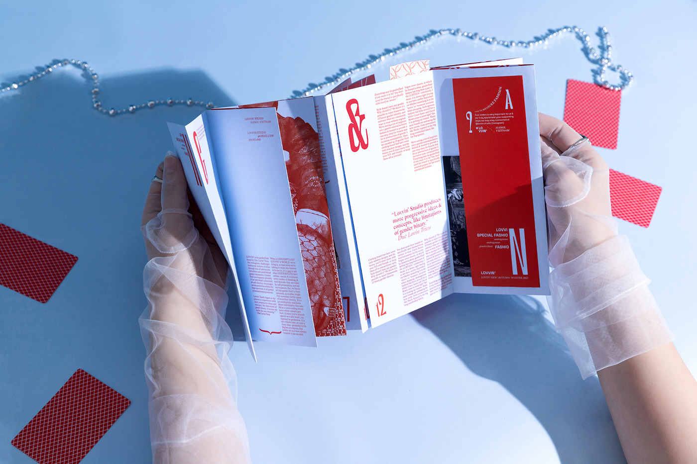
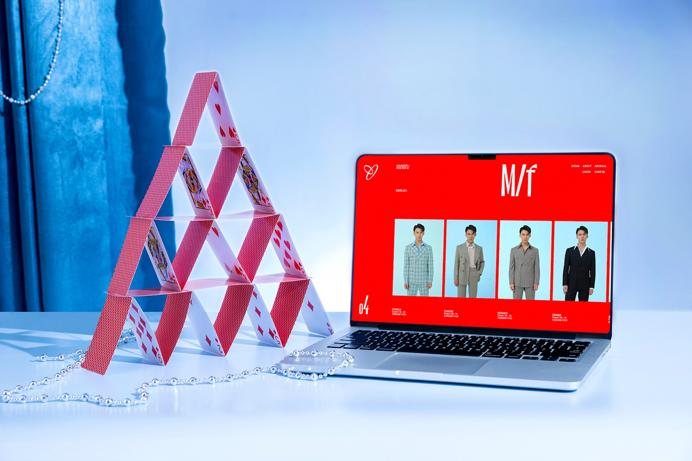
Influenced by the revolutionary Futurism and Dada, Lovvin's identity promotes the rebellious typography and layouts with cropped texts, huge drop caps, mixed fonts, multi-directional typesettings, and editorial experiments. This playful typography conveys a more expressive and less rational composition, as the way gender-fluid fashion challenges the rigid gender binary. The free yet powerful typographic experiments in every design evokes the explosive and amplified message of androgynous clothing that Lovvin’ delivers - “Your fashion. Your choice”.
Rather than follow the rules of phrases and sentences, the letters come to life, express freedom and pride in every design, captivate audience attention and encourage them to love and change. There is no limit or boundary for fashion, also for design.


*Effects
We have gone a long way to enhance creativity in design and witnessed many refreshing projects that dare to go against design traditions. Lovvin’s identity is also a test to stimulate the fluidity of material in branding design, relating to the flexibility of gender-inclusive fashion. A combination of paper stocks and woven labels presents the distinctive essence of the brand and extends the forms and material technique to entertain people's sensuality.
The goal of this experiment is to expand the brand interaction as well as determine the potential development of Lovvin’s identity. With this challenge, we hope you may always “stay true to your identity and desire” more than ever.


*Messages
We were born in a world where blue for boys, pink for girls, a grid for texts, and straight lines for typesetting. In an environment where you are expected to act as people want, small differences in your clothing or design may lead to objection and refusal. Therefore, a desire to dress and design however we like becomes not only a mission to self-express but also a journey to find our own identity.
It is the time for us to refresh our minds, against traditional binary borders and live with our identity and fashion interest.
*Lovvin' - Freedom to self-express


*Environment
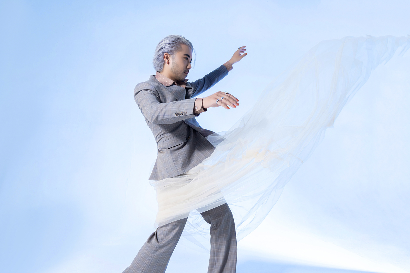
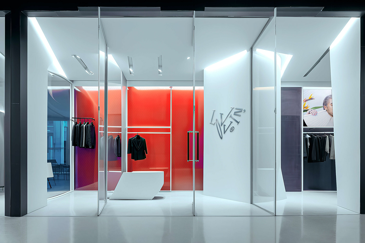
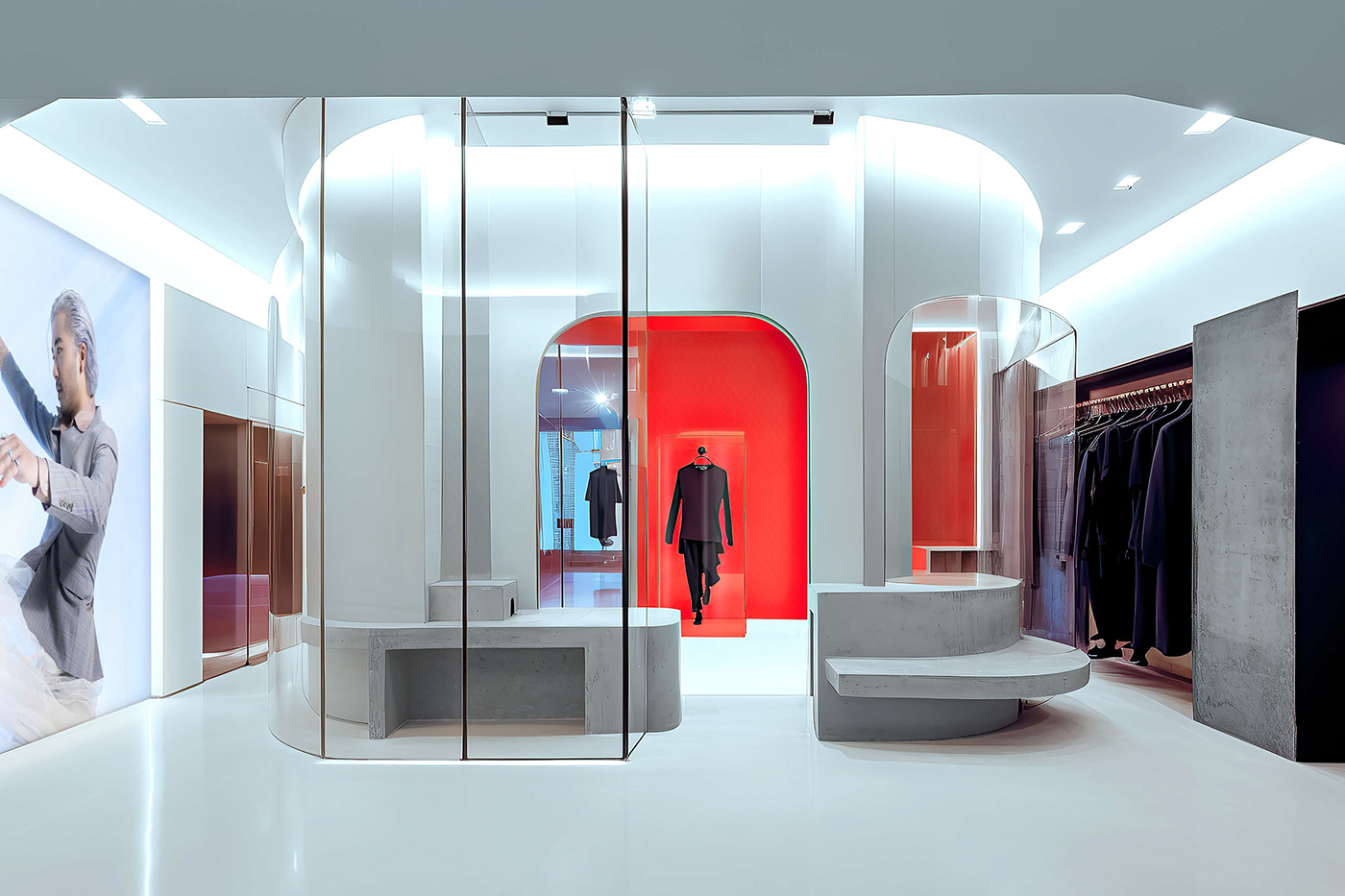
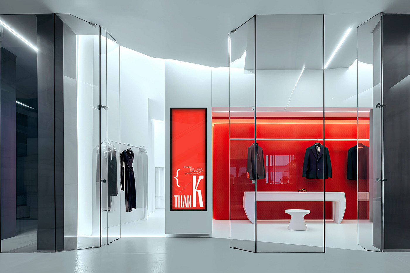
In the heart of the bustling city, Lovvin' Studio reimagines fashion as a form of self-expression. This gender-fluid fashion store is more than a retail space; it's a symbol of modernity, creativity, and inclusivity. It invites you to explore the intersection of style, modernity, and self-expression, where creativity knows no bounds.
The store's interior is a testament to transparency and style. Glass dominates, allowing natural light to showcase the garments' true colors and textures. Abstract-shaped cement stands and glass counters merge function and artistry, reflecting Lovvin's avant-garde spirit. Minimalism reigns, directing focus squarely on the fashion. Metal materials infuse innovation, echoing today's creative generation. Lovvin' Studio's branding is art in itself. Logo patterns adorn metallic and linen-wrapped walls, tying the store to its identity. Amidst the white minimalism, strategic touches of red and blue inject vibrancy and energy.


Credit
Creative Director: Alex Dang
Designer: Truong Thanh, Danson Vu
Account Manager: Hang Nguyen
Print Producer: Hong Ha
Copywriter: Truc Pham
Copywriter: Truc Pham
Models: Duc Trieu
Photography: Dung Pham
Thank you for your watching & appreciation!


