ENG
Velebitsko pivo is surely among the best beers to be found on the Croatian market. It boasts a rich and unique flavour, a benefit of the natural brewing process and pure spring water from the wellspring Ričina, located at the base of the Velebit mountain. The brand’s only shortcoming, as we see it, is the design of its current label and the way it communicates the basic idea.
This was the reason why we decided to redesign the label, considering all elements crucial for the story of a naturally brewed beer with healthy ingredients and the story of the Velebit fairy, the guardian of that region. Our goal was to retain essential elements and redesign them, so as to emphasize the idea, but also to structure textual information of relevance to the consumers, by taking into consideration the expenses of label production.
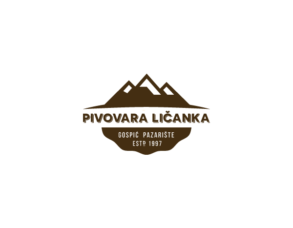
First of all we created a logo for the brewery which, in our opinion, hasn’t been clearly defined yet. Our graphic solution highlights the location of the brewery. With the lettering “Pivovara Ličanka” (Ličanka brewery) and “Velebitsko pivo” (Velebitsko beer) on a separate label, in the combination with our logo, we wanted to point out to the origins of the beer and the quality of the water used in its production.
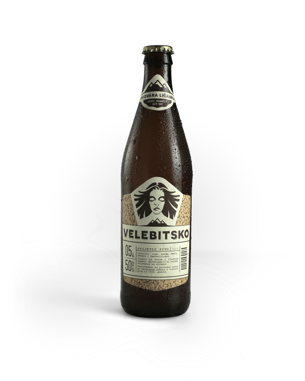
Current label depicts a woman representing the Velebit fairy. According to the Croatian mythology, fairies are the guardians of nature. The problem here is that the fairy is placed in a small oval shape and is barely visible so we wanted to accentuate her importance.
Furthermore, we find that information such as bottle capacity and alcohol content is not visible enough and well readable on the current label and since it is relevant for the consumers, we decided to restructure it and thus make it more noticeable. We adjusted the hierarchy of all information and sorted it by relevance.
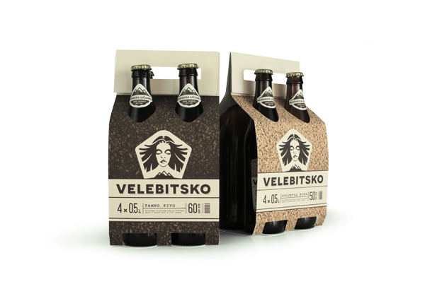
Beer colour depends on how long barley is roasted before brewing. We used that fact and pasted different barley photos in the background of our label – one for lager beer and one for dark beer.
HR
Velebitsko je pivo zasigurno jedno od kvalitetnijih piva na domaćem tržištu. Osim bogatog i jedinstvenog okusa, njegova posebnost leži i u prirodnom načinu proizvodnje - korištena voda je neobrađena i crpljena iz ličkog vrila Ričina. Nedostatak jednog tako kvalitetnog proizvoda jest upravo njegova trenutna etiketa koja loše komunicira željenu ideju.
Upravo iz tog razloga odlučili smo napraviti redizajn uzimajući u obzir trenutne elemente koji pokušavaju iskomunicirati priču o pivu s prirodnim i zdravim sastojcima s sjedne strane, a s druge priču o vili Velebita kao zaštitnici tih prirodnih dobara. Cilj je bio zadržati bitne elemente, preoblikovati ih ne bi li naglasili ideju, ali i strukturirati informacije bitne potrošačima, naravno, vodeći računa i o isplativosti proizvodnje jednog takvog grafičkog proizvoda.
Prije svega, napravili smo logotip pivovare koji do sada nije bio jasno definiran. Predloženim rješenjem nastojali smo locirati proizvodnju piva. Uz natpis Pivovara Ličanka, i natpisom Velebitsko koji se nalazi na odvojenoj etiketi, logotipom smo pokušali dati do znanja da je pivo proizvedeno na Velebitu te da je voda korištena u proizvodnji crpljena upravo iz izvora u podnožju planine.
Na trenutnoj je etiketi vidljiv i ženski lik koji predstavlja vilu Velebita, po hrvatskoj mitologiji, zaštitnicu tog prirodnog podneblja. Problem je u tome što je nezamjetna pa smo na ovaj način pokušali naglasiti njenu važnost.
Nadalje, informacije poput zapremnine ambalaže, postotka udjela alkohola i slično, nesuvislo su posložene na trenutnoj etiketi. Predloženim rješenjem nastojali smo strukturirati i oblikovati informacije po njihovoj važnosti.
Boja piva ovisi o prethodnoj zaprženosti ječma prije same proizvodnje piva. Tu smo činjenicu iskoristili i upotrijebili različitu fotografiju ječma u pozadini etiketa te time dobili i kodirane boje za svaku ekstenziju proizvoda.
Isplativost same etikete, odnosno pojefitnjenje cijene proizvodnje u usporedbi sa sadašnjom etiketom, vidimo u broju boja korištenima u tisku. Na trenutnoj je etiketi vidljivo da se u njenoj proizvodnji koristi pet boja po svakoj etiketi. Mi smo ih sveli na dvije jedinstvene za obje etikete.
BREWERY LOGO

CURRENT LABELS

REDESIGNED LABELS

TYPOGRAPHY

MAKING OF ILLUSTRATION

Pri izradi ilustracije, ne bismo li dobili pravilne oblike, kao gajdice koristili smo krugove (iznad je vidljiv primjer s usnama).
We used circles for guidelines so we could get nice defined shapes.


Sudnji dan 2014 - Judgment day 2014 (independent festival of creative communication) - Mlada nada (best student project of 2014 - voted by leading croatian creatives)
Photo: Stephan Bednaić
Design: Tomislav Fabijanić, Dubravko Tuksar