

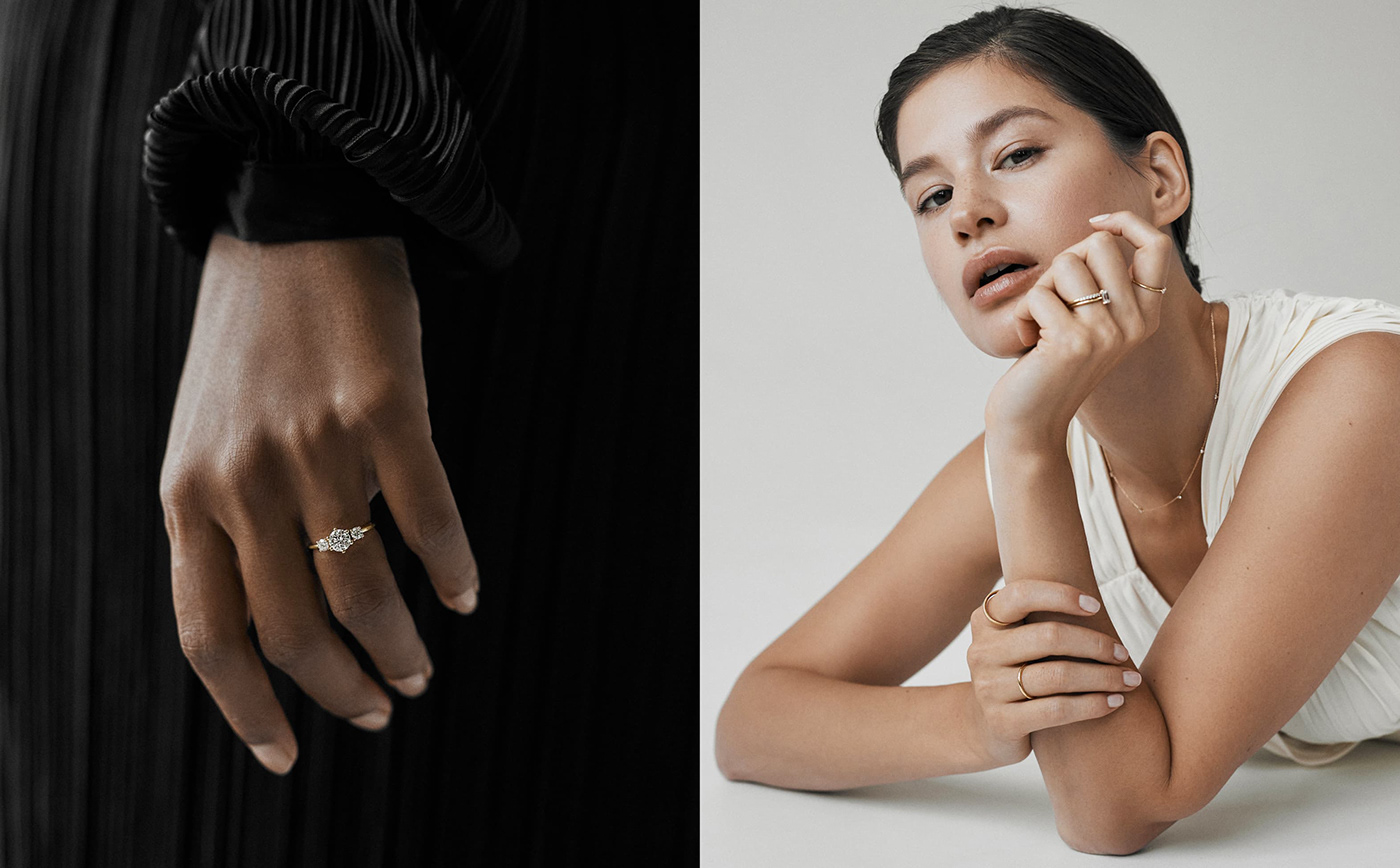
Lab grown diamonds and recycled gold
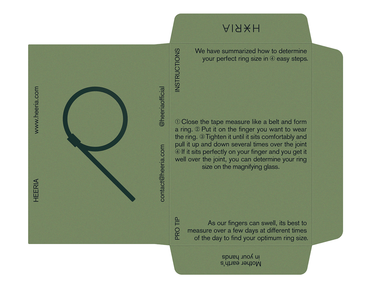
Brand Identity for Heeria
Heeria is a new sustainable jewelry brand focused on connecting people by embodying quality craftsmanship and materials in a conscious and considered way. Aimed at women and men who value timeless, classic, and sustainable design. Their goal is to provide a conscious luxury feeling combined with a low impact on planet earth - these values drove Humana's approach to its brand identity.
Heeria had two specific goals with the new branding. First, to stand out and become a unique sustainable jewelry brand - and second, to communicate the sense of conscious consumerism by connecting and engaging with social, environmental, and cultural responsibility.
This idea is established by working with small production lines and orders, which stands for quality over quantity without losing the humanitarian aspect of its business model. The branding highlights the empowering mission combined with a minimal visual language.
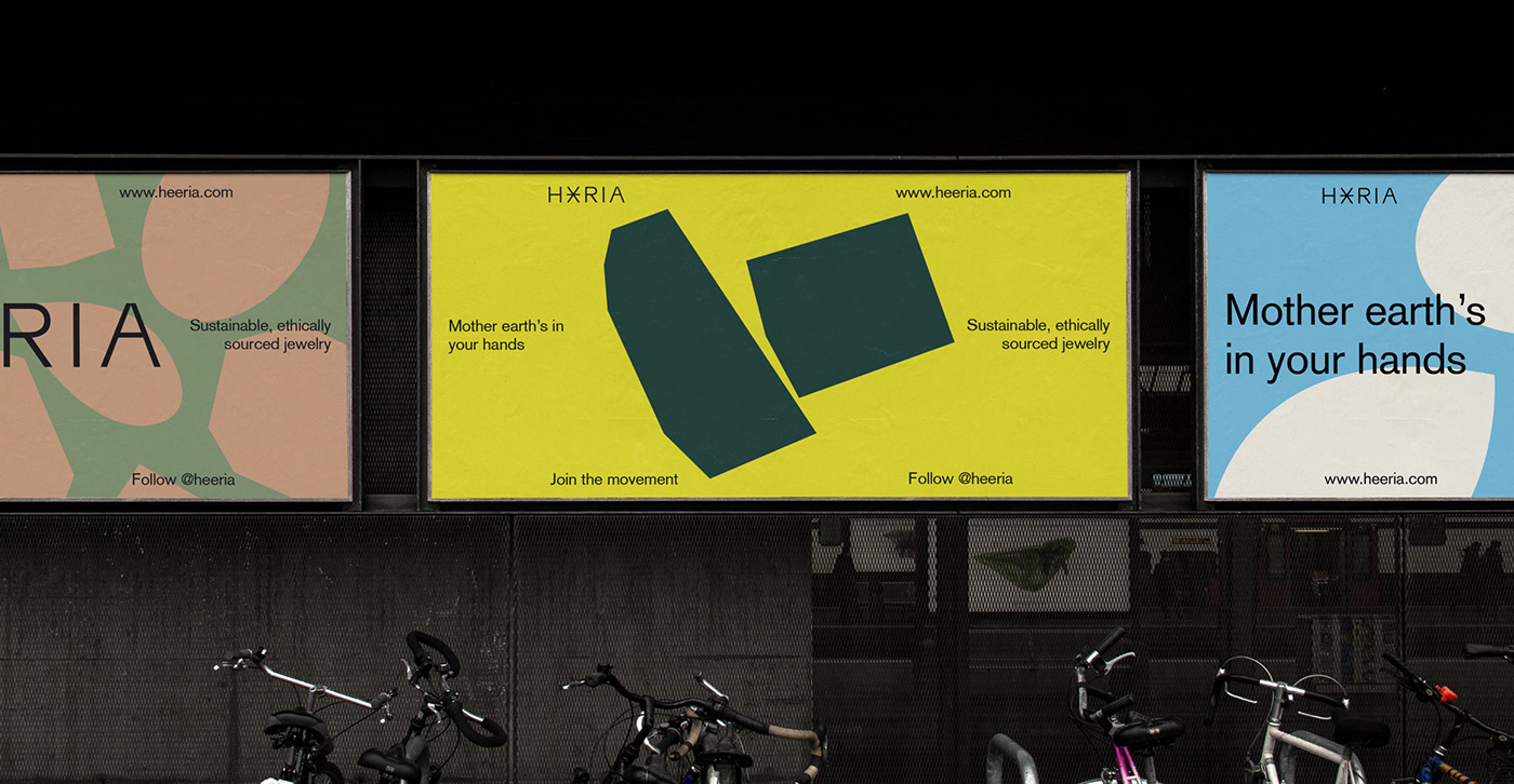
Mother earth’s in your hands.


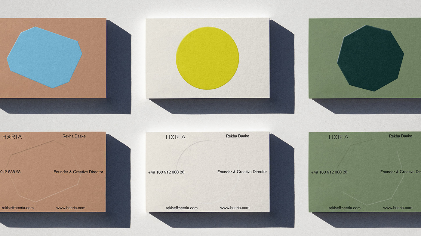
The visual identity is clean but dynamic. To create this dynamism and complement the brand visuals, it was decided to use geometric and flat shapes based on the different diamond forms and cut types.
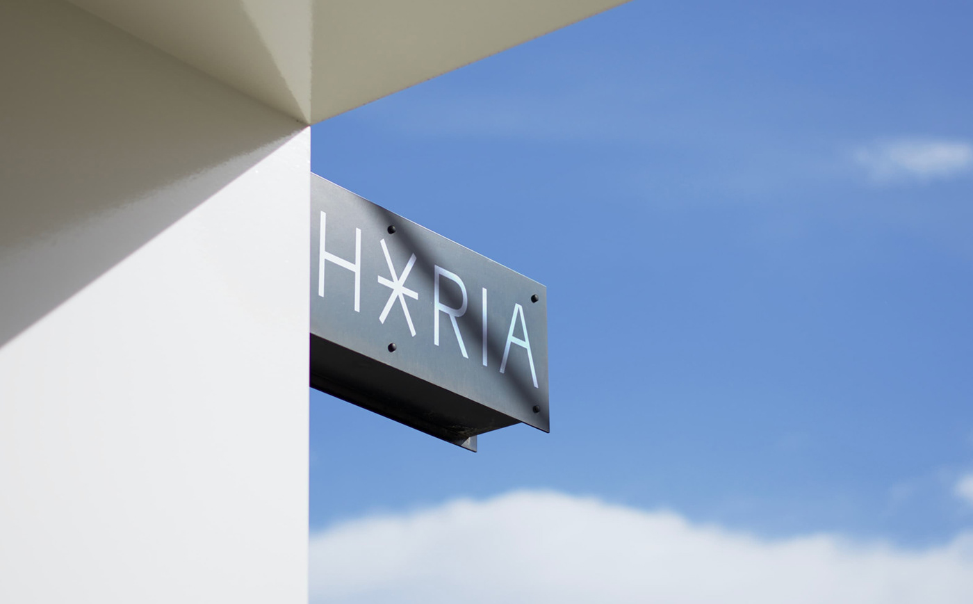
The logomark is formed by merging the “EE” from Heeria. It represents a diamond seen from below and a jewel shining. The symbol is an effective mark to create an authentic brand that stands out from others. The color palette used is a reference to the colors found in nature.


Our solution is inspired by what Heeria believes as a brand, but more importantly, it aims to shift perceptions about sustainable and ethical jewelry.


