In contro tint
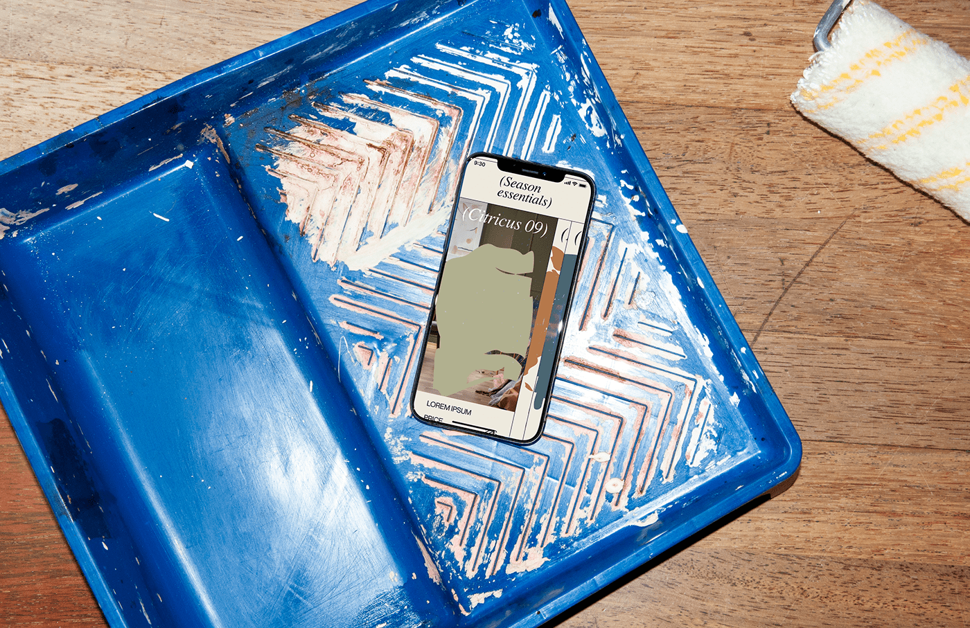
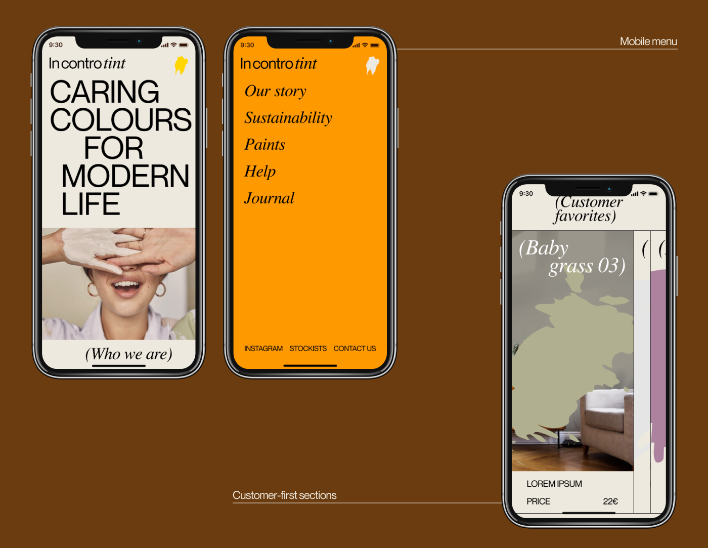
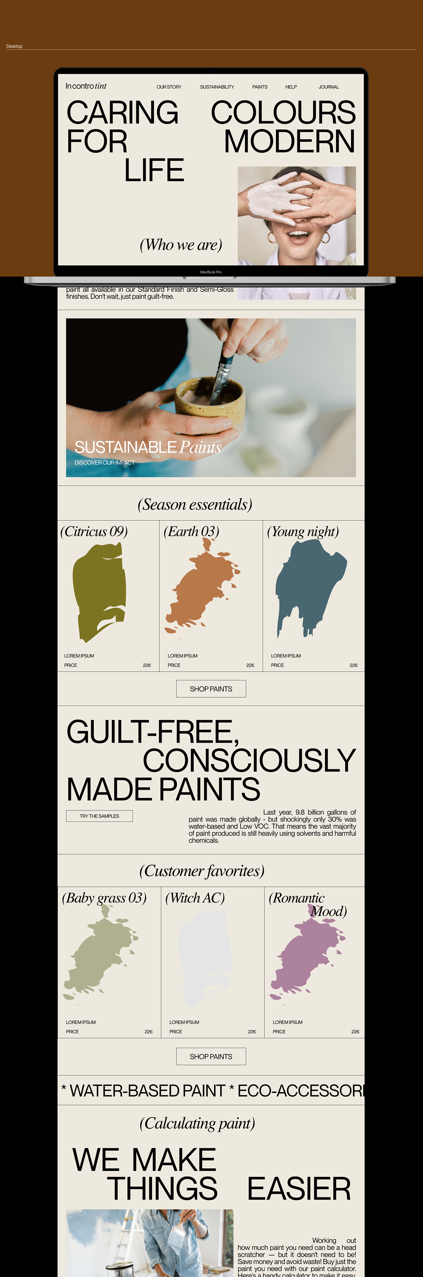
The intention of In contro tint is to bring sustainable paints to the market and to new and reassured audience, inside and outside their homes. The challenge was to create a homepage for the company and design coherent visuals and graphics for the website that reflect on the brand values and engage the user. Inspired by the slogans "old meets new" and "learning by doing" the identity delivers a joyful and contrasting mix that is seen throughout the visuals, photography and layouts. The user has a full on experience that assesses their needs: buying the right amount of paint, learning personalized tips on how to do it right, and visualizing their projects beforehand.
Role: Creative direction, graphic design, photography, motion, UX/UI.

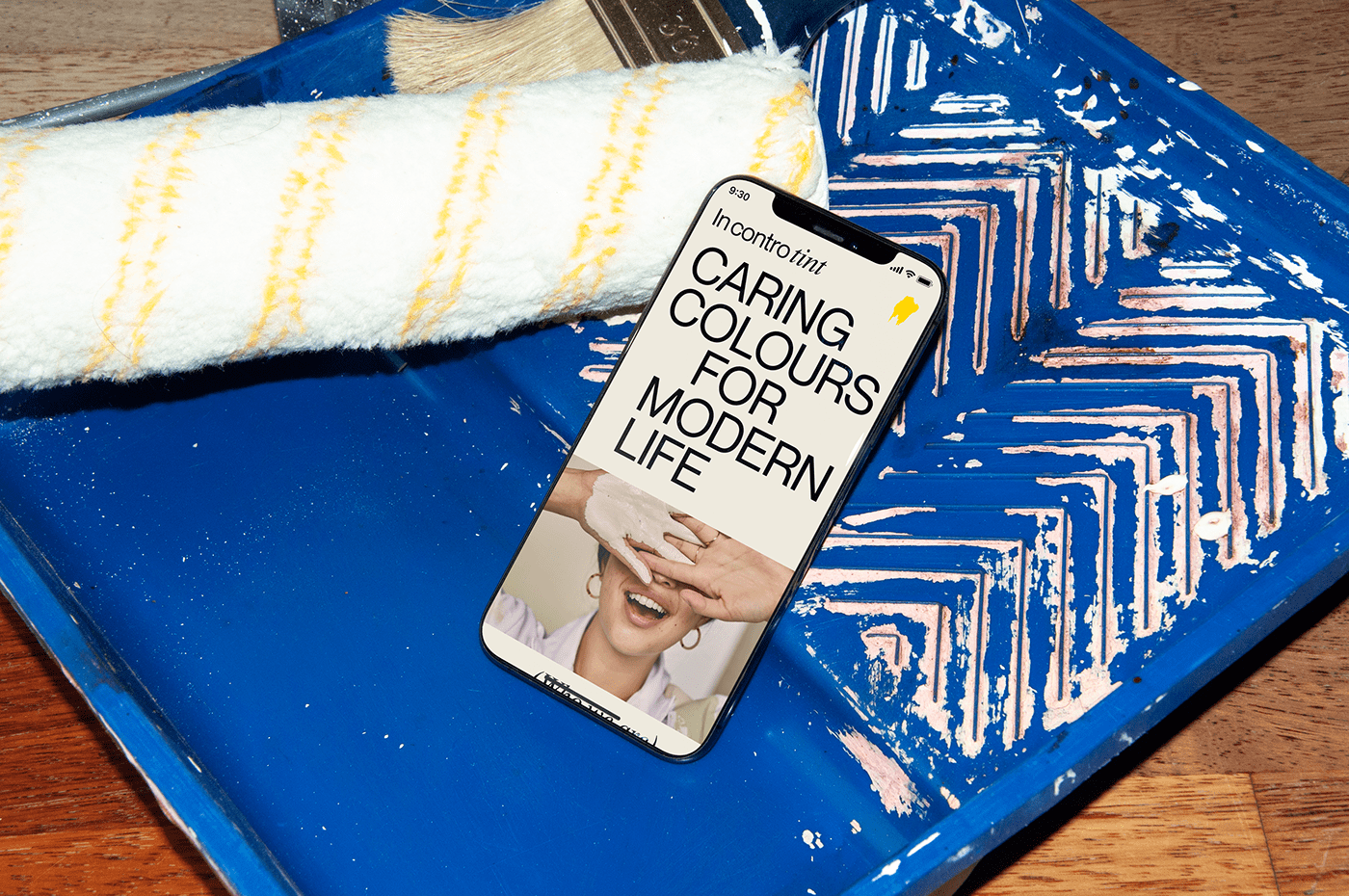


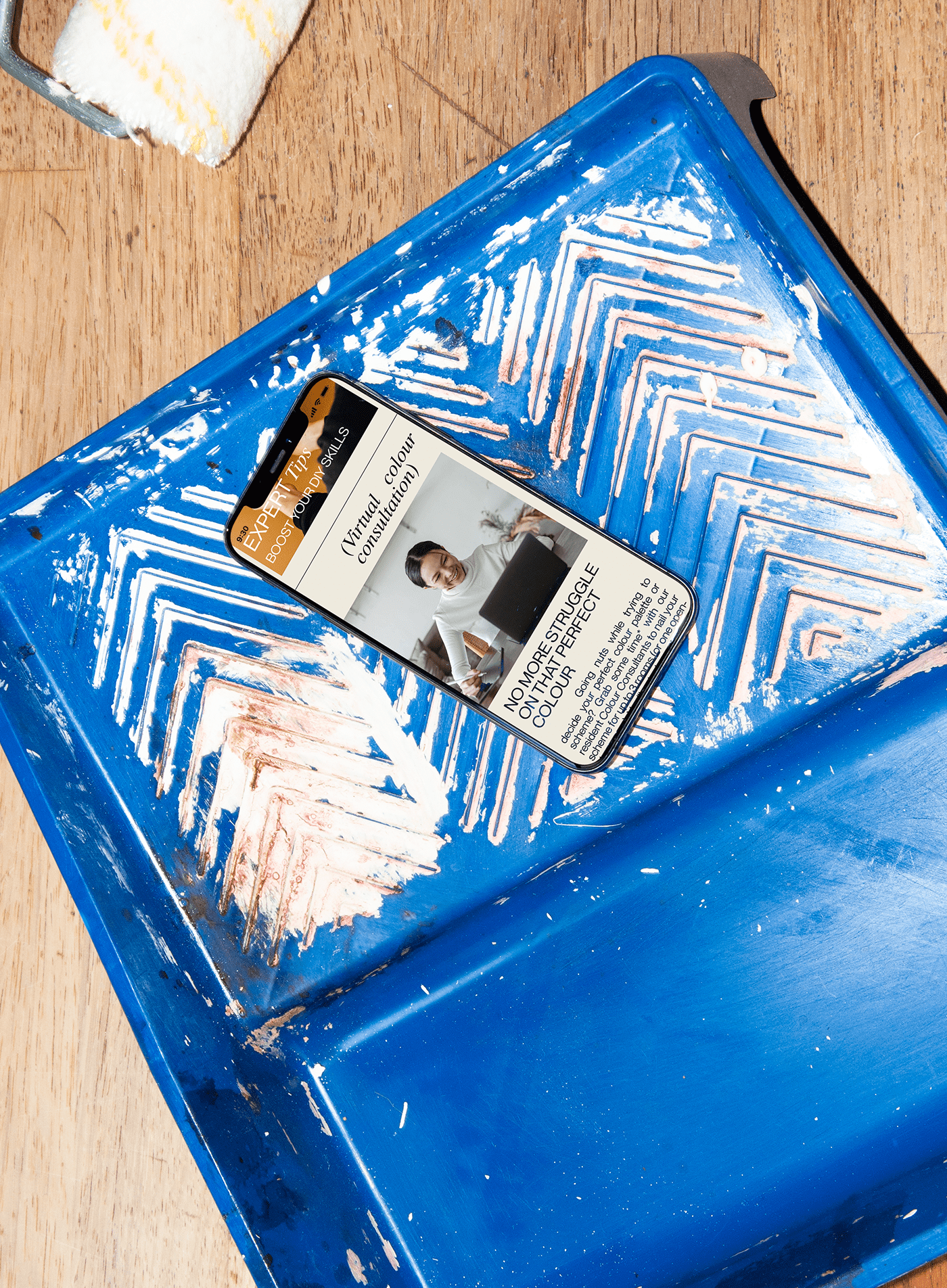
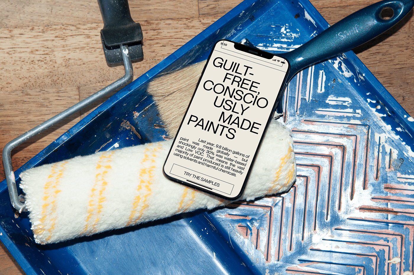


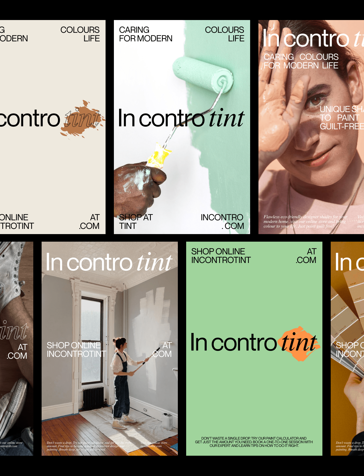


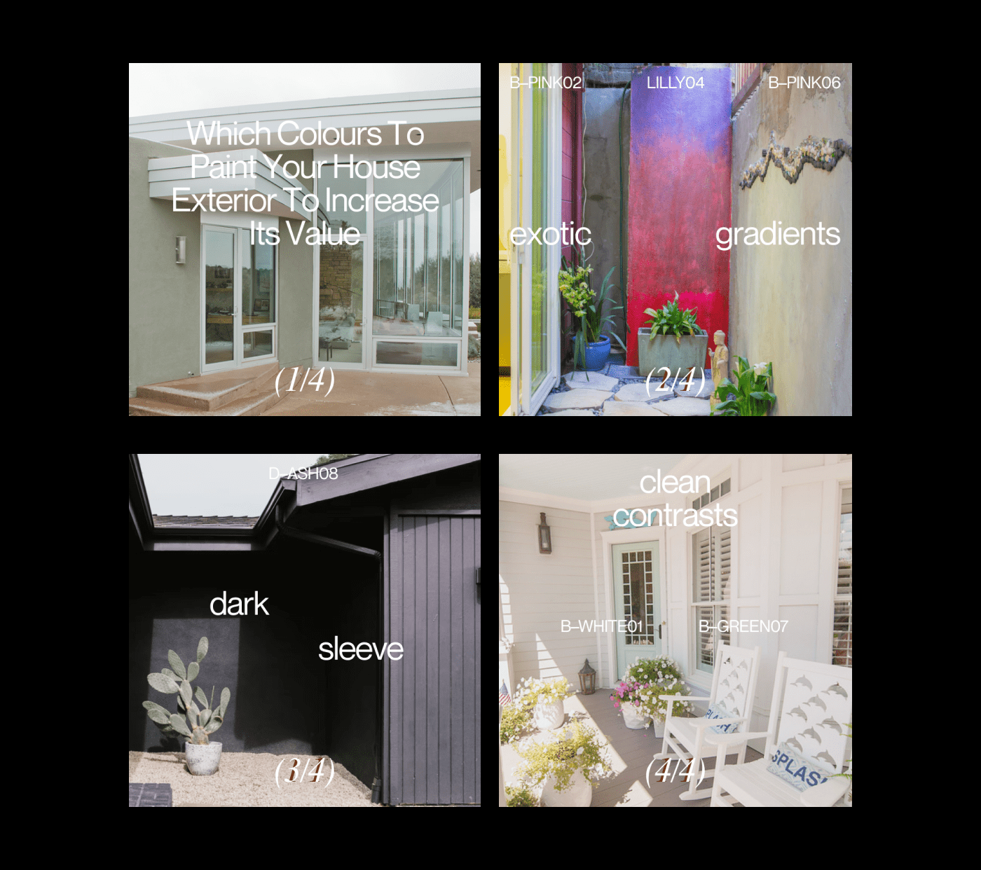
The customers seek ways to innovate and transform their homes through painting, are into DIY and they are aware of the social&environmental impact of daily actions.Therefore, the communication strategy builds a strong connection with the potential customers showing them content that interests them and making them to participate. For instance, Instagram stories and posts are organized within 4 categories (news, tips, stories, impact), each of them featuring either new products, real tips, customers' projects and brand values, as well as the social and environmental impact of the brans'd products.