FR_
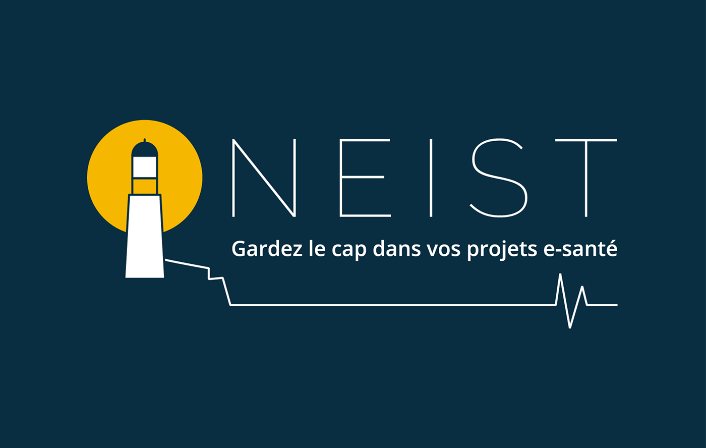
Le nom NEIST
« NEIST » fait référence au Neist Point de l’île de Skye en Écosse dans les Highlands, un voyage marquant pour Caroline, la fondatrice de l’entreprise.
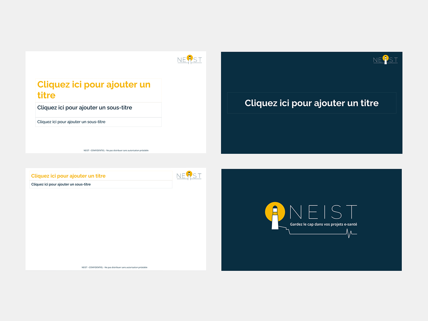
Le symbole du phare
Caroline se décrit elle-même comme une « boussole » pour ses clients. Elle les guide vers l’accomplissement de leurs objectifs en restant sur le bon chemin. Le phare est donc une représentation imagée de sa mission.
Le slogan « Gardez le cap dans vos projets e-santé »
Le slogan fait également référence à la mission de l’entreprise : guider ses clients dans la bonne direction. C’est aussi un clin d’œil à l’univers marin développé dans l’identité de marque.
Création du logo, de la charte graphique et de modèles de documents
GB_
The name NEIST
"NEIST" refers to Neist Point on the Isle of Skye in Scotland's Highlands, a landmark trip for Caroline, the company's founder.
"NEIST" refers to Neist Point on the Isle of Skye in Scotland's Highlands, a landmark trip for Caroline, the company's founder.
The lighthouse symbol
Caroline describes herself as a "compass" for her clients. It guides them towards achieving their goals by staying on the right path. The lighthouse is therefore a pictorial representation of its mission.
Caroline describes herself as a "compass" for her clients. It guides them towards achieving their goals by staying on the right path. The lighthouse is therefore a pictorial representation of its mission.
The slogan "Stay the course in your e-health projects"
The tagline refers to the company's mission: to guide its customers in the right direction. It is also a nod to the marine universe developed in the brand identity.
The tagline refers to the company's mission: to guide its customers in the right direction. It is also a nod to the marine universe developed in the brand identity.
Creation of the logo, the graphic guideline and document templates