Layar Creator
Layar Creator is Layar's interactive print creation tool, a web based drag-and-drop editor that allows users to upload scanned images of physical printed material and add digital content on them to be displayed in Augmented Reality using the Layar app.
The challenge
The tool is already famous for its simplicity and ease of use but there were still user frictions that had been observed in our usability testing sessions, and feedback gathered from our periodical surveys and user interviews.
As part of Layar's rebranding Creator needed to be refreshed, instead of the new coat of paint we took the opportunity to polish out such frictions and line the product up with the new business goals, making the tool even easier and more flexible to new features.
Goals
- Smooth out the first time experience: Augmented Reality is a very new concept, many people think that a lot of technical knowledge is required to create AR, our mission was taking people by the hand in their first AR creation experience, along the whole lifecycle of their first campaign.
- Improve content quality: Creator is an amazing tool, it's really easy to add quite impresive digital content without much technical knowledge, still, the quality of most of the published campaigns could be improved with the right help and inspiration, we put some mechanisms in this new version to help people creating astonishing AR experiences.
- Extend the visibility and lifetime of interactive print campaigns: Creator 2.0 introduces a new feature to promote user campaigns by easily generating a landing page that can be shared in social media to be scanned with the Layar app.
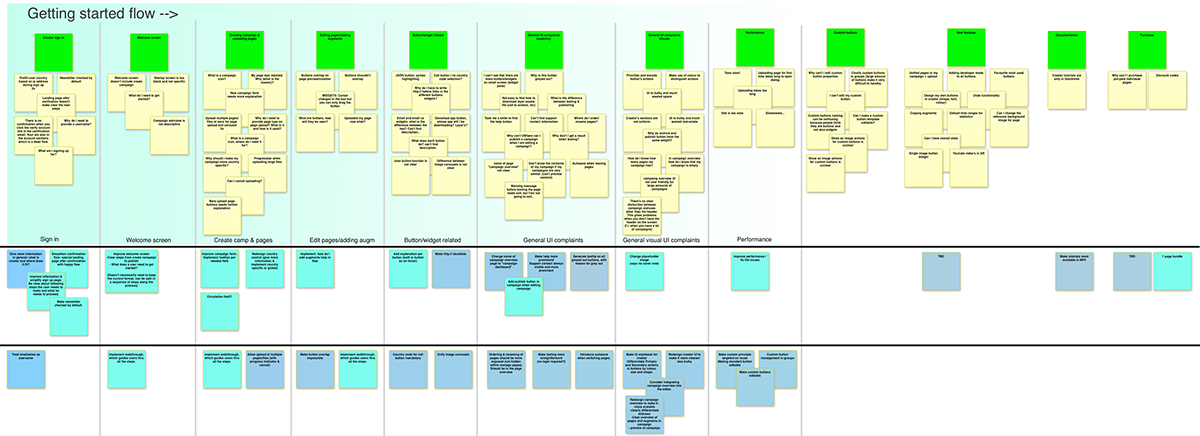
Affinity diagram identifying areas of improvement for different flows
Workspace vs. quick overview
Creator's new workspace tries to keep all the actions relevant to a campaign within the context of the editor, allowing people to quickly switch to actions like testing or sharing a campaign with other team members and still remain in the campaign creation flow.
Layar Creator, edition workspace.
The campaign overview is designed with a different use case in mind, that is being able to see at a glance the different status of the created campaigns.
Campaigns are represented by self-contained cards and sorted by time of modification to keep the most likely to be reopened first. People can filter the view by campaign status (draft, published, shared, archived) allowing more flexibility to power users and solving one of the main issues of Creator 1.x which used a simple vertical list to display campaigns.
Campaigns are represented by self-contained cards and sorted by time of modification to keep the most likely to be reopened first. People can filter the view by campaign status (draft, published, shared, archived) allowing more flexibility to power users and solving one of the main issues of Creator 1.x which used a simple vertical list to display campaigns.
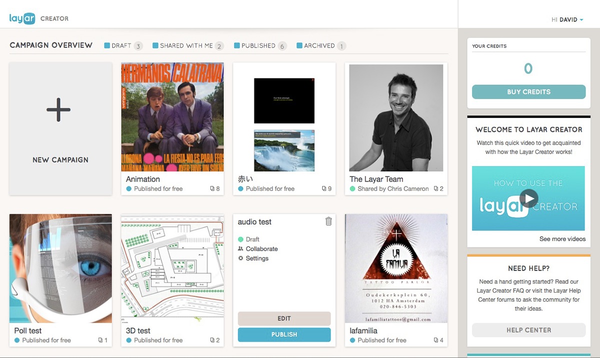
Campaign Overview in Creator 2.0
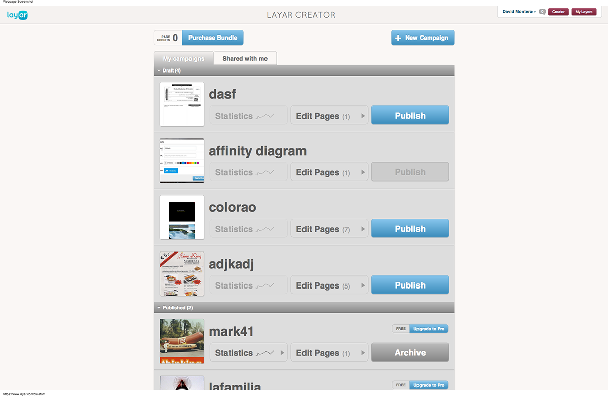
Campaign Overview in Creator 1.1
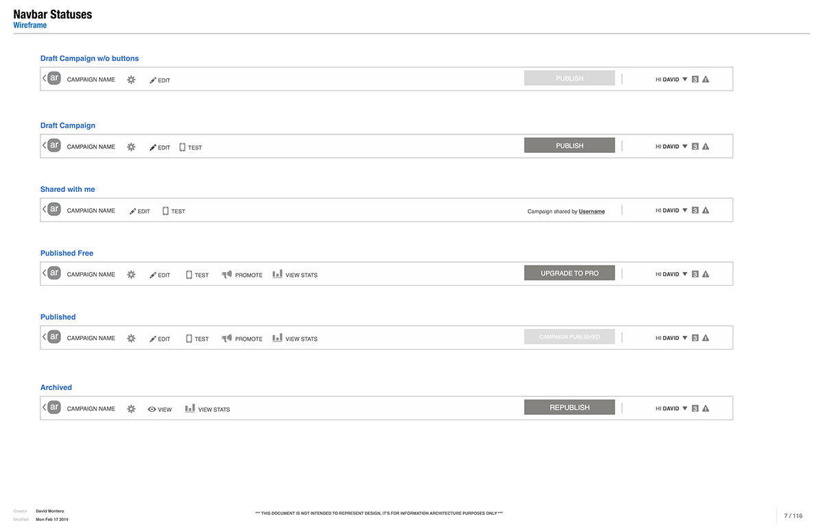
All relevant operations for each stage in a campaign lifecycle have been identified and assigned a priority, being the primary action opening it in the editor, the secondary action varies depending on the campaign status. Therefore the primary action is assigned to the whole card while the secondary action and the rest are available in a contextual menu that opens on hover.
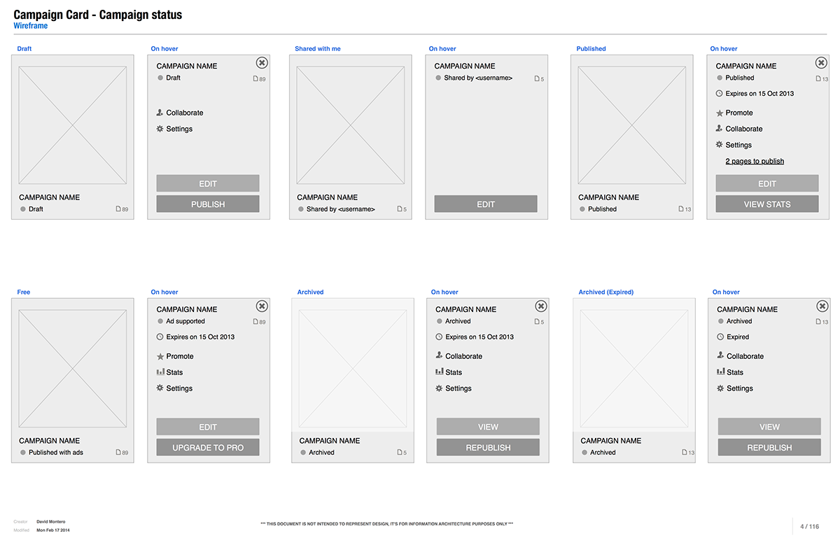
Different campaign statuses and their corresponding action menu
Gently introducing the environment
One of our biggest challenges was the onboarding process, how to assist people to get up to speed while giving them enough freedom to explore the tool and be creative. We have identified the key touch points in the campaign lifecycle (creation, edition, publication, promotion and stats) and provide a descriptive explanation for the first time a user encounters them, between stages the user is free to use and explore the tool without further interruptions.
Message bubbles appear on the first interaction with key touchpoints.
Educate, inspire, start a conversation
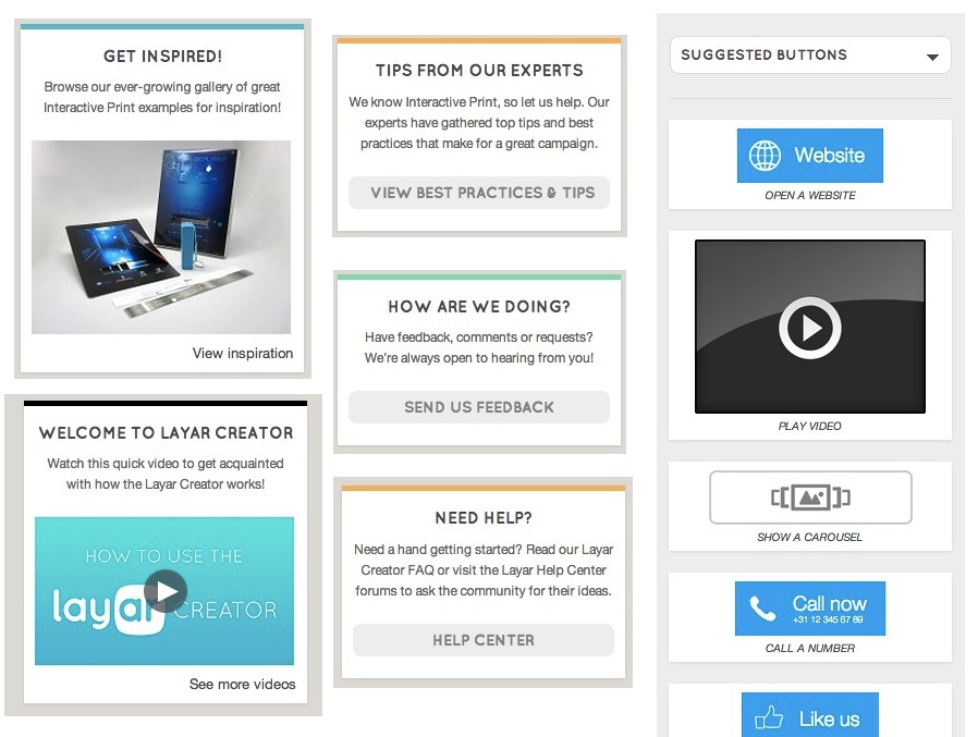
Along Creator there are several touch points in which we communicate to our users offering advice on how to get the most out of the tool, the most significant place is at the campaign overview's right column where a series of smart cards offer useful information, four of these card types are specifically designed to both inspire the user and let the user inpire us:
- Inspiration card: features a use case and links to the inspiration page in layar.com where people can experience AR by scanning the different use cases with the layar app.
- Video card: plays our latest tutorial video and links to Layar's YouTube channel.
- Help cards: randomly display tips from our help documentation and FAQs.
- Feedback card: opens a dialog where people can leave us their feedback and comments on the the tool.
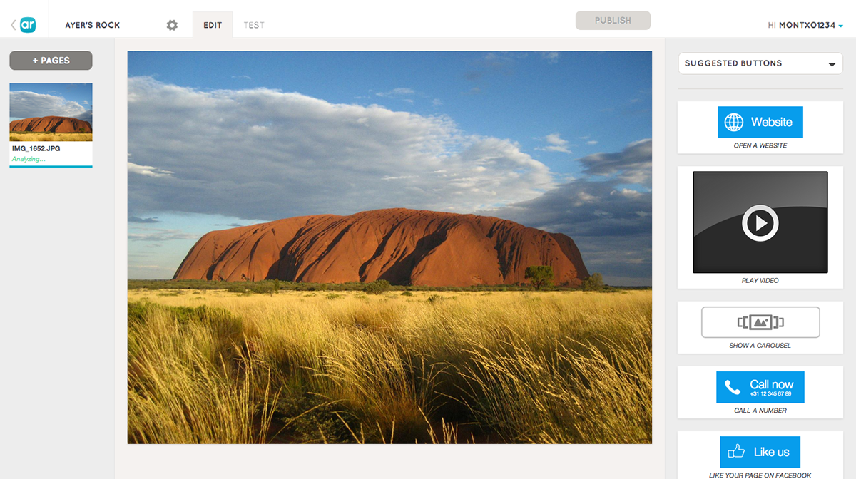
Other touch points in the editor aim to improve the quality of the experience offered by the interactive print campaigns, for example we curate the most engaging types of AR content (called "buttons" in Creator), for each campaign type (magazine, poster, business card...) and group them under the "Suggested Buttons" menu, this menu is displayed by default to first time users.
Communication touchpoints
Be where the action happens
In Layar Creator 2.0 we have taken a contextual approach to its design, expanding the "what-you-see-is-what-you-get" language that made its predecessor famous for its simplicity. Actions are taken directly over the affected objects, and UI elements are displayed when and where needed, thus reducing cognitive load.
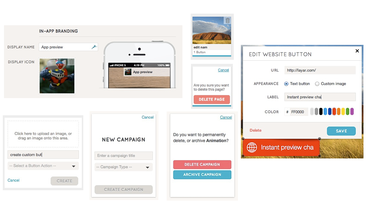
Examples of direct manipulation in Creator 2.0

Custom button creation flow, the creation form reflects the button layout.
Navigation bar displays different controls through the different statuses in the campaign lifecycle.
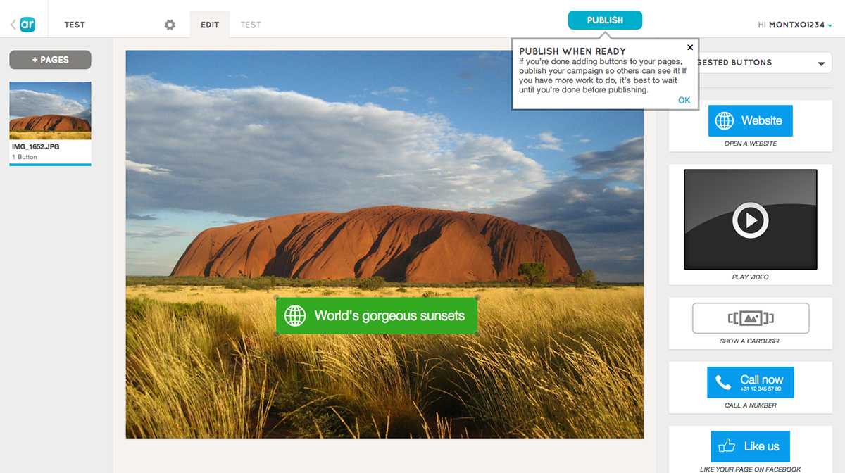
Probably the best example of direct manipulation is the "Promote" mode in which the user creates a promotional landing page of their campaign by dragging and typing content directly into the final page's template.
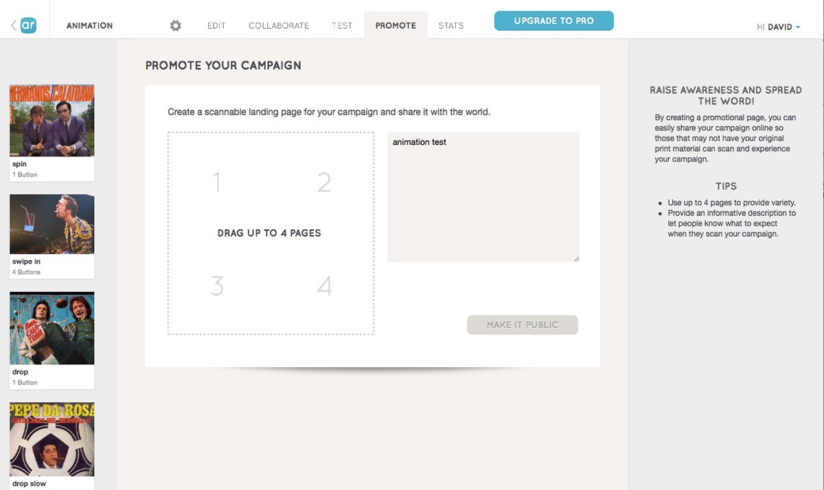
Creating a promotional landing page
In the same way error handling and feedback are also contextual, loading spinners, uploading indicators and error messages are specific and applied to the concerned item.
Error messages are brief and to the point, we have tried to reduce the copy to the bare necessary, further help and error explanations are always available via hover tooltips.
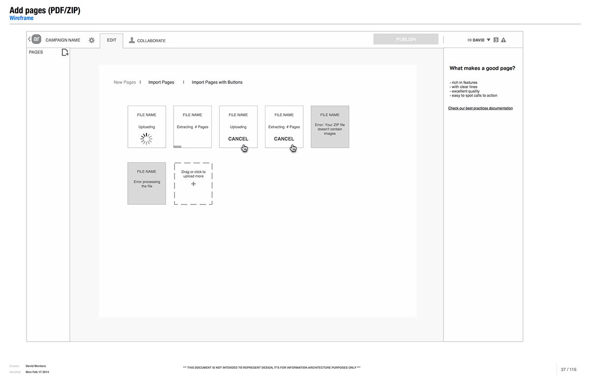
Loading indicators and error messages while adding pages
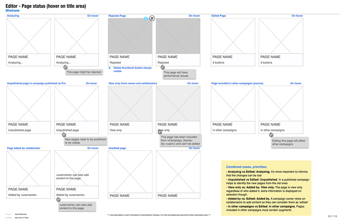
Page status feedback
Reducing friction
The UI elements are positioned in such a way that the default next action is at easy reach if not directly under the mouse, the user will have to explicitly move the mouse to apply destructive actions, such as delete.

Positioning controls for default actions next to mouse position
Switing between modes must preserve user context, keeping the same page selected between modes allows to easily edit, test and review the statistics of a single page without extra navigation.
In the same way it is possible to navigate through the whole campaign in any mode by selecting pages in the left pane or using keyboard shortcuts, allowing for example testing a full campaign without switching modes.
Testing an interactive print campaign has also been simplified with a better integration with the mobile app, in previous versions logging in the app was required to test a campaign, that is not necessary anymore, removing the most cumbersome step of the testing process.

Test mode
Assisting with next steps
There's much more to do with a campaign after it has been published, the most important action being raising awareness of its existance to the public. After publication a confirmation dialog guides through the next available steps, like downloading an invoice for paid campaigns, unsharing the campaign so team members cannot modify it and, of course promoting the campaign.
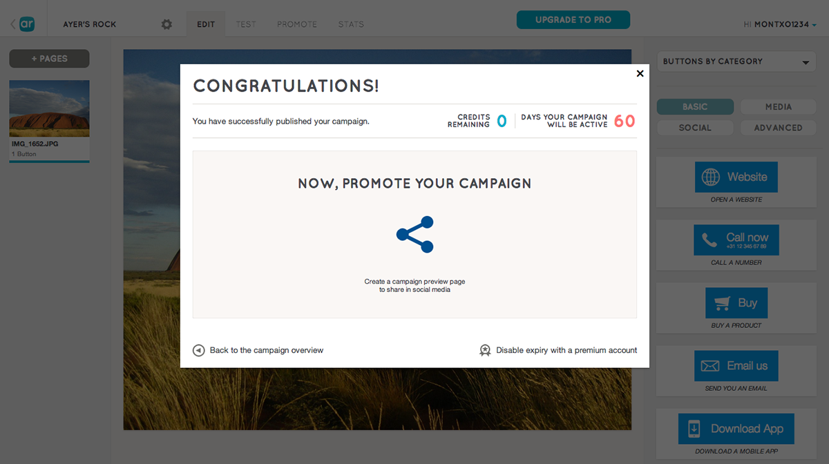
Next steps after publication
Adapting to user habits
Last but not least Creator 2.0 counts with some smarts that learn from user campaign types and preferred content.
In the campaign overview some of the smart cards summarise your campaigns' details and performance (statistics, expiration date) providing shortcuts to take direct action, in the help and inspiration cards the feedback provided is adapted to the type of your most frequently created campaigns.
In the same way we offer suggested buttons for newbies in the editor, we have a dedicated set of buttons for power users, under "Frequently used" they'll be able to find a shortcut to their mostly used buttons.
Too much reading?
Who better than Layar's VP of Product to introduce you to the brand new layar Creator?
You can also have a look at Layar's press release and dedicated blog post.


