

Simplicity being our main principle in creating the design of the logo, logo is derived from the initials of the photographer’s name and surname and is housed in a circle that is easily associated with the shape of the photographic tool, the lens.
Keeping the same simplicity in mind when creating other materials (such as tubes for posting the photos, CD covers, business cards, diary, website) our goal was to make those materials subtle and easy to read, so that the photographer and photographs is what is always in the forefront. That is the reason behind using mainly black and white in combination with not fully processed along with recycled materials, which all together convey a subtle, light and natural media in which the design is laid out.
Poetical part of the design is the business card. What stands behind it? Back in the days when there were no digital cameras and when people were using film cameras or Polaroid, photography had not been as inexpensive and easily accessible as it is today. People were careful with snapping a photo, and tried to get as much as possible quality shots from their film rolls, trying to capture only the essential moments – whether it be a happy moment or a less happy one, but a moment one would reminisce upon with a sense of satisfaction. In a way, just a glance at an old family photo album gives an overview of a person’s life thanks to those little moments captured on a film, because those moments are that person’s life. Life consists of such little moments of happiness, so what about your piece of happiness?

Vodeći se jednostavnošću pri oblikovanju identiteta logotip je izveden od inicijala imena
i prezimena fotografa te je smješten u kružni oblik koji se može povezati s oblikom leće fotografskog objektiva.
Jednostavnost smo htjeli zadržati i pri oblikovanju ostalih materijala (tuba za slanje fotografija poštom, omot za CD, posjetnice, rokovnik, web); napraviti ih ugodnima i suptilnima ne bi li fotografija uvijek bila ta koja je u prvom planu kada se zateknu zajedno. To je razlog zbog kojeg smo koristili pretežno crno/bijelu kombinaciju uz reciklirane i nepotpuno obrađene materijale koji su opet suptilni, a komuniciraju jednostavnost i prirodnost.
Za poetiku su zaslužne posjetnice. Krenimo ispočetka. Vratimo se u vrijeme kada nisu postojale digitalne kamere i kada su ljudi koristili fotoaparate na film ili polaroide. Fotografija tada nije bila pristupačna i jeftina kao danas. Ljudi su pazili kako “pucaju” film; fotografirali su samo bitne trenutke - bilo sretne, bilo manje sretne trenutke kojih se uvijek rado prisjećaju. Možemo reći da bi pogledom na jedan stari album fotografija dobili pregled života pojedinca jer upravo su ti trenutci, u širom pogledu, njegov život. Život je pun malih trenutaka sreće, stoga What about your piece of happiness?
Posjetnice su oblikovane po uzoru na polaroid fotografije, a na svakoj se nalazi dio kadra jedne fotografije. Poslagane jedna do druge čine kompletnu panoramu. Ispod svake, brojem je označeno mjesto u redu kojem fragment pripada. Time smo htjeli iskomunicirati pripadnost dijela većoj cjelini - mali trenutci na kraju i jesu život. Posjetnice dolaze u dva seta po tri fragmenta. Za svaki je set korištena fotografija nastala u gradovima koji su najviše obilježili fotografov život.


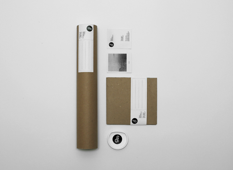


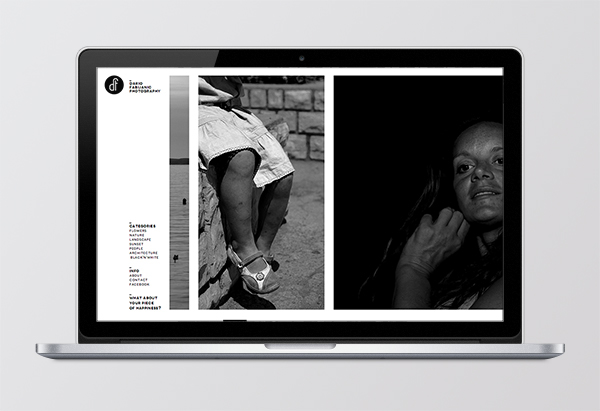
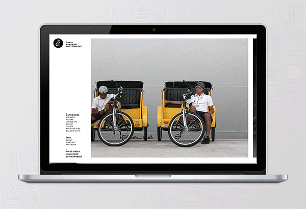


Photo: Stephan Bednaić
Design: Tomislav Fabijanić, Dubravko Tuksar


