


PT
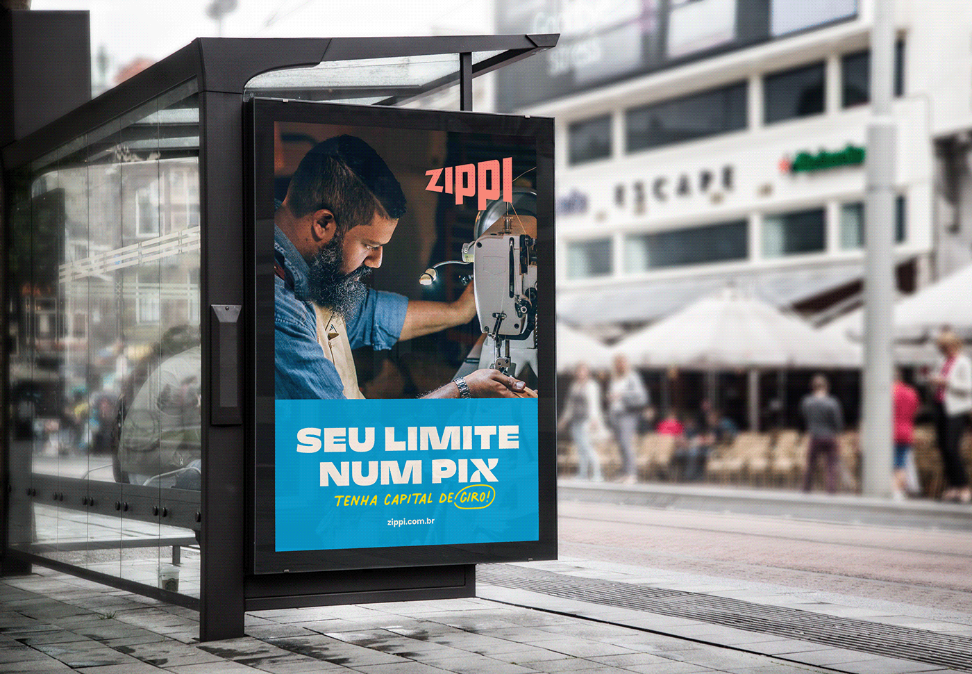
Zippi é o primeiro e único cartão de crédito feito pro autônomo, uma das maiores forças da economia brasileira e um público que até hoje foi ignorado pelos grandes bancos, justamente por não conseguir comprovar renda. Com faturas semanais, pagamento via pix e atendimento por WhatsApp, um dos desafios foi divulgar ao mercado um posicionamento único de uma categoria inédita.
Mais do que isso, depois de pesquisas em profundidade com o público, notamos o quanto eles foram negligenciados pelos grandes bancos e não se identificavam com nenhuma das ofertas existentes. Foi preciso entender como as marcas do segmento financeiro se expressavam em termos de identidade para que fosse criado algo a se distanciar, deixando claro que a nova marca se tratava de um produto diferente. Através de uma imersão no universo cultural do público conseguimos entender os seus anseios e desejos para criar uma identificação com eles. O objetivo era fazê-los sentir-se reconhecidos e parte de um movimento de valorização do autônomo.
O resultado foi um logo que ouve o autônomo, aumenta a sua voz e dá ouvidos ao que ele tem a dizer, transformando palavras em ações. Já o universo multicolorido vai na contramão das marcas monocromáticas do mercado financeiro, deixa claro que se trata de um produto novo e dá espaço pra diversidade e customização. As cores foram baseadas no design vernacular e trazem proximidade e dialogam com referências do dia-a-dia do público. A tipografia em caixa alta nos faz lembrar os lambes de rua e traduz a potência da voz do consumidor, dando destaque para mensagens inspiradas em um jeito mais coloquial de falar: 'vamo pra cima', 'tamo junto', 'hoje é dia'.
EN
Zippi is the first and only credit card made for the self-employed, one of the greatest forces of the Brazilian economy and a public that until today has been ignored by the big banks, precisely because they cannot prove income. With weekly invoices, payment by pix and WhatsApp service, one of the challenges was to promote to the market a unique positioning of an unprecedented category.
More than that, after in-depth research with the public, we noticed how much they were neglected by the big banks and did not identify with any of the existing offerings. It was necessary to understand how the brands of the financial segment expressed themselves in terms of identity in order to create something new that create distance from them, making it clear that the new brand was a different product. Through an immersion in the public's cultural universe, we were able to understand their desires to create an identification with them. The objective was to make them feel recognized and part of a movement to value the self-employed.
The result was a logo that listens to the self-employed, raises their voice and listens to what they have to say, turning words into actions. The multicolored identity, on the other hand, goes against the monochromatic brands in the financial market, making it clear that this is a new product and gives room for diversity and customization. The colors were based on vernacular design and bring proximity and dialogue with the public's daily references. The uppercase typography reminds us of street art and translates the power of the consumer's voice, highlighting the messages that were inspired by the public's own way of speaking, messages that gave names to the cards: 'Let's go up' , 'we are together', 'today is the day'.
Strategy: Laís Chiavone e Andréa Avedissian
Verbal Identity: Andréa Avedissian
Animação do logo: Estúdio Pingo
Client: Zippi (André Bernardes, Bruno Lucas, Ludmilla Pontremolez)
Client: Zippi (André Bernardes, Bruno Lucas, Ludmilla Pontremolez)


@estudioditongo
estudioditongo.com.br
estudioditongo.com.br


