The Story
UPLAKE Residence is a residential complex that defines the exclusive term. It is placed between the edge of the forest and by the lake, in a peaceful and quite place surrounded by nature. The complex is formed of 47 apartments, 3 boutique apartments and 8 villas each with their own pool.
The housings are also eco-friendly, good for the environment, they have solar panels, floor heath and ceiling coolers for best confort and charging stations for electric cars. You can say that UPLAKE Residence meets the latest trends.
All these properties were thought and projected to meet the highest standards of quality, comfort and modern design.


The Branding
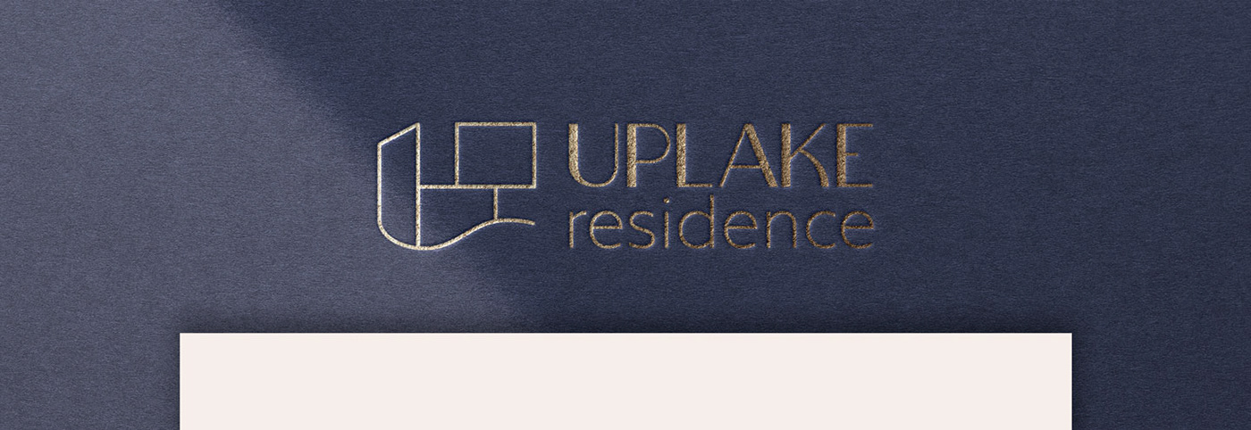
UPLAKE Residence branding was created in collaboration with Adacity agency. They needed a logo for the name and a brand book. As it is obvious anyway, the name is composed by the words 'UP' and 'lake' meaning that the residential houses are up by the lake.
The font for the UPLAKE name is bespoke + the name 'residence' is Natom Pro font I used.
The symbol easily represents the architecture of the villas in this complex: the upper part is a bit out of the place, creating this zig-zag effect on them. The wave under the symbol belongs to the lake and adds a bit of flow to the hard edged design.


UPLAKE Residence
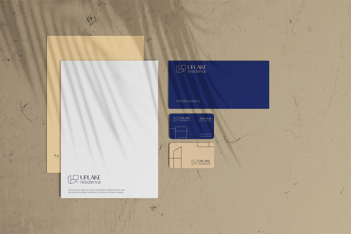
Logo design/ brand identity/ visual identity/ stationery
Collaboration with Adacity
Date: July-August 2022
