


Vibrating and dreaming since 2010
we created a magical campaign in which we remember that love is everywhere!
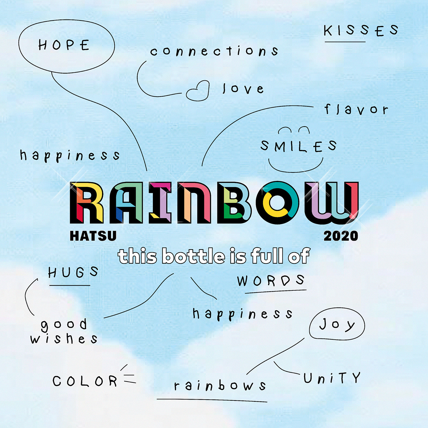
This campaign is a special edition for pride month. We gave a new meaning to the rainbow fading away the borders between colors. We believe love has no limits, therefore, has no labels. This is why each HATSU TEA has a magical rainbow and a unique word that can define love. There are hundreds of them.
Concept, photography, and graphic development.
This project is focused on illustrations, photography & graphic content creation for our brand communication.
CREDITS
STUDIO HATSU DESIGN LAB (@hatsu_official)
Copywriting, HATSU Photography, Illustration, Packaging, and Design created by
HATSU Creative Directors:
Julian Mesa (@Julianmesave), Felipe Vélez Vélez (@felipevelezve) and
© All rights reserved


