Kendra Ferri is a psychologist and lecturer that helps her clients by connecting to their needs, understanding their anguish and guiding them to find the courage to embrace who they are and the liberty to change and develop as a human being.
The client requested that the brand reflected her own personality, transiting between extroverted and welcoming, and to avoid too much seriousness.
The new identity helps Kendra to engage further with her audience and transmit authentically all the atmosphere around her method and work.
Credits:
Design Strategy: Bruno Moreni & Luiza Eberhardt
Photography: Luiza Eberhardt
Retouch: Luiza Eberhardt
Motion: Mateus Foca Iamarino
Photography: Luiza Eberhardt
Retouch: Luiza Eberhardt
Motion: Mateus Foca Iamarino
Design: Bruno Moreni
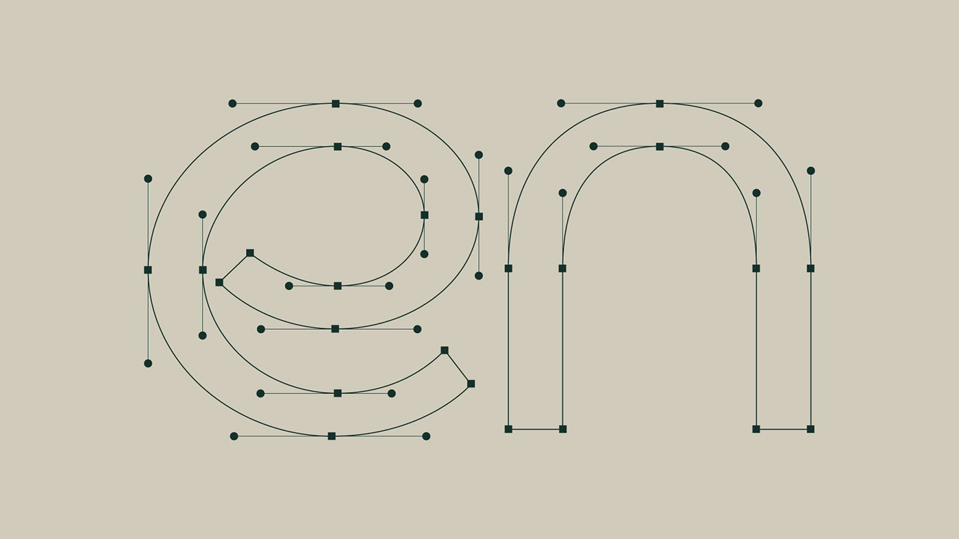
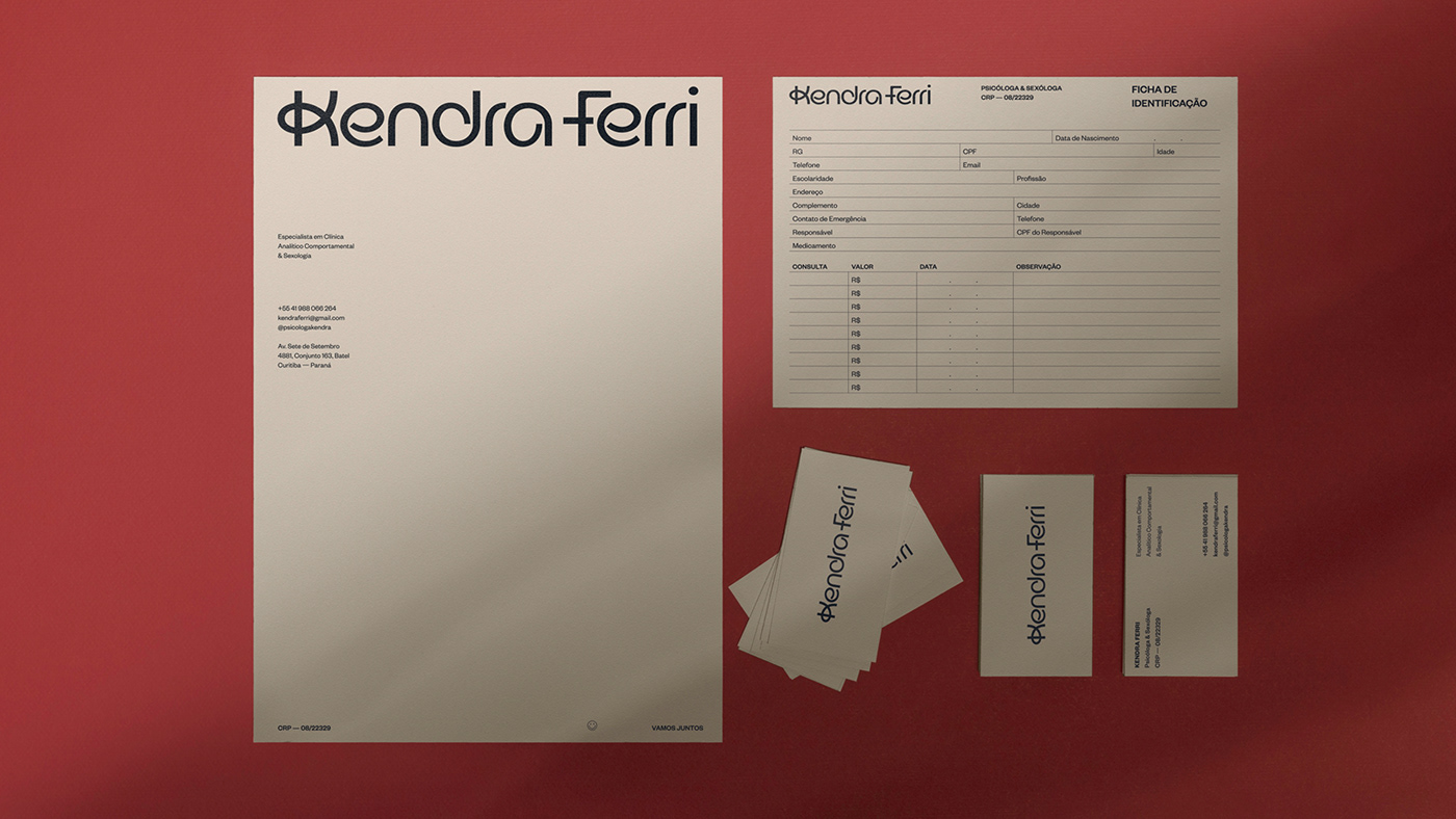
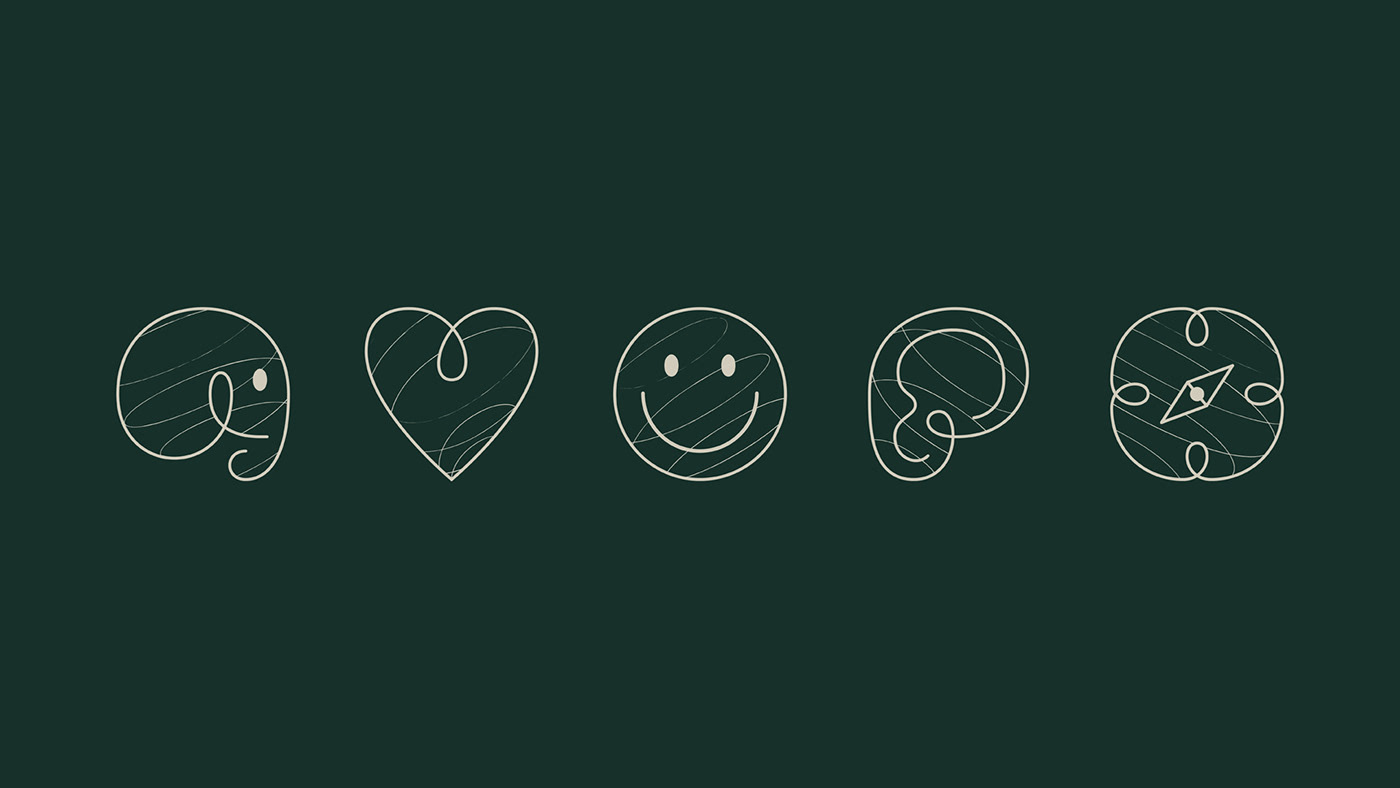
The custom logotype was created with the idea of flexibility, one of the client’s values and strategies to transition between her occupation areas.

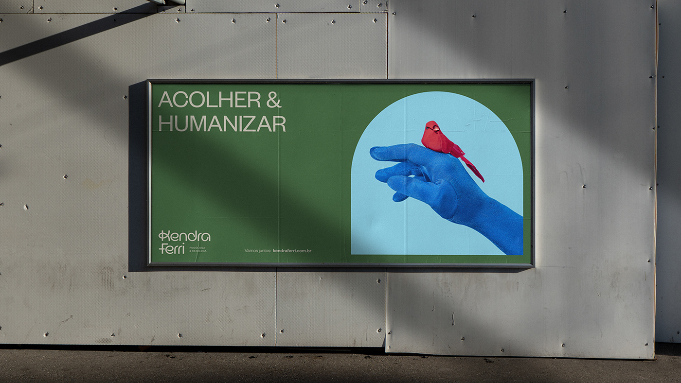
Based on Kendra’s values and ideas one of her main inspirations is the artist Frida Kahlo, so all the colors of the brand were inspired by Frida’s own meaning for each one of them, taken from the book “The Diary of Frida Kahlo: An Intimate Self-Portrait”. The figure of Frida is something so symbolic in Kendra's universe that it is possible to find a painting with the artist’s face highlighted on the wall of Kendra’s office, where she attends to her clients. Although Frida Kahlo has no direct relationship with psychology, her values are consistent with the way Kendra works with her clients. It can be in the form of self-acceptance, empowerment, strength, resilience, freedom, independence, as well as ideas inspired by feminism and discussions about gender roles.


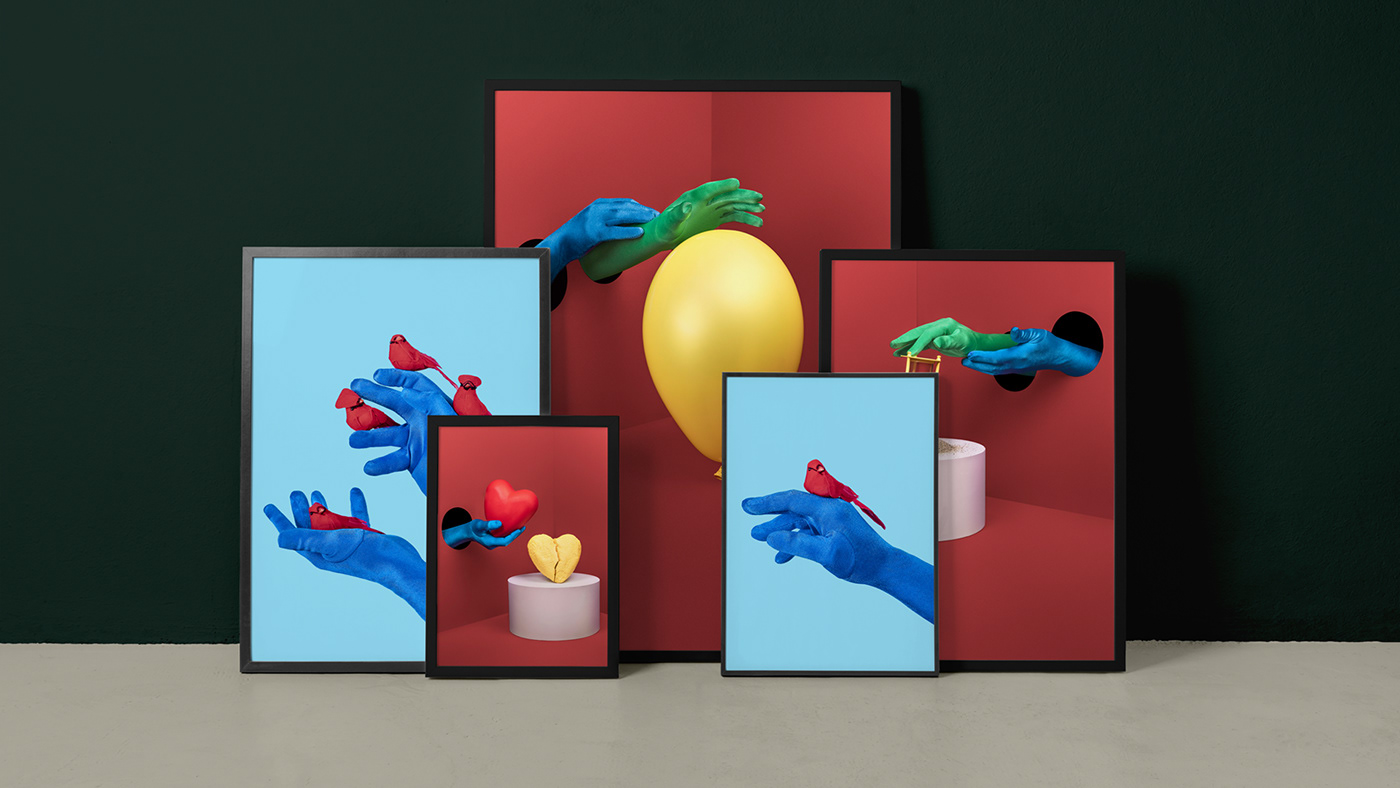
The visuals manifest the idea of helpfulness and shelter but also playful and light.


The name of her previous brand was “Meu Elefante Branco” (My White Elephant) which referred to the saying “elephant in the room” but in the process we decided with her to use her own name as the brand to reflect even more who she is but to keep the ideia of the elephant in the visuals as a symbol.


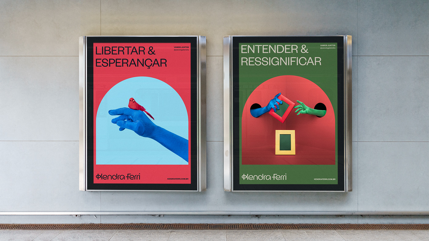


The idea of the photographs also came from the Indian parable “Blind Men and an Elephant”, in which we used Kendra’s hand (blue color) as being the one guiding the client (green color) through some mental health issues such as depression, anxiety, freedom, etc.