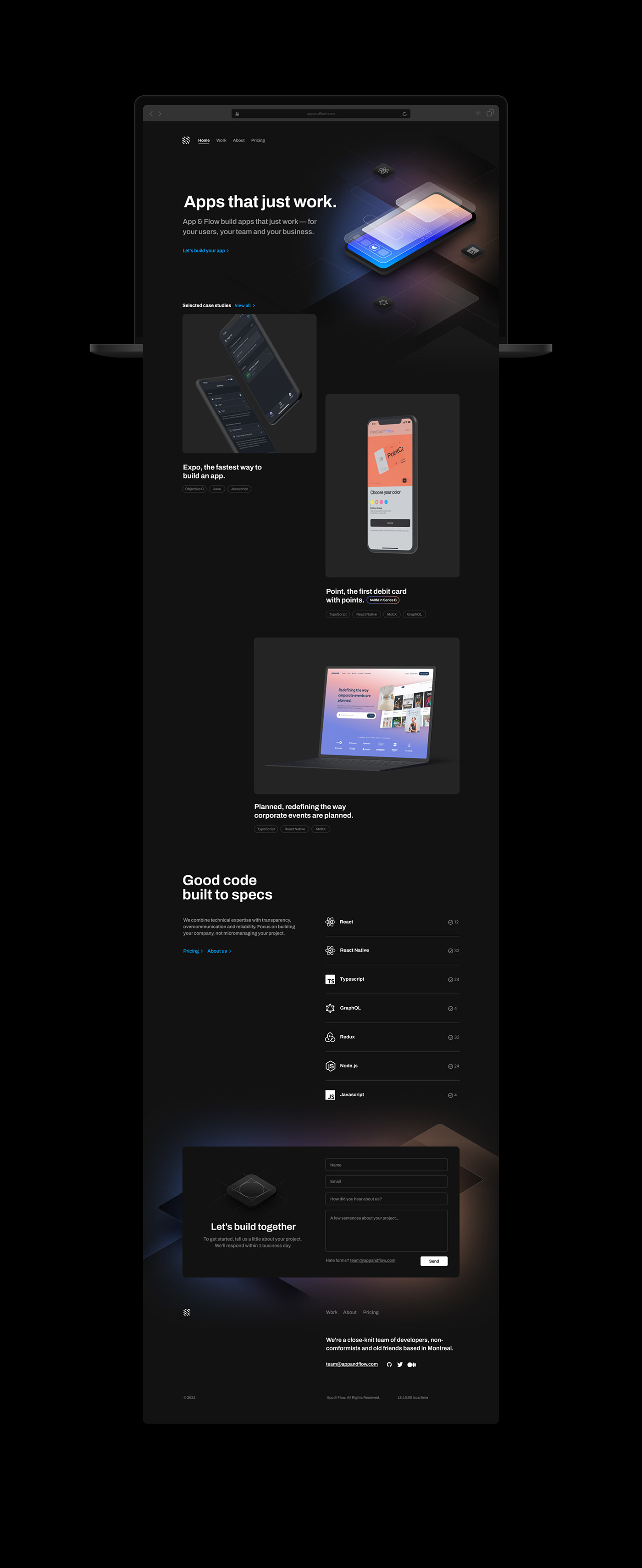
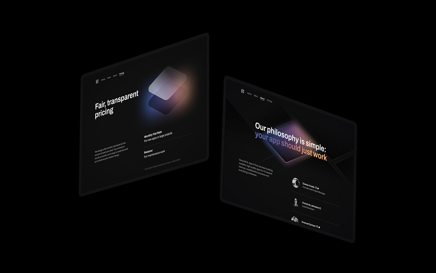
App&flow website redesign – I got the chance to be able to tweak the visual identity and come up with a new illustration style to refine the whole look and feel of the website. I started by establishing a short style guide that includes the new colors, font and use of the logo and flexed it to the various web needs. Then suggested a couple artifacts that could tie the visual identity to the business and ultimately the web experience. The isometric tiles are used in many instances to create a visually consistent theme and accommodate the few different contexts of the page (pricing/about/contact). Overall the website is fairly simple. 2 columns max – Responsive design – Dark theme