


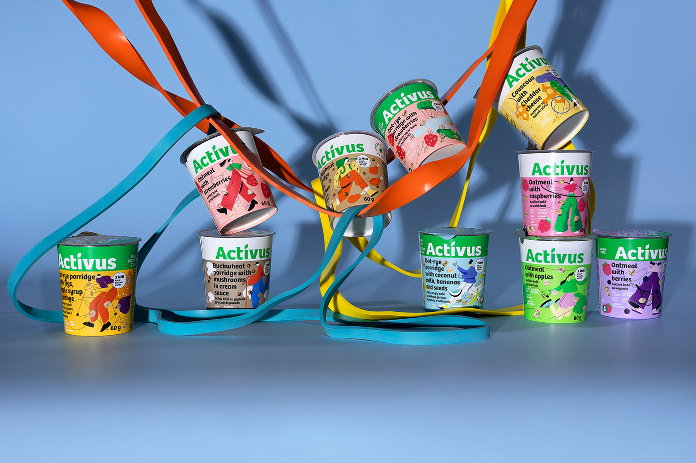
SITUATION
Healthy lifestyle, active lifestyle, fast life — you name it. Although these buzzwords mean positive and dynamic things, the Baltic store shelves are still dominated by boring designs with photos of porridge bowls and ingredients.
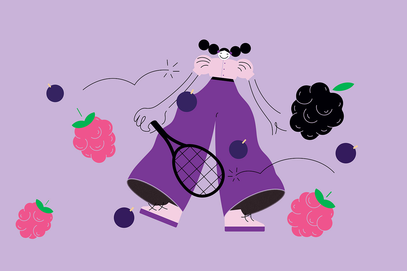
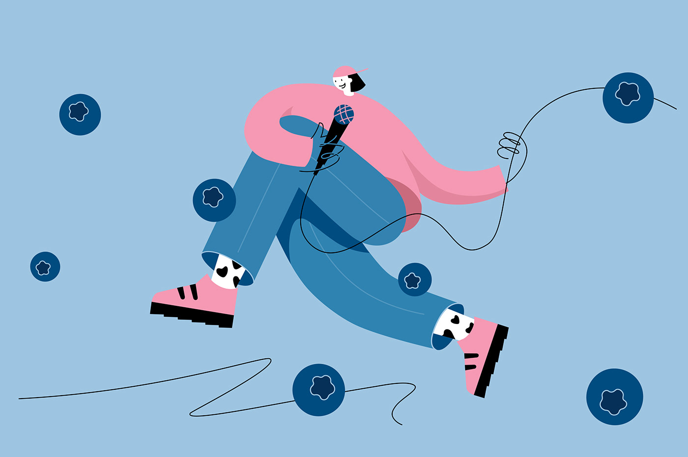
After analysing the situation and bringing out all the strategic insights we won’t mention here, we stated that healthy ≠ boring. So we decided to bring fun to every breakfast or quick lunch pack.
SOLUTION
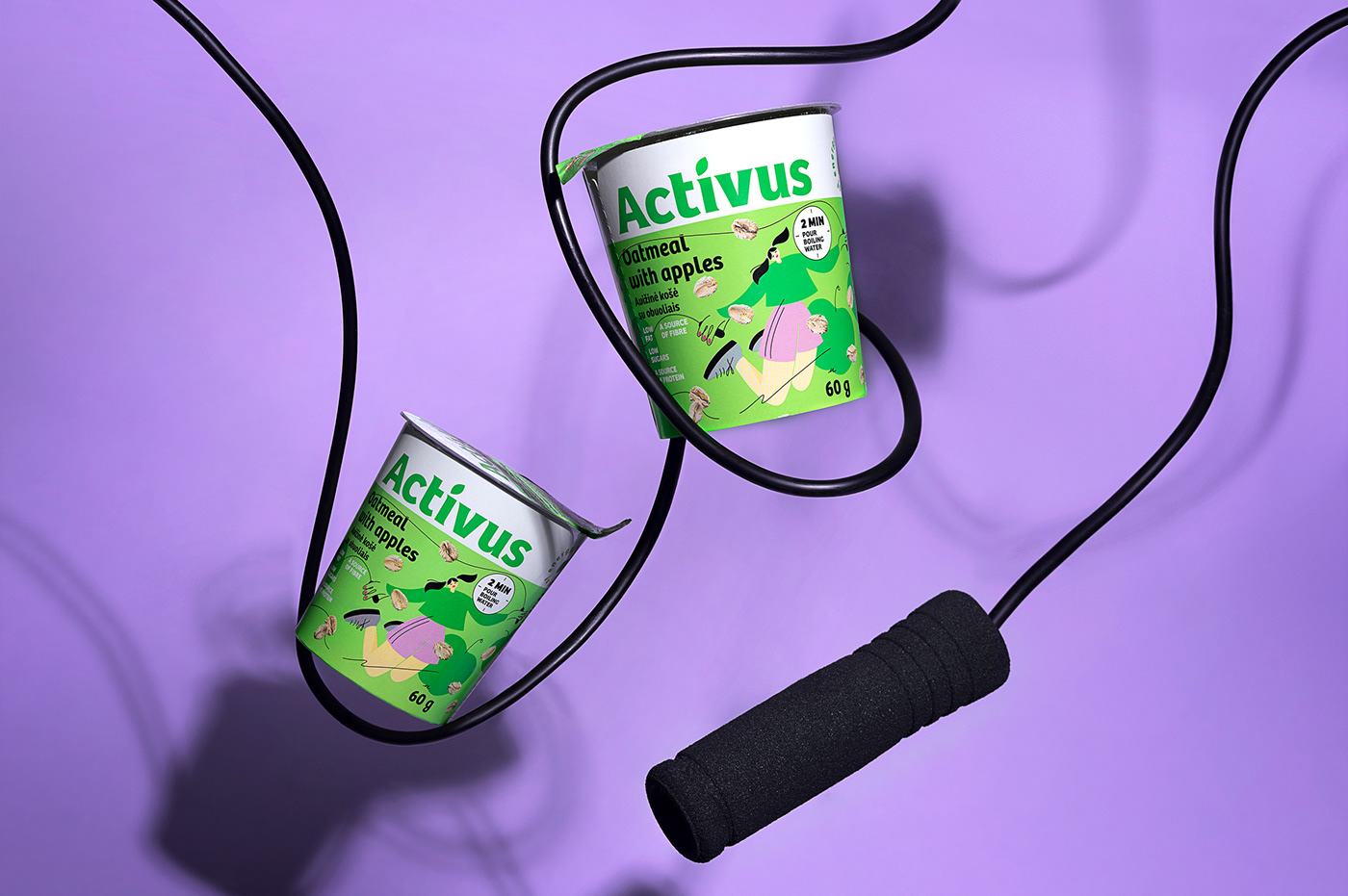
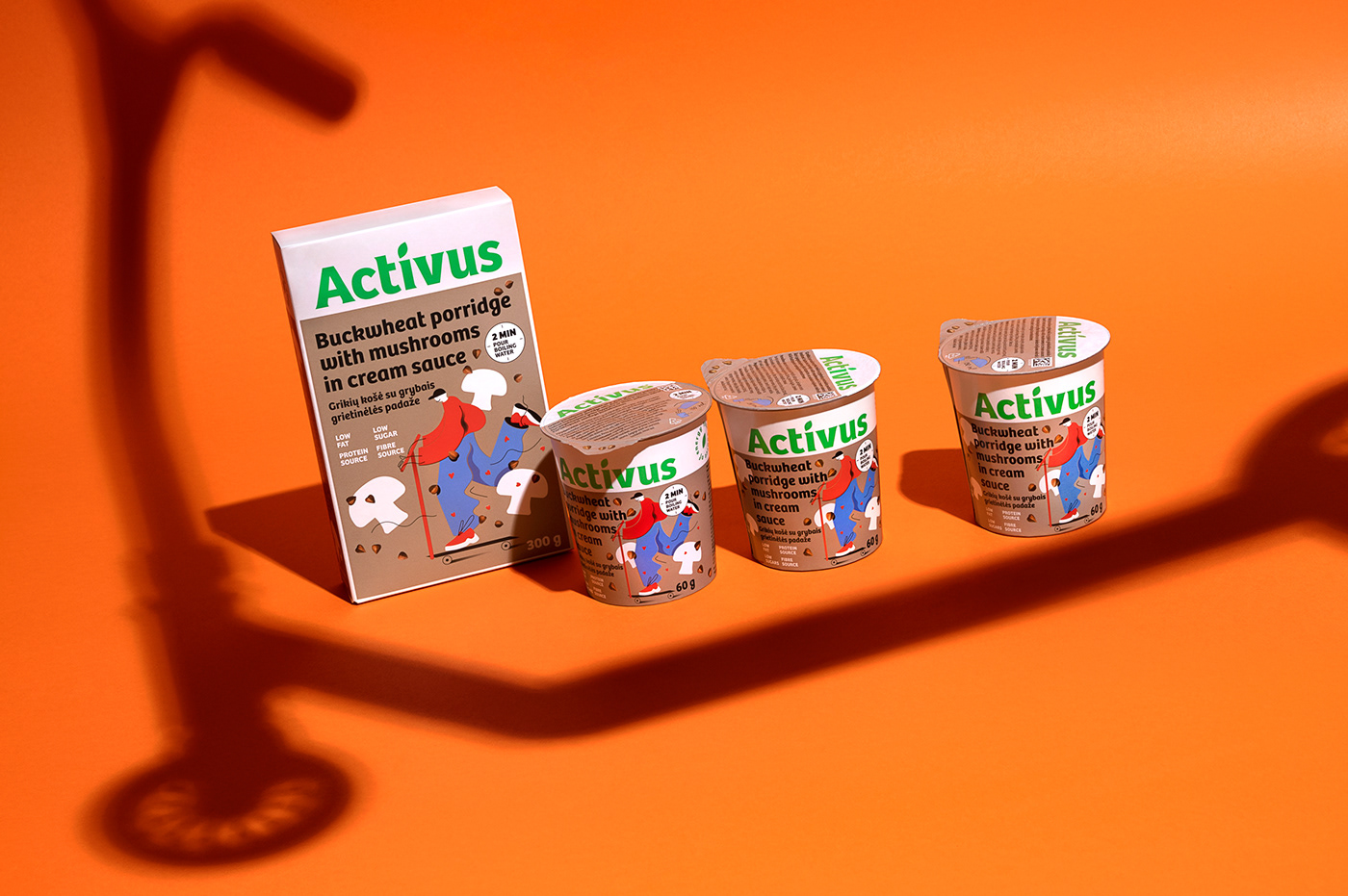
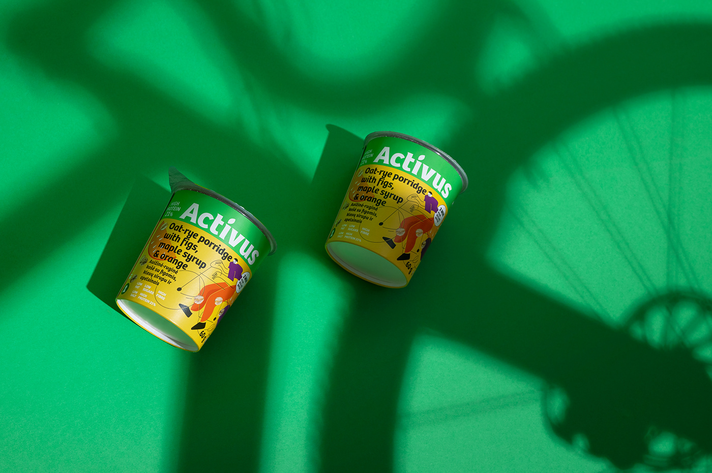
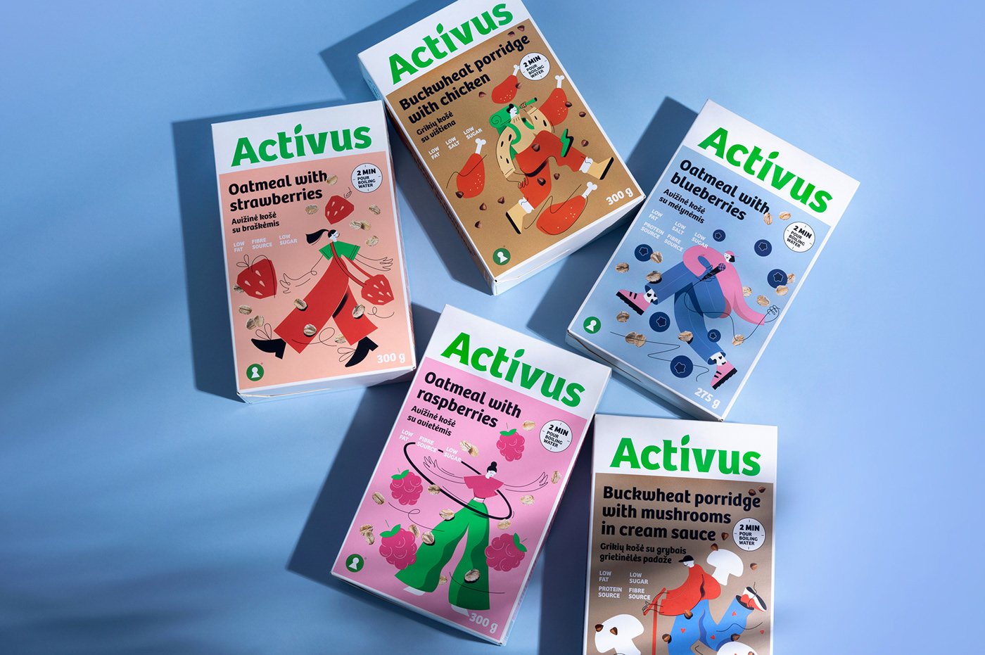
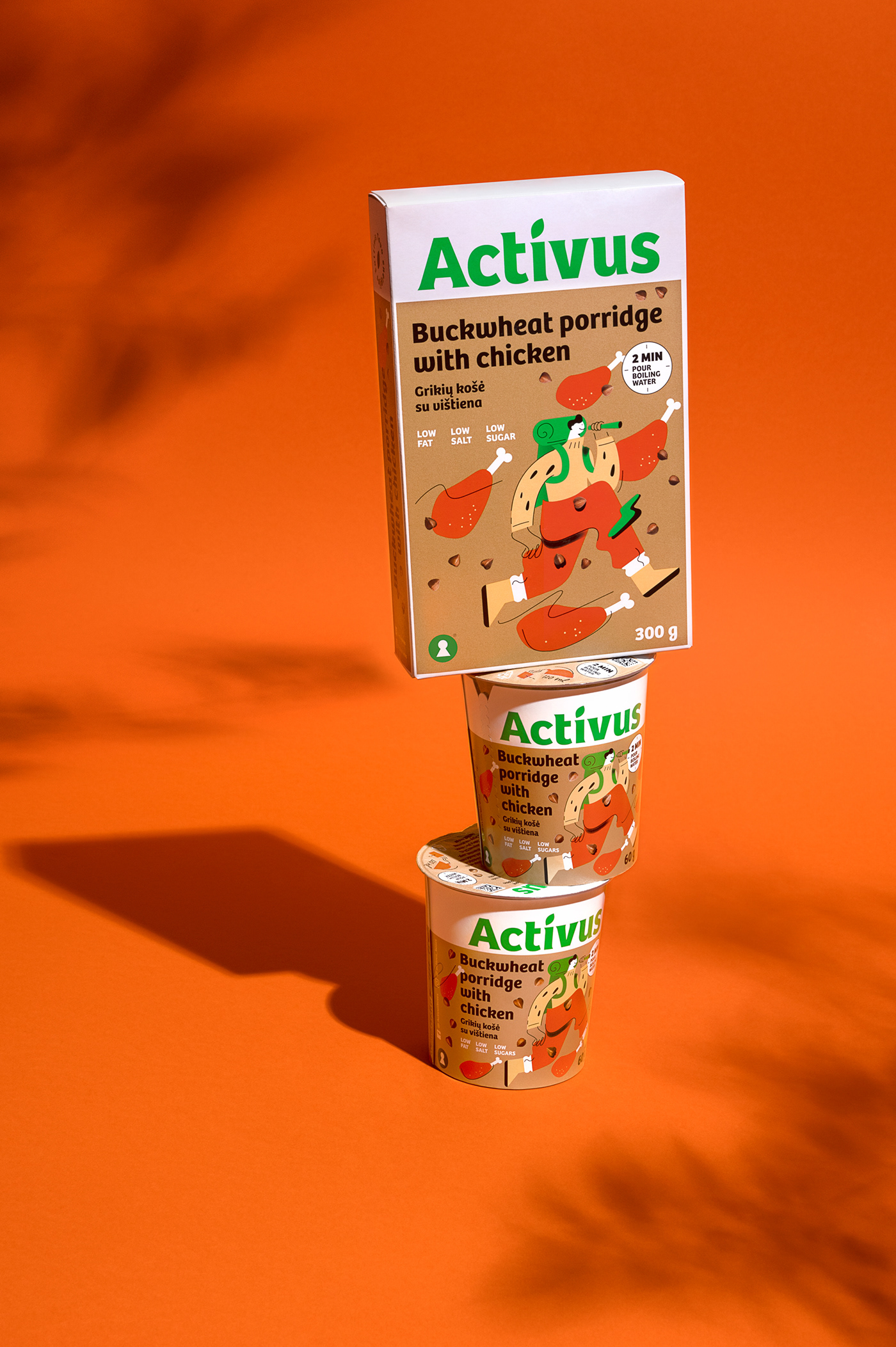
When you have a brand name like Activus, you don’t need to look around for design inspiration. We’ve strategically divided the packaging into two parts. A sizeable logo and colour blocking ensure 360° brand visibility on shelves, while the lower part works to differentiate products through names, illustrations and colours.
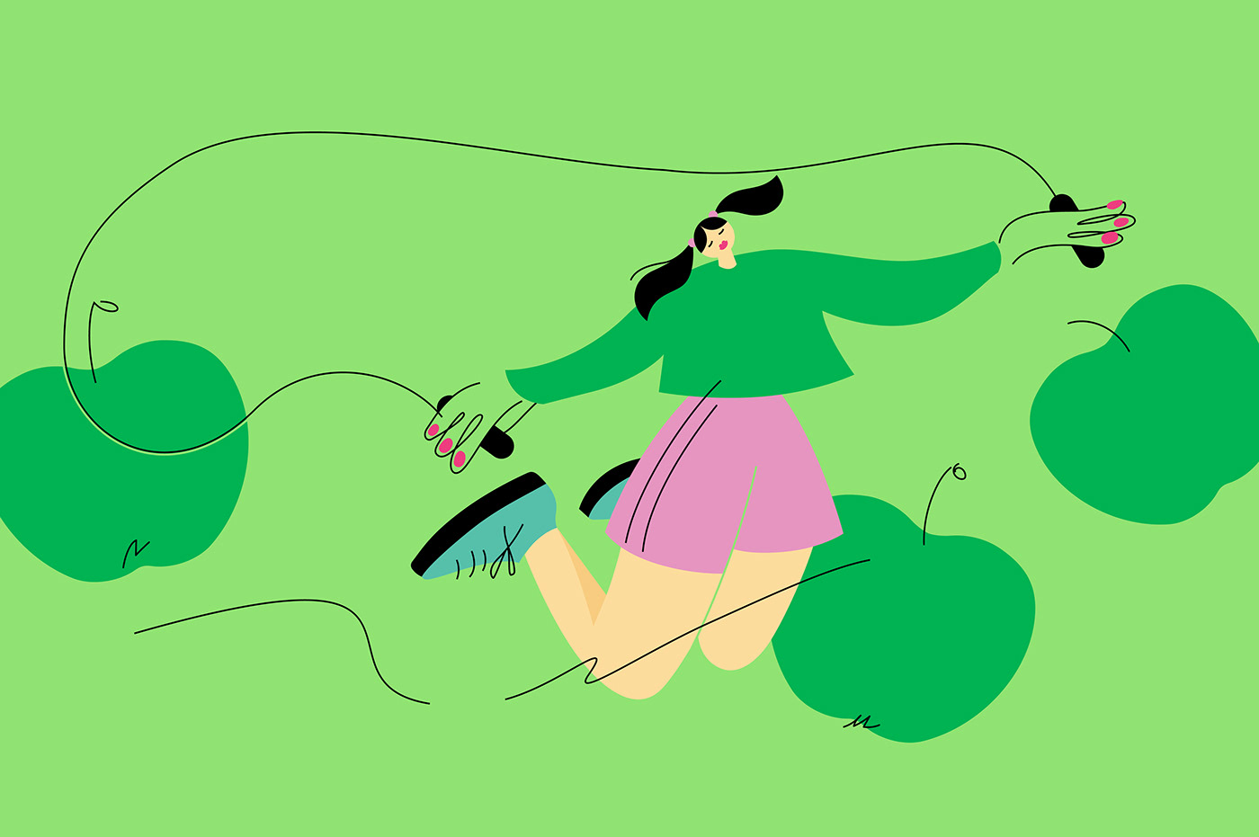
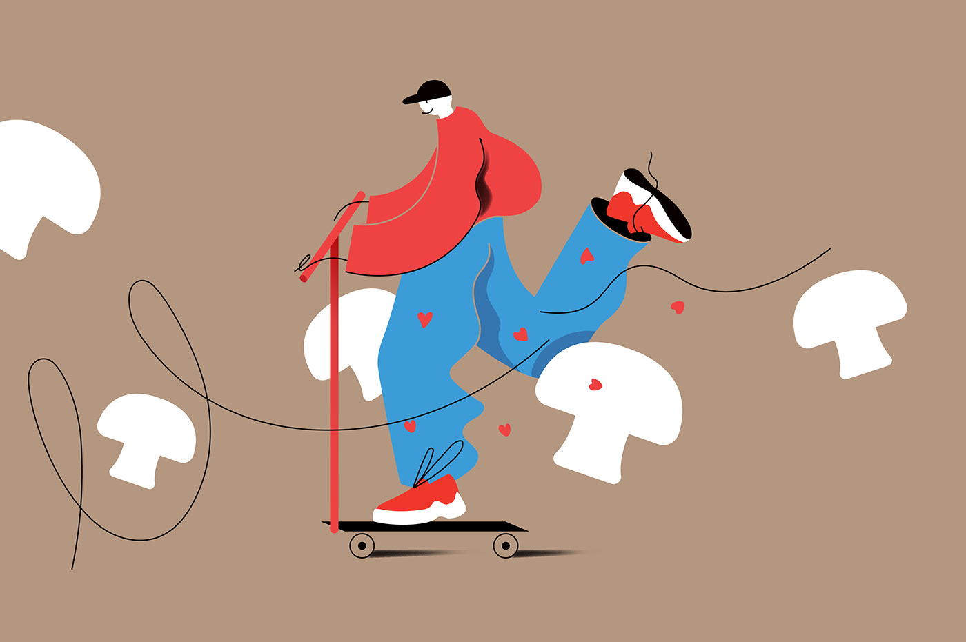
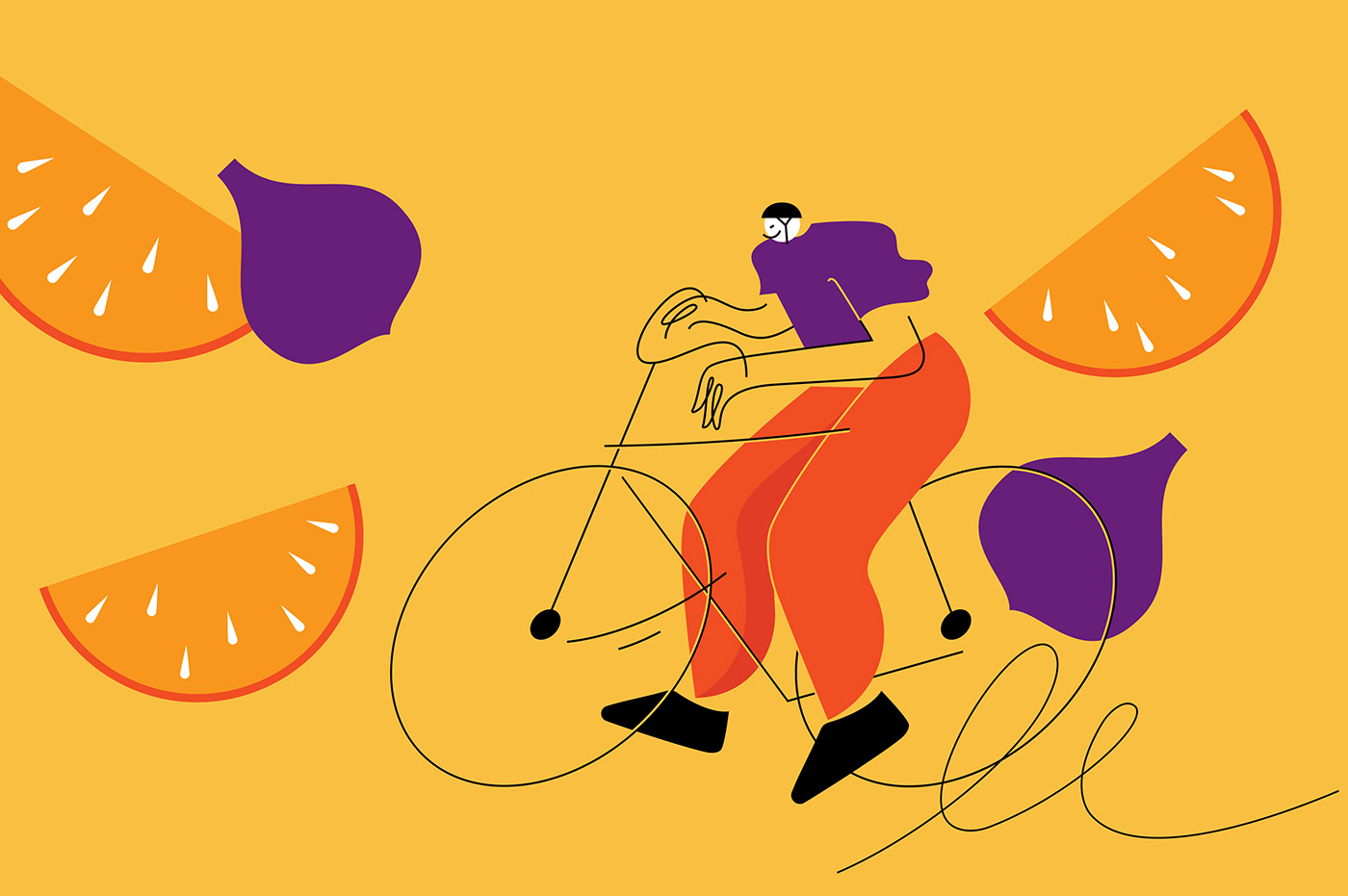
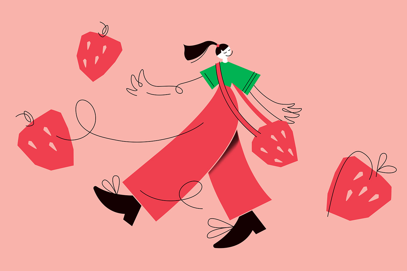
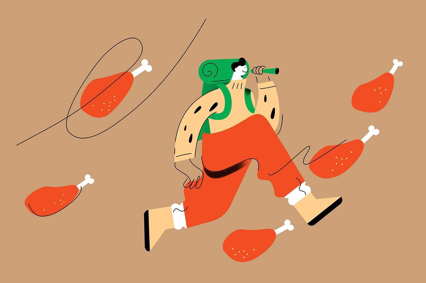
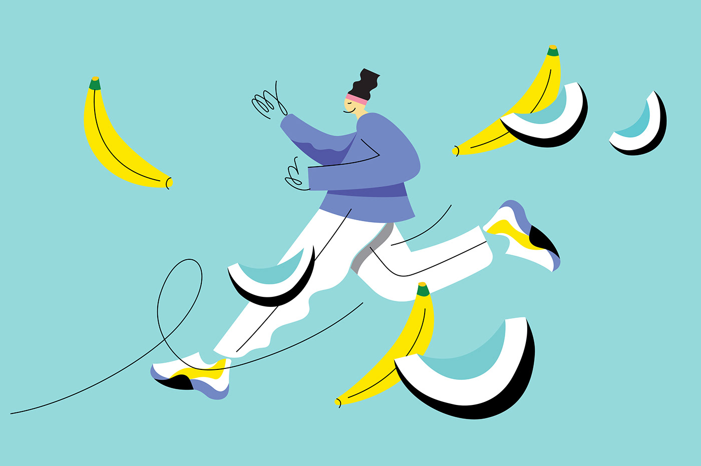
The unique exaggerated proportion illustrations reveal a variety of activities that buyers can identify with. And it’s not only sports but also other ways of spending time actively.


Agency: étiquette
Design strategy: Valerija Žilėnienė
Design: Aliona Bobin
Account management: Anton Slepov
Design strategy: Valerija Žilėnienė
Design: Aliona Bobin
Account management: Anton Slepov
Product photoshoot: Irmantas Savulionis


