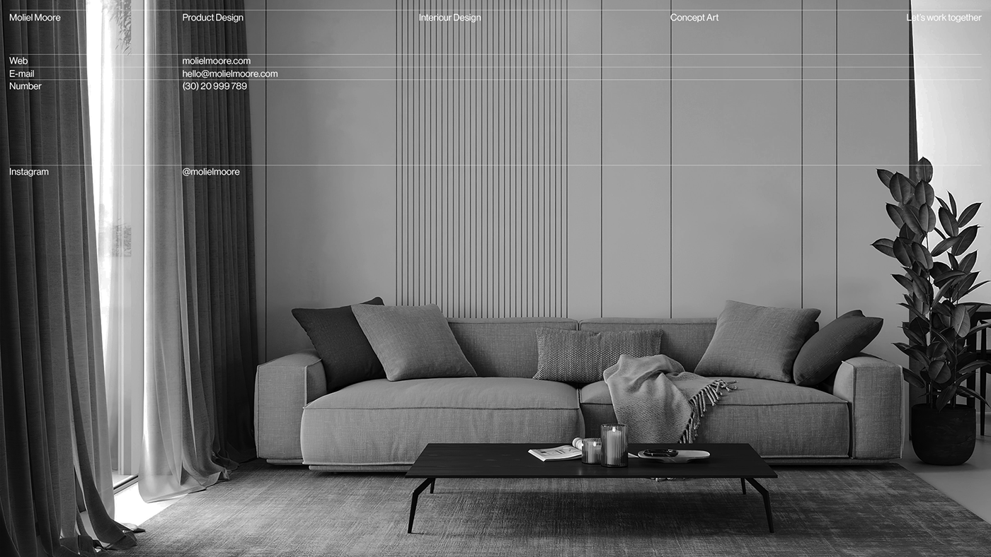
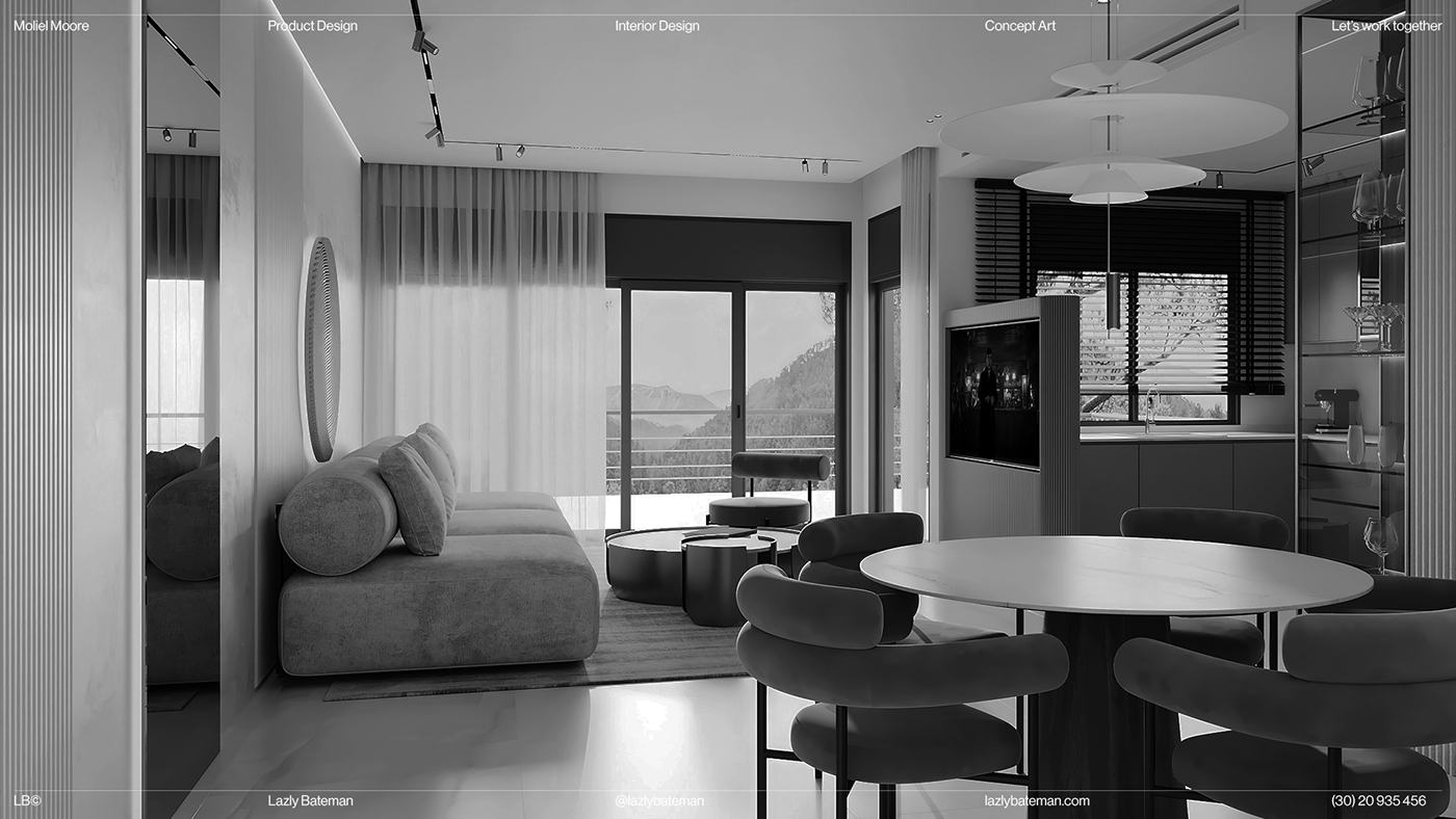
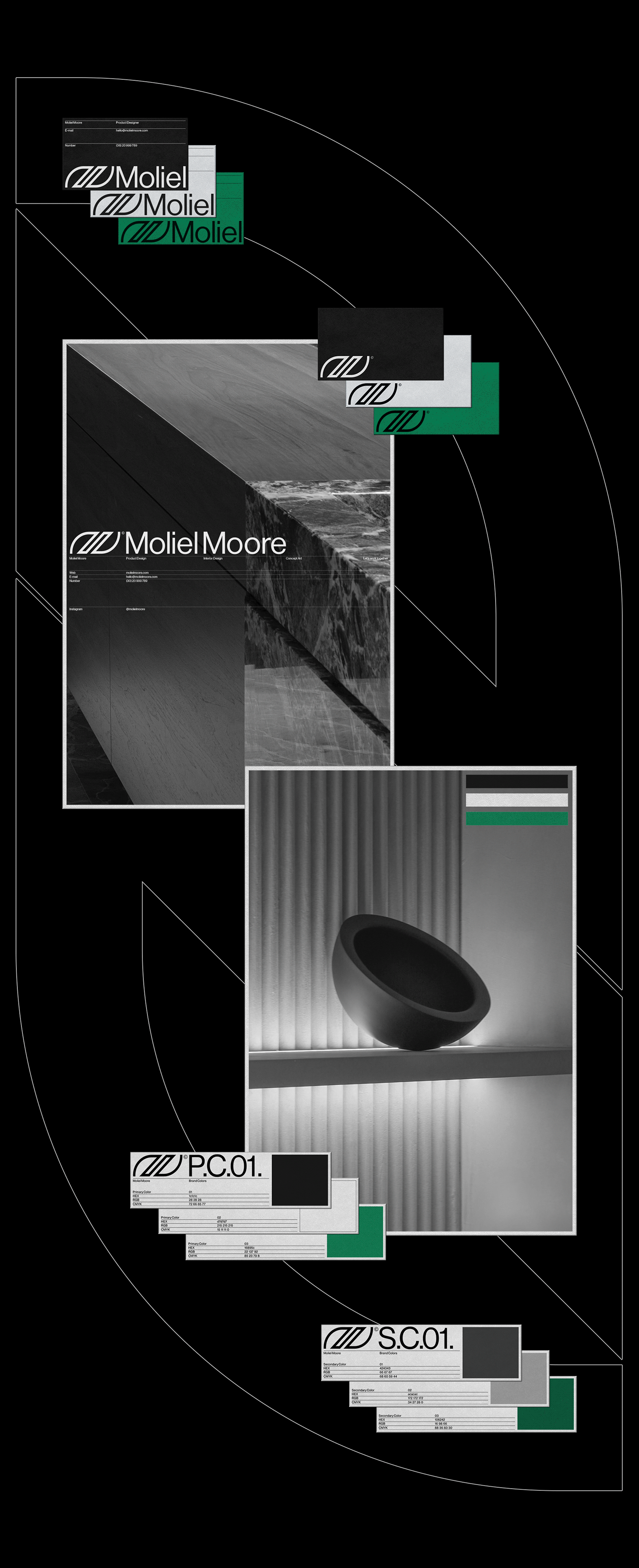
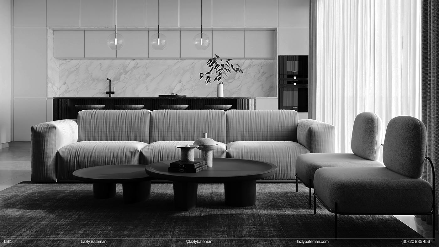
The concept is based on a synergy of elegant typography and minimalist product and interior design, resulting is a flexible and consistant look in the style of Swiss typography.
I was very impressed by Jens Muller's book Logo Modernism, which collects around 6000 trademarks, focused on the period 1940-1980, to examine how Modernist attitudes and imperatives gave birth to corporate identity.
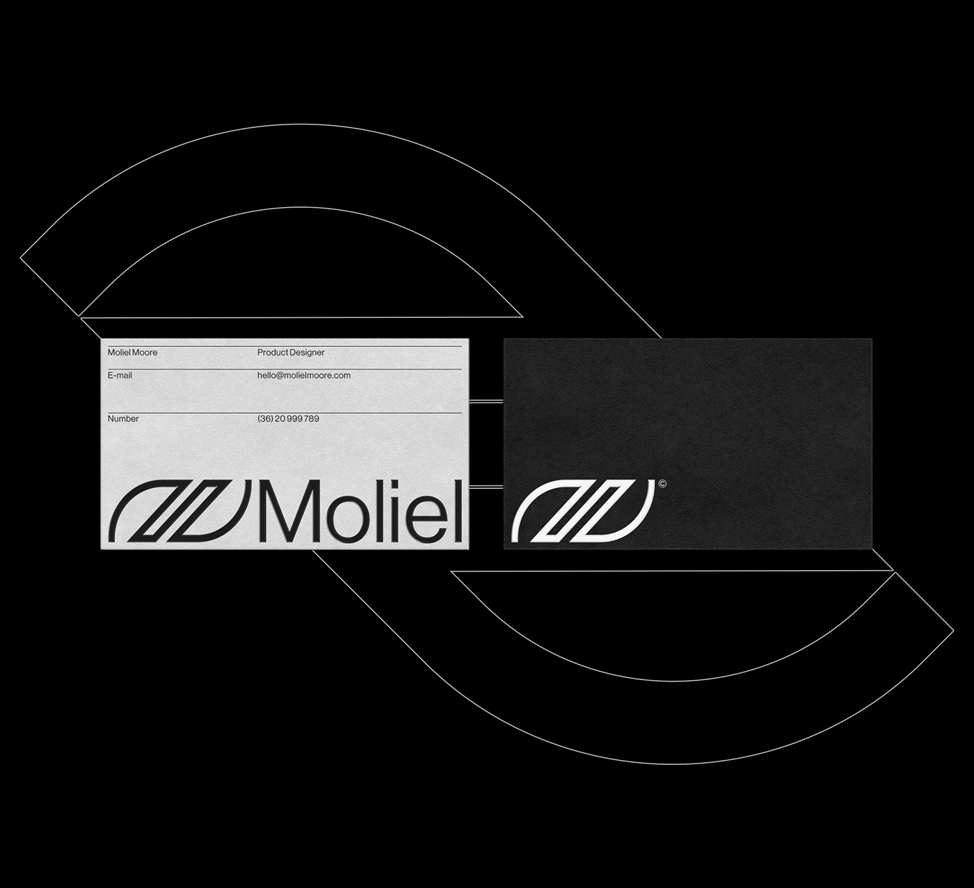
The symbol is curve based, you can adjust the
stroke weight for responsive usage.
BRAND FONT
NEUE HAAS GROTESK
ART DIRECTOR
LAZLY BATEMAN
PRODUCT DESIGNER
MOLIEL MOORE