THE BRIEF
Develop and rebrand an antiquated, boring product, place, or service. Rejuvinate, reinvent and reposition the brand.
THE CONCEPT
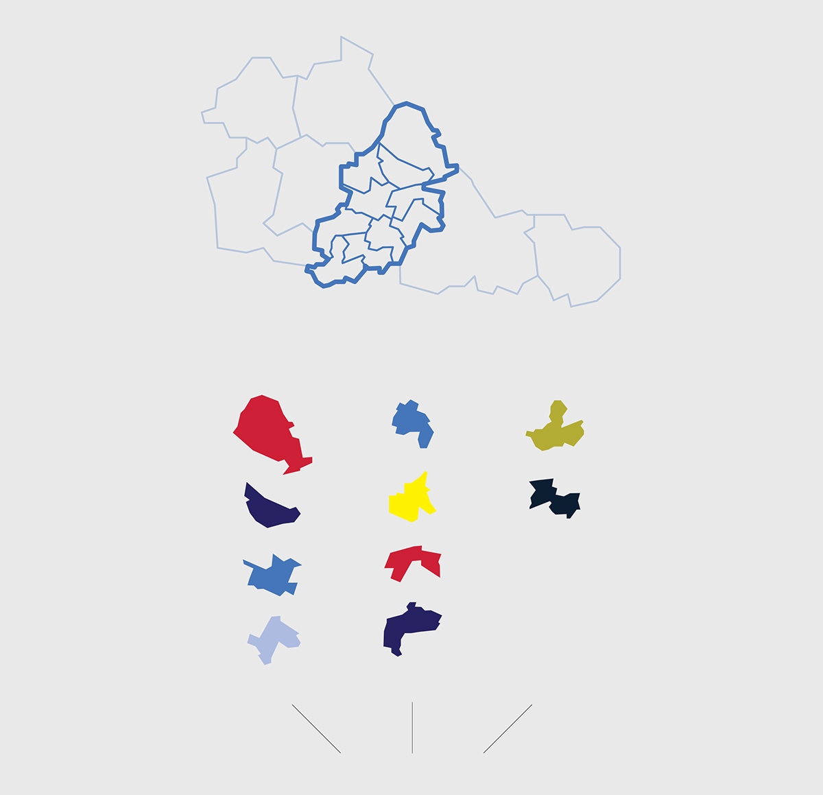
Birmingham is the UKs second largest city, and should have a 21st century identity to match. Government should be inviting and friendly, not intimidating or boring.
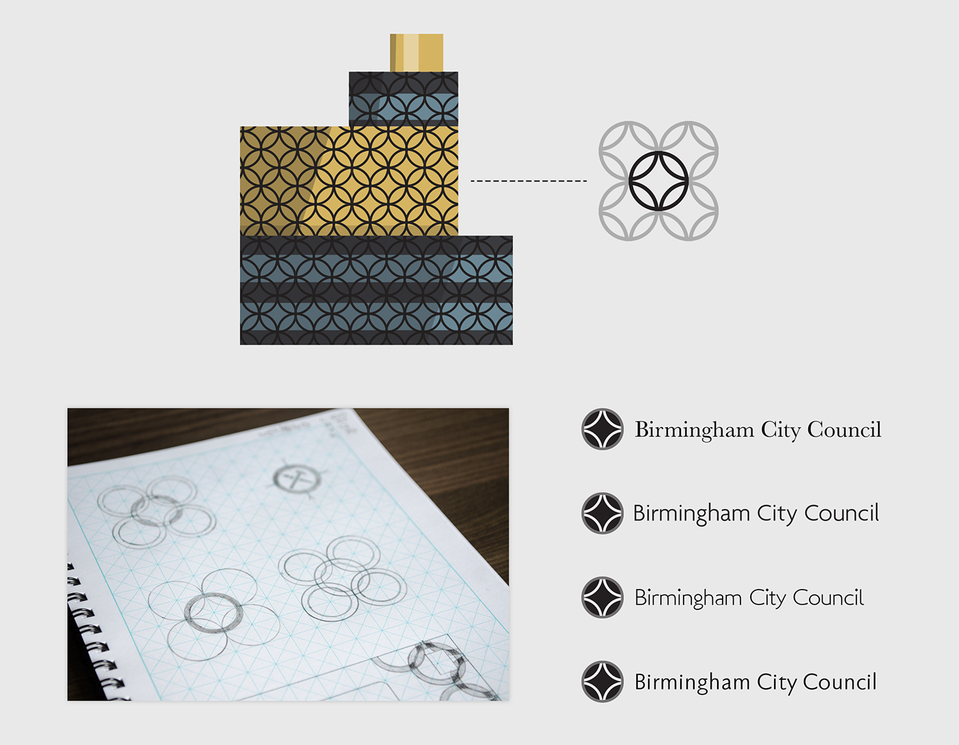
The big city plan has birthed some of the most iconic architecture in the country; repeating patterns are common throughout, and the interlocking circles on the side of the Library of Birmingham (a flagship of regeneration) were of great inspiration.

_________________________________________________________________________________________
WEB
There is a consistent flow of content across screen sizes and plenty of white space is used to express simplicity.


_________________________________________________________________________________________
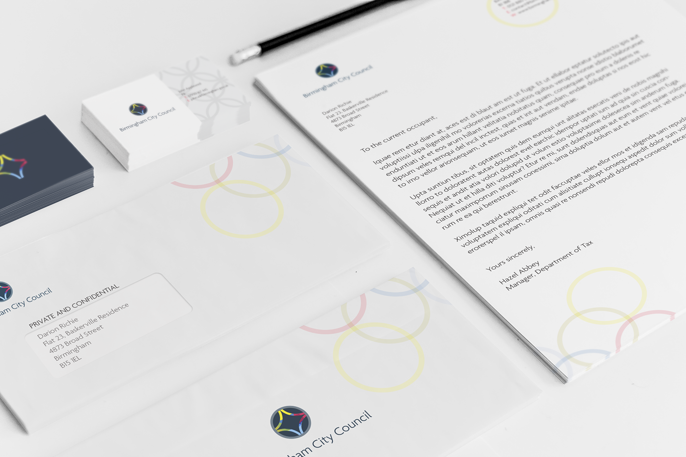
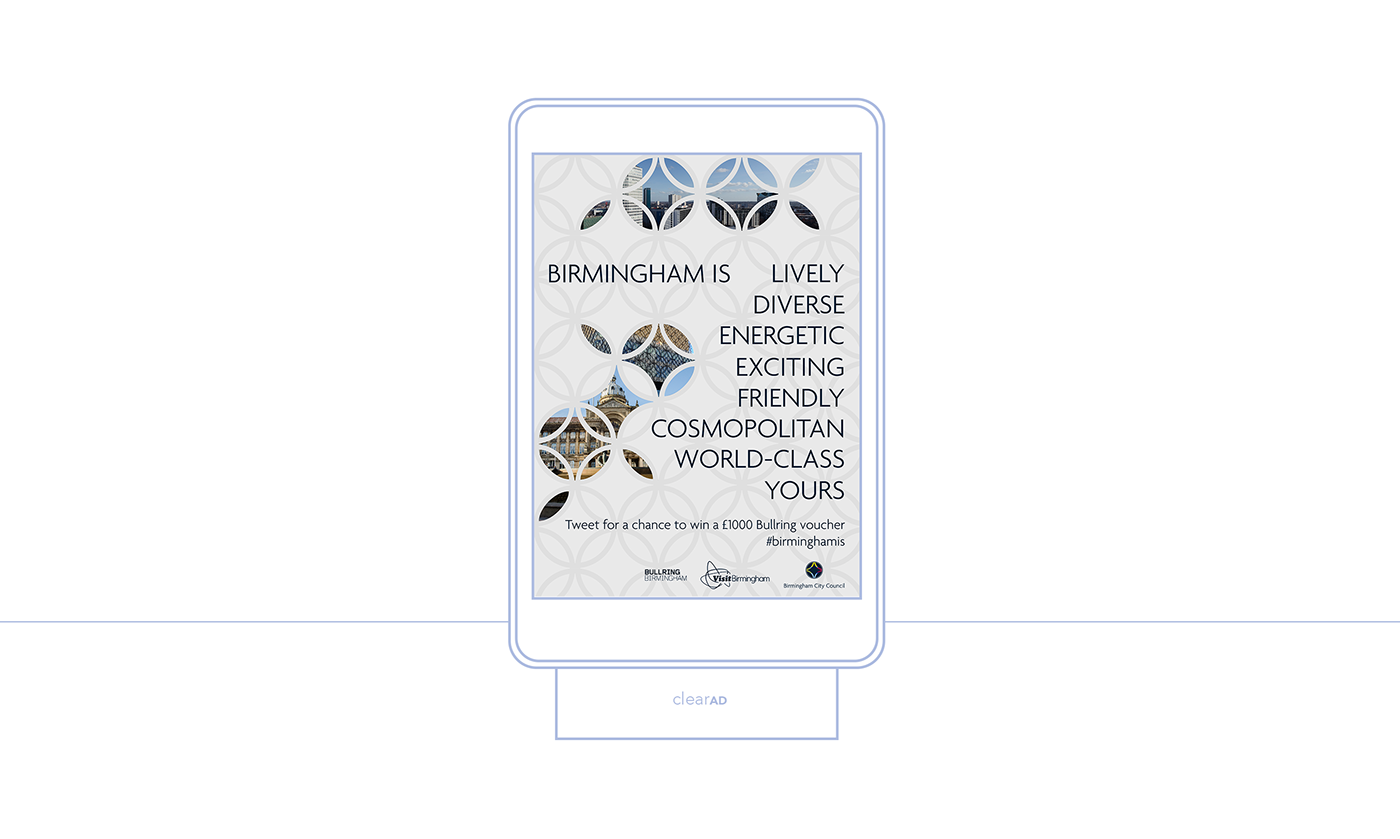
PRINT
Print materials are simple and friendly, making government seem less intimidating.
Print materials are simple and friendly, making government seem less intimidating.