

DEERLY SUPPLY / brand identity
objectives:
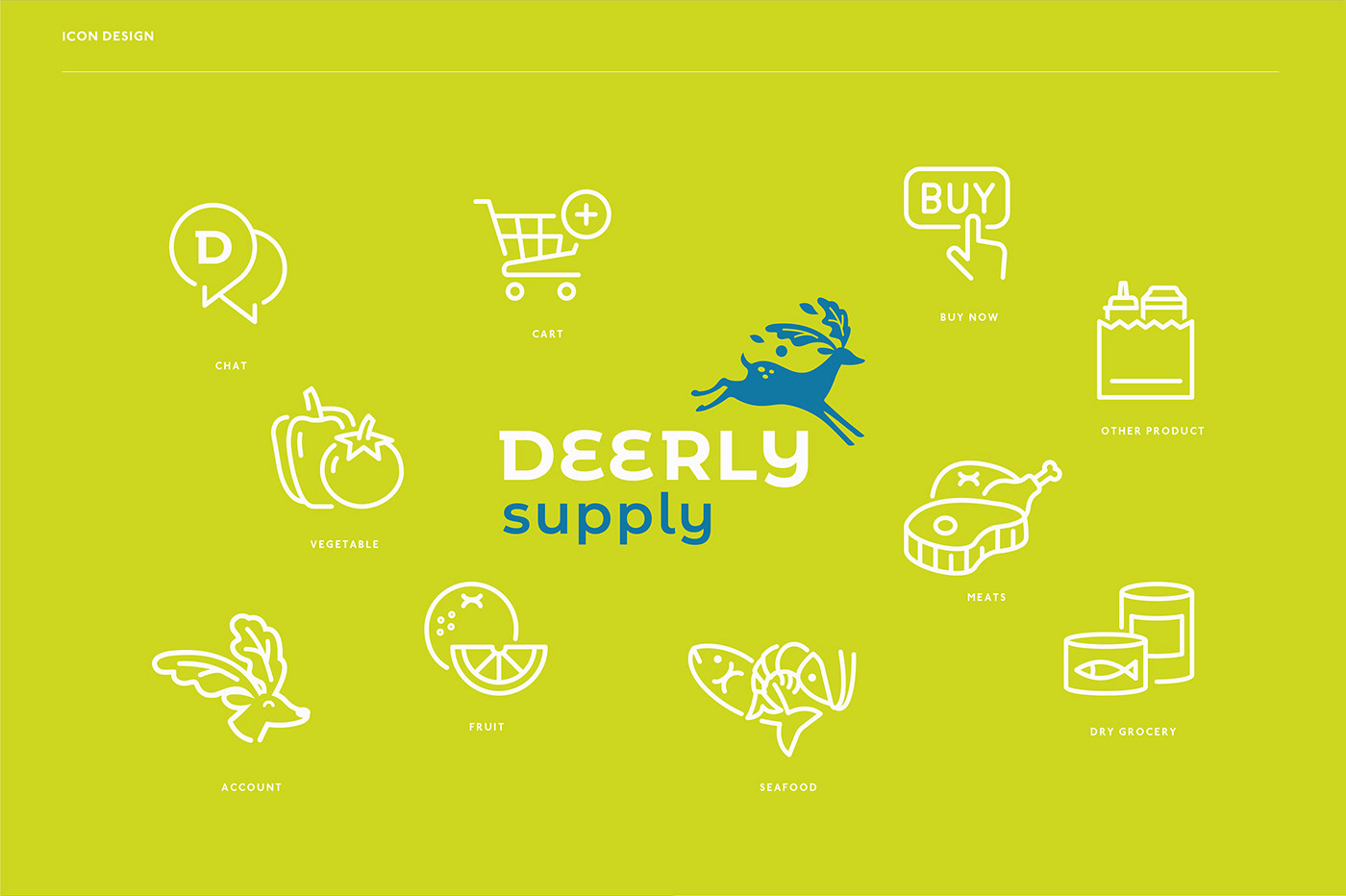
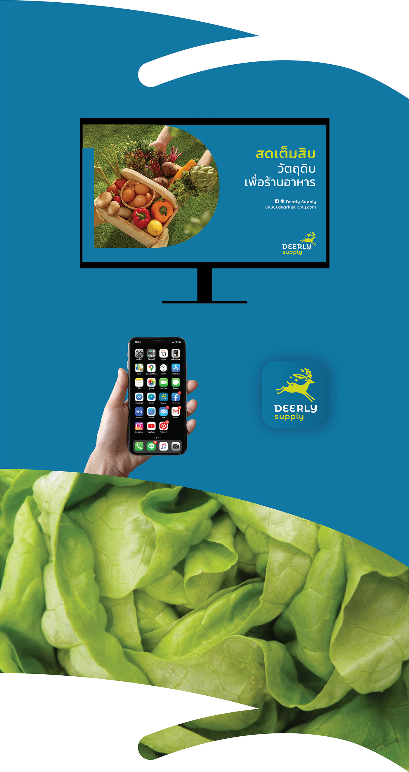
In an era where online businesses are booming, many novel forms of businesses arise and Deerly Supply is one of them. Deerly Supply delivers raw materials for cooking to customers, in the form of Food Service E-commerce. The primary targets of Deerly Supply are start-ups and SMEs, as the company aims to facilitate business operations. For this project, we designed a platform delivery as an alternative channel for customers to purchase necessary raw materials for their production. This platform will also reduce the cost of SMEs by eliminating the need to physically travel to the stores, thus saving customers many costs they must incur when they leave their homes, such as car fare, travel expenses, parking fees, gas fees, etc. This service will also save customers the time and hassle of looking for companions to help with shopping, as well as of processing raw materials, where merely several grams of several kilograms of raw materials may be left after they have been cut, chopped, and washed and after the removal of any defective materials.
logo design:
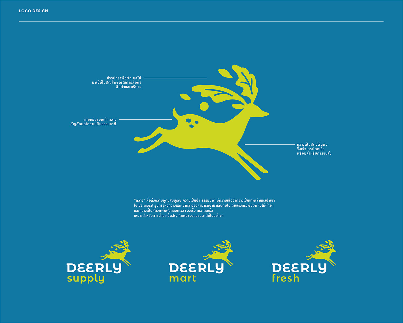
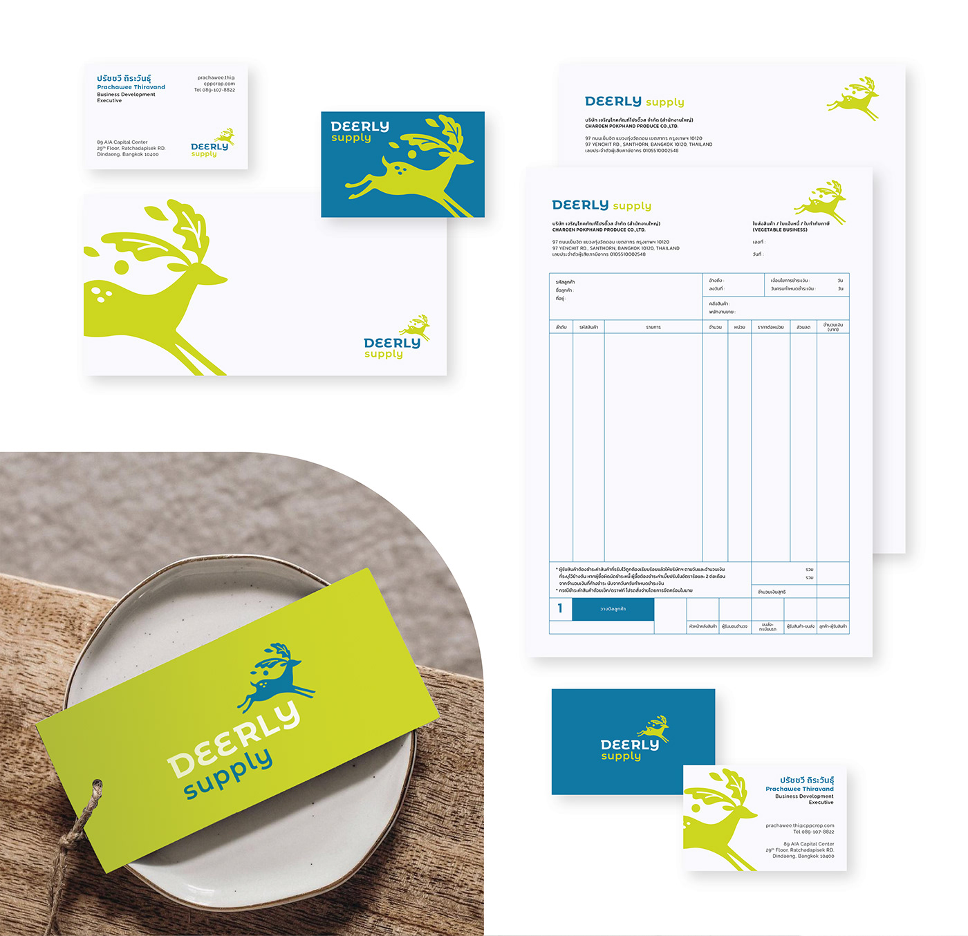
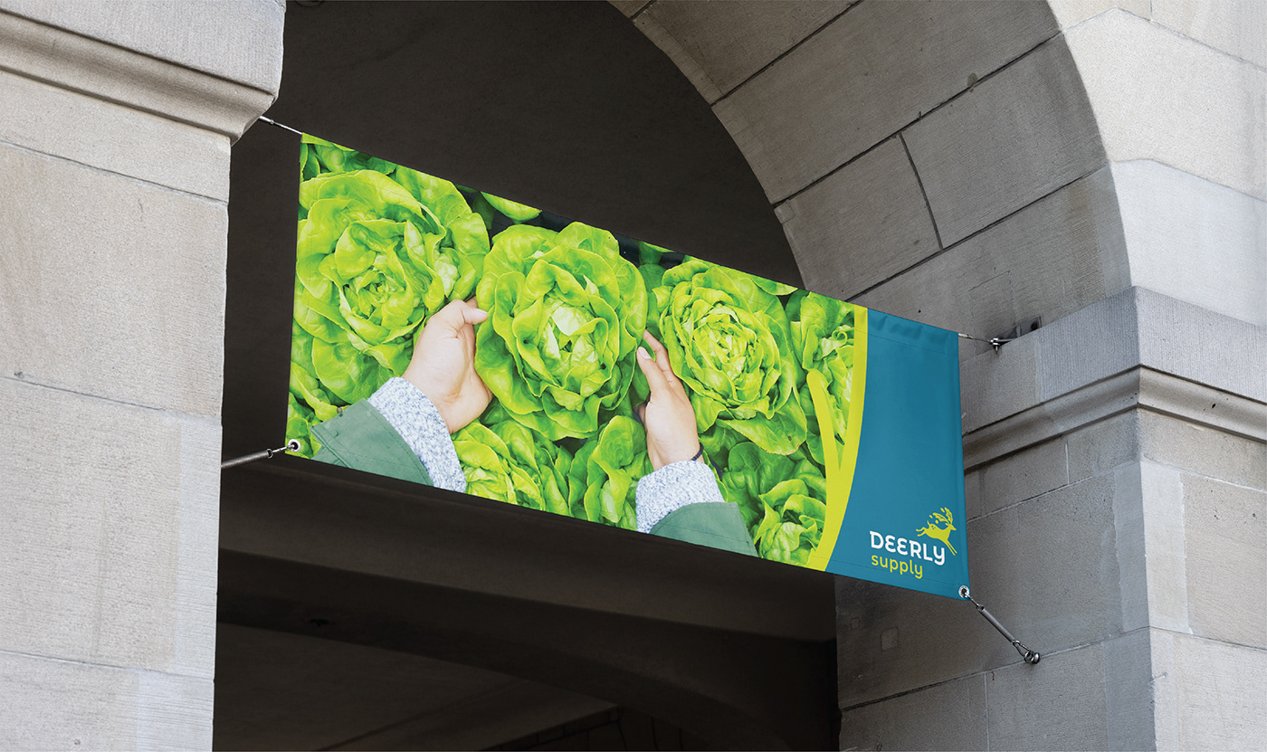
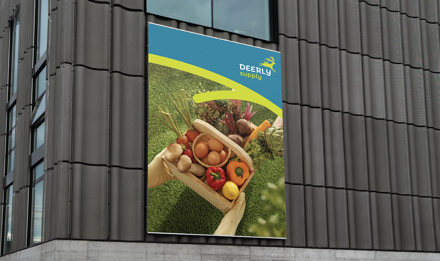
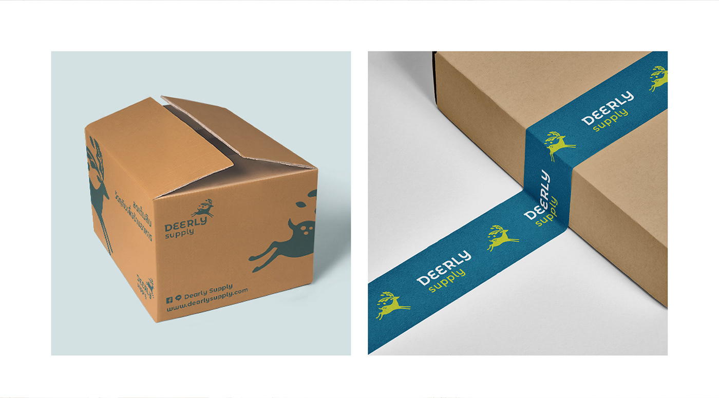
According to the concept of the business model, we want the logo of this brand to be easily recognizable and thus we use a deer in the logo. The deer symbolizes plentifulness and naturalness. We designed its antlers as vegetables and fruits to symbolize the delivery service. Moreover, as an animal, deer are always alert and they run and jump really fast as well.
brand color:
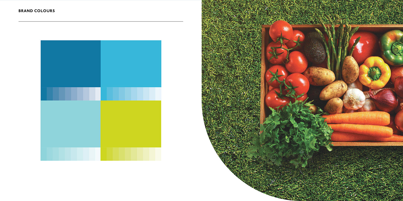
For this brand, we chose turquoise green and neon lemon green as the main color pair, in order to create new awareness when customers see the logo on online media. This pair of smoothly contrasting colors is also visually attractive and it also conveys the feeling of friendliness.


AGENCY :
Andon Design Daily Co.,Ltd.
CREDIT :
Design Director by Pongtorn Wachirapoka
Designer by Yuwarat Surattanasathitkul
Copyright © Andon Design Daily Co.,Ltd. All Rights Reserved.


