Ma Veda
The Brand
Ma Veda is a homegrown brand that brings the best of nutrition and nostalgia together through one of the most enjoyed desserts in the country.
In an ecosphere obsessed with health and well-being, Ma Veda brings a refreshing yet familiar angle of a mother's love in a self-care equation. With its products, Ma Veda has aimed to manifest a mother's care, wisdom and eye for detail and dissolved it into a concoction of various nutritious and delicious elements that ultimately turn into their products.
The Ask
Armed with information, empathy and vision, our clients approached us to build their brand from the scratch.
The Approach
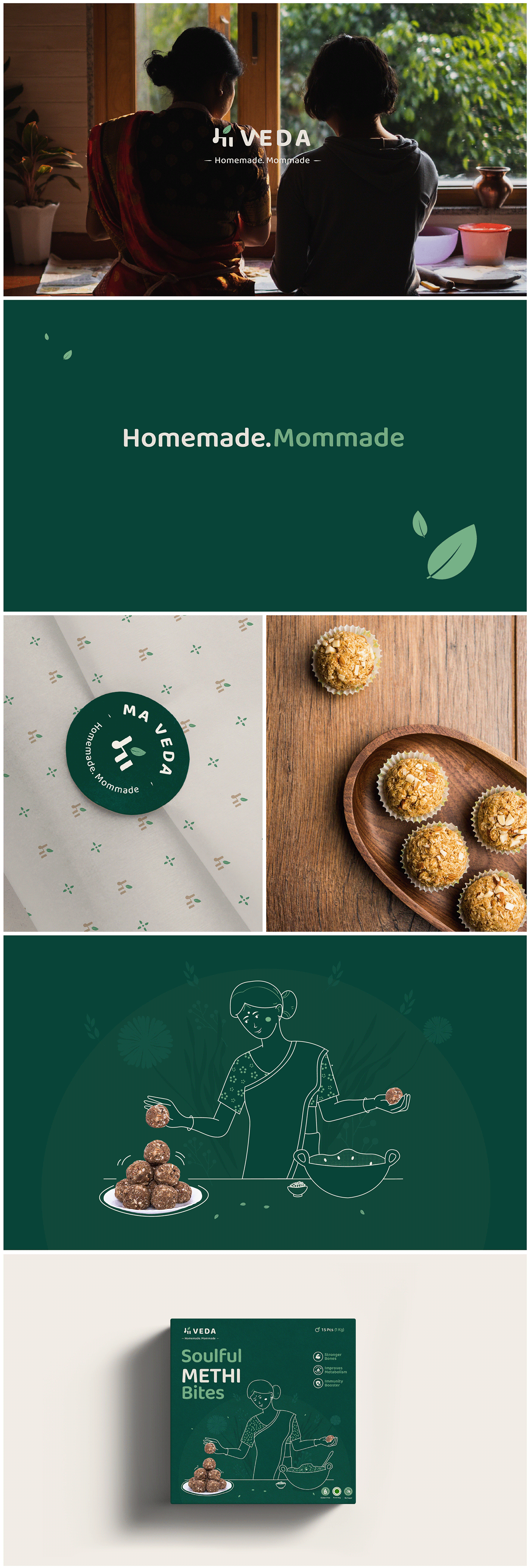
After rigorous market research, we moved forward to branding and conceptualisation. As the first step of branding, we had to come up with a name and after much brainstorming and studying the brand, we settled on 'Ma Veda'.
This name was easy to spell and even easier to say and came from the word “ma” meaning “mother” and “veda” which means “knowledge or wisdom”. Besides that, it also represented the key USPs of the brand which were tradition, well-being and a mother's care.
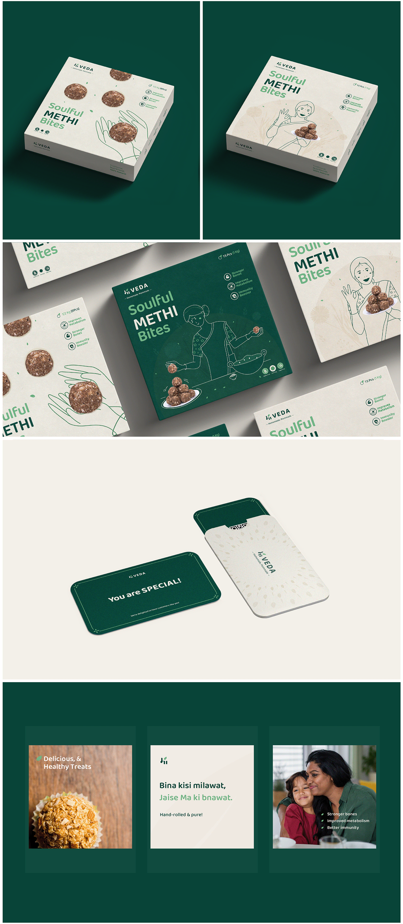
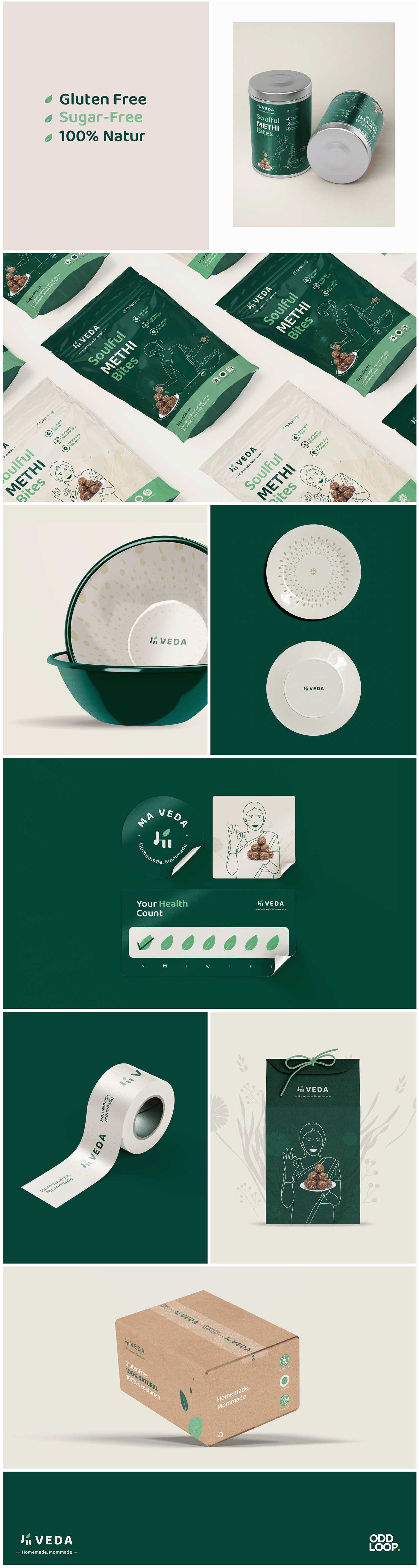
To solidify the visual identity of the brand, we had to come up with a primary colour palette. These colours would not only form a connecting link between the product and the audience but would also glue together the elements of Ma Veda giving it a cemented visual persona. The team went with 'green' and 'brown' as the primary colours to form the visual identity of the brand consistent with its ethos. These colours represent wisdom, friendliness, dependability as well a connection to nature thereby promoting a connection to oneself. Through these colours, the brand would be pleasing to look at and could also easily incorporate itself anywhere which helped the visual identity to come full circle.
Our team also put careful thought into designing the packaging boxes and jars for the brand. Both the design of the box and jars came from a place of nostalgia and familiarity. The box packaging design was heavily inspired by the gift packages that people receive from their mothers, especially people living away from their hometowns. The brand Jars were inspired by the common Indian household utensil that most mothers use to store snacks and sweets.