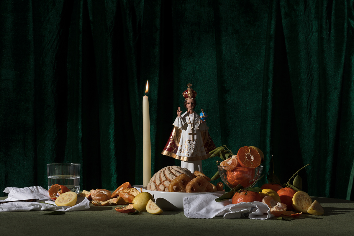
A lavish restaurant in Sydney, Casa Mérida welcomes the delicate palates, as well as indulgent foodies to it's Mexican-European atmosphere serving gastronomy from the south peninsula of Yucatan, México. Founded by Spanish conquistadors, and named after the town of 'Mérida' in Extremadura, Spain, the city prospered to be the wealthiest in the country, and said to house more millionaires than any other city in the world. The result of this massive concentration of wealth, impacted every aspect of the city; including—our main inspiration—Architecture and Food.
Carved Mayan stones from ancient cities were used to build Spanish colonial buildings, mixed with European embellishments, paintings and ornamentation from the epoch. The blend of both worlds, represents in it’s own way, the richness and the heritage of Merida, but despite it's architectural distinction, the same principle can be found in its gastronomy. Dishes such as such as Queso Relleno, Sopa de Lima and the traditional ‘Cochinita Pibil’ are as majestic and jaw-dropping as any of the mansions in the Paseo Montejo.
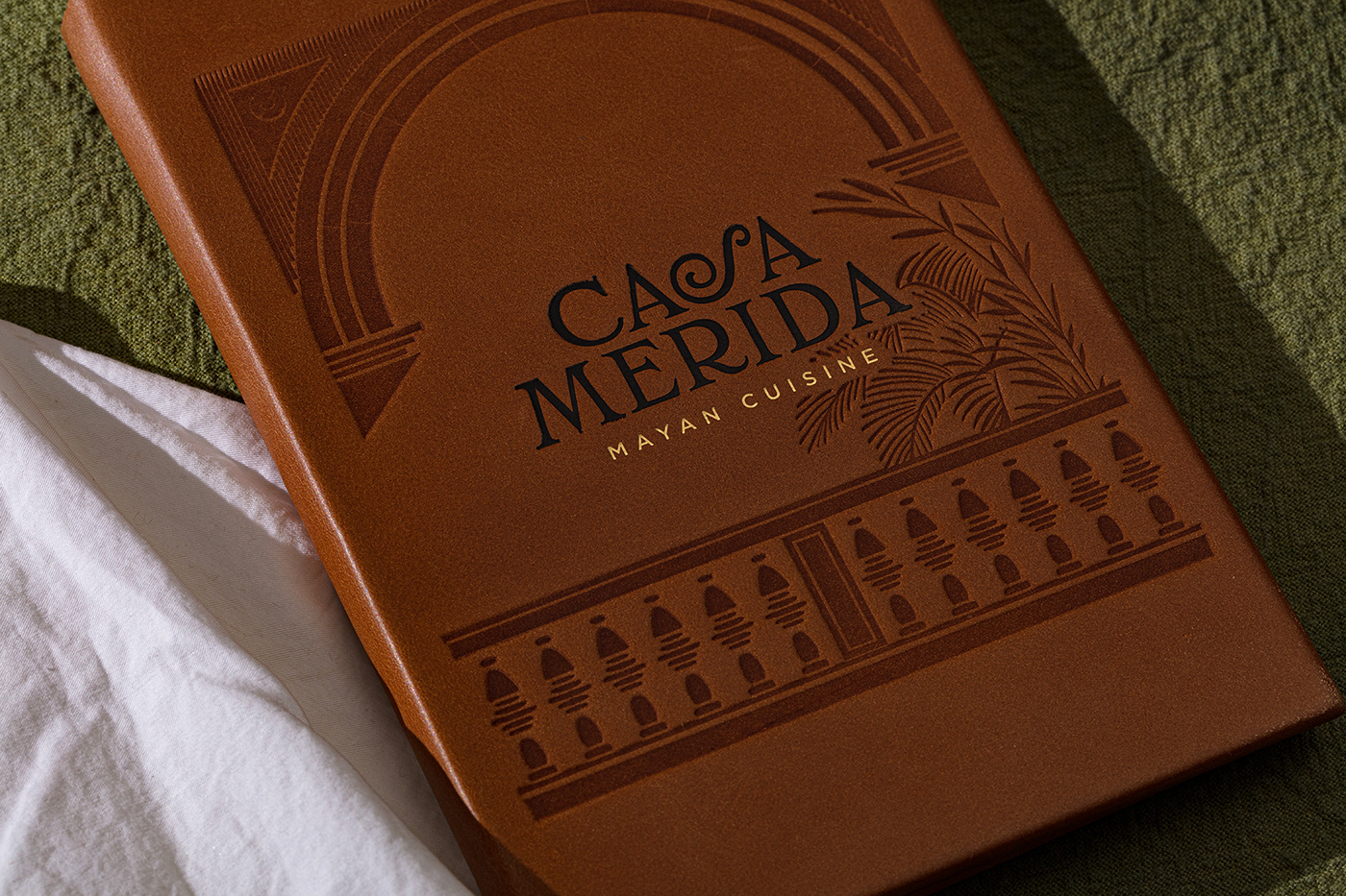
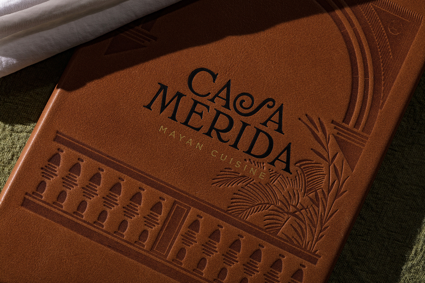
Despite the lack of any 'proper' Mayan references in the logotype, the identity keeps it's authenticity by mirroring the city of Merida as we know it today—European yet very Mexican—supporting the concept by staying away from any mayan-cliché and adding another layer of meaning to what's already written in the descriptor: 'Mayan Cuisine'
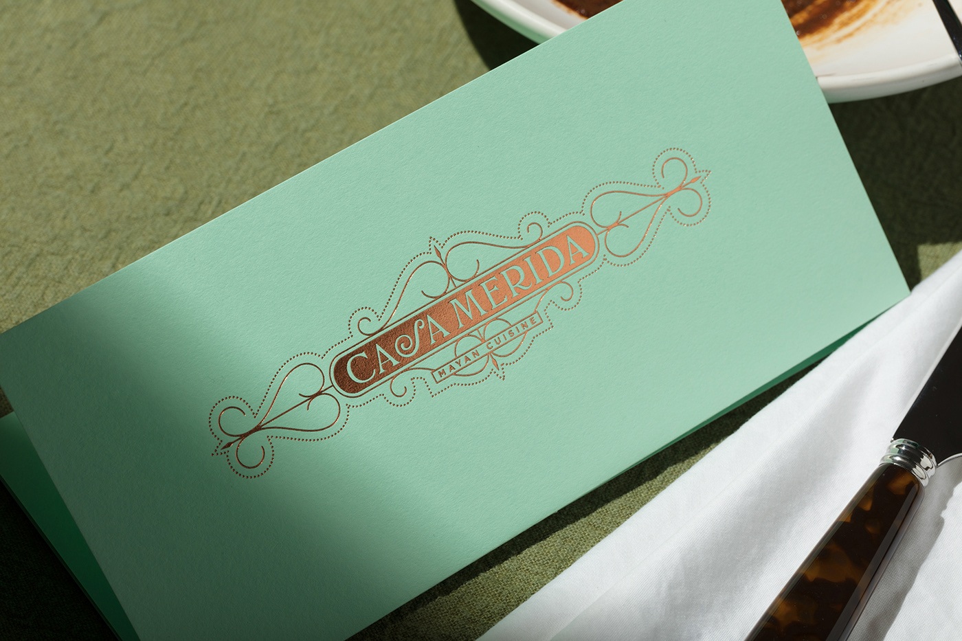
The seriffed logotype, elegantly slows the pace of the reading, like a snail moving through a ledge; while the illustration brings a sense of place and home (casa) inspired by the elegant architecture in Mérida, which, as if by magic, resemblances the one in Potts Point, Sydney, Including an outdoor patio, like the one you could find eating at Dulcería y Sorbetería Colón in Mérida.


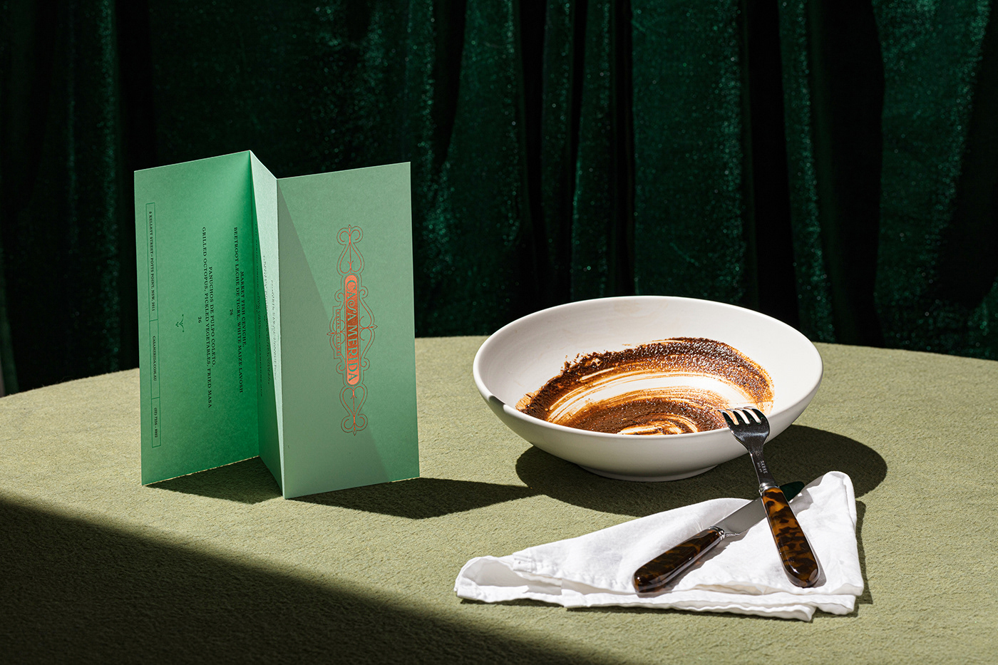
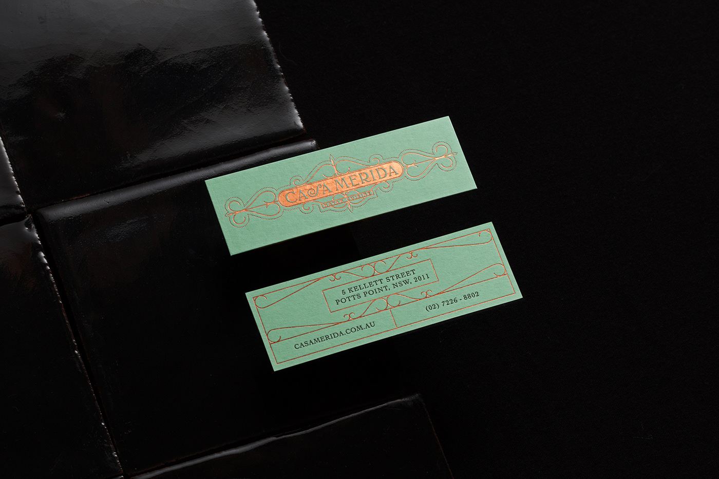
A Lagoon, Jazmin, Jade, Limestone and the long-dark shadows casted by the sun in Merida, are the inspiration behind the color palette of Green Powder, Copper and Black.
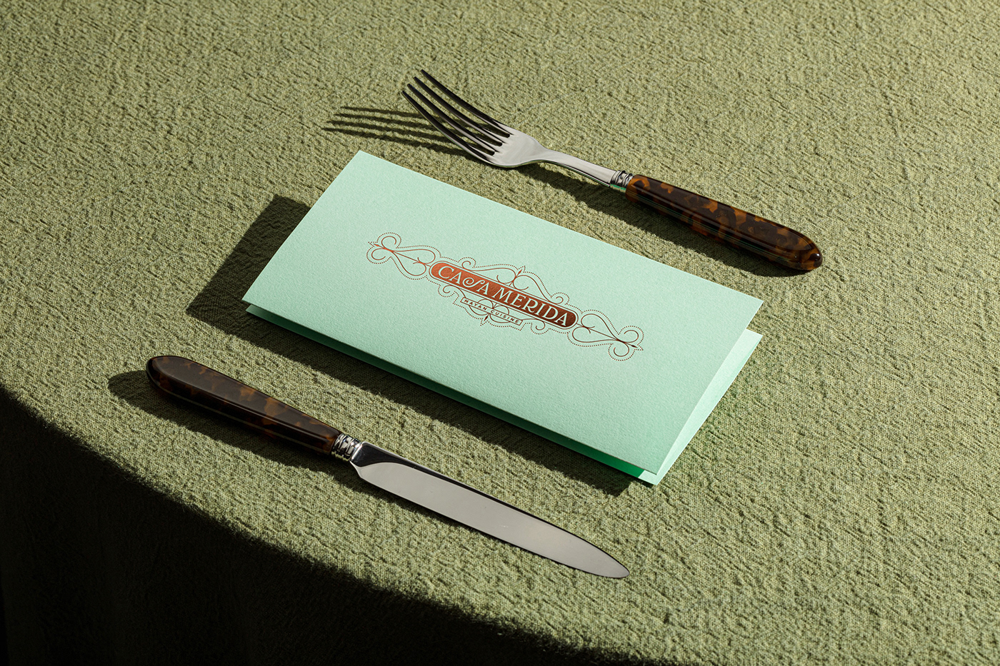
The stationary, printed in Melbourne, AUS by Hungry Workshop uses a Park Green paper by Colorplan, printed on black, and featuring copper foils on the ironwork inspired elements. Alternatively, the drinks menu features blind embossing on the logo, inviting light to be a part of the design.
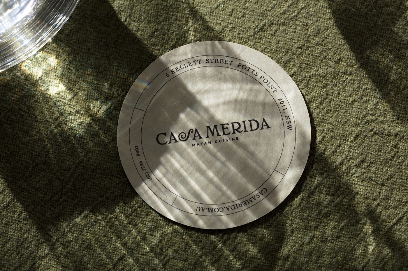
The ornamented version of the logotype, a luxurious graphic representation of the iron work as seen on the fences of the big mansions, is the welcoming sign of this identity. The design displays the logotype in two versions; stacked and straight, allowing flexibility and making the applications suit the logo and not the other way around. In the same way, the design features a simplified version without any ornamentation allowing the identity to move between minimal and ornamented without loosing cohesiveness.



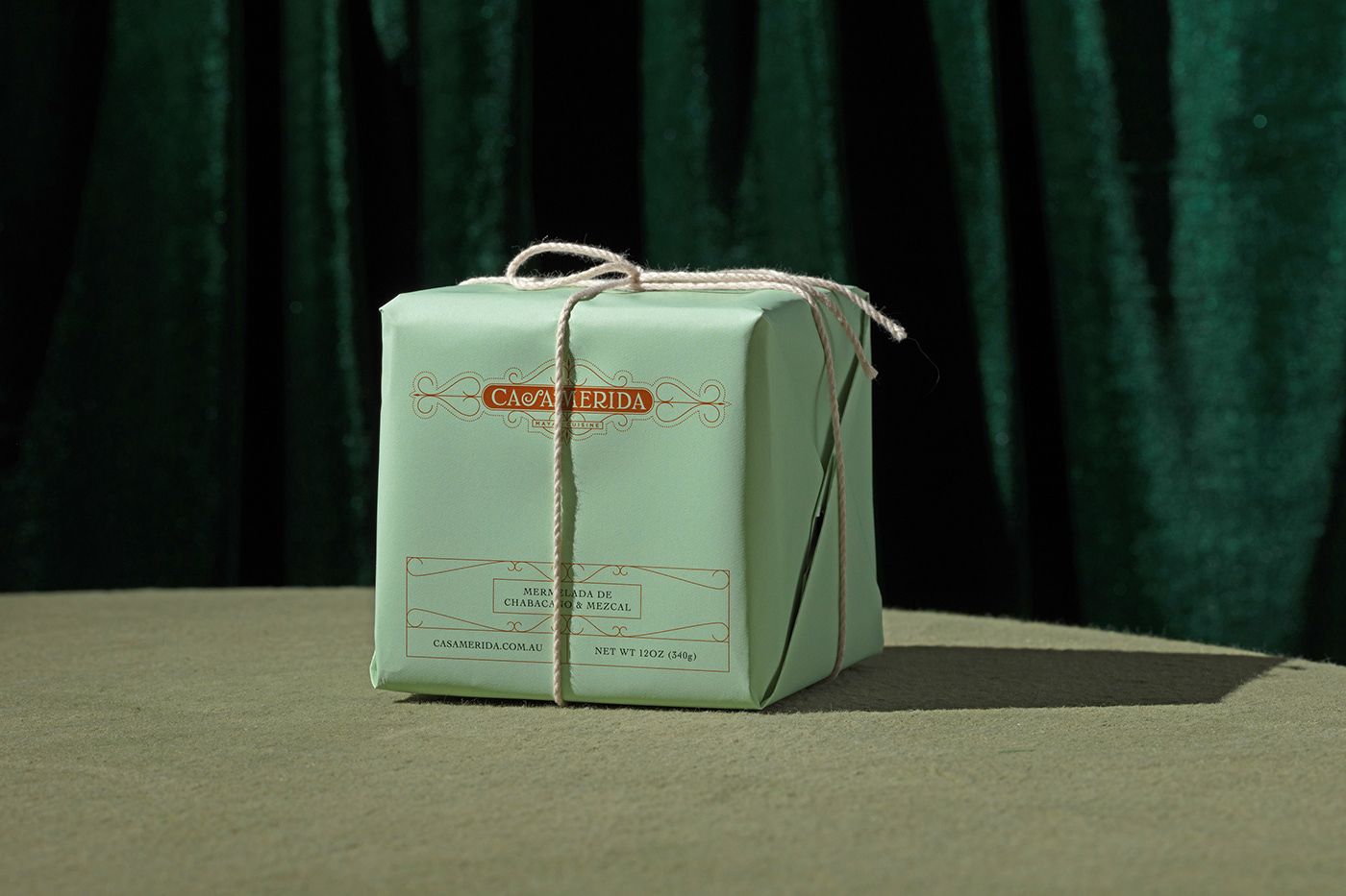
Complimentary packaging for in-house retail products, such as this mezcal infused-apricot jam.
