

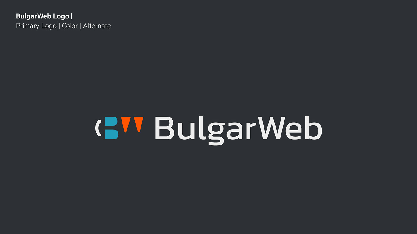
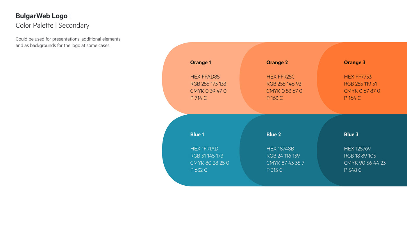
I was commissioned by a Bulgarian web agency to design a logo for their business. The project was a lovely experience as the clients knew quite well what they wanted and the whole process was nice to be part of. They were quite happy with the result and there may be a next phase to develop the brand with supporting elements and graphics as a future plan.
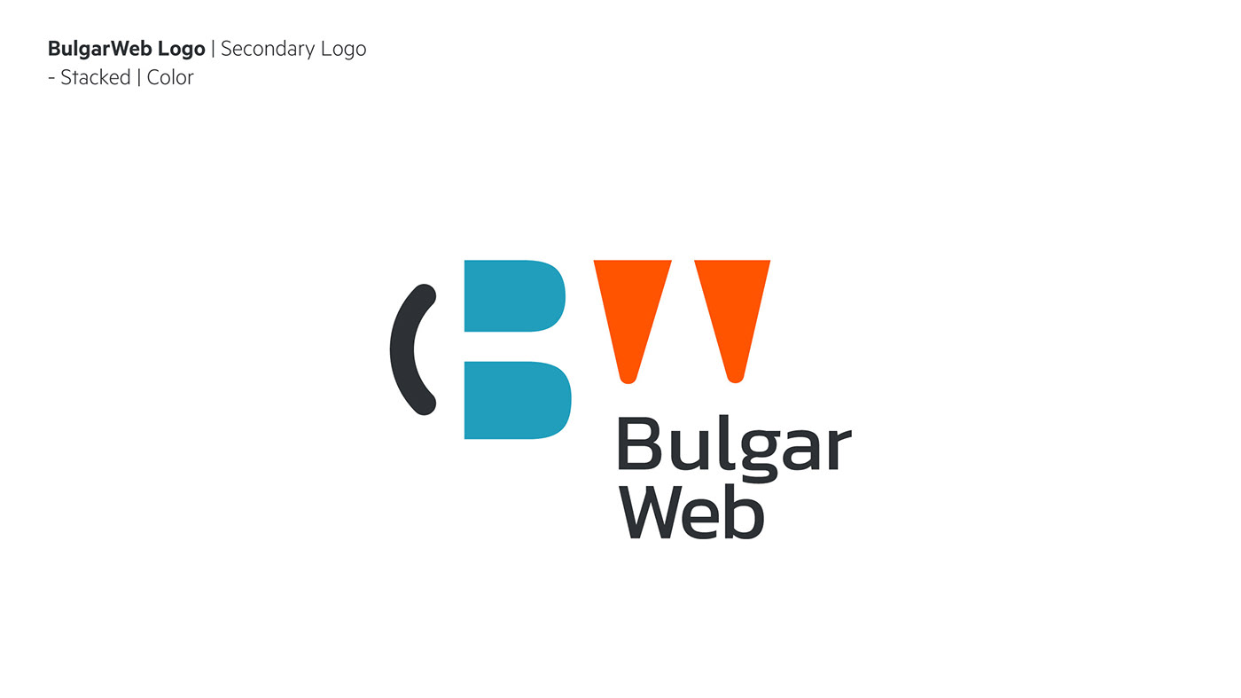
The concept uses a very common approach when branding a name that consists of more than one word, most of the time the combination of first letters for a brand is unique and even if it’s not, visually it can be.
BulgarWeb consists of the letters B and W. I took the letters and made the negative space in them our main visual element in regards to showing what’s behind this brand and the readiness to be transparent and be at the same time visible what the letters say and popularise the name as it is but also what’s beyond. And beyond is the personal touch, the attitude, and the friendly atmosphere that people will get when working with the brand besides the technical expertise and professionalism. We have the B sideways serving as eyes and the bracket as a joyful and fun element forming a smiley face with the eyes, which not everyone will notice but those who will, will instantly get a positive reaction to it and connect the brand with a positive attitude towards the work and people.
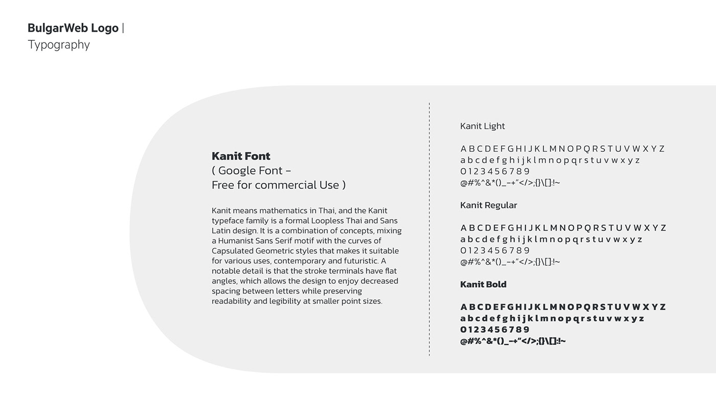
Many touch points are encompassed in this concept, wearing a sense of a story, a sense of something that deserves a second look and driving away from the generic logos out there but still at the same time very simple and clear. Just aesthetically we have a modern flat and bold look combined with the dynamic and very clear Kanit Font ( Free Google Font for commercial uses and purposes ).


Thank You!


