


art direction . branding . graphic design . animation
RTP (Rádio e Televisão de Portugal) is the Portuguese public service broadcasting organization. It runs four national television channels and three national radio stations. As well as several satellites and cable offerings. They challenged Itsanashow Studio to develop a new visual identity for every newscast program.
THE CHALLENGE
This new identity should mirror the company's new strategy — forward-looking, dynamic, and youthful.
This new identity should mirror the company's new strategy — forward-looking, dynamic, and youthful.
It had to make the operators' daily routine easier and in line with the channel's visual identity.
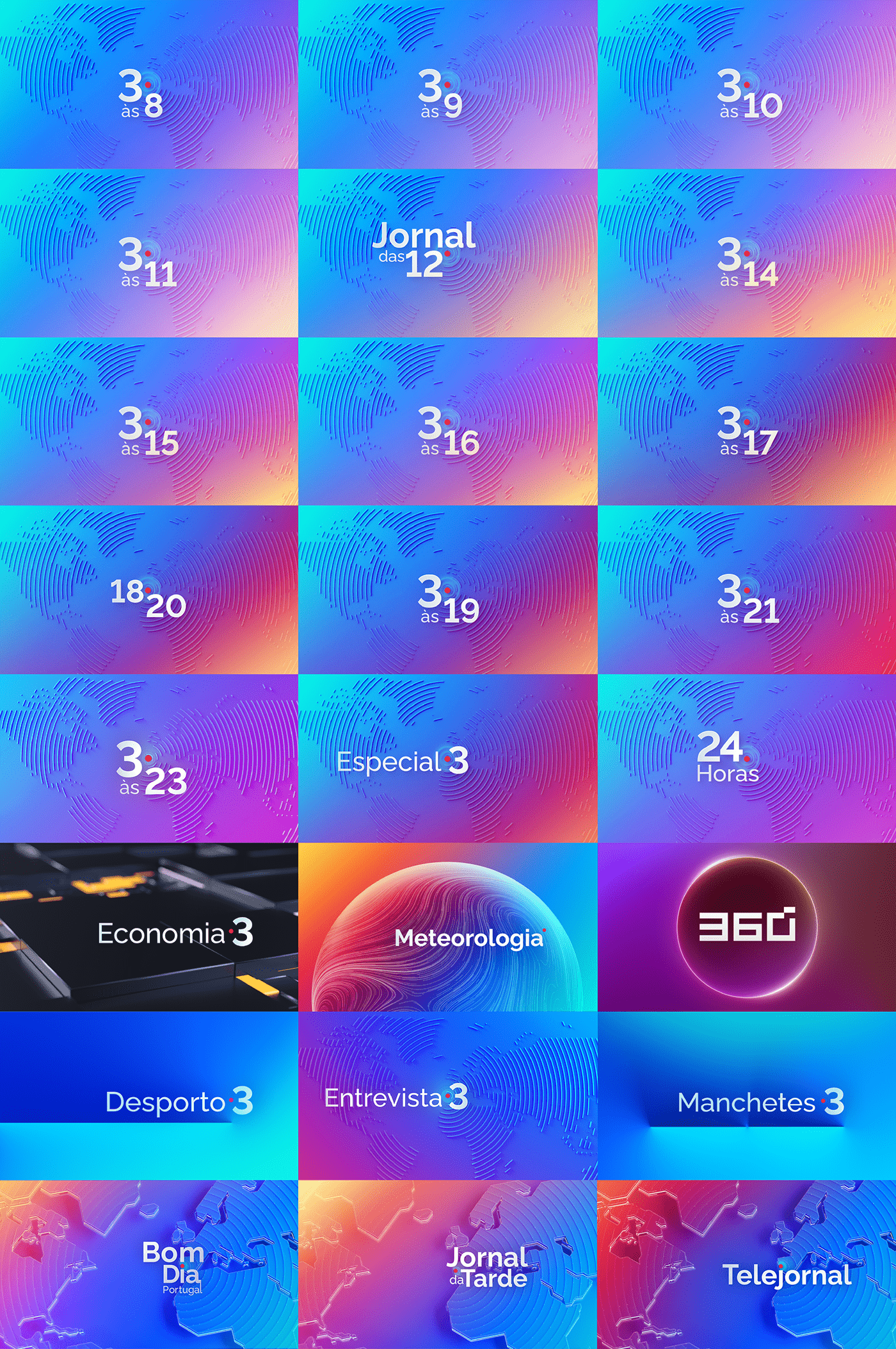
PACKSHOTS
[Curiosity note: We have developed about 24 different openings]
THE SOLUTION
Light . Image . Information
These are the main pillars of our graphic identity. Light became a metaphor for a window to the world. A window in which the screen appears as an information vehicle. Which unfolds on the various digital platforms. We chose to be daring along with strong and vibrant colors. Here, light and color, play together. They reflect the change of daylight throughout the day. We opted for a sophisticated 3D work for the openings where light and color play the leading role.
VISUAL DEVELOPMENT

PROCESS


—
Directed by: Itsanashow Studio
RTP's Art Direction: Nicolau Tudela
Creative Direction: Ana F. Borges
3D Design / Animation: Ruben de Sousa
Project Manager: André Torres
3D Design / Animation: Ruben de Sousa
Project Manager: André Torres
—
THANKS FOR WATCHING!
If you liked it, please don't forget
to give us some love :)
FOLLOW US ON


