Anatome Milano is a hypothetical graphic design gallery in Milan.
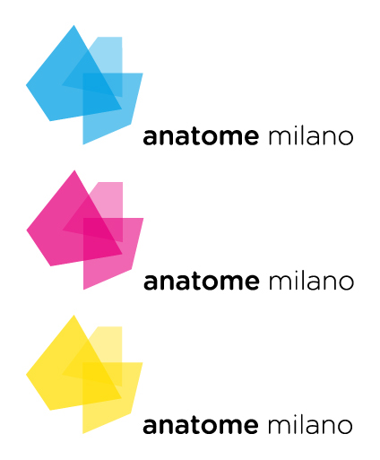
The logo is formed by three squares located on three different planes and with three different percentages of opacity, overlapping one another: these represent the different styles of contemporary graphics that coexist in the gallery.
The words "anatome milano” are all lowercase to counter the strong geometry of the sign; the two words have two different thicknesses to recall the different percentages of opacity of squares.

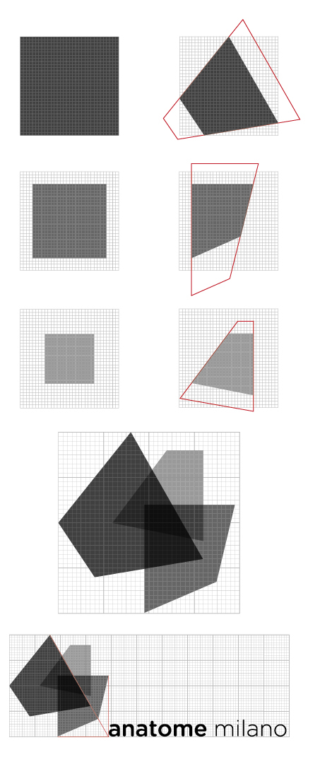
From three squares constructed on a modular grid, the same for everyone, several changes were made to the same squares (through the same grid) so as to make them appear on three different planes in space.
Still in accordance with the modular grid, the squares were superimposed so that there are construction lines that join at a single point. At this same point is aligned the inscription "anatome milano", which is also in accordance with the grid.
Still in accordance with the modular grid, the squares were superimposed so that there are construction lines that join at a single point. At this same point is aligned the inscription "anatome milano", which is also in accordance with the grid.
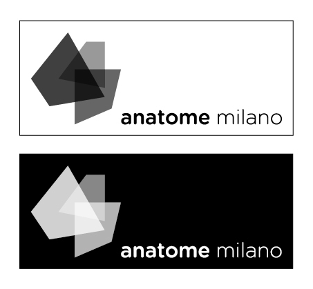
The logo can only be represented in grayscale version, but not in the version in black and white.
For each square black has different percentages (75%, 60%, 40%); the writing, however, is 100% black.
The positive and the negative of the logo.
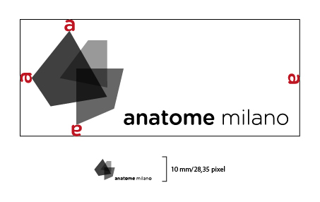
The minimum size for readability indicate how the logo can be scaled down, staying still recognizable.
Regarding the printing, the logo can not be smaller than 10 mm (1 cm); regarding the video, the logo can not be smaller tha 28,35 pixel.
Regarding the printing, the logo can not be smaller than 10 mm (1 cm); regarding the video, the logo can not be smaller tha 28,35 pixel.
To maintain the integrity of the logo must be left some space around all sides: thus indicates the area where it can not be inserted any foreign element to the logo itself.
The area of respect is indicated on the basis of a proportional value, in this case is the "a" of the word "anatome".
There are three different color versions of the logo: cyan, magenta, yellow that are the basic colors of graphic design.