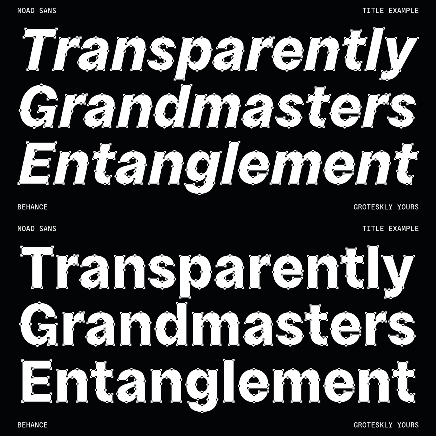

In July 2022, we've had our first release of the year. For a number of reasons the release of Noad Sans was being postponed time and time again, until we ourselves began to doubt if it's going to come out at all. But that's history. Noad Sans is here and here to stay.
Noad (originally titled Noder) is an experimental type family in 7 styles (6 static fonts and a nifty variable font that combines all styles). The defining feature of Noad Sans is its visualised nodes–all control points of Bézier curves in each of the fonts in the family are intentionally visualised. The effect of this feature is largely defined by the usage: in titles and larger bodies of text, the visualised nodes stand out and create a rhythmic pattern of their own. In smaller sizes, the sans serif base of the font becomes more prominent and the nodes create a visual fuzz.


While Noad was designed with a spirit of experimentation at heart, we were not satisfied with a generally limited character set and lack of styles that are prevalent in experimental display typefaces. That being said, there are 570+ characters in Noad Sans, covering most Latin-based languages, various sets of numbers (lining, tabular, numerators/denominators), and a ton of extra symbols.


The idea to release a font with visualised nodes isn't all that novel. For us, however, the first foray into this style was in an endeavour to demonstrate how Bézier curves behave themselves in a larger family and particularly in italics. Every type designer knows that after slanting a character even slightly sideways, a need arises to add new control points (extremums). We always considered this shift visually interesting and it was our inspiration for Noad Sans.


The slide above demonstrates how the position of on-curve points (or nodes, or control points) changes when font is italicised. When designing italic styles, it's important to have a set pattern of actions, so that the italic styles match romans as close as possible. Unless of course you're designing true italic styles that may not resemble your uprights point for point.


Noad Sans features a number of OpenType features, such as tabular figures, which changes default lining figures to tabular counterparts. Tabular figures are used in designing, say, schedules and timetables.


Case Sensitivity is another cool OpenType feature that is included in all our projects. What it does is basically change the height of punctuation and symbols to that of uppercase letters. With .case feature turned on, you can USE CAPS ALL THE WAY – and not worry about punctuation not following the suit.

Noad Sans type family includes 6 static fonts (Mini, Mini Italic, Regular, Regular Italic, Extra and Extra Italic) and one variable font. Each style can be purchased separately. There is also a free trial version of Noad Sans that can be downloaded free of charge on MyFonts.
Oh, before we forget, there is also a PDF Specimen for Noad Sans that can be downloaded free of charge.


