

About
Glorify is an all-in-one Ecom-focused design tool that allows entrepreneurs, marketers, designers and business owners to create stunning designs. We bridge the gap between advanced and basic tools by providing a balanced UI and features that are suitable for both professionals and beginners. With the launch of Glorify 3.0, we aim to become the most balanced design tool on the market and the only software you will need to center all your design activities. Glorify’s vision is to make design accessible to all regardless of age, location, career or design skills. Through our vision and expertise, we seek to educate designers and non-designers on the value of an easy and effective design process.
To coincide with the launch of 3.0 features, we decided to give Glorify a major rebrand. Our previous brand identity was just like the countless other software tools on the market. It was pretty basic with nothing exciting going on, and didn’t create the impact we wanted. After months of planning and experimenting, we created a unique look that speaks to our diverse community and establishes instant brand recognition.


Visual Identity
To create the ideal branding elements that matched our big ideas, we collaborated with Komi who are experts in the field of branding. Through workshops and discussions, we explored countless stylescapes to find the one that resonated with our vision, mission and purpose. We finally decided to go with a retro-futurism style that is inspiring, fresh and bold.
Our retro-futurism style establishes a nostalgic feeling relatable mainly to people between the ages of 25 and 45 (Gen X and Y). This creates an image of how far humanity has come in terms of design and brings a shared vision of where we will go.
The pillars of Glorify’s brand identity are effective by themselves and create powerful brand recognition when combined. Glorify’s new brand identity is a combination of carefully designed graphic guides that make our brand coherent and relatable to our audience worldwide.
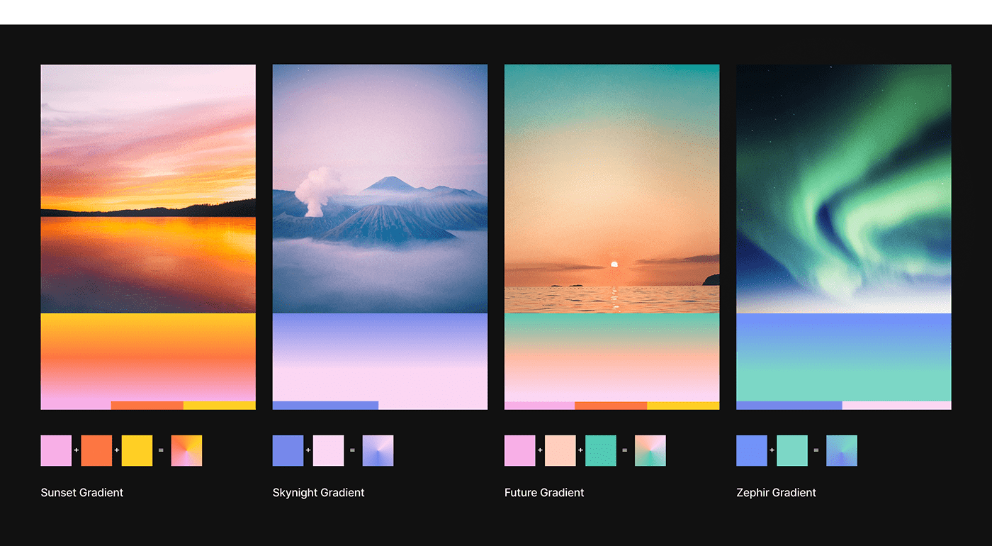
Glorify uses a flat retro color palette with four opacity variations and futuristic gradients, each gradient being made from a mix of 2 or more flat retro colors. Paper, black, blue, pink, yellow, acqua, orange and red are the refreshing splash of colors that give character to our content.
Cut-out elements are an essential part of our brand identity’s image style. We prioritize using retro objects (from the 50s to the 90s) unless compelled to do otherwise. These elements help to conceptualize ideas or add tasteful humor to content. The use of noise treatment also gives human images a warm retro look.


Typography
To top off our retro-futuristic vibe, we had to choose fonts that supported our brand identity.
PP Monument Extended Bold is ideal for titles that communicate big ideas.
To add contrast, Inter Medium is used for all body text.


