

Re-designing Glucon-D
Following is one of the outcomes of a course, Packaging Design. The brief revolved around picking up an existing product and re-designing the packaging, putting in the knowledge of the previous course’s such as typography, colour, grid. Since I am a sports enthusiast, I decided to re-package a sport energy drink–Glucon-D.
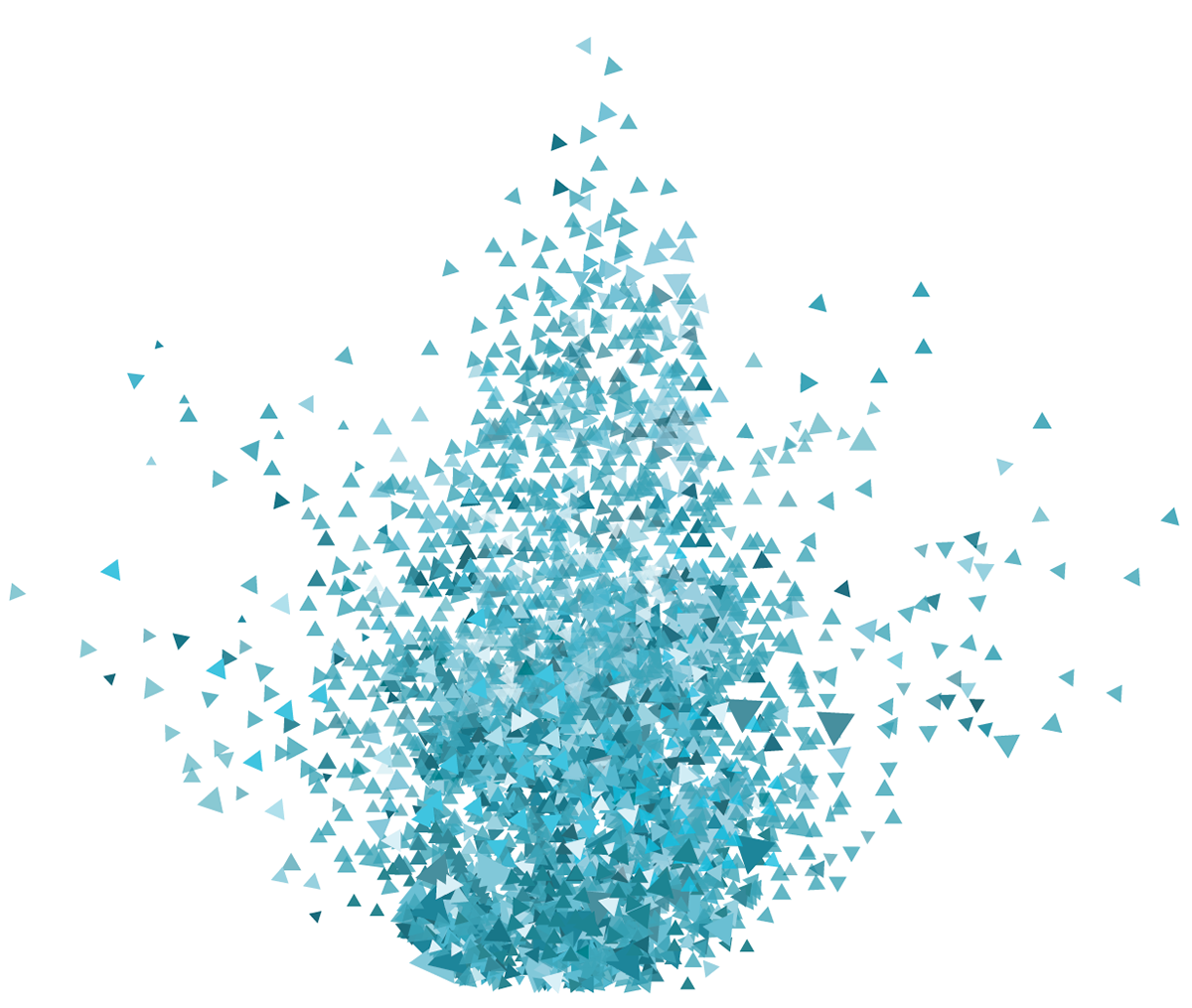
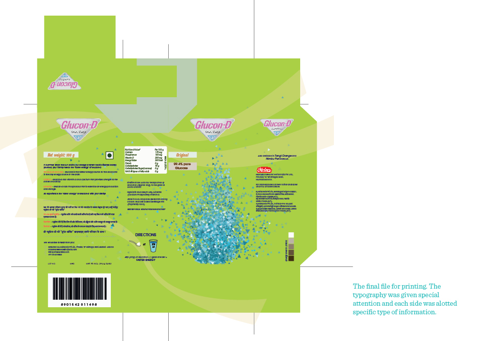
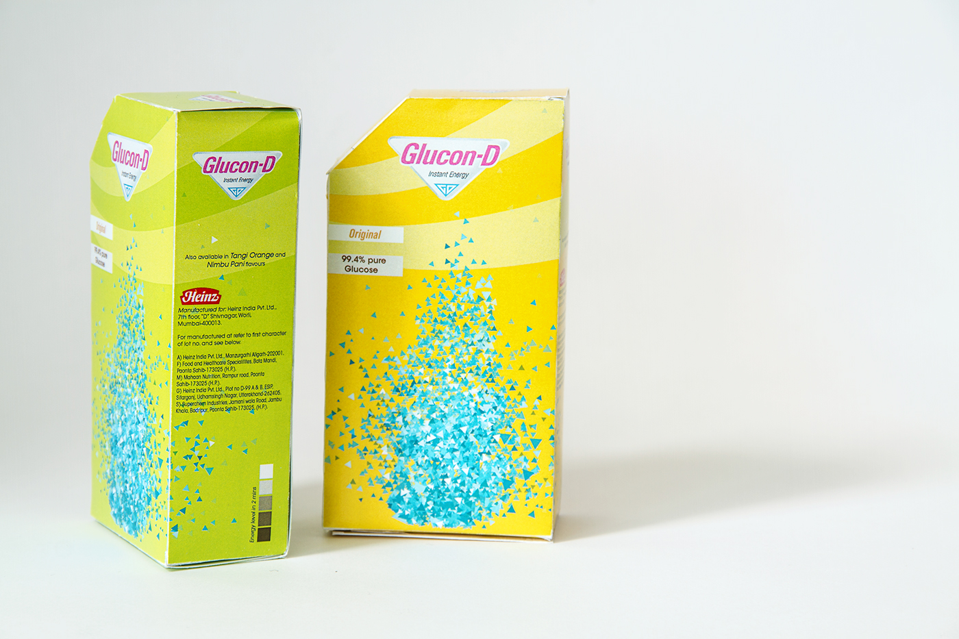
Since its a sports drink, it was essential to demonstrate the sudden burst of energy graphically. The idea was to bring about a feeling of rush of water and energy on consumption. Glucon-D is well renowned energy drink and comes in a powder form which is mixed with water for consumption.
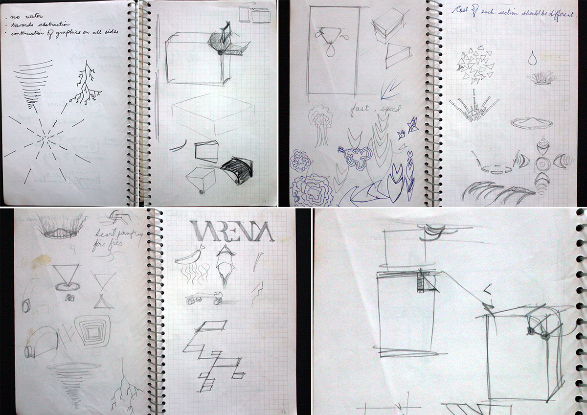
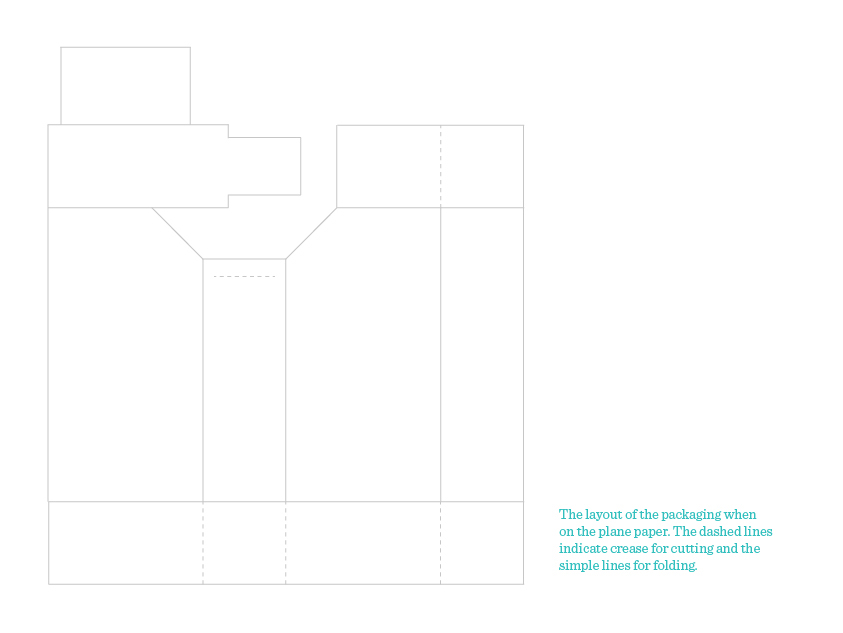
Some exploration for graphics and the folding for the packet.

It was important to maintain a level of clarity of information. There were many types of content displayed on the same page making readability difficult and the information appeared cluttered. The main challenge was to accommodate every information without any compromise and enhancing the readability. This was achieved by clearly segregating information on each side. Only one type of content was placed on each side which brought categorisation to all sides.
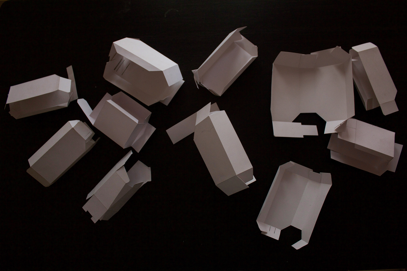
Various explorations for different folding and cutting were done. As the use case demanded two variations of consumption i.e., with the water (common use) and without the water (players in between the matches), it was necessary to explore methods to incorporate both the variations into one.


Thank you!


