The Estancia Art Center is a cultural center located in Caracas, Venezuela. In colonial times it was a famous coffee plantation. Even today, different areas of the place have names from that time: Stables, el patio del secado, the gazebo, etc.
The current signage system lacks uniqueness and visual coherence, thus creating confusion within the spaces, as well as disregarding the origin and historical importance of the center.
To redesign the signage system, it is necessary to start from a concept that encompasses history as well as the different characteristics that make you connect with the Center, such as its architecture and nature. So as a central axis we have the Estancia Art Center as an entity with informative and corporate signage, as well as the importance of developing signage with routes to explore the benefits and history of the place.


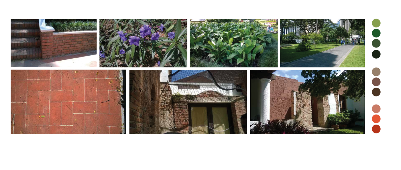
The main elements are: coffee, flora, water and architecture. This is significant for the development of signage as well as its graphic line.
Based on my research and its history, it is understood that the Estancia Art Center has two visual points of great importance and contrast: Colonial architecture and the vast flora that exists. It is not only a contrast at the level of colors, but also of shapes, environments, and physical and visual sensations. This is why the concept of the graphic style will be defined as the fusion between the geometric and the organic (architecture and flora).
Based on my research and its history, it is understood that the Estancia Art Center has two visual points of great importance and contrast: Colonial architecture and the vast flora that exists. It is not only a contrast at the level of colors, but also of shapes, environments, and physical and visual sensations. This is why the concept of the graphic style will be defined as the fusion between the geometric and the organic (architecture and flora).


Three important experiences will be part of the signage system:
• The tree experience: Tour of the trees and flowers of the center.
• The coffee experience: History and tour of the emblematic areas in its process.
• The water experience: It is also derived from the coffee experience thanks to the water channels that exist within the center and used to connect with El Ávila in the past, the main valley that surrounds Caracas that has rivers and grottos.
In addition, the main elements are chosen to develop the entire graphic style, also taking into account the context of the center, its structure, the green areas, and any visual element that may be an interesting resource to communicate the origins in a modern visual language.

Icons are illustrated from geometry, including curves and smooth ends to also express the organic shapes from nature.

Modules and super-modules were made from the icons to create patterns as part of the graphic style. In this step, it is important for the elements to be visually in sync with the main concept: The union between the structural and the organic.


The color palette is selected from the Estancia Art Center's man-made and natural elements. For this step, different tones were explored until the ideals were compatible with the main concept selected, taking into account the icons previously created.