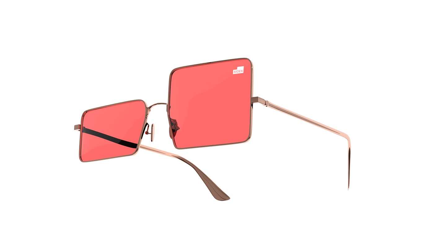
Moscow Exchange (MOEX). Rebranding
Moscow Exchange is the largest exchange platform that allows to trade shares, bonds, currencies, precious metals and products. Annual traded value exceeds 1 quadrillion rubles.
In 30 years the Exchange has gained unique experience, technologies and expertise, as well as a large portfolio of brands and subbrands. However, it has still been percepted exclusively as an exchange platform.
The hardest challenge was the discrepancy between the company’s advanced products and its visual identity that wasn’t up-to-date and didn’t convey the image and the role of the brand on the market.
That’s why before we started working on the new visual style, we had to analyse the current brand architecture and make changes on the level of brand strategy and brand platform.
Interviews and strategic sessions with stakeholders allowed to bring to light the main brand values and understand the deep motivation of the audience and vision of the future of the group of companies.
The company empasizes that they want to share experience and develop financial culture in the country. They are proud of being pioneers on the market and paves new ways. The new brand positioning is formulated as “The best technologies and knowledge for those who manage money”.


We decided to bring the mother brand to the front, meaning MOEX Group (MOscow EXchange). This approach allowed to formally unite all the existing assets under one brand and made it easy to launch new projects from the non-exchange sector.

The new visual identity is based on the metaphor of growth shown on the single chart section. The only rule is that the chart is always growing, but the shape itself can be different even within a single layout. Simple and convincing geometry varies due to the use of different visual approaches: the graphics can exist as a plate or a container, take most of the layout space or be an addition to single images.


Bold typography reflects brand character of the exchange: contemporary sans serif works great technically and aesthetically.


The visual language of MOEX Group is reflected in the new branding for Finuslugi platform. This marketplace helps to provide banking and insurance services and products for people all around the country.


We also developed a concept of Finuslugi mobile app.


As a result of several months of work of agency and client teams MOEX has become a stong contemporary brand that helps achieve company’s goals and support its development outside of the exchange sector.
Project team:
Ilya Lazuchenkov, Executive director
Egor Myznik, Creative director and partner
Elena Litvinova, Producer
Natalia Tarakanova, Producer
Ekaterina Palshina, Head of strategy
Olga Barkova, Senior strategist
Alya Kryachko, Stategist
Galina Teorina, Strategist
Alyosha Kolesnikova, Strategist
Aleksandr Bankin, Art director
Aleksandr Bankin, Art director
Irina Purtova, Art director
Maria Pechkurenko, Art director
Evgeniya Khludentsova, Designer
Rodion Kuznetsov, Designer
Daria Vasilieva, Designer
Anna Volkova, Designer
Oleg Ahn, Content producer
Nikita Sapozhnikov, Logo
MOEX team


