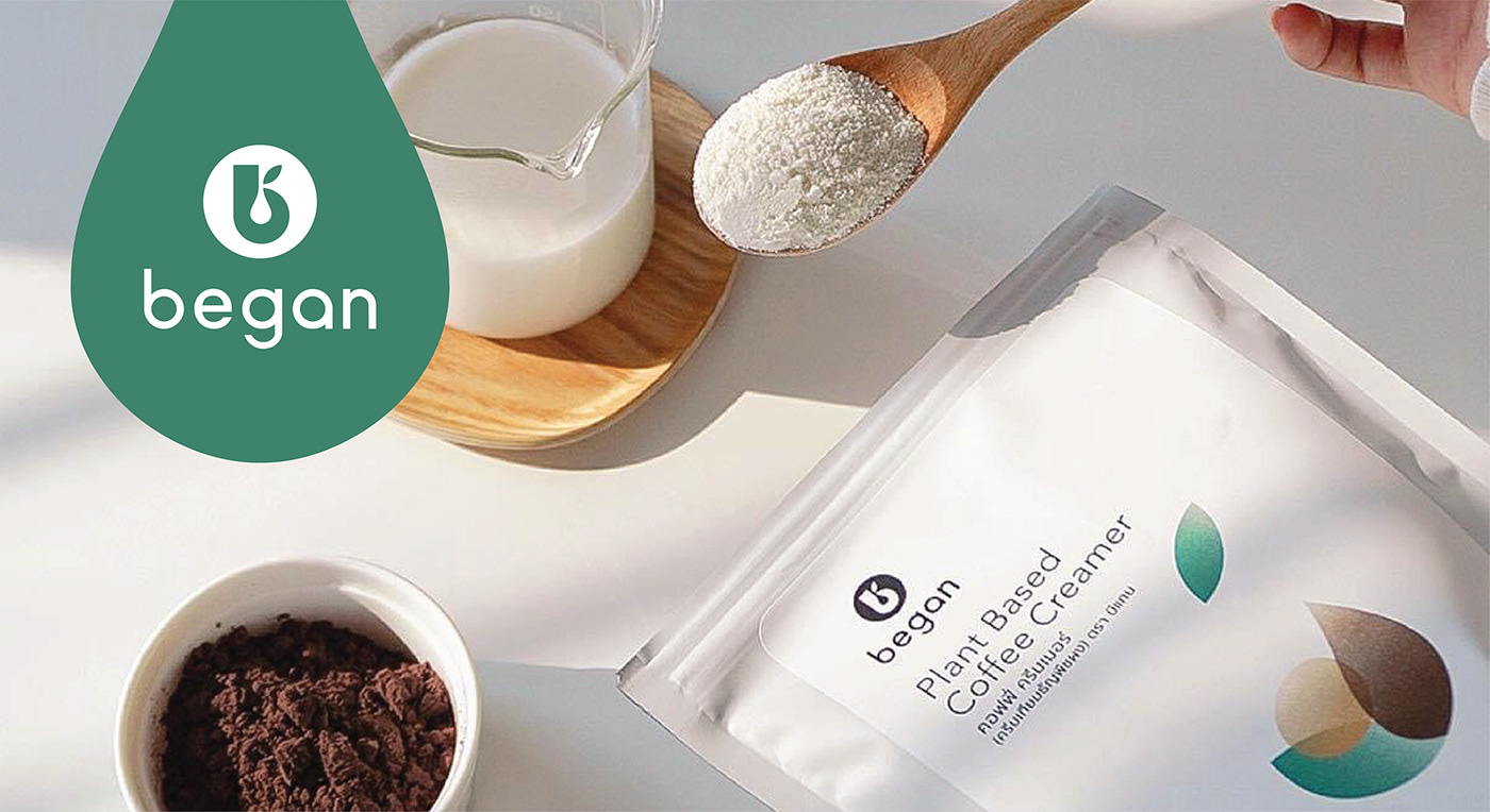

BEGAN / brand identity & packaging design
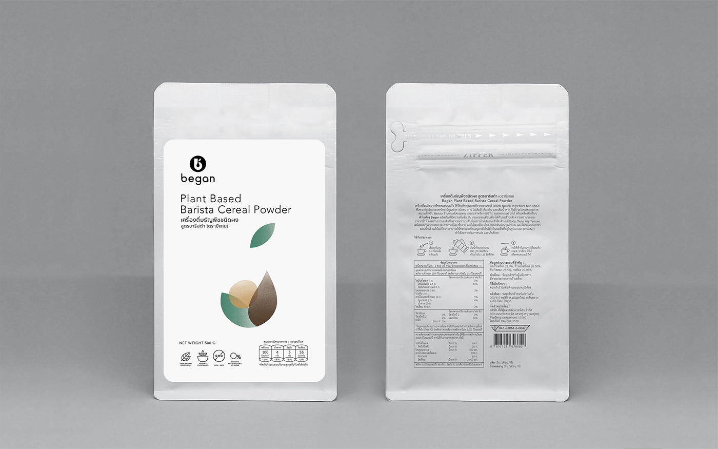
The brand’s concept is to improve the quality of life for health-conscious people who are allergic to animal protein by providing the best selection of 100% plant-based ingredient products. Products that are ideal for both home consumers and commercial cafes.
objectives:
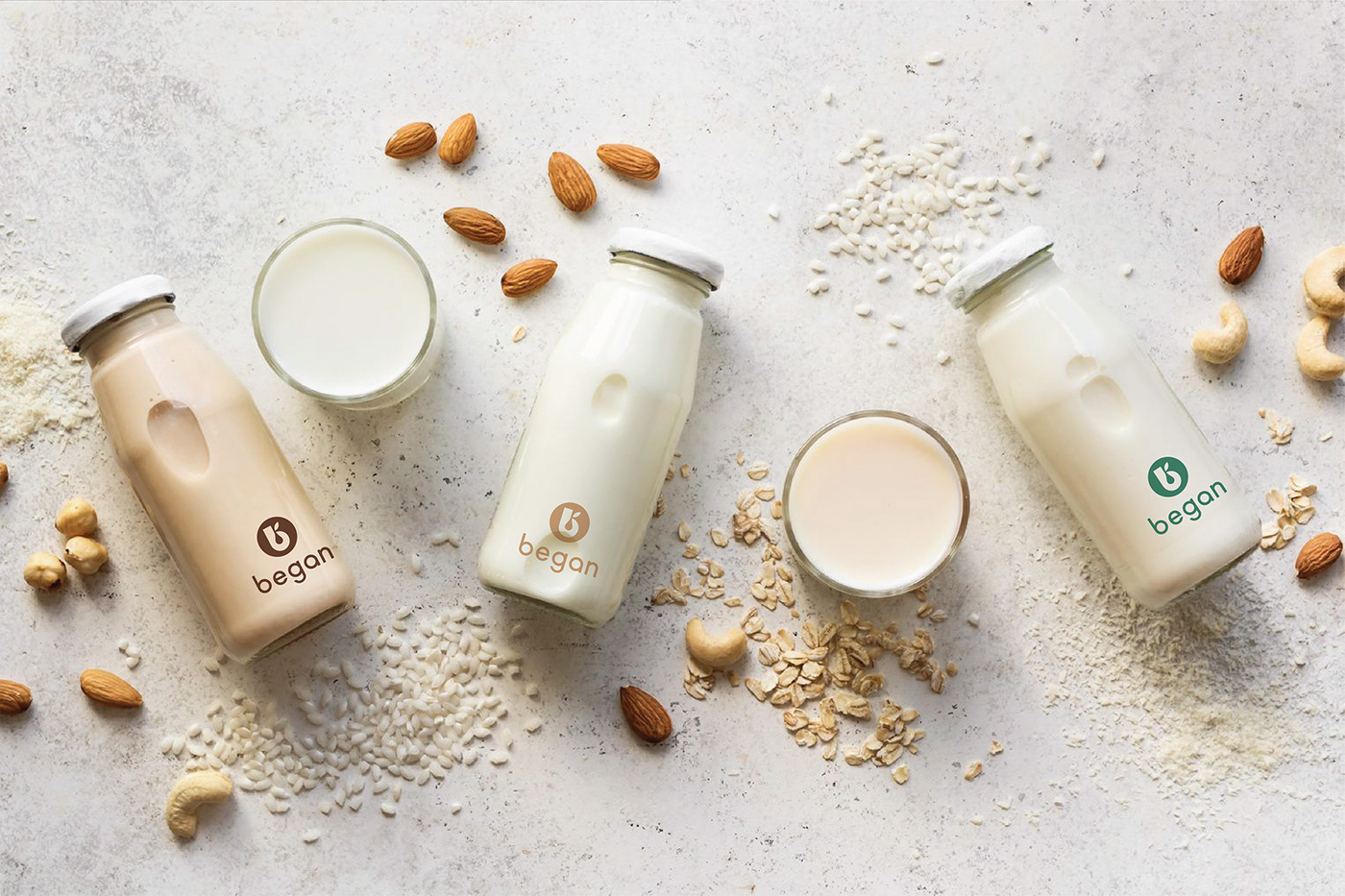
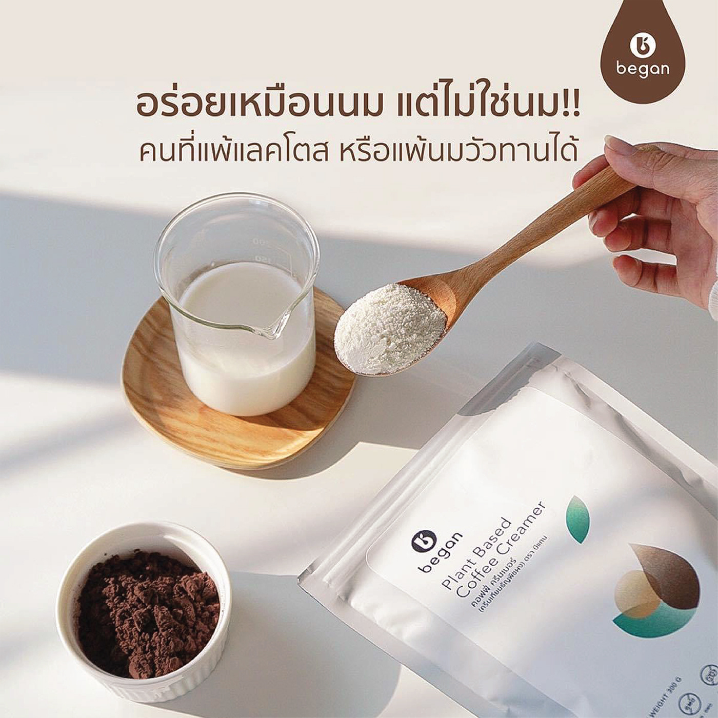
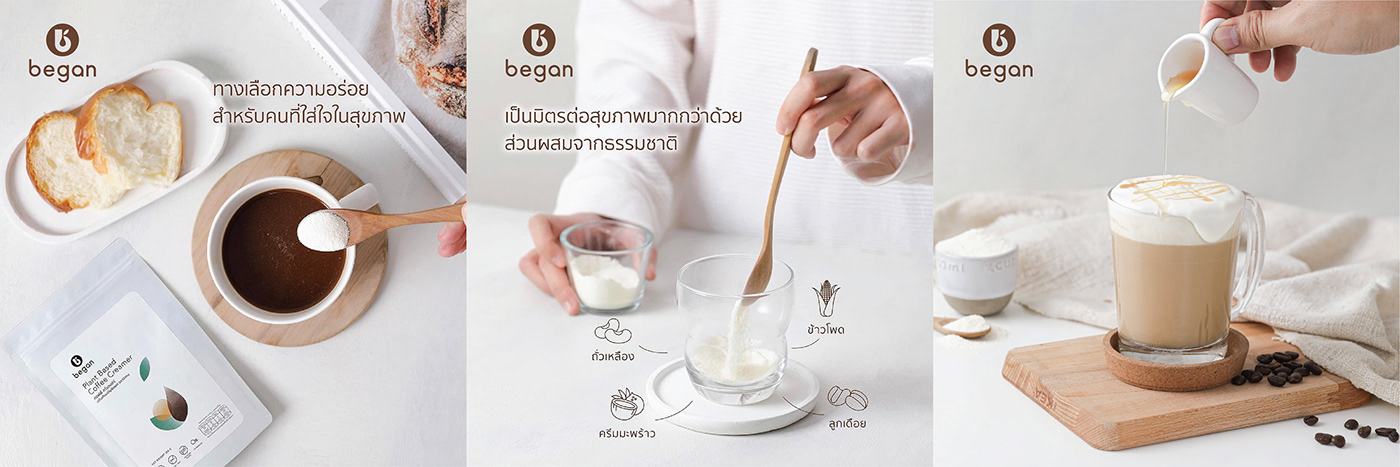
Began’s 100% plant-based products are an excellent substitute for any beverages or menu items.
logo:
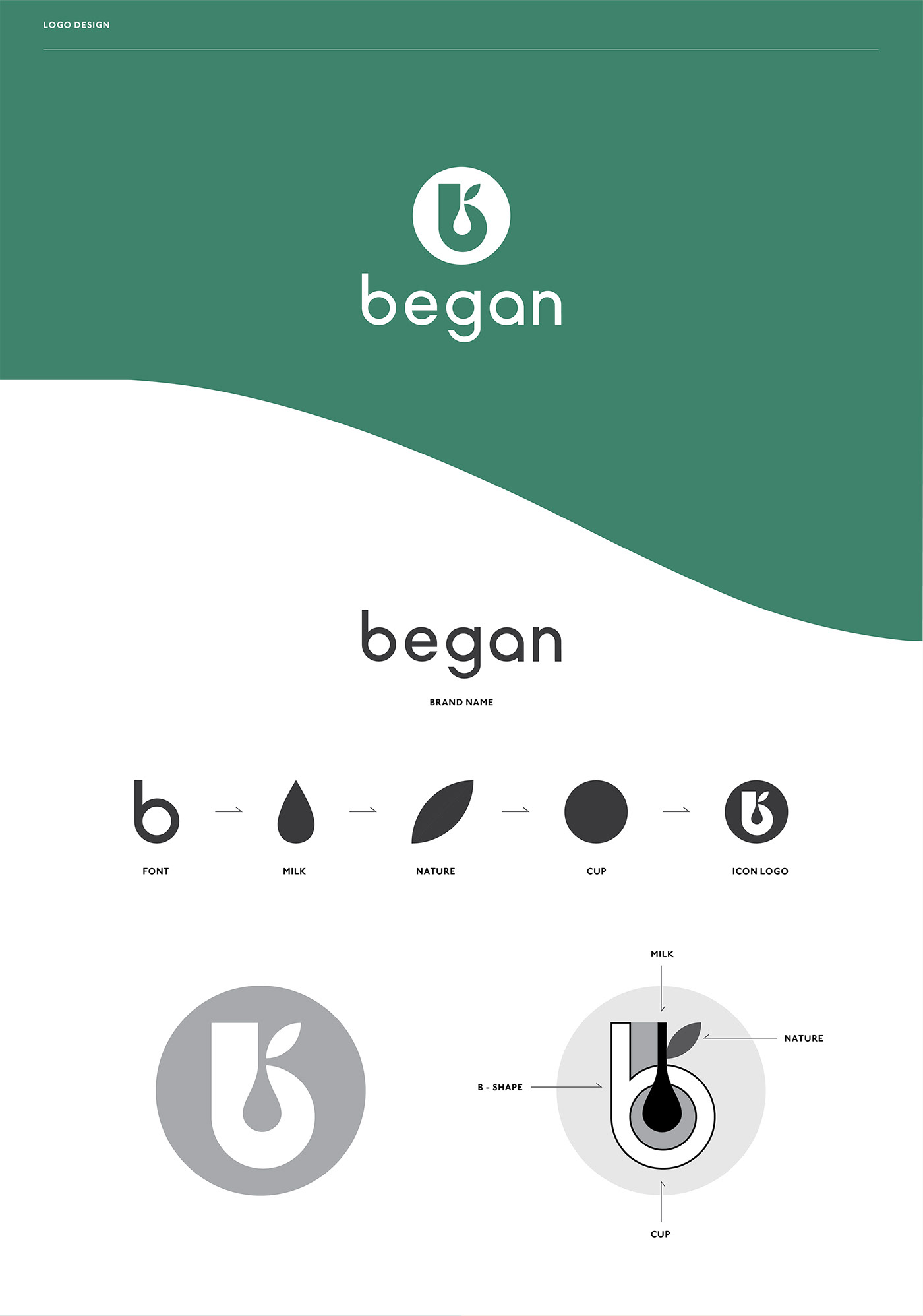
The logo design is created by developing the 4 elements. The letter ‘b’ represents the brand’s initial, the ‘drop’ represents the powder product that must be dissolved in water to become milk, the ‘leaf’ represents the natural ingredient and the ‘circle’ represents the shape of a glass of water.
graphic identity
graphic identity:
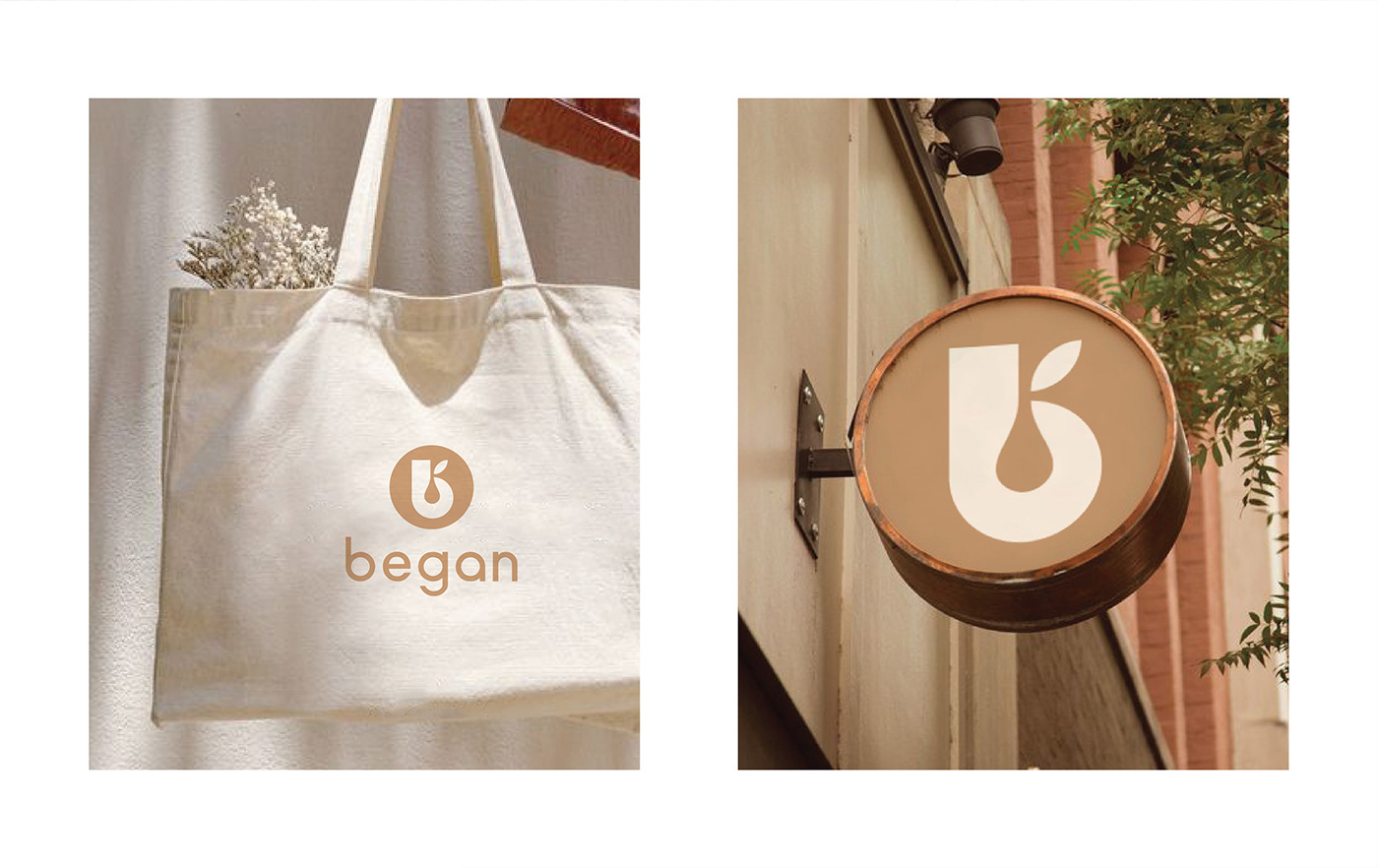
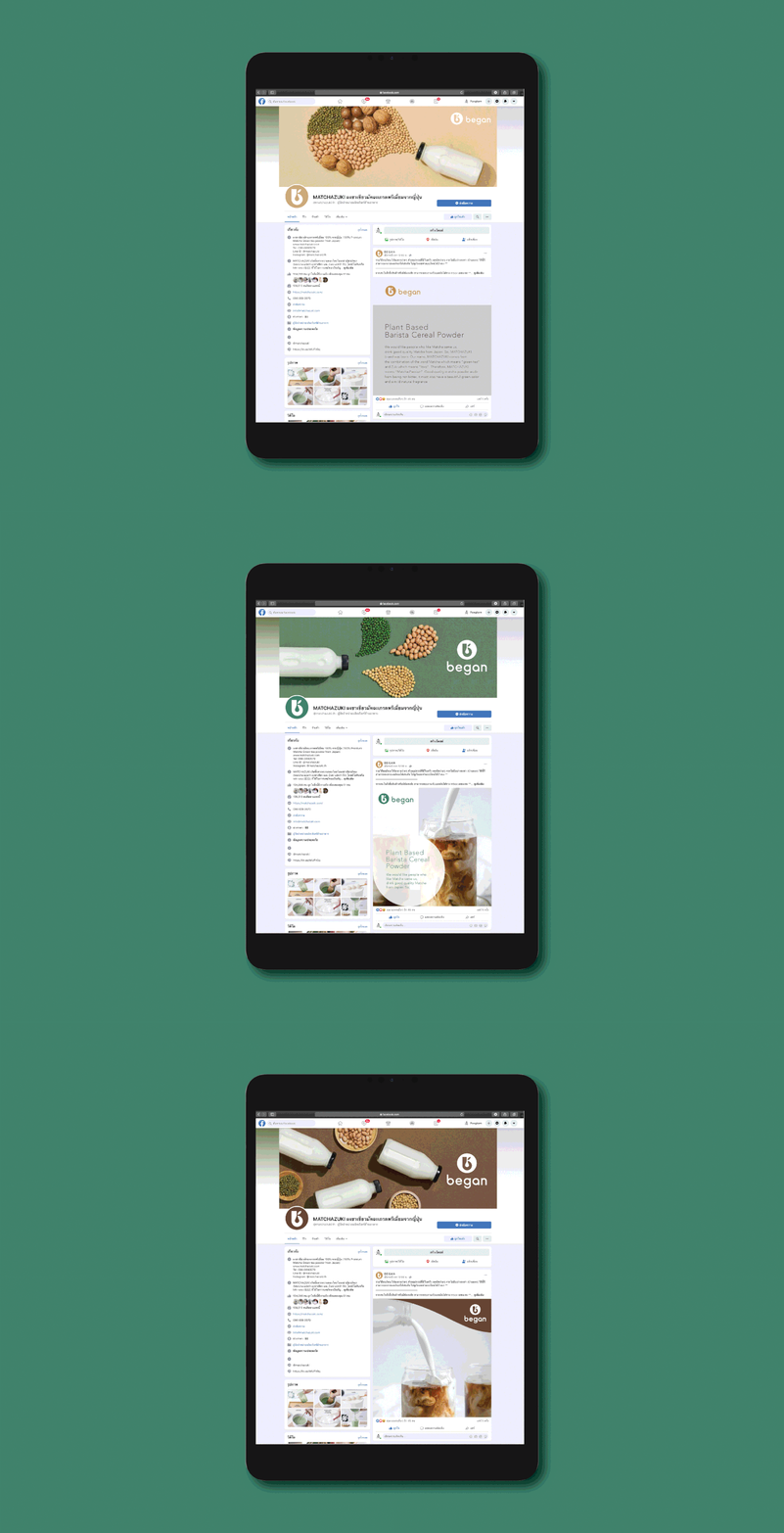
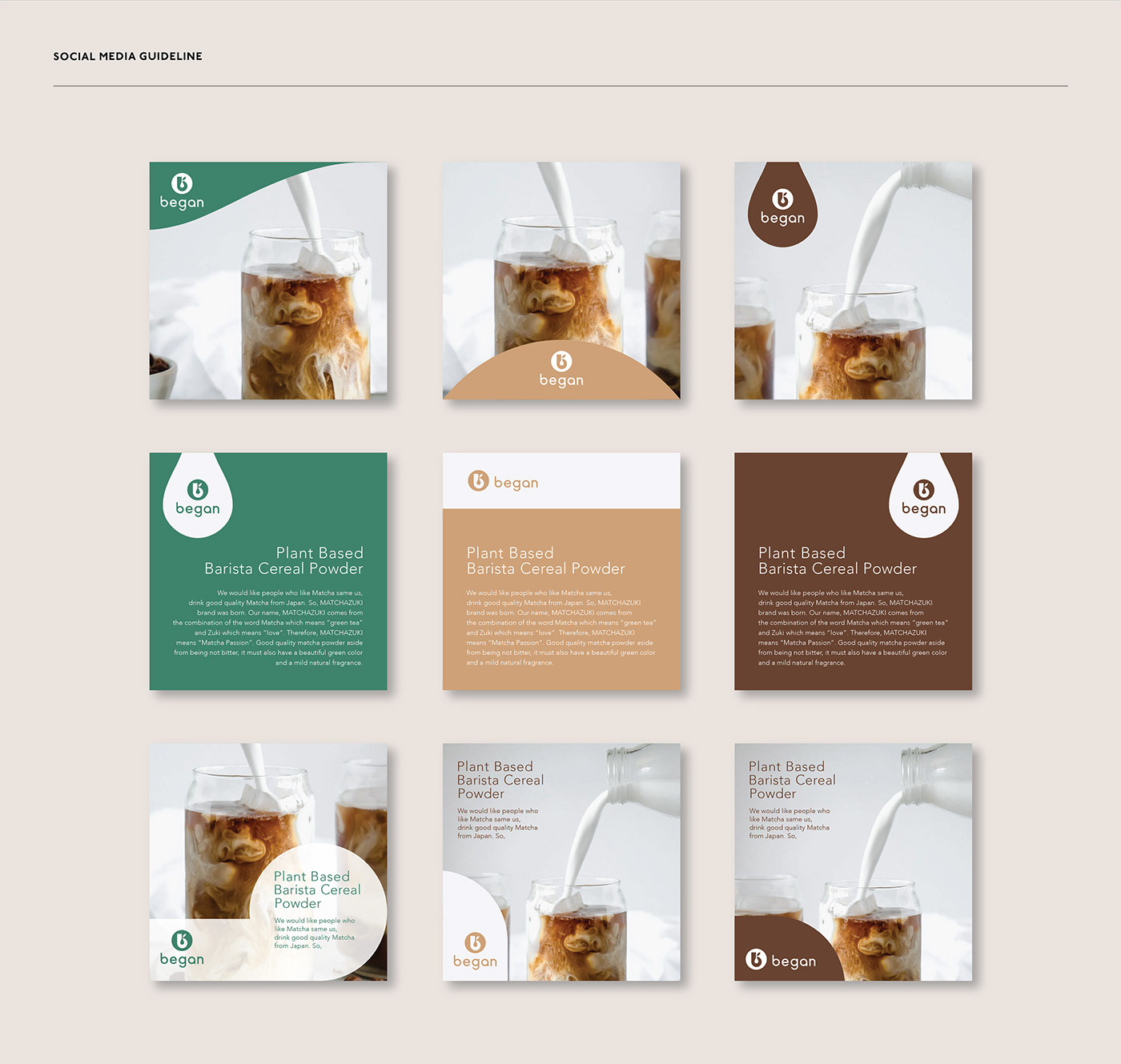
Develop the cropped logo, resized and selected the key elements of the logo movement. As a result, the brand image system was recognised.
font & color:
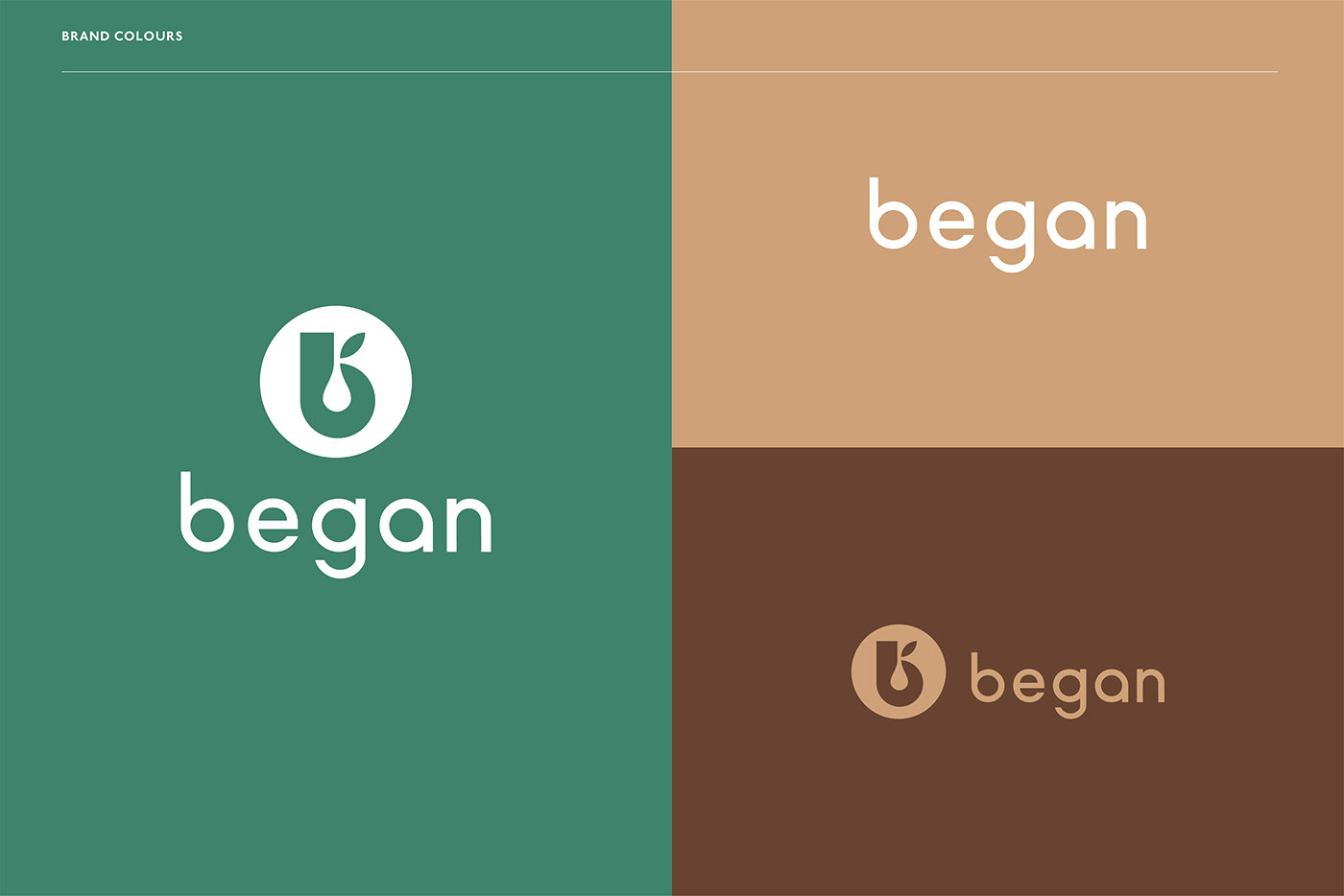
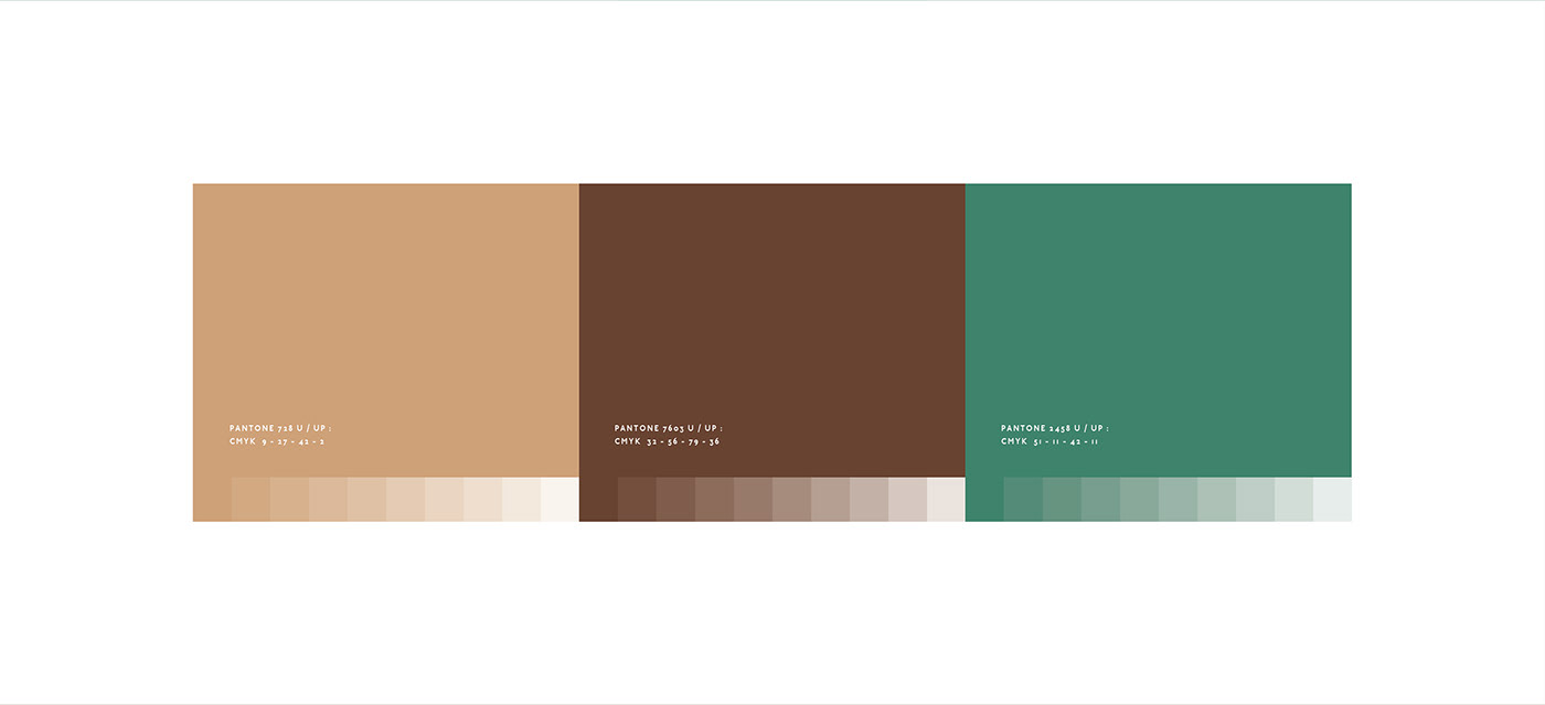
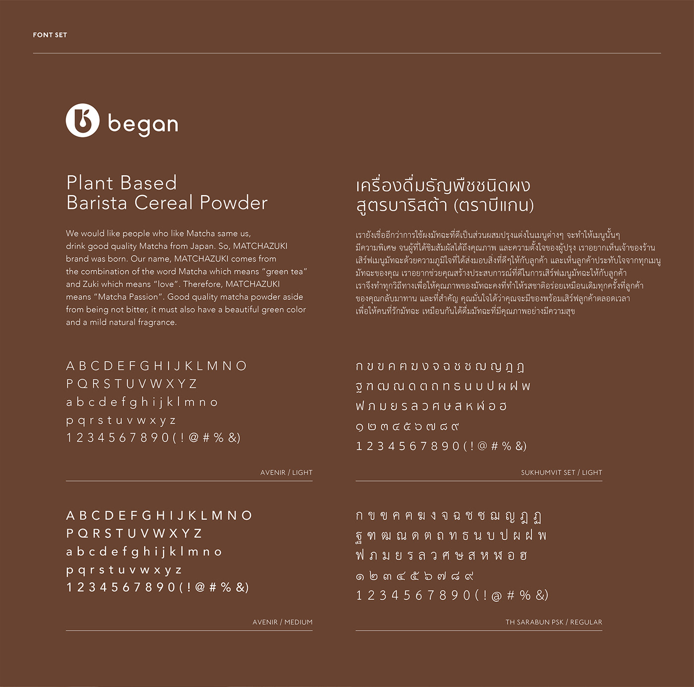
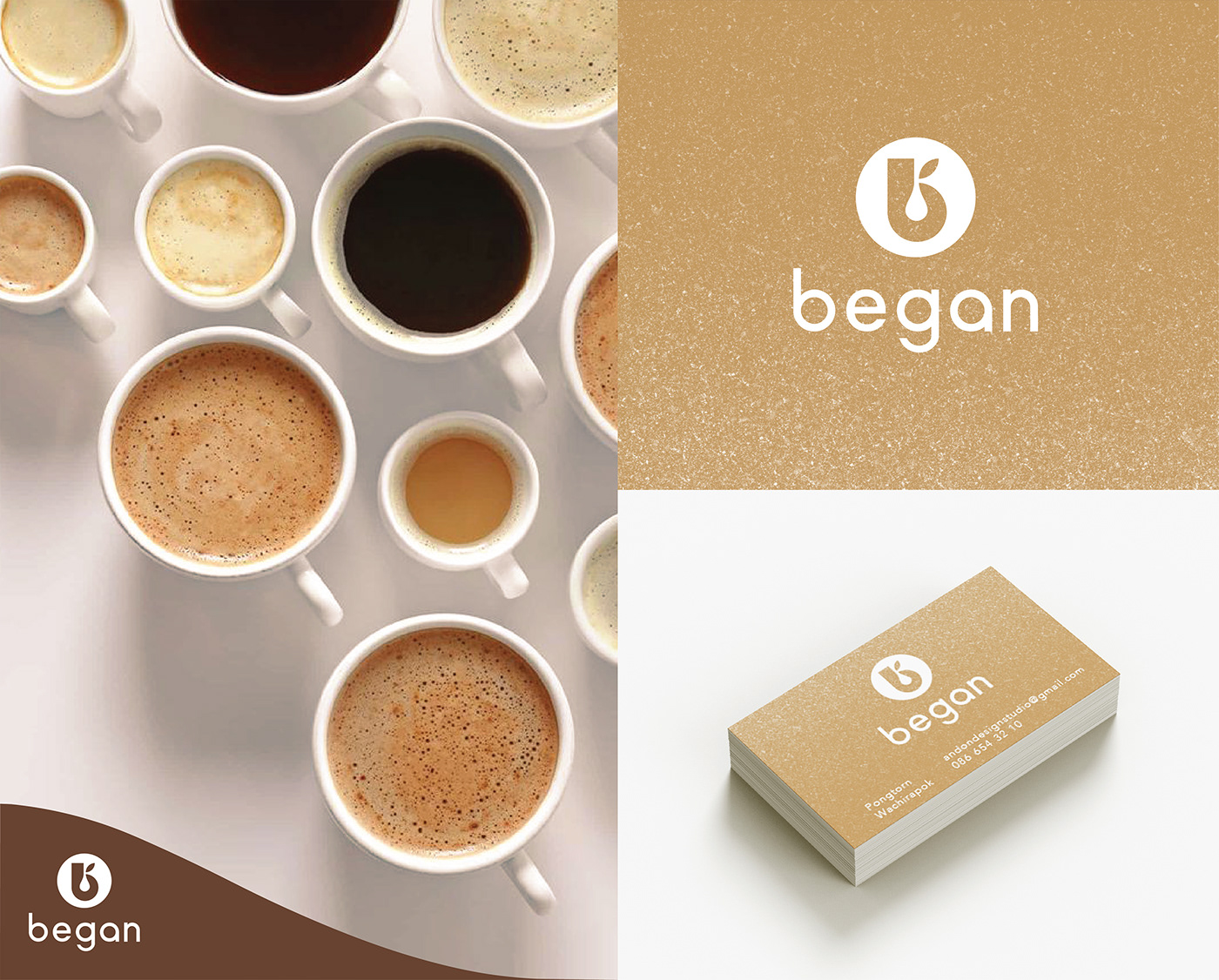
Brand fonts are chosen to facilitate communication while also enhances the brand’s quality appearance. The brand's green colour simply represents nature, cream represents milk and brown represents beverages, altogether creating a healthy brand image.



AGENCY :
Andon Design Daily Co.,Ltd.
CREDIT :
Design Director by Pongtorn Wachirapoka
Designed by Natcha Dusadeepun , Sira Getudom
VIA:
https://www.facebook.com/Beganbrand
https://www.instagram.com/began.brand
Copyright © Andon Design Daily Co.,Ltd. All Rights Reserved.


