2021 / Client: LAW
Brand refresh for Legal Action Worldwide (LAW), an organisation that takes a survivor centred, gender sensitive approach to creative legal strategies in order to improve access to justice and provide legal redress to the most vulnerable in conflict-affected and fragile regions.
LAW wanted to maintain a visual connection to their old branding when updating their identity, but wanted the new branding to better reflect the organisation and what it stands for. After a workshop run by Tayo Kopfer, I gained insight into how they felt about the existing logomark and colours, and what they wanted to see from the brand refresh. I ended up tweaking their logo and icon (with the help of Danica Ricciardi), Introduced new colours to compliment their blue and red, a new font for variety and created a series of custom illustrations.
LAW needed to use photographs and had a backlog of photos taken over the years, most of them were of very low quality. Taking cues from classic newspaper imagery, I worked with Tayo Kopfer, and we applied a compression technique called “dithering” to all their images, it transformed the low quality images into something nuanced and engaging.
Graphic Designer and Illustrator: Emma Philip
Digital Designer and Project Manager: Tayo Kopfer
Developer: Toby Tomlinson
Logo animation: Caitlin Weare
Digital Designer and Project Manager: Tayo Kopfer
Developer: Toby Tomlinson
Logo animation: Caitlin Weare
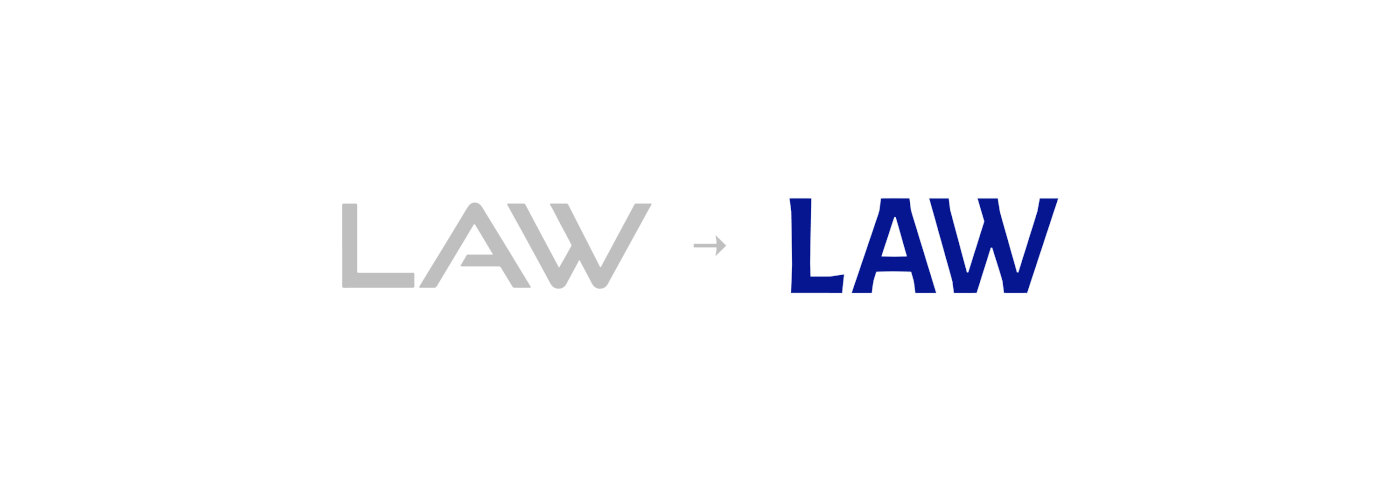
Derived from the shape of the original logo, I created a logotype that is approachable and trustworthy. Using the current icon as inspiration, I kept the circle shape as it represents unity, and created a more abstract representation of the globe and movement. The horizontal lines create a sense of tranquility and calm.


