Kiro Switchel
EN
Saber (Knowledge) and sabor (flavor) are two words with the same root: in Portugal, it is said that something flavory "knows well". For Kiro, a pioneer in the manufacture of switchel in Brazil, this connection goes beyond the dictionary: there, everything is made with flavor and knowledge.
Since 2017, the company's purpose has been to offer a drink that is not only healthy and clean label, but also to create a sustainable business capable of strengthening small producers. The four flavors and the canned version (carbonated and alcoholic) are made with ingredients of agroecological origin. Nowadays, production, which started in the home of one of the partners, takes place in its own factory in São Paulo, allowing full control of the chain. All this care, combined with the intense and refreshing flavor, makes Kiro a brand with a devoted audience.
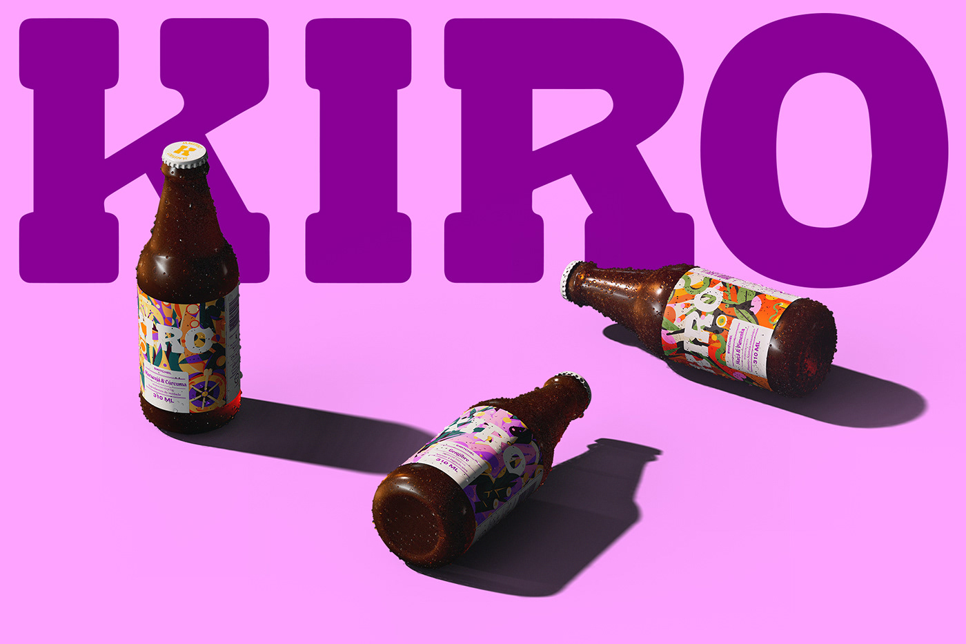
To reflect the more mature moment of the business, we redesigned the beverage labels, reinforcing the protagonism of some elements already consolidated: the logo (Estúdio Colletivo) and the illustrations (Fabrizio Lenci) that refer to the ingredients of each flavor.
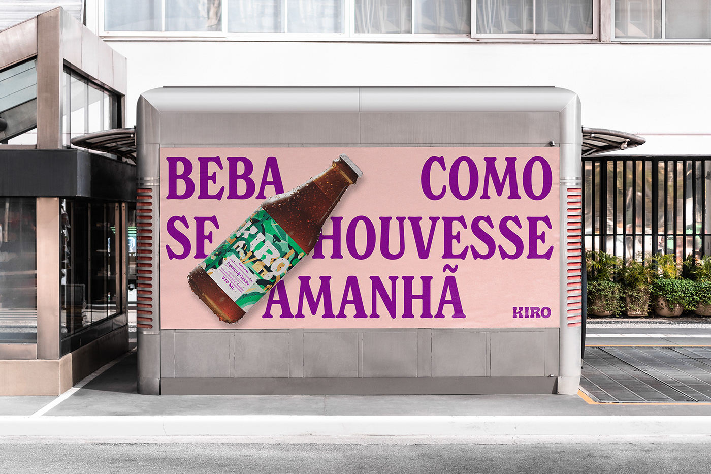
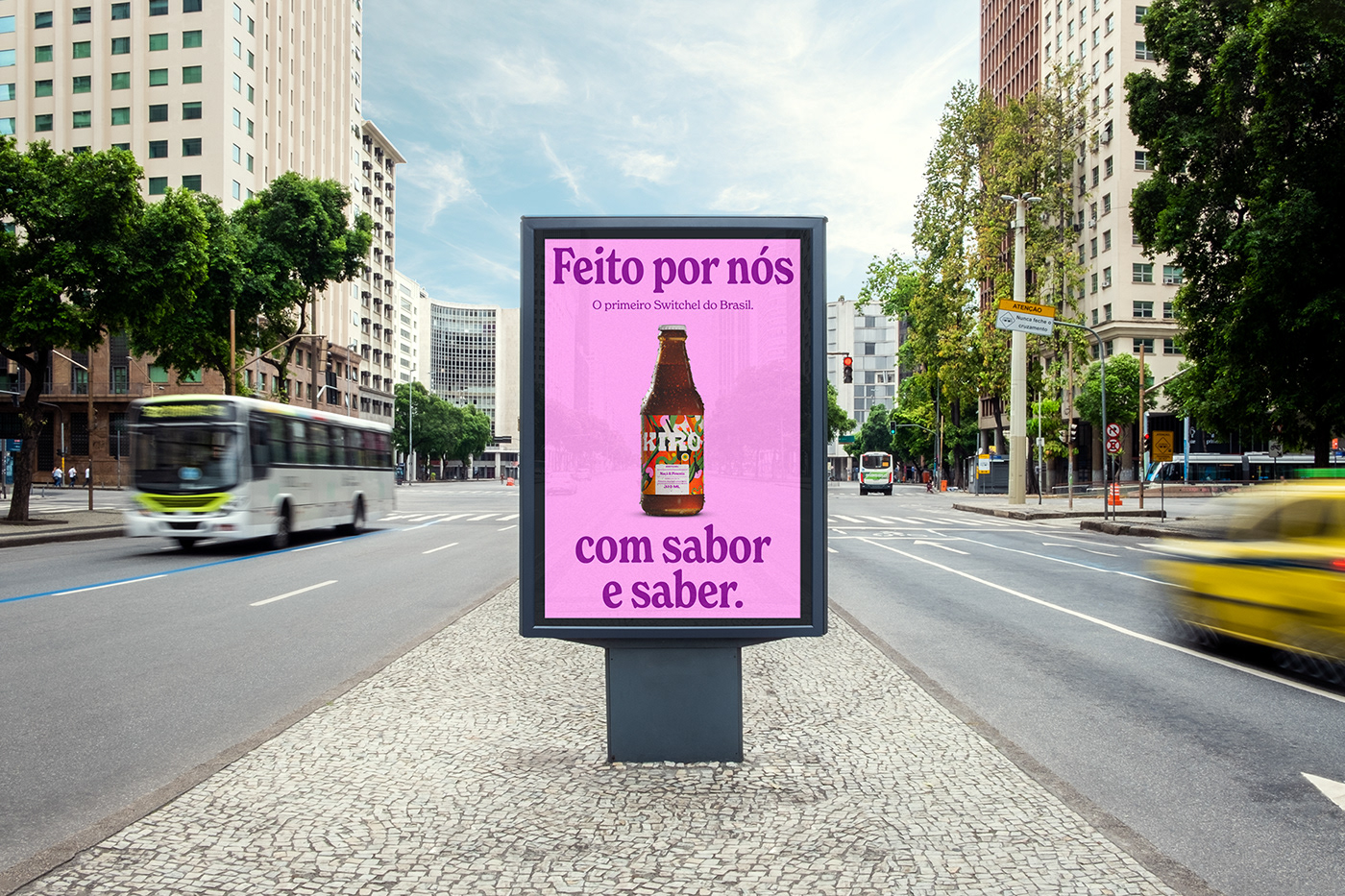
In addition to the labels, we also designed a new visual identity, contemplating a chromatic palette, illustrations and iconography, positioning Kiro as a drink beyond sober curious and suitable for all occasions. The new typographic palette was designed for a brand that makes a great of use of text in its communication: words and phrases are organized in order to generate recognizable textures, strengthening the idea that Kiro knows very well.
COLOPHON
Typography: New Spirit + Nimbus Sans
TEAM
Creative Direction & Design: Polar, Ltda.
Identity illustration: Stella Bonici
Label illustrations: Fabrizio Lenci
Kiro Logo: Estúdio Colletivo
3D Modeling: Lucas Kawakami
3D render and motion: AGED*04
Kiro Team: Leeward Wang, Raquel Leal, Roberto Meirelles
Creative Direction & Design: Polar, Ltda.
Identity illustration: Stella Bonici
Label illustrations: Fabrizio Lenci
Kiro Logo: Estúdio Colletivo
3D Modeling: Lucas Kawakami
3D render and motion: AGED*04
Kiro Team: Leeward Wang, Raquel Leal, Roberto Meirelles
PT
Saber e sabor são duas palavras com a mesma raíz: em Portugal, diz-se que algo saboroso "sabe bem". Para a Kiro, pioneira na fabricação do switchel no Brasil, essa conexão vai além do dicionário: ali, tudo é feito com sabor e saber.
Desde 2017, o propósito da empresa é oferecer uma bebida não apenas saudável e clean label, mas também criar um negócio sustentável e capaz de fortalecer pequenos produtores. Os quatro sabores e a versão enlatada (gaseificada e alcoólica) são feitos com ingredientes de origem agroecológica. Hoje, a produção que começou na casa de um dos sócios, acontece em uma na fábrica própria em São Paulo, permitindo total controle da cadeia. Todo esse cuidado, aliado ao sabor intenso e refrescante, fazem da Kiro uma marca com um público devoto.
Para refletir o momento mais maduro do negócio, redesenhamos os rótulos das bebidas, reforçando o protagonismo de alguns elementos já consolidados: o logotipo (Estúdio Colletivo) e as ilustrações (Fabrizio Lenci) que remetem aos ingredientes de cada sabor.
Além dos rótulos, também desenhamos uma nova identidade visual, contemplando paleta cromática, ilustrações e iconografia, posicionando Kiro como uma bebida para além dos sober curious e adequada para todas as ocasiões. A nova paleta tipográfica foi pensada para uma marca que faz muito uso de texto em sua comunicação: as palavras e frases são organizadas de modo a gerar texturas reconhecíveis, fortalecendo a ideia de que Kiro sabe muito bem.
COLOFÃO
Tipografia: New Spirit + Nimbus Sans
Tipografia: New Spirit + Nimbus Sans
EQUIPE
Direção de Criação & Design: Polar, Ltda.
Ilustrações identidade: Stella Bonici
Ilustrações rótulos: Fabrizio Lenci
Logotipo Kiro: Estúdio Colletivo
Modelagem 3D: Lucas Kawakami
Render e motion 3D: AGED*04
Equipe Kiro: Leeward Wang, Raquel Leal, Roberto Meirelles
Direção de Criação & Design: Polar, Ltda.
Ilustrações identidade: Stella Bonici
Ilustrações rótulos: Fabrizio Lenci
Logotipo Kiro: Estúdio Colletivo
Modelagem 3D: Lucas Kawakami
Render e motion 3D: AGED*04
Equipe Kiro: Leeward Wang, Raquel Leal, Roberto Meirelles