


just smile!
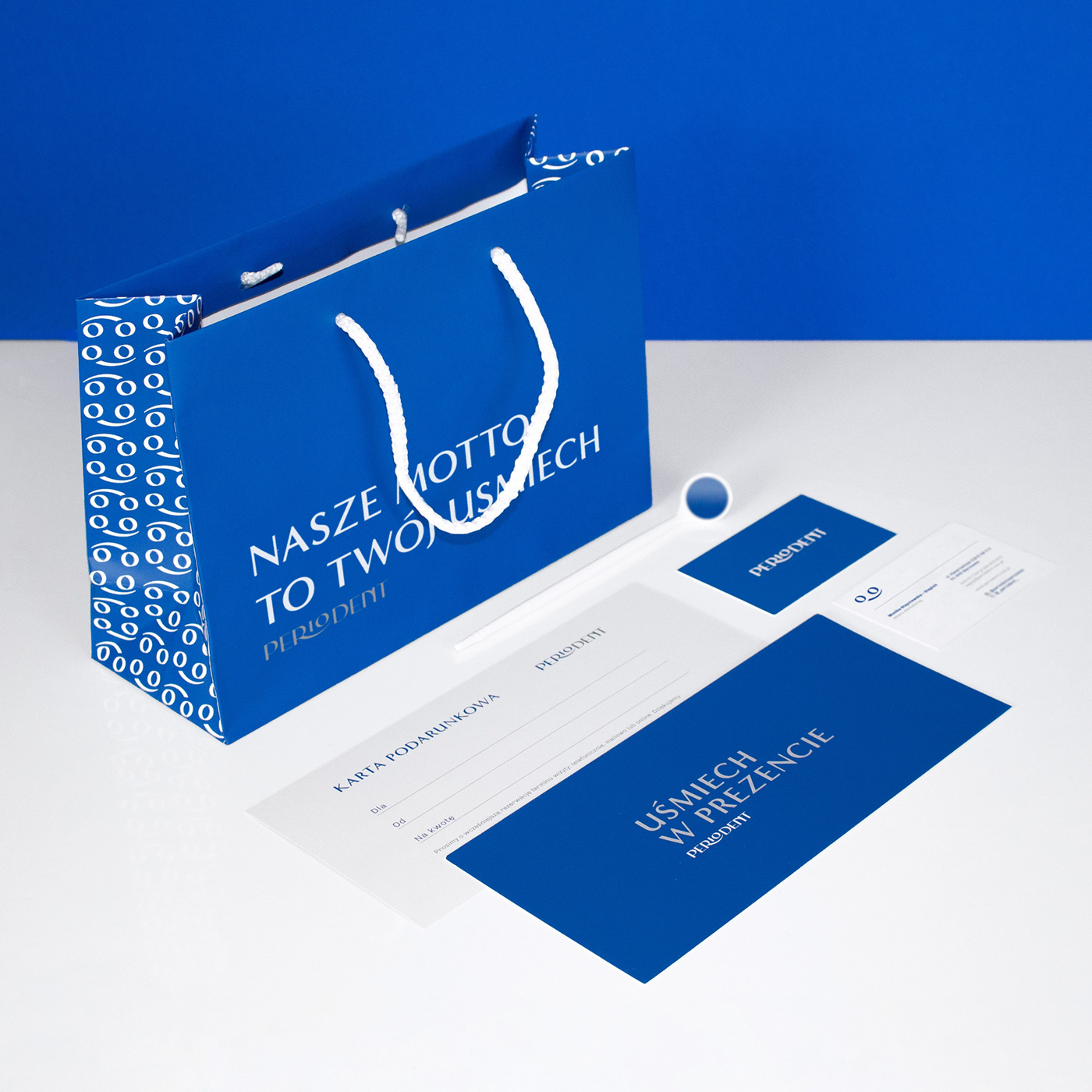
This Warsaw dental clinic prides itself in effecient and trouble-free caries, periodontitis and peridontal disease treatments. For them, their ultimate goal is customers' satisfaction and their beautiful smile. At the end of the day, their ultimate goal is the custommers' satisfaction and their beautiful smile. The clinic's interior is snow-white alongside blue annd grey additions. In order to fill in and complete the big idea, we made good use of the same colors and focused on the clinic's style itself, while keeping in mind what's the most important thing about dentists' general goal - the smile.

challenge
The dental clinic wanted to change its image among customers for more modern, with a hint of elegance. However, it had to be taken to account that the goal was also to appear family-friendly. Furthermore, it aimed to fit the current trends and stand out from other clinics.
& solution
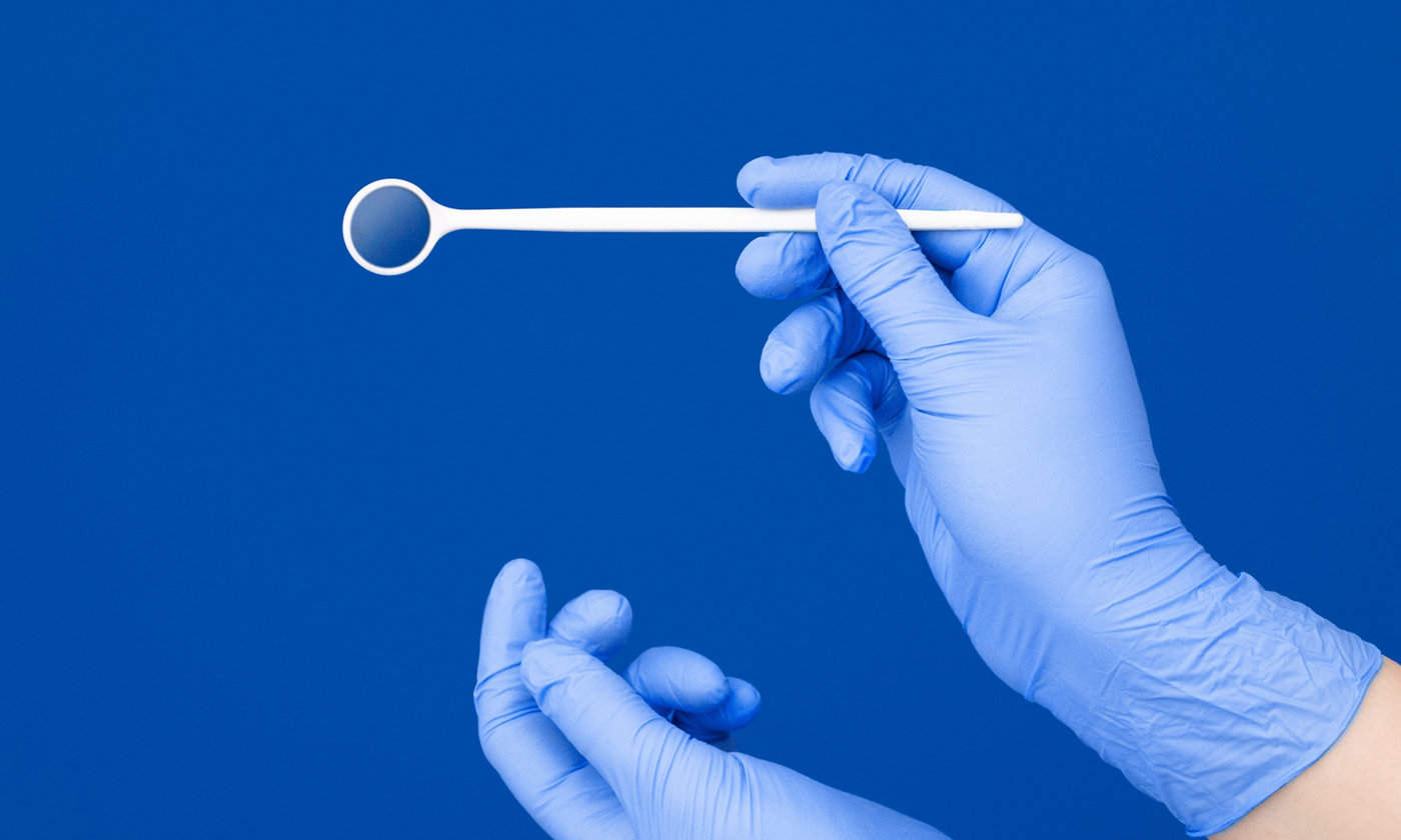
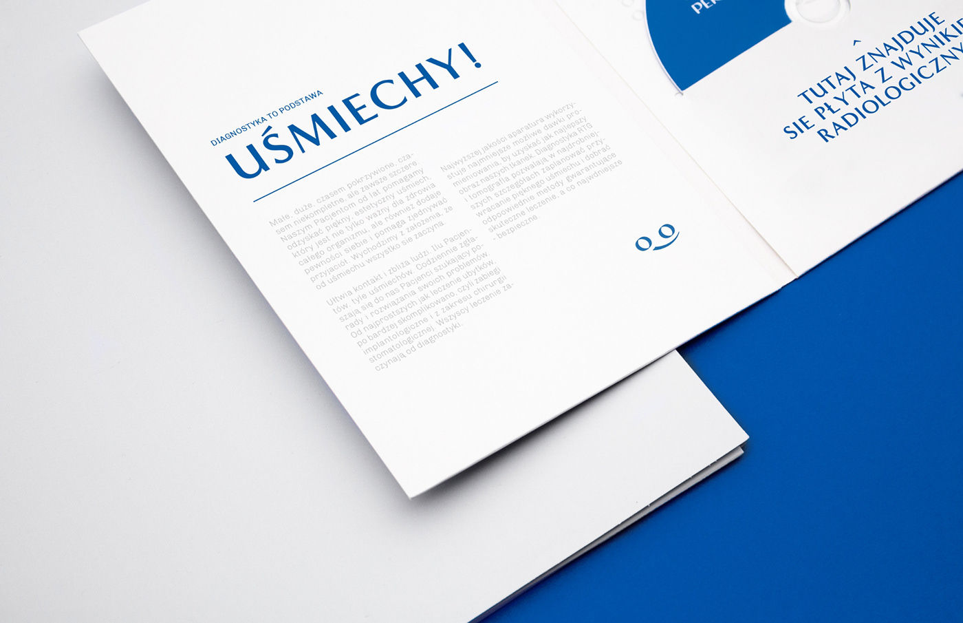
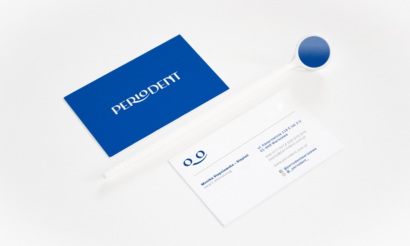
While designing the first scratches, our attention was drawn to the interior's arrangement, that is primarly white, although there happen to be isolated blue elements, that has become the primary identification color in contrast to the place itself. The imporant part was also previously mentioned modernity and elegance, which can be seen on the typography and designed layout. Even though the logo is associated with high quality service, it represents a smile-shaped signet. And that is what's crucial to the clinic - the client's satisfaction.


|
|
project menagment —— marta wołejko
art direction & design —— konrad rószkowski
support —— weronika jastrzemska
client —— periodent

|
|


