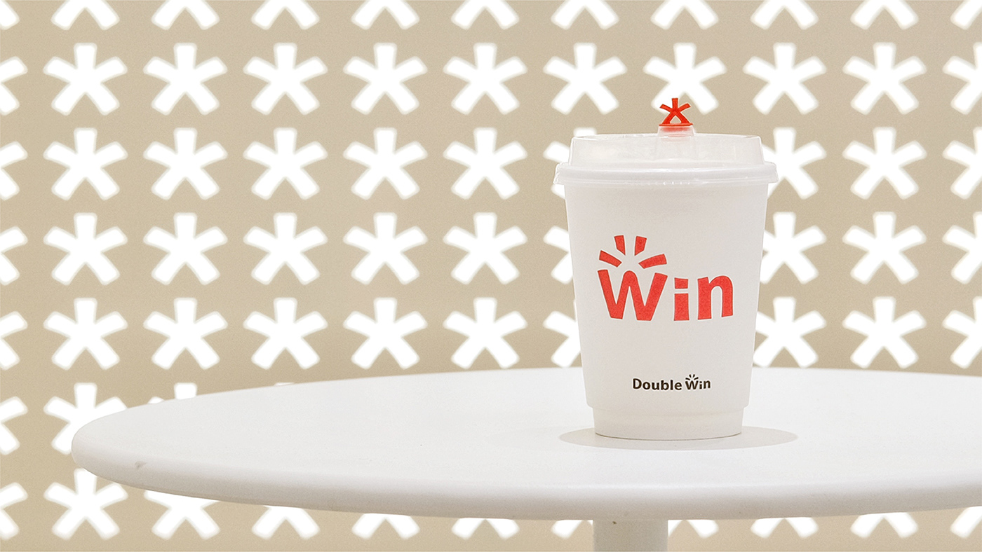

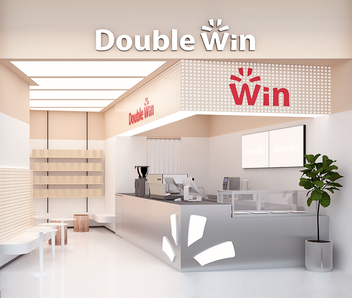
Double Win is a coffee brand that has been rooted in Shanghai for more than 5 years. Starting with niche flavors and gradually gaining popularity of the white-collar group, they decided to catch up in the wave of new consumption and expand into the local coffee market with new flavors.
LxU worked for 6 months to create a new brand image for it, including store materials, e-commerce packaging and a full set of brand design.
Double Win 是一家扎根在上海五年多的咖啡品牌。从小众口味做起,逐渐收获白领群体味蕾的他们,决定在新消费浪潮中迎浪而上,拓展本土新口味咖啡饮品市场。品牌形象升级的需求迫在眉睫。
LxU 历时六个月为其打造全新的品牌形象,以及门店物料、电商产品包装等全套品牌设计方案。
Brand Refresh Showcase
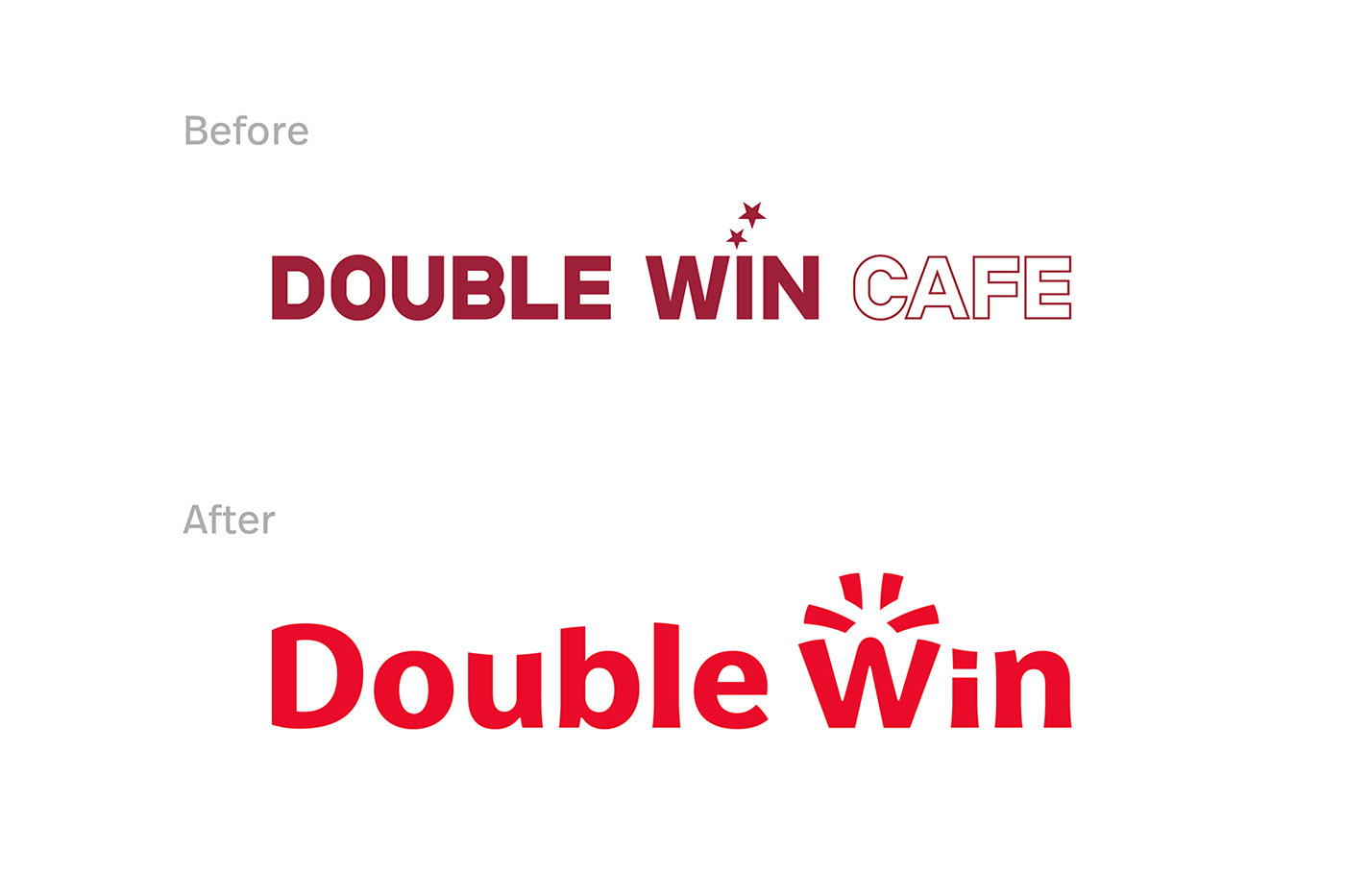
After research and study, LxU found that the original logo and design language of the brand were very inconsistent due to the different plans of each store. It was difficult for the public to remember the brand from the visual level, and even hard to recall a full brand name because the name was too long.
LxU 在实际调研后发现,品牌原本的 logo 和设计语言由于各个门店规划的不同,差异性十分明显。大众很难从视觉层面记住品牌,甚至因为名称太长难以记住全名。

Animated Logo
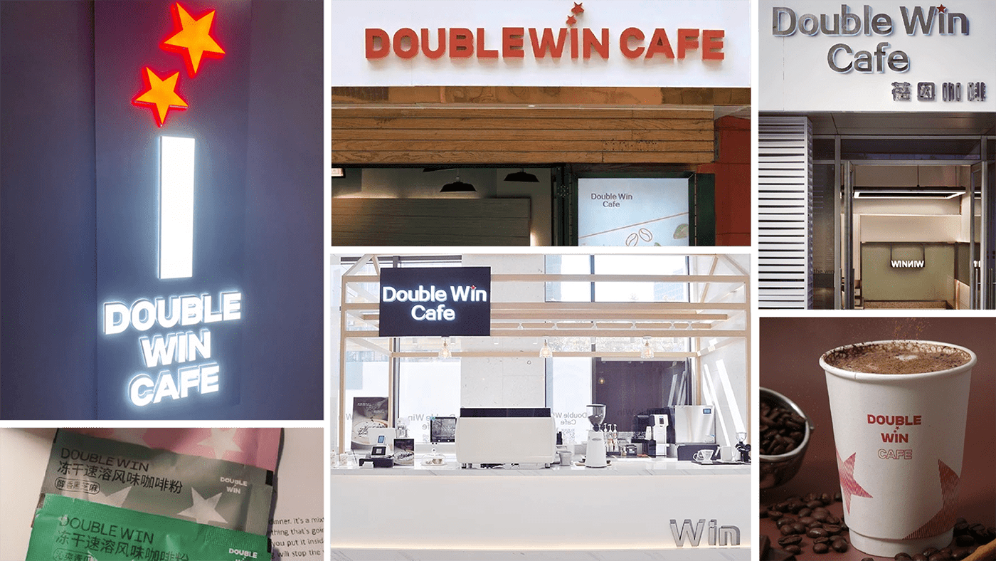
Before Rebranding
However, the voices of some consumer groups caught our attention: loyal fans would affectionately call it "Da BaoWen" (which means "Big Wave" in Chinese, since the pronunciation of this two words is very close), the word "Win Coffee" could be directly associated with the brand in the search engine, and a famous influencer even simplified it to “Some-Win" coffee when recommending it in a live show.
It is clear that in long-term communication, the short and concise word "Win" has become a powerful symbol used by some consumers to identify the brand.
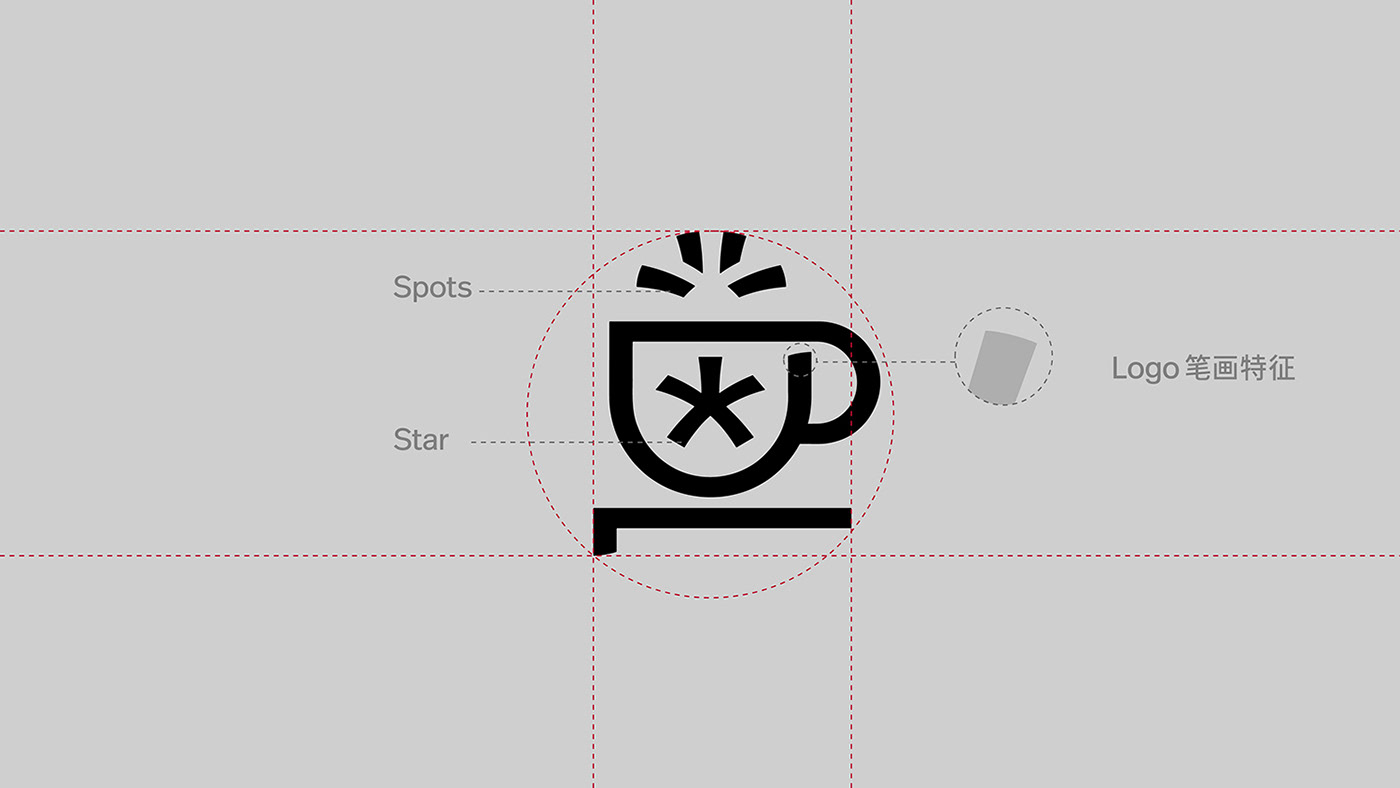
Therefore, "Win" became a key point for our in-depth brand design upgrade work. After several rounds of analysis and experimentation, the core starting point of the strategy is defined as taking the "Star" from the original logo to create a recognizable "Win".
但同时,一些消费群体的「反馈声音」引起了我们的注意:忠实粉丝会亲切地称呼 Double Win 为「大保温」;在搜索引擎中「Win 咖啡」可以直接关联到品牌;某头部主播更是在直播推荐它时,简化为「什么 Win」咖啡。
可见在长期沟通中,短小精悍的「Win」已经成为了一部分消费者用来辨识品牌的有力符号。 于是,「Win」成为我们深入品牌升级设计工作的重要抓手。在多轮分析与尝试之下,「结合品牌原 logo 中的星星图形,打造一个有辨识度的 Win」成为策略的核心出发点。
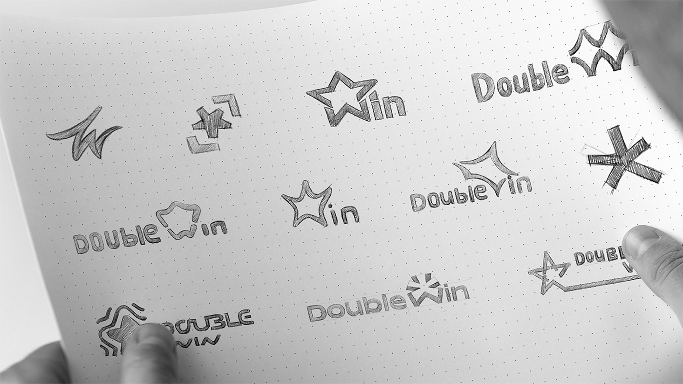

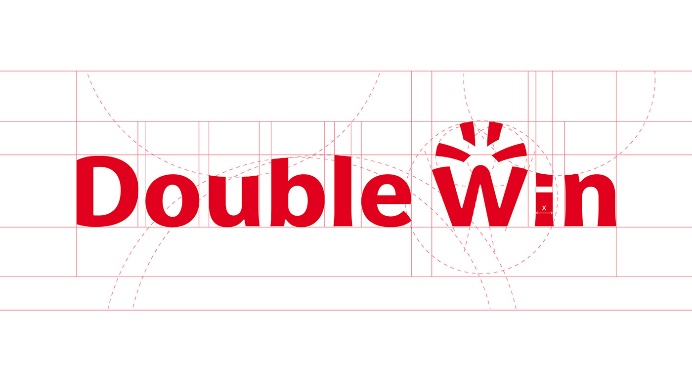
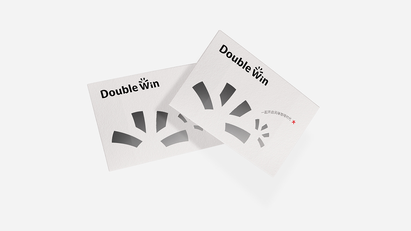
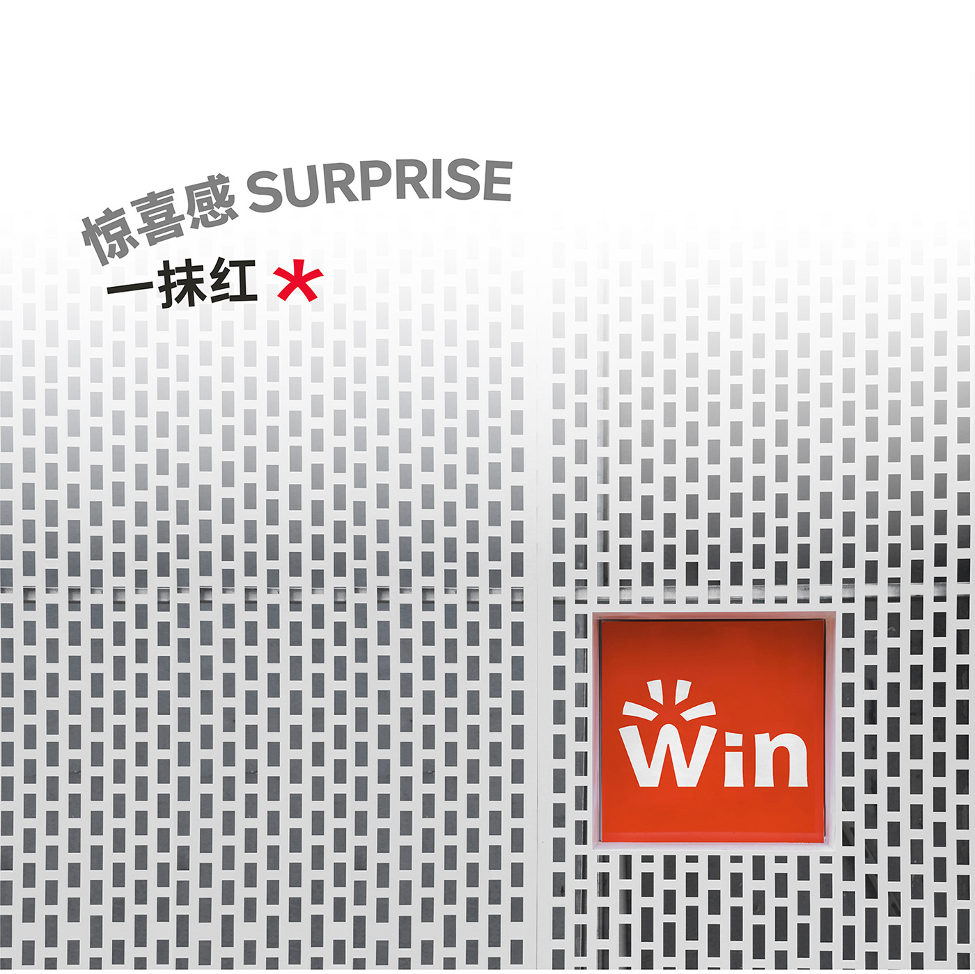
Eventually, the negative shape of the "Star" and the glyph of "Win" is integrated organically to develop a creative solution for the logo. At the same time, we also introduced the creative idea that would lead the whole brand upgrade: a sense of surprise.
最终,我们通过将「星星」作为负形与「Win」的字形相结合的方式,产出了 logo 的创意方案。同时提出了引领整个品牌升级创意的 idea:惊喜感。

This originates from the product level, Double Win combines many flavors of Thailand and produces very fresh flavors such as lemon leaf, which is recognized and followed by consumers. And we hope that in the future, each new product will bring surprises and make "Special Flavor" a placeholder for the brand in public minds’.
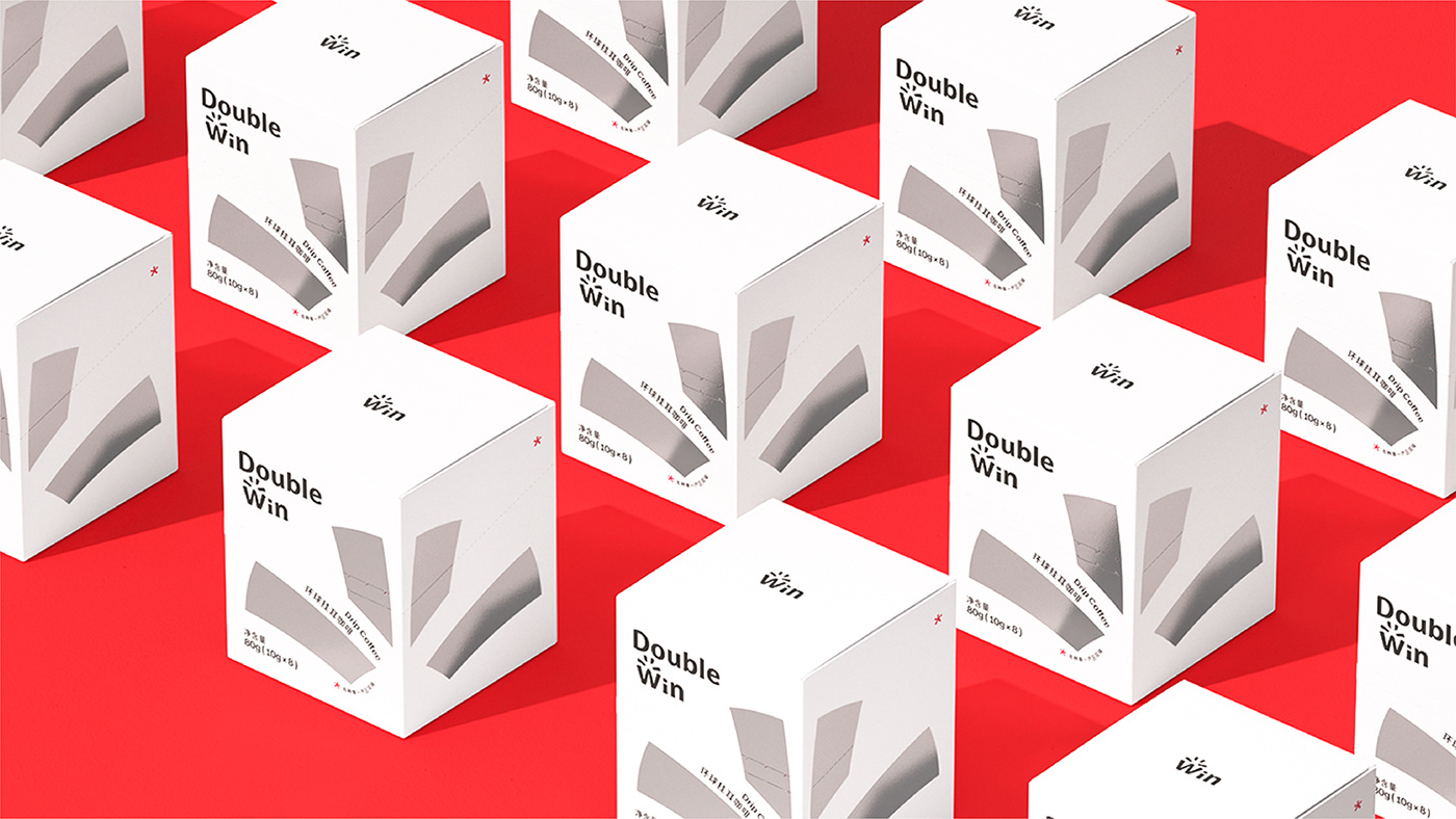
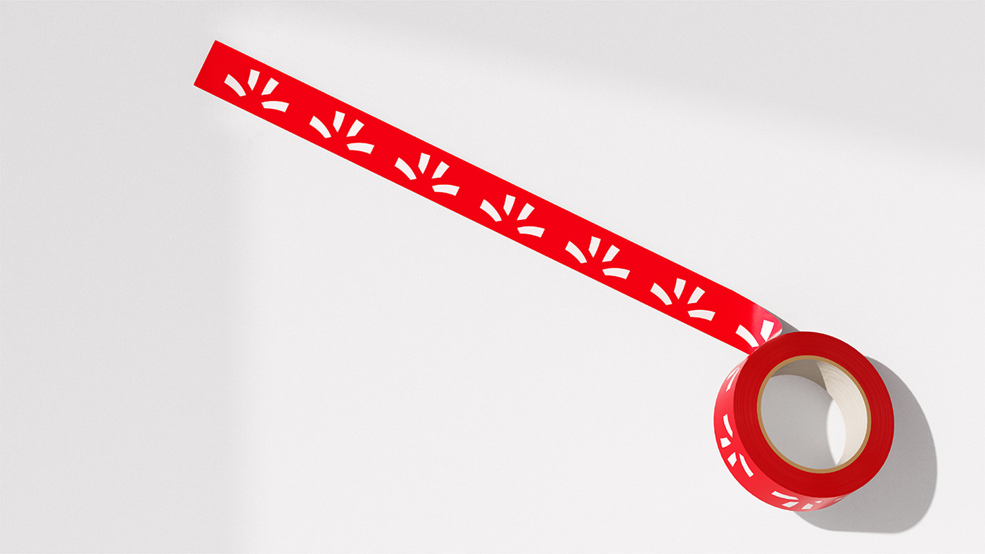
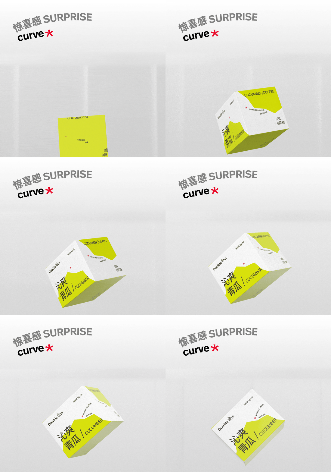
In order to strengthen the sense of surprise, we extracted four key graphic design elements: Spots, Star, Curve and a touch of red, and applied them to the logo, layout design, packaging design and color scheme in all aspects.
这是因为从产品层面,Double Win 结合泰国的众多风味,调制出柠檬叶等新奇口味,已经被消费者认可和追随。并希望在未来,每次新品都能带来惊喜,让「口味特调」成为大众的心智占位。
为了实现「惊喜感」,我们在品牌设计的细化过程中,提炼出了四个图形设计的要素:Spots、Star、Curve 和一抹红色,并将其全方位应用于 logo、版式设计、包装设计、色彩搭配等内容中。


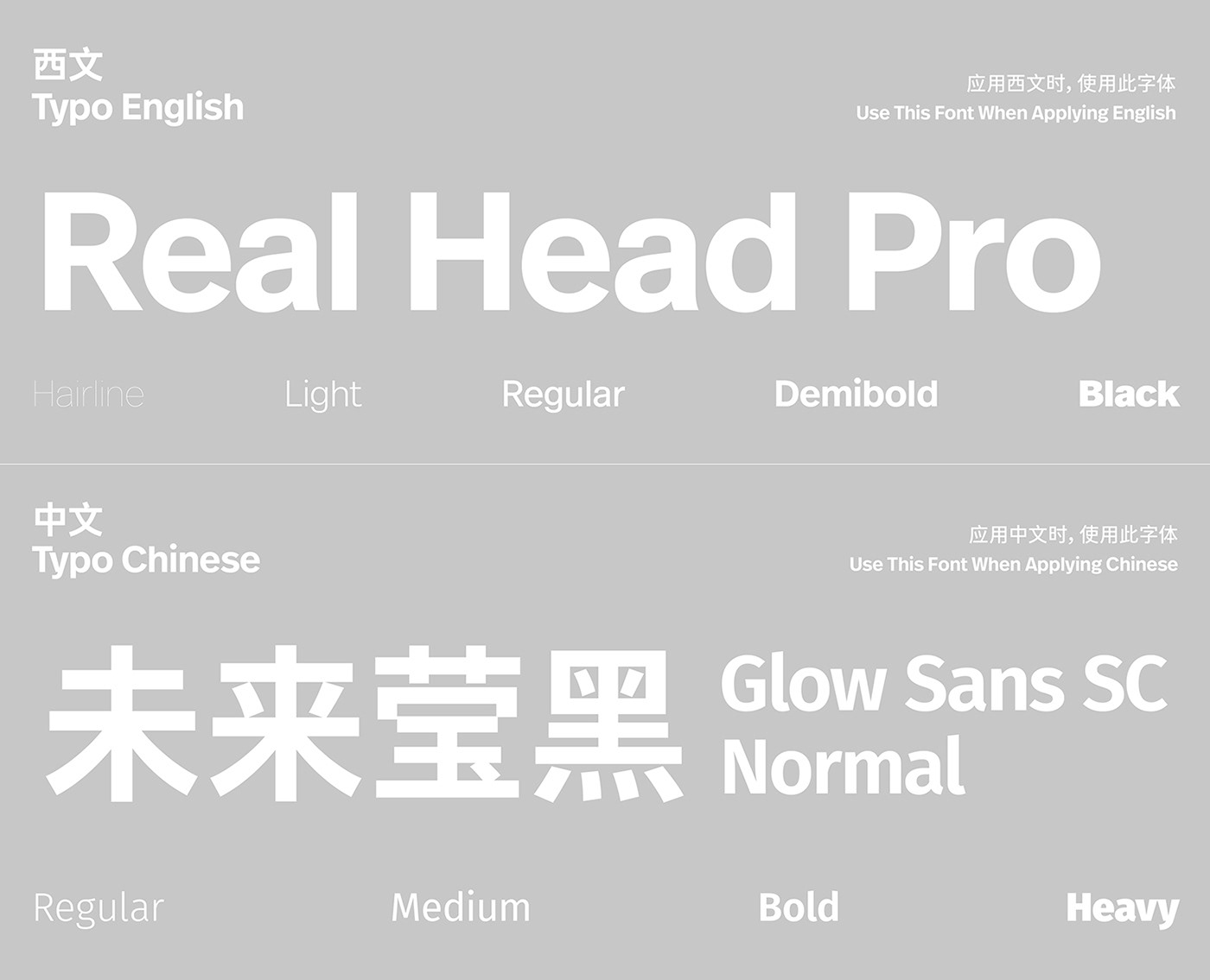
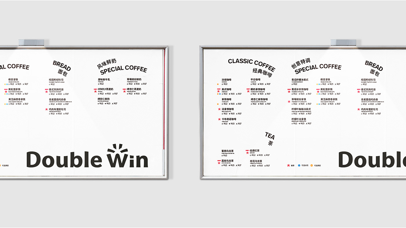
After many attempts and comparisons, Welai Glow Sans, a simple and concise font suitable for both web and print, became the preferred Chinese font. Matching with the English font Real Head, which is well-balanced and comprehensive.
经过多次尝试与比对之后,笔画简练、同时适用于屏显和印刷的「未来莹黑」成为中文字体首选。搭配的英文字体 Real Head 具备整体均衡、包容性强的特点。

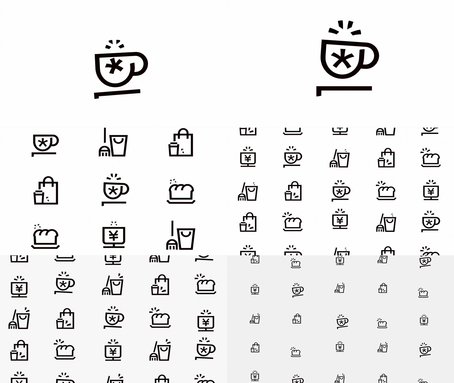
Continuing the core idea of the sense of surprise, we applied the element of "Spots" to the icon design. It enhances the sense of dynamics and gives each icon a light-up moment.
延续「惊喜感」的核心创意,将 Spots 要素应用在 icon 设计中。既增强动态感,也为每个 icon 赋予了「点亮瞬间」。
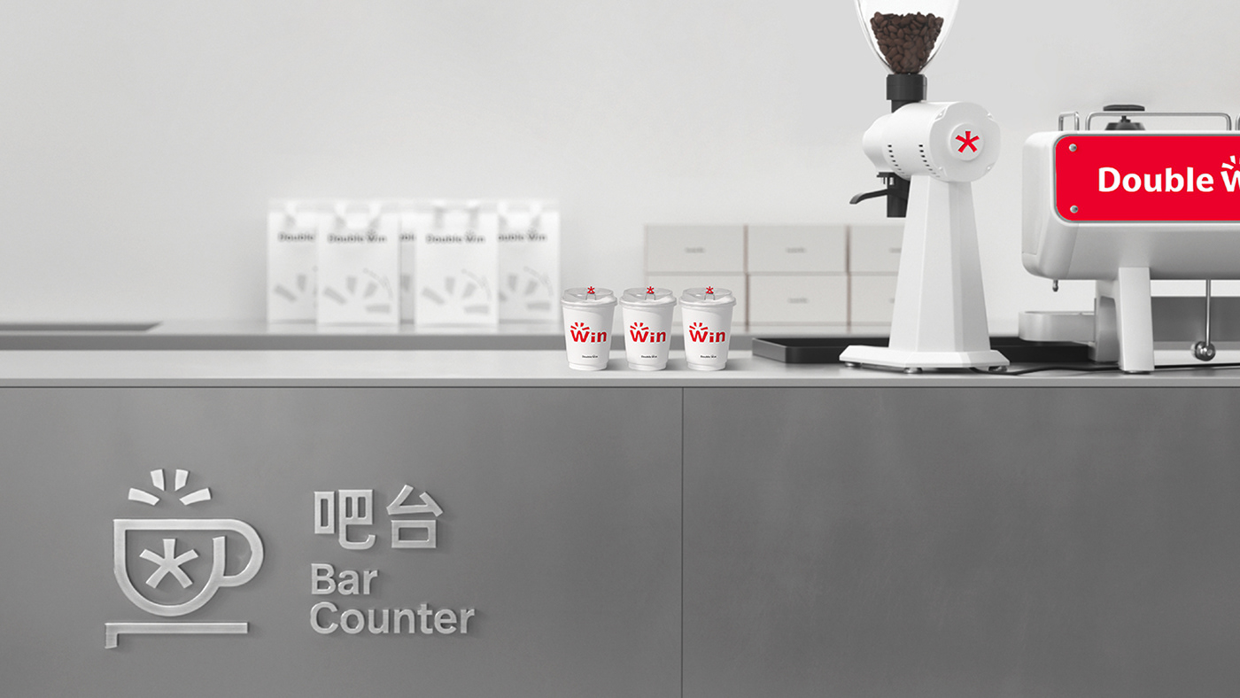

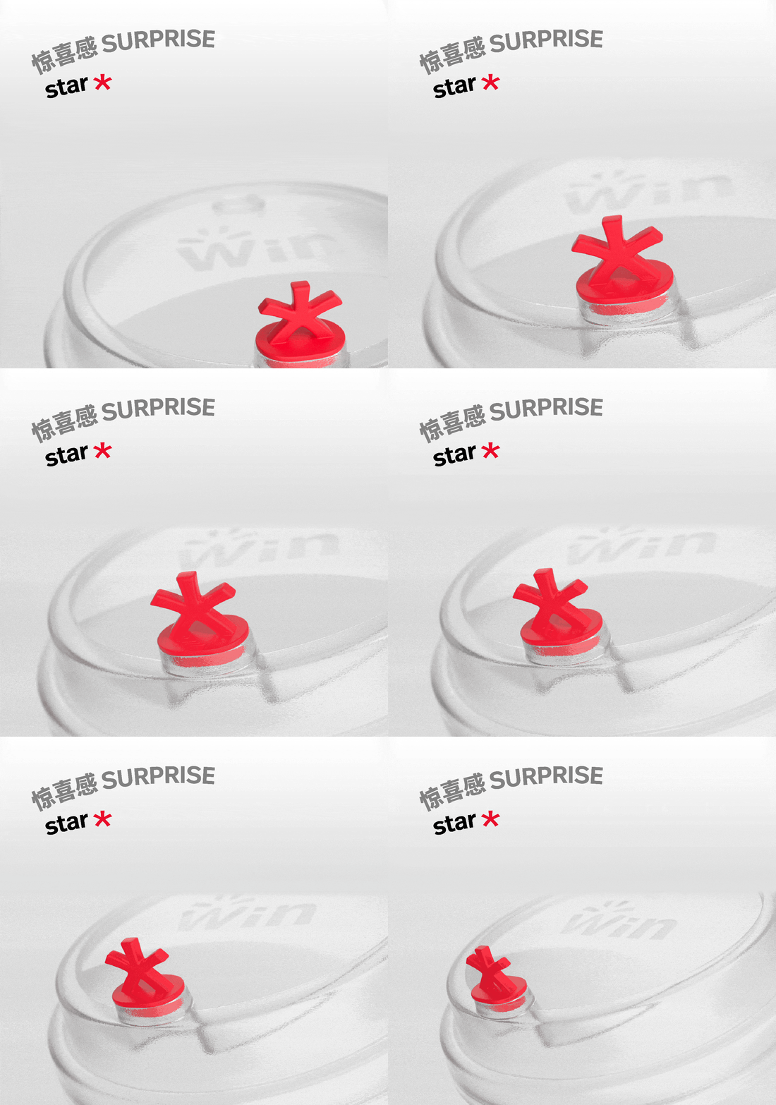
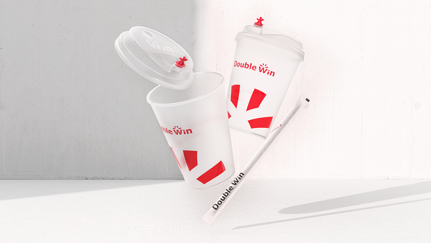
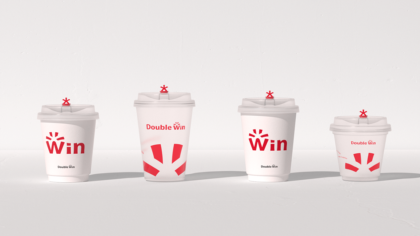
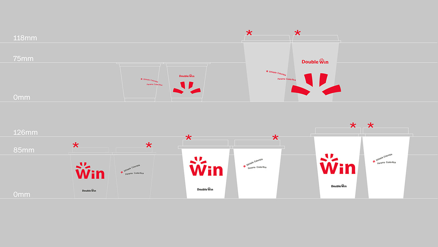
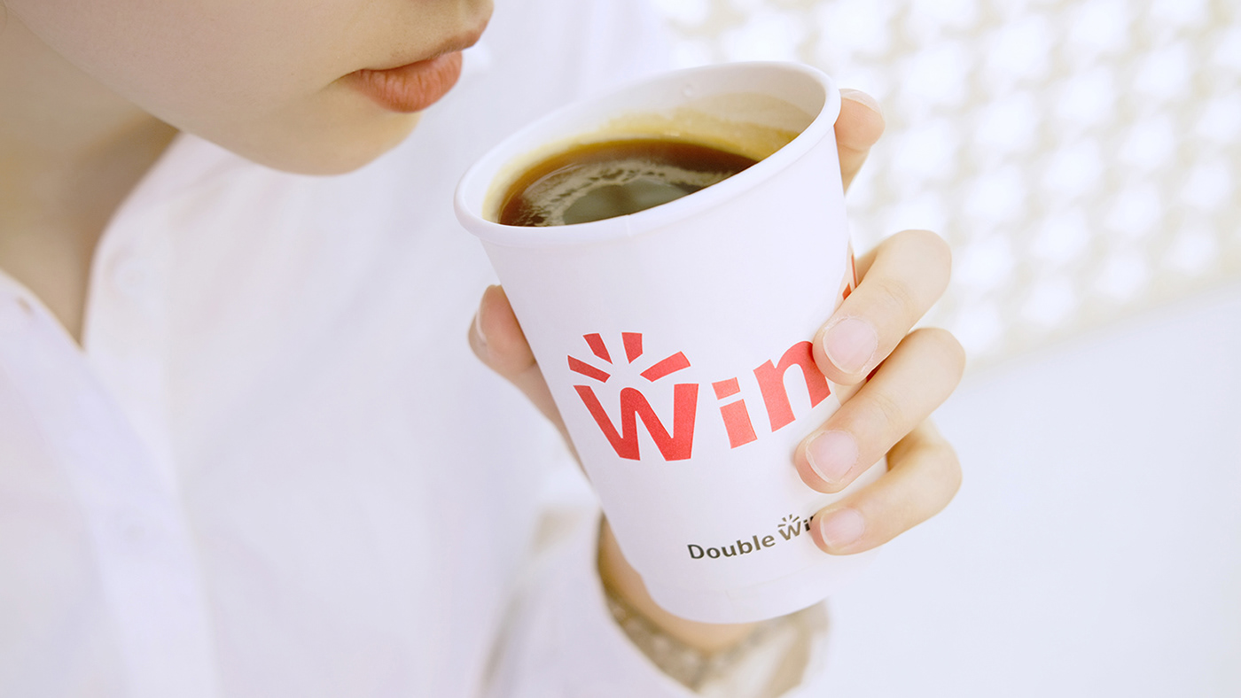
In the hot battlefield of the new consumption field, online communication touchpoints are particularly important. As an important connection point between stores and online communication, the coffee cup, which is most often featured in consumers' social media photos, became one of the key materials we focused on.
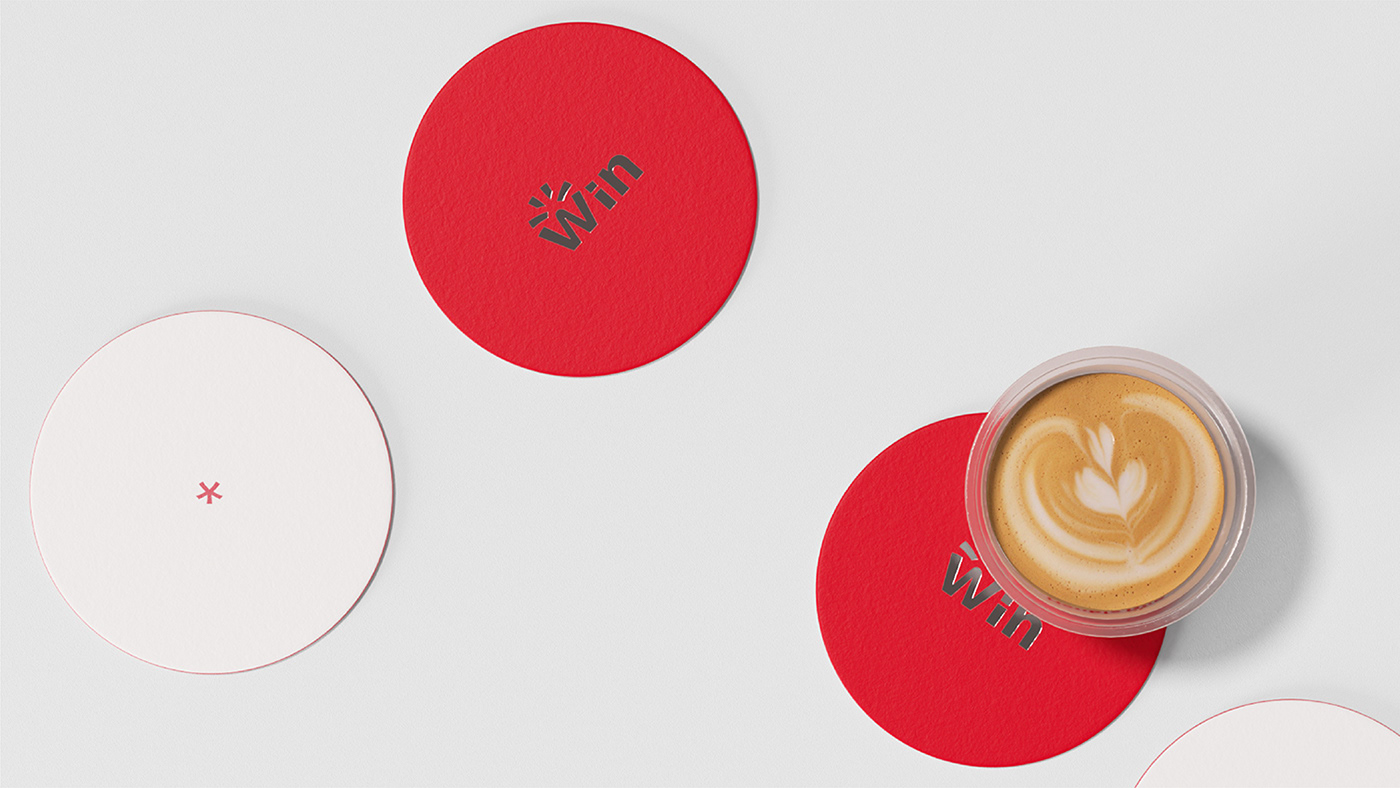
The combination of the "Win" exposure and the iconic red and white color palette, along with the use of the Star stopper and the Spots pattern, the emphasis and unified combination of these branding elements ensure the unity of the brand, while the cups are available in various sizes and with different hot and cold functions.
在新消费领域的火热战场中,线上传播触点尤为重要。作为门店与线上传播的重要连接点,最常在消费者打卡照中出镜的「咖啡杯」,成为我们重点关注的物料之一。
通过「Win」的露出面积与标志性红白配色,结合星星杯塞与 Spots 图案的应用,这些品牌要素的强调与统一组合,让杯子在多种尺寸、冷热功能差别需求的前提下,保证了品牌的统一性。


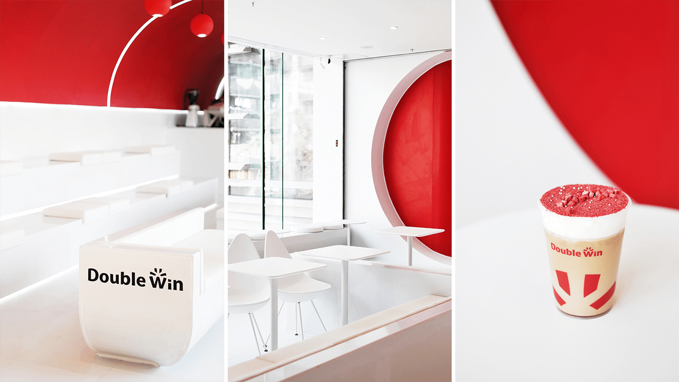
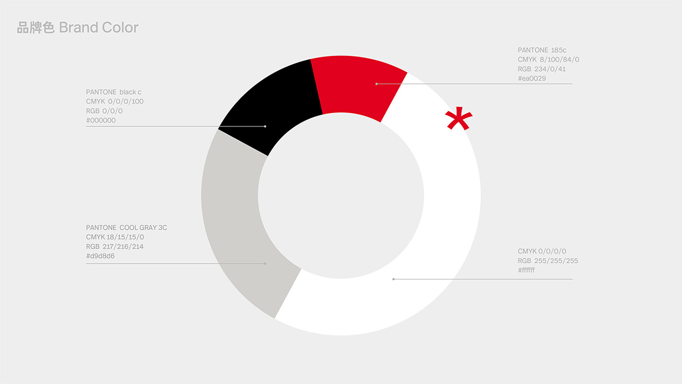
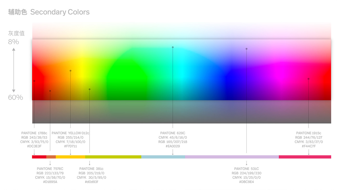
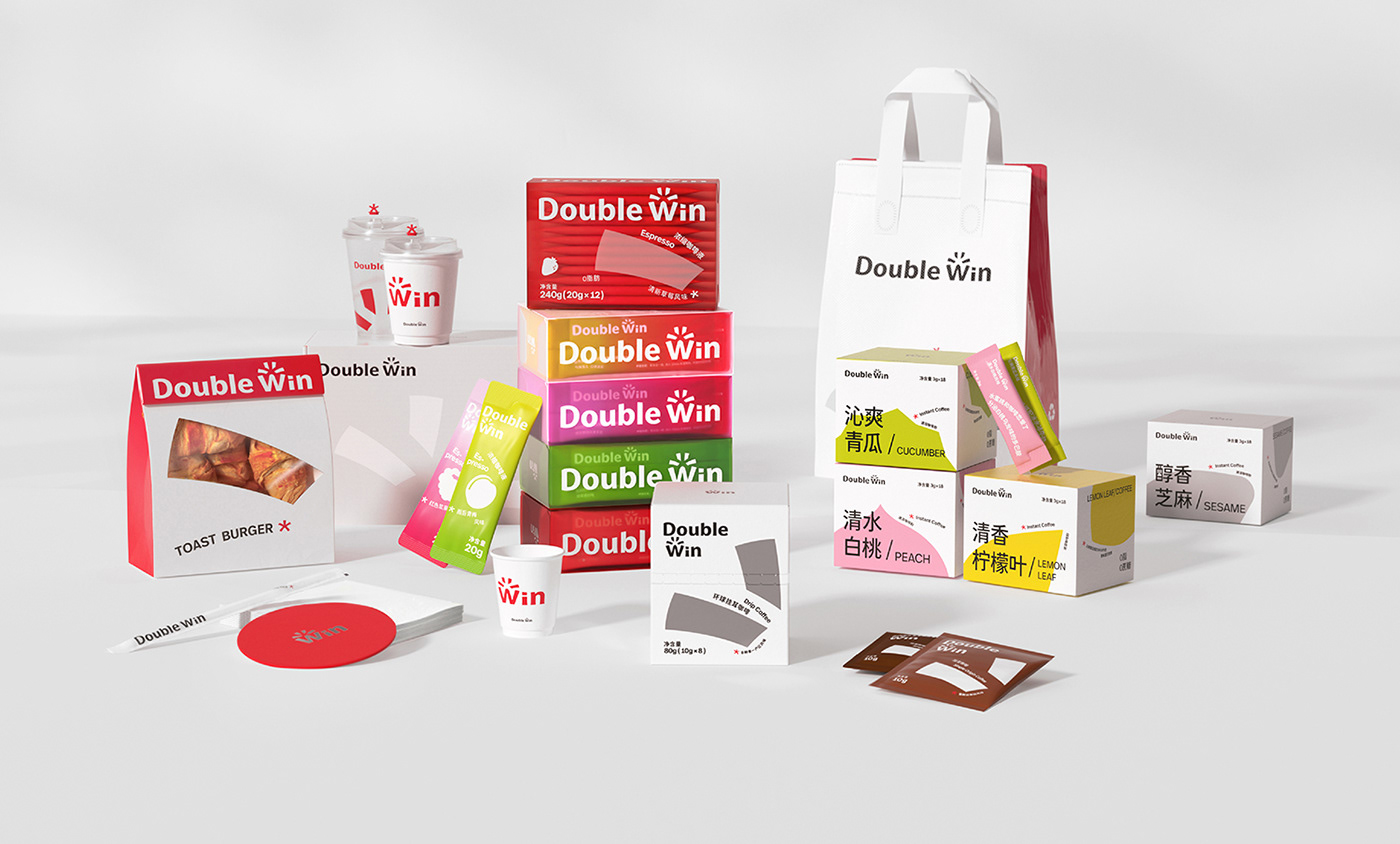
In addition to emphasize the ratio of brand colors — red, white and black, we combined the core idea of sense of surprise and gave the secondary colors a wider color range. By unifying the saturation and brightness of the secondary colors, more possibilities were provided for online product packaging and communication design.
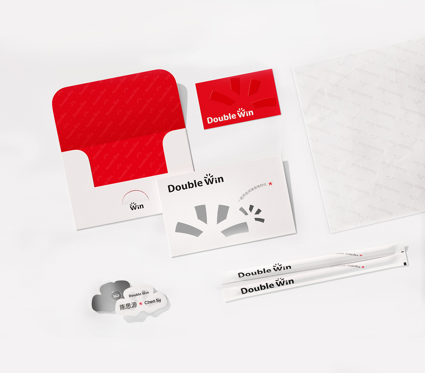
At the same time, by ensuring the uniformity of logo position and proportional area, combined with other elements of surprise, the overall visual integrity and systematization were achieved.
在强调品牌色「红、白、黑」的配比基础之上,我们结合「惊喜感」核心创意,给予辅助色更广泛的色域区间。统一饱和度与亮度的辅助色,赋予线上产品包装、传播物料设计等触点更多的可能性。
同时保证 logo 位置和占比面积统一,结合其它惊喜感要素,实现整体视觉的完整性与系统性。


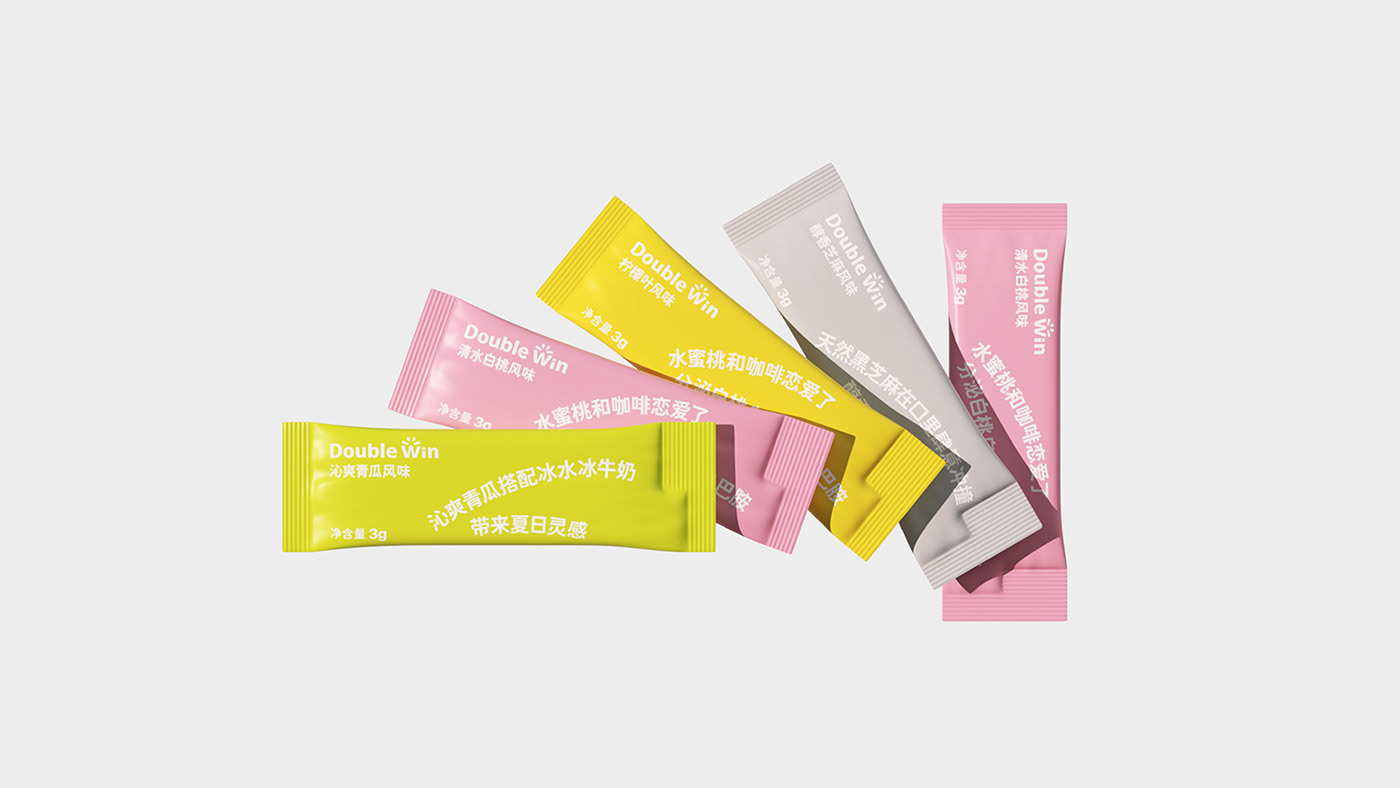
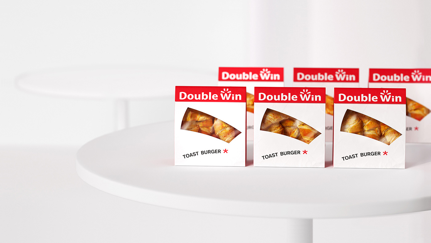
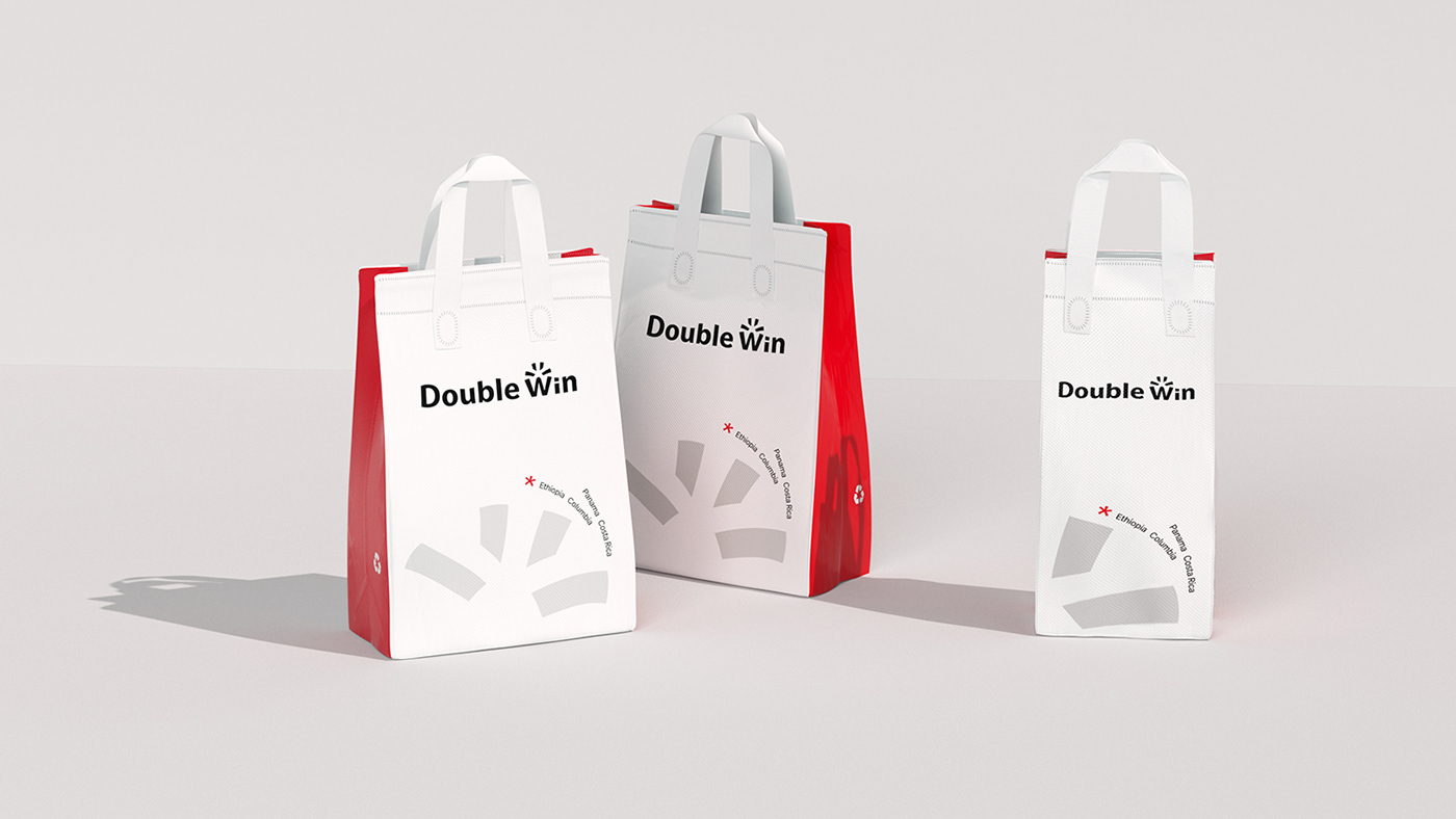
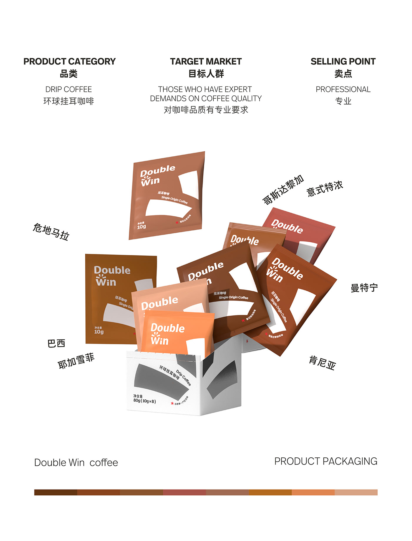
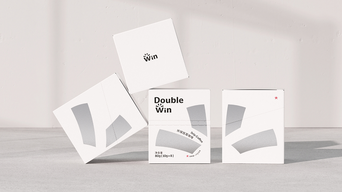
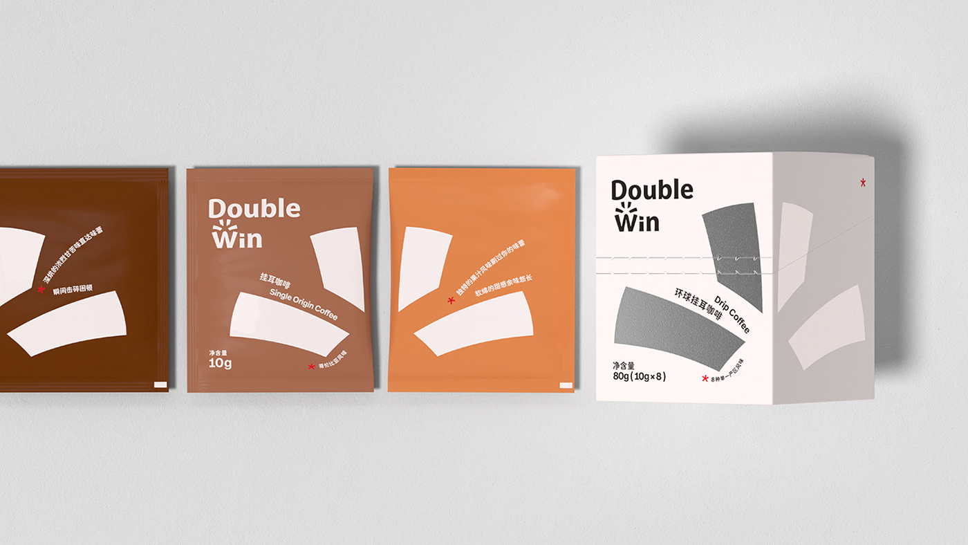
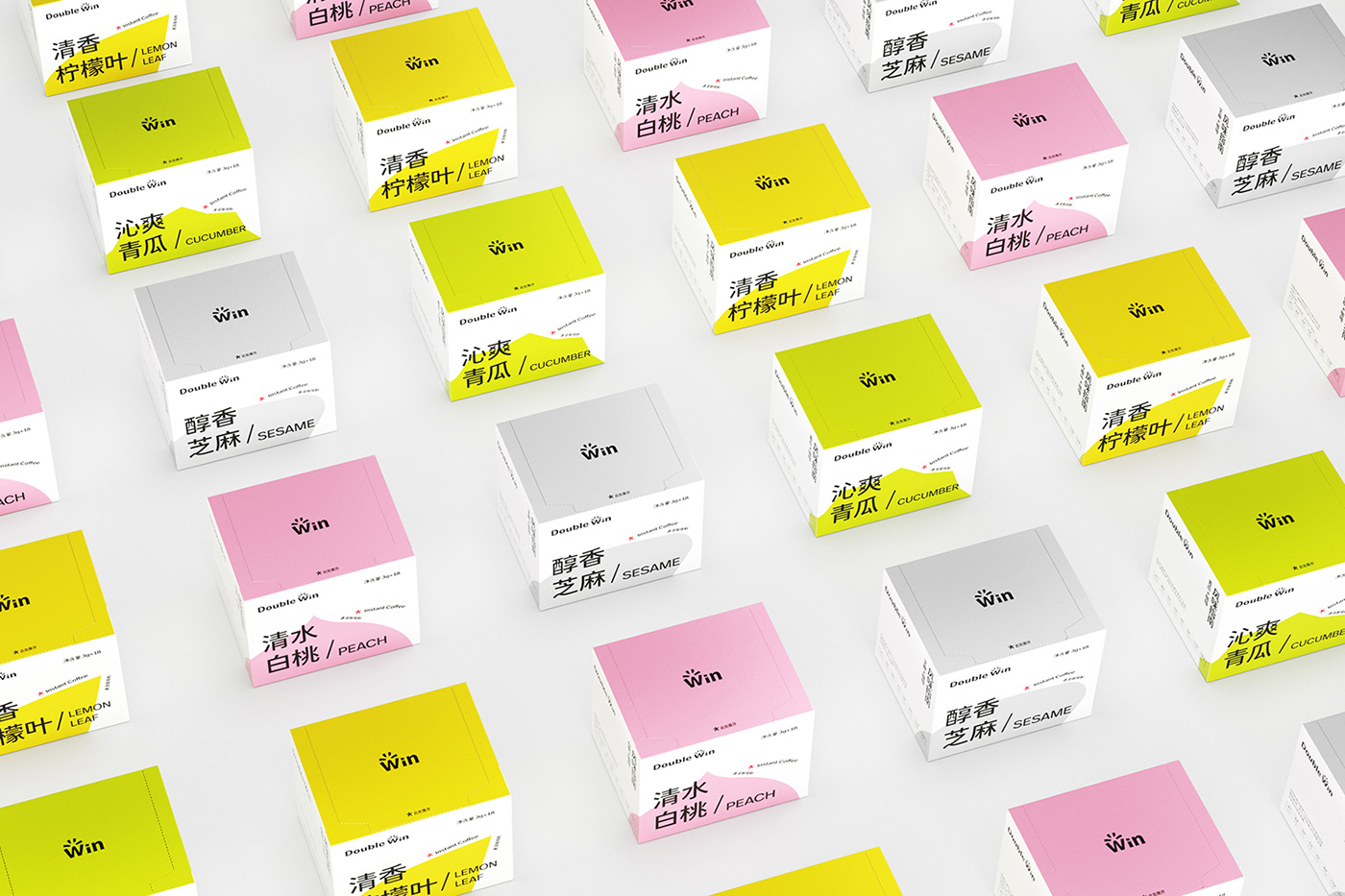
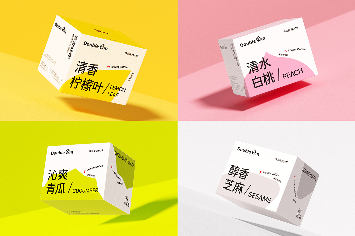
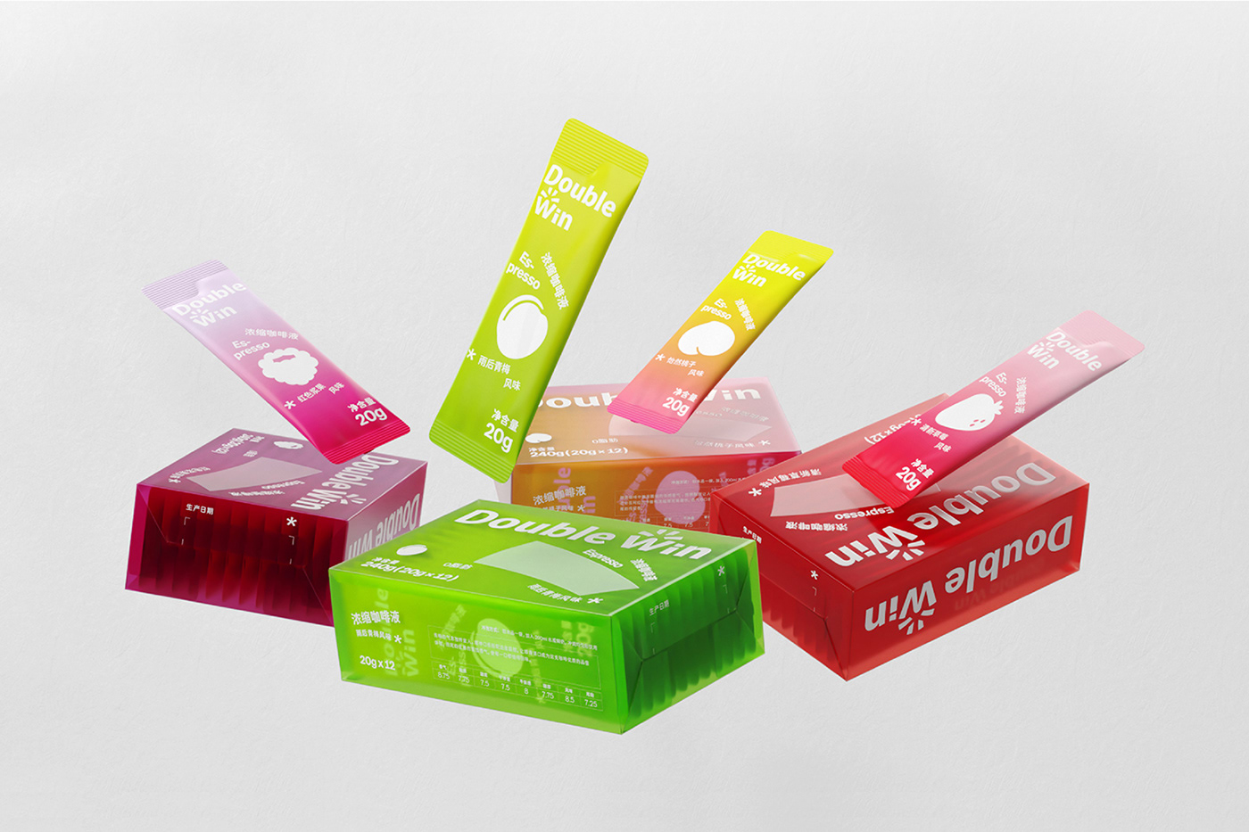
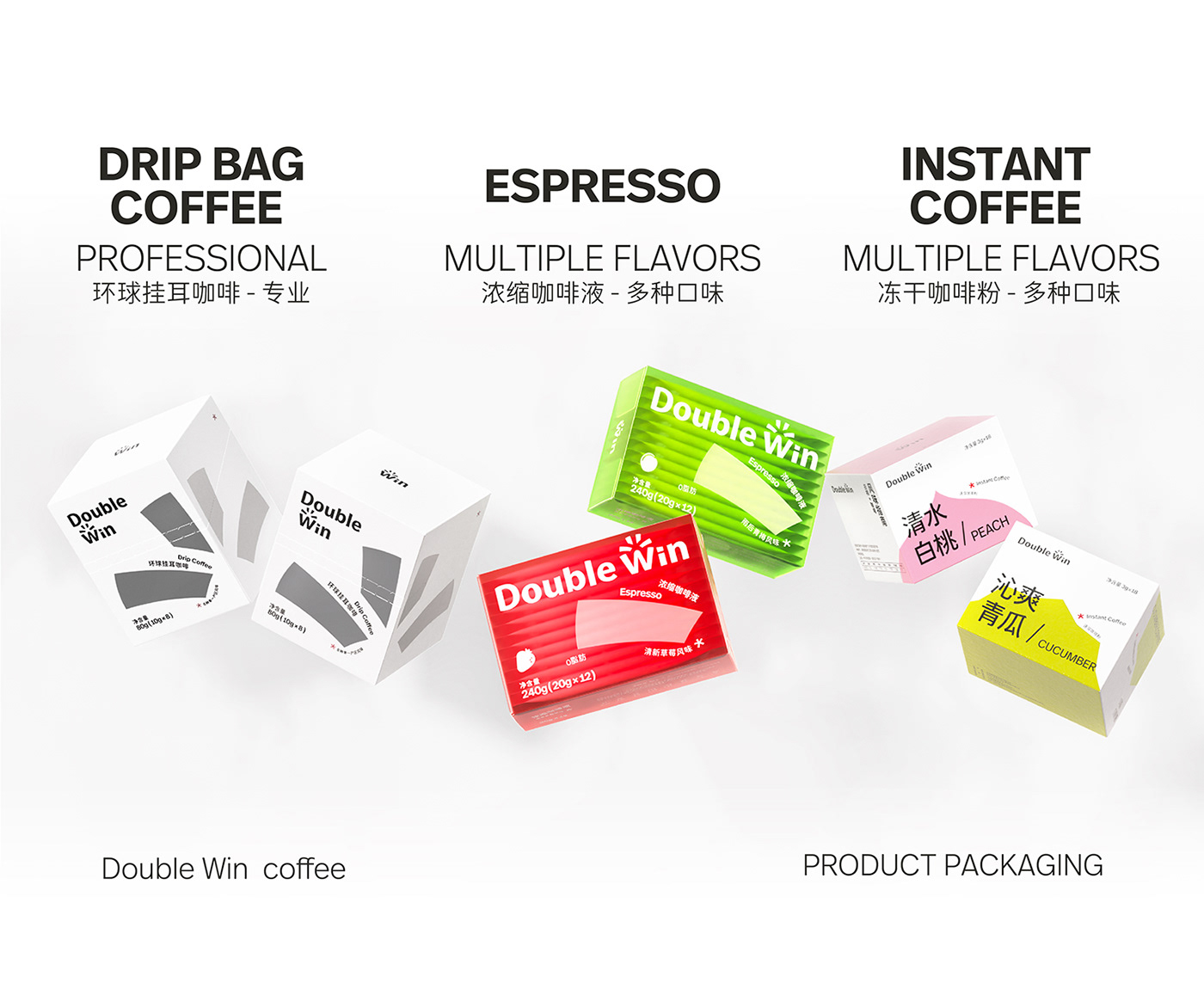
In packaging design part, we focused on the different positioning of the three types of coffee products, analyzed and considered the product categories, target groups and main selling points to complete a targeted upgrade design.
Under the guidance of the overall strategy, the three types of coffee products, from the color to the choice of packaging methods, all reflect their own characteristics on the basis of brand unity, to meet the different needs from professional to youthful.
在产品包装设计部分,我们着力于三类咖啡产品的不同定位与需求,从产品品类、目标人群与主要卖点等方面进行分析与考量,完成了针对性的升级设计。
最终在整体策略指导下,三类咖啡产品从色彩到包装方式的选择,都在保证品牌统一性的基础上,体现出各自的特征,满足从专业到年轻化的不同需求。






Client - Double Win
Creative Agency - LxU
Project Director - 李雨/Levi
Design Director - 高蕴/Yun
Art Director - 魏婷婷/Una
Account - 唐莹/Tang
Design - 孙亚楠/YaNan & 王璐明/Mushroom & 严恺/Key
3D Modeling & Animation - 岳昕宇/Shou-zhang & 周家荣/Joro & 胡漠天/Suanan & 肖珍东/Source & 张思杰/Sijie
Type Design - atelierAnchor 锚坞


