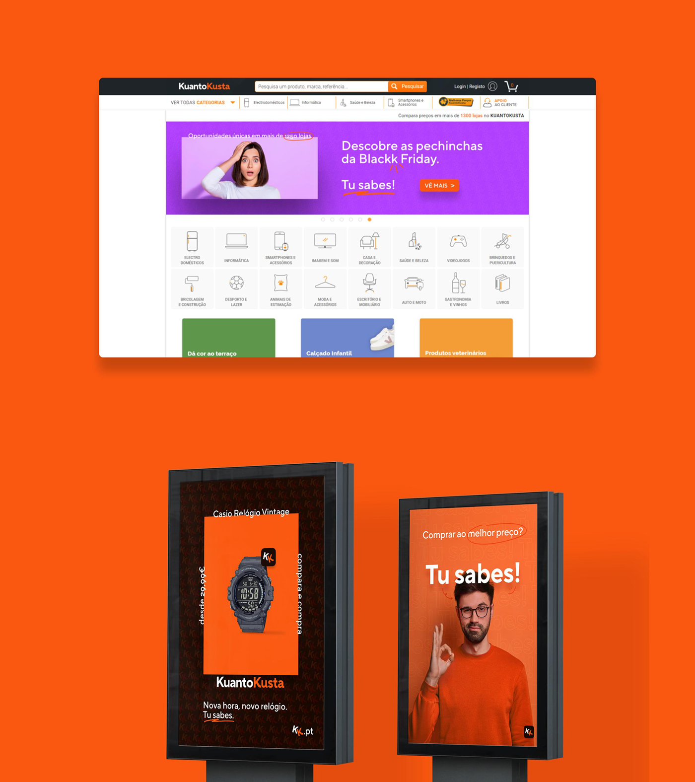
As result of an invitation by KuantoKusta, the brand and management agency AMMP, in close collaboration with the creative studio studium, presented a global and strategic proposal, focused on the brands' positioning, tone of voice and conceptual and formal evolution. Starting from the need to evolve and position KuantoKusta in a proper communication dynamic of 2022, the proposal is distinguished by the affirmation of an approach recognizable by different audiences, capable of affirming its identity, values and speech in each relation and emotional environment.

KuantoKusta logo evolution (2006-2019)
KuantoKusta logo has remained virtually the same since its creation, with small changes throughout the years. The brand always focused on the unusual spell of its name (instead of the actual portuguese spelling Quanto Custa), with K being a letter not used in portuguese. That allowed the brand, an online price comparison and marketplace, to live in a place of its own in terms of SEO and internet searches.

A custom K was designed to fit with the alternates used on the second word. This allowed the logo to keep the original idea of splitting the words, even when used in a single color.
While developing the brief, we noticed that the team referred to itself as KK, shortening the name in conversations. We decided to pile on that and further emphasize the oddity of the Ks and the playful approach to the brand's name, by turning it in one of the brand's main assets.


