Let me give you some context.
I'm a Colombian writer, but I recently noticed how far I am from who I want to become as a writer so I've been making a lot of tests. The most recent one—is also the most promising one—is about my Patreon page on which I plan to post my new articles, book updates, videos, and audios.
Having that in mind, I started my journey of designing and building my FCPX presets through Affinity Designer—since it works better on mac than Illustrator—and Apple Motion.

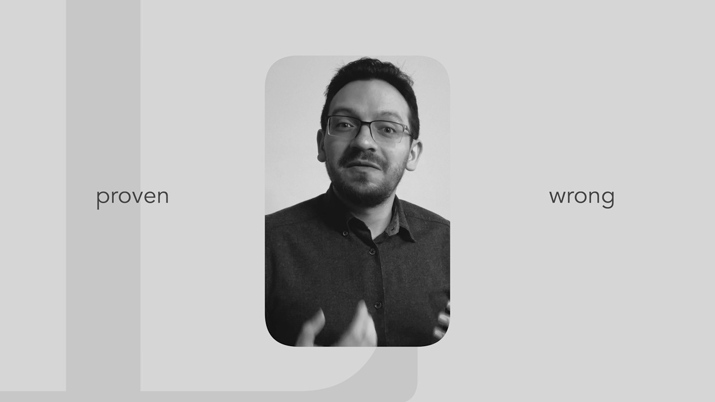
Starting with the cover, I initially used a black with 85% opacity background on top of my face. It only made the text look good, but not me, so I deleted it.
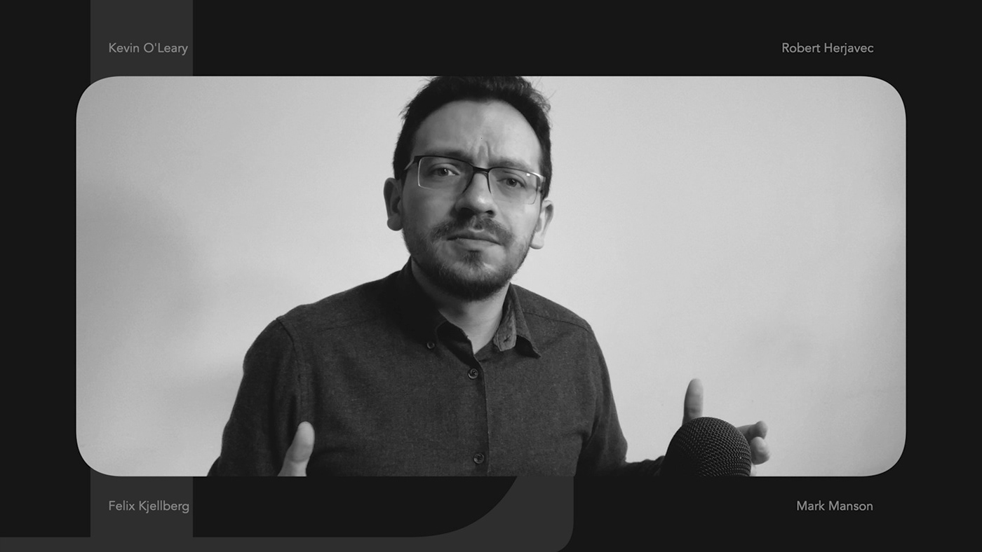
By the way, on my previous videos (as you can notice on my Youtube channel: Jordy [en]) my background was black, but I decided to change it because if I travel it's easier to find a white background than a black one with grass texture. Anyway, that was my main motive.
Another great reason is that a white background drives more attention to me since I always wear dark colors.
That is, commodity and neuromarketing.

Leaving me full screen felt weird, maybe too minimal. It felt rustic and cheap, so I added a frame with a nice white to make it more clean and elegant. The title of the video was supposed to appear as a design element and not as an important input, so I used a soft tone for such text. I don't want it to drive attention, just to add a little touch to the design.

This is a dark version with a square frame for me. Notice the soft round corners as it gives a more friendly perspective than just a simple square. As my brother—also a designer—said, it makes the video more dynamic which is something that I wanted.
I only have one shot of me talking. Only one angle and that's it. Therefore, to make a dynamic video I added different frame options that changed through video cuts so it doesn't feel rigid.
Also, I'm not so good with Apple Motion so adding animated elements was too complicated for me, and I needed to set easy to use templates for a fast editing. After all, it's just me who writes, records and publish.


Did you noticed? I'm flipping me which in previous attempts felt awful because my grass-like background didn't allow me to do so. Now, since I have a white background you can perceive it as a change of camera which gives a better pace to the video. Also, as I only use cuts, then it makes it feel more natural.


Now, let me tell a couple of things that drove me crazy and I couldn't sleep because of that.
First one, the color from the logo and the text didn't match even though I used the same color preset. It was a color set that I've saved in my Apple's color library a year before. I liked those colors and I've been using them for everything in my brand.
Well, turned out that those colors were wrong. For example, I saved a dark color tagged as #282828, but in reality it was like #181818. So, I had to change all that set because it didn't make sense at all.
As I only use black and white tones, I divided the 255 tones and got 3, 5, and 17. I decided to create a set of 15 tones (16 considering the initial black) with a gap of 17 in between. Anyway, the tones that you see are 17 (rgb) for black and #CCCCCC for (white). I didn't choose 238 (rgb) as my base white because between black and white scenes the contrast was too strong.
Noted: I know that as designer I should mention mainly RGB, but I was a developer first (HEX) and now I just remember the one that's easier for me to remember.
Second, I had to update the color on everything. Therefore, it was a long night.
Third, I recently changed my logo and I don't have the first drafts, so I'm not going to make a post about it. But as I was editing the video I noticed some symmetry errors that I had to fix, update the FCPX plugin, and then apply it to the video.
It was definitely a fun process and I've enjoyed it a lot. I also loved the outcome even though there are a couple of things I want to fix and try for the next video.
If you want to watch the video or any of my work as a writer, here's my Patreon: https://www.patreon.com/jordymaduenoen

This is my current branding color tone set.
