
"Žalia Giria" (translated from lithuanian meaning Green Forest) is underground spring water with an original chemical composition, extracted from a 200 m deep water well. This water has a calcium-magnesium hydrocarbonate composition with a pH of 7.7 and a certain amount of other mineral substances.
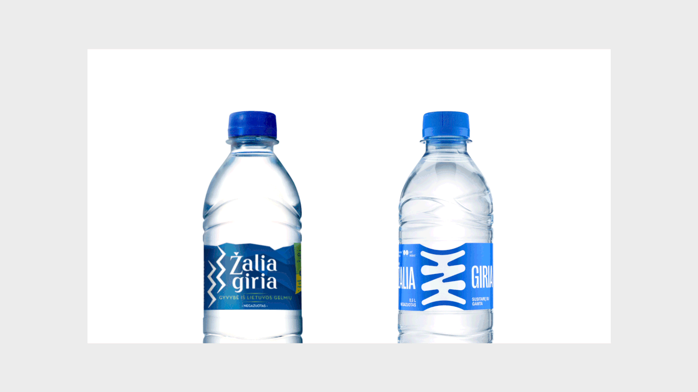
The new “Žalia giria” logotype is the letter “Ž” with two check marks: one at the top and one at the bottom. The extra check mark indicates symmetry and balance. Balance between branches and roots, earth and sky, human and nature. The new letter “Ž” symbolizes “root-nourishing water,” where roots belong to both: forest and human. “Žalia giria” represents the agreement and connection between man and nature. How? The branches and roots interwine not only in the forest - the same happens in the life of humans.
While creating the logotype, we also looked at the roots of culture, especially the traditions of old ceramics. In ancient times, people decorated their everyday dishes with magic signs, thus fostering a connection with nature. The ambition for a new label was the same - to make it meaningful in terms of relationship with nature - just like in the old pottery.


Client: Žalia Giria (UAB Gelsva)
Design: CRITICAL
Photography: Kernius Pauliukonis packshot.lt
Year: 2020


